为了提升用户体验,很多网站都会使用预加载动画来美化网页加载过程,为用户带来更好的感受。网页预加载一般是两部分组成,一个是web前端
效果,一个手Javascript代码,不废话,直接上代码。
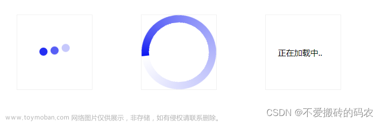
Web前端加载10个动画效果
Loading 动画效果一
<style>
    .spinner {
      margin: 100px auto;
      width: 50px;
      height: 60px;
      text-align: center;
      font-size: 10px;
    }

    .spinner > div {
      background-color: #67CF22;
      height: 100%;
      width: 6px;
      display: inline-block;

      -webkit-animation: stretchdelay 1.2s infinite ease-in-out;
      animation: stretchdelay 1.2s infinite ease-in-out;
    }

    .spinner .rect2 {
      -webkit-animation-delay: -1.1s;
      animation-delay: -1.1s;
    }

    .spinner .rect3 {
      -webkit-animation-delay: -1.0s;
      animation-delay: -1.0s;
    }

    .spinner .rect4 {
      -webkit-animation-delay: -0.9s;
      animation-delay: -0.9s;
    }

    .spinner .rect5 {
      -webkit-animation-delay: -0.8s;
      animation-delay: -0.8s;
    }

    @-webkit-keyframes stretchdelay {
      0%, 40%, 100% { -webkit-transform: scaleY(0.4) }
      20% { -webkit-transform: scaleY(1.0) }
    }

    @keyframes stretchdelay {
      0%, 40%, 100% {
        transform: scaleY(0.4);
        -webkit-transform: scaleY(0.4);
      }  20% {
        transform: scaleY(1.0);
        -webkit-transform: scaleY(1.0);
      }
    }
</style>
<div class="spinner">
  <div class="rect1"></div>
  <div class="rect2"></div>
  <div class="rect3"></div>
  <div class="rect4"></div>
  <div class="rect5"></div>
</div>
Loading 动画效果二
<style>
    .spinner {
      width: 60px;
      height: 60px;
      background-color: #67CF22;

      margin: 100px auto;
      -webkit-animation: rotateplane 1.2s infinite ease-in-out;
      animation: rotateplane 1.2s infinite ease-in-out;
    }

    @-webkit-keyframes rotateplane {
      0% { -webkit-transform: perspective(120px) }
      50% { -webkit-transform: perspective(120px) rotateY(180deg) }
      100% { -webkit-transform: perspective(120px) rotateY(180deg)  rotateX(180deg) }
    }

    @keyframes rotateplane {
      0% {
        transform: perspective(120px) rotateX(0deg) rotateY(0deg);
        -webkit-transform: perspective(120px) rotateX(0deg) rotateY(0deg)
      } 50% {
        transform: perspective(120px) rotateX(-180.1deg) rotateY(0deg);
        -webkit-transform: perspective(120px) rotateX(-180.1deg) rotateY(0deg)
      } 100% {
        transform: perspective(120px) rotateX(-180deg) rotateY(-179.9deg);
        -webkit-transform: perspective(120px) rotateX(-180deg) rotateY(-179.9deg);
      }
    }
</style>
<div class="spinner"></div>
Loading 动画效果三
<style>
    .spinner {
      width: 60px;
      height: 60px;

      position: relative;
      margin: 100px auto;
    }

    .double-bounce1, .double-bounce2 {
      width: 100%;
      height: 100%;
      border-radius: 50%;
      background-color: #67CF22;
      opacity: 0.6;
      position: absolute;
      top: 0;
      left: 0;

      -webkit-animation: bounce 2.0s infinite ease-in-out;
      animation: bounce 2.0s infinite ease-in-out;
    }

    .double-bounce2 {
      -webkit-animation-delay: -1.0s;
      animation-delay: -1.0s;
    }

    @-webkit-keyframes bounce {
      0%, 100% { -webkit-transform: scale(0.0) }
      50% { -webkit-transform: scale(1.0) }
    }

    @keyframes bounce {
      0%, 100% {
        transform: scale(0.0);
        -webkit-transform: scale(0.0);
      } 50% {
        transform: scale(1.0);
        -webkit-transform: scale(1.0);
      }
    }
</style>
<div class="spinner">
  <div class="double-bounce1"></div>
  <div class="double-bounce2"></div>
</div>
Loading 动画效果四
<style>
    .spinner {
      margin: 100px auto;
      width: 32px;
      height: 32px;
      position: relative;
    }

    .cube1, .cube2 {
      background-color: #67CF22;
      width: 30px;
      height: 30px;
      position: absolute;
      top: 0;
      left: 0;

      -webkit-animation: cubemove 1.8s infinite ease-in-out;
      animation: cubemove 1.8s infinite ease-in-out;
    }

    .cube2 {
      -webkit-animation-delay: -0.9s;
      animation-delay: -0.9s;
    }

    @-webkit-keyframes cubemove {
      25% { -webkit-transform: translateX(42px) rotate(-90deg) scale(0.5) }
      50% { -webkit-transform: translateX(42px) translateY(42px) rotate(-180deg) }
      75% { -webkit-transform: translateX(0px) translateY(42px) rotate(-270deg) scale(0.5) }
      100% { -webkit-transform: rotate(-360deg) }
    }

    @keyframes cubemove {
      25% {
        transform: translateX(42px) rotate(-90deg) scale(0.5);
        -webkit-transform: translateX(42px) rotate(-90deg) scale(0.5);
      } 50% {
        transform: translateX(42px) translateY(42px) rotate(-179deg);
        -webkit-transform: translateX(42px) translateY(42px) rotate(-179deg);
      } 50.1% {
        transform: translateX(42px) translateY(42px) rotate(-180deg);
        -webkit-transform: translateX(42px) translateY(42px) rotate(-180deg);
      } 75% {
        transform: translateX(0px) translateY(42px) rotate(-270deg) scale(0.5);
        -webkit-transform: translateX(0px) translateY(42px) rotate(-270deg) scale(0.5);
      } 100% {
        transform: rotate(-360deg);
        -webkit-transform: rotate(-360deg);
      }
    }
</style>
<div class="spinner">
  <div class="cube1"></div>
  <div class="cube2"></div>
</div>
Loading 动画效果五
<style>
    .spinner {
      margin: 100px auto;
      width: 90px;
      height: 90px;
      position: relative;
      text-align: center;

      -webkit-animation: rotate 2.0s infinite linear;
      animation: rotate 2.0s infinite linear;
    }

    .dot1, .dot2 {
      width: 60%;
      height: 60%;
      display: inline-block;
      position: absolute;
      top: 0;
      background-color: #67CF22;
      border-radius: 100%;

      -webkit-animation: bounce 2.0s infinite ease-in-out;
      animation: bounce 2.0s infinite ease-in-out;
    }

    .dot2 {
      top: auto;
      bottom: 0px;
      -webkit-animation-delay: -1.0s;
      animation-delay: -1.0s;
    }

    @-webkit-keyframes rotate { 100% { -webkit-transform: rotate(360deg) }}
    @keyframes rotate { 100% { transform: rotate(360deg); -webkit-transform: rotate(360deg) }}

    @-webkit-keyframes bounce {
      0%, 100% { -webkit-transform: scale(0.0) }
      50% { -webkit-transform: scale(1.0) }
    }

    @keyframes bounce {
      0%, 100% {
        transform: scale(0.0);
        -webkit-transform: scale(0.0);
      } 50% {
        transform: scale(1.0);
        -webkit-transform: scale(1.0);
      }
    }
</style>
<div class="spinner">
  <div class="dot1"></div>
  <div class="dot2"></div>
</div>
Loading 动画效果六
<style>
    .spinner {
      margin: 100px auto 0;
      width: 150px;
      text-align: center;
    }

    .spinner > div {
      width: 30px;
      height: 30px;
      background-color: #67CF22;

      border-radius: 100%;
      display: inline-block;
      -webkit-animation: bouncedelay 1.4s infinite ease-in-out;
      animation: bouncedelay 1.4s infinite ease-in-out;
      /* Prevent first frame from flickering when animation starts */
      -webkit-animation-fill-mode: both;
      animation-fill-mode: both;
    }

    .spinner .bounce1 {
      -webkit-animation-delay: -0.32s;
      animation-delay: -0.32s;
    }

    .spinner .bounce2 {
      -webkit-animation-delay: -0.16s;
      animation-delay: -0.16s;
    }

    @-webkit-keyframes bouncedelay {
      0%, 80%, 100% { -webkit-transform: scale(0.0) }
      40% { -webkit-transform: scale(1.0) }
    }

    @keyframes bouncedelay {
      0%, 80%, 100% {
        transform: scale(0.0);
        -webkit-transform: scale(0.0);
      } 40% {
        transform: scale(1.0);
        -webkit-transform: scale(1.0);
      }
    }
</style>
<div class="spinner">
  <div class="bounce1"></div>
  <div class="bounce2"></div>
  <div class="bounce3"></div>
</div>
Loading 动画效果七
<style>
    .spinner {
      width: 40px;
      height: 40px;
      margin: 100px auto;
      background-color: #333;

      border-radius: 100%;
      -webkit-animation: scaleout 1.0s infinite ease-in-out;
      animation: scaleout 1.0s infinite ease-in-out;
    }

    @-webkit-keyframes scaleout {
      0% { -webkit-transform: scale(0.0) }
      100% {
        -webkit-transform: scale(1.0);
        opacity: 0;
      }
    }

    @keyframes scaleout {
      0% {
        transform: scale(0.0);
        -webkit-transform: scale(0.0);
      } 100% {
        transform: scale(1.0);
        -webkit-transform: scale(1.0);
        opacity: 0;
      }
    }
</style/>
<div class="spinner"></div>
Loading 动画效果八
<style>
    .spinner {
      margin: 100px auto;
      width: 20px;
      height: 20px;
      position: relative;
    }

    .container1 > div, .container2 > div, .container3 > div {
      width: 6px;
      height: 6px;
      background-color: #333;

      border-radius: 100%;
      position: absolute;
      -webkit-animation: bouncedelay 1.2s infinite ease-in-out;
      animation: bouncedelay 1.2s infinite ease-in-out;
      -webkit-animation-fill-mode: both;
      animation-fill-mode: both;
    }

    .spinner .spinner-container {
      position: absolute;
      width: 100%;
      height: 100%;
    }

    .container2 {
      -webkit-transform: rotateZ(45deg);
      transform: rotateZ(45deg);
    }

    .container3 {
      -webkit-transform: rotateZ(90deg);
      transform: rotateZ(90deg);
    }

    .circle1 { top: 0; left: 0; }
    .circle2 { top: 0; right: 0; }
    .circle3 { right: 0; bottom: 0; }
    .circle4 { left: 0; bottom: 0; }

    .container2 .circle1 {
      -webkit-animation-delay: -1.1s;
      animation-delay: -1.1s;
    }

    .container3 .circle1 {
      -webkit-animation-delay: -1.0s;
      animation-delay: -1.0s;
    }

    .container1 .circle2 {
      -webkit-animation-delay: -0.9s;
      animation-delay: -0.9s;
    }

    .container2 .circle2 {
      -webkit-animation-delay: -0.8s;
      animation-delay: -0.8s;
    }

    .container3 .circle2 {
      -webkit-animation-delay: -0.7s;
      animation-delay: -0.7s;
    }

    .container1 .circle3 {
      -webkit-animation-delay: -0.6s;
      animation-delay: -0.6s;
    }

    .container2 .circle3 {
      -webkit-animation-delay: -0.5s;
      animation-delay: -0.5s;
    }

    .container3 .circle3 {
      -webkit-animation-delay: -0.4s;
      animation-delay: -0.4s;
    }

    .container1 .circle4 {
      -webkit-animation-delay: -0.3s;
      animation-delay: -0.3s;
    }

    .container2 .circle4 {
      -webkit-animation-delay: -0.2s;
      animation-delay: -0.2s;
    }

    .container3 .circle4 {
      -webkit-animation-delay: -0.1s;
      animation-delay: -0.1s;
    }

    @-webkit-keyframes bouncedelay {
      0%, 80%, 100% { -webkit-transform: scale(0.0) }
      40% { -webkit-transform: scale(1.0) }
    }

    @keyframes bouncedelay {
      0%, 80%, 100% {
        transform: scale(0.0);
        -webkit-transform: scale(0.0);
      } 40% {
        transform: scale(1.0);
        -webkit-transform: scale(1.0);
      }
    }
</style>
<div class="spinner">
  <div class="spinner-container container1">
    <div class="circle1"></div>
    <div class="circle2"></div>
    <div class="circle3"></div>
    <div class="circle4"></div>
  </div>
  <div class="spinner-container container2">
    <div class="circle1"></div>
    <div class="circle2"></div>
    <div class="circle3"></div>
    <div class="circle4"></div>
  </div>
  <div class="spinner-container container3">
    <div class="circle1"></div>
    <div class="circle2"></div>
    <div class="circle3"></div>
    <div class="circle4"></div>
  </div>
</div>
网页预加载方法一:渐隐淡出动画
首先,我们需要在网页中插入一个容器元素,用于显示预加载动画。这个容器可以是一个居中的盒子,也可以是全屏的遮罩层。然后,通过设置CSS样式,在加载完成后逐渐将该容器淡出,以实现渐隐效果。
以下是具体的代码示例:
<div class="loading">
    <!-- 动画 -->
    <p style="color: #999; text-align: center;">为美好的世界献上祝福<br>MoeQY</p>
    <!-- 可选择添加字幕 --></div>
.loading {
  position: fixed;
  top: 0;
  left: 0;
  right: 0;
  bottom: 0;
  background-color: #fff;
  z-index: 999999;
}

.fadeout {
    opacity: 0;
    transition: all 0.3s ease;
}
window.onload = function(){
setTimeout(function(){
var loader = document.getElementsByClassName("loading")[0];
loader.className="loading fadeout" ;// 使用渐隐的方法淡出 loading page
setTimeout(function(){loader.style.display="none"},1000)
},1000)// 强制显示 loading page 1s
}网页预加载方法二:旋转加载动画
另一种常见的预加载动画是旋转加载动画。这种动画通常使用多个矩形元素,通过不同的动画延迟和变换效果,产生旋转的效果。
以下是具体的代码示例:
<!DOCTYPE html>
<html>
<head>
<style>
@keyframes spin {
  0% { transform: rotate(0deg); }
  100% { transform: rotate(360deg); }
}

.loader {
  border: 16px solid #f3f3f3; /* 设置边框 */
  border-top: 16px solid #3498db; /* 设置顶部边框颜色 */
  border-radius: 50%; /* 设置圆角 */
  width: 120px; /* 设置宽度 */
  height: 120px; /* 设置高度 */
  animation: spin 2s linear infinite; /* 设置动画属性 */
  margin: 0 auto; /* 居中显示 */
}
</style>
</head>
<body>

<div class="loader"></div> <!-- loader元素用于显示旋转加载动画 -->

</body>
</html>
在上述代码中,我们使用了CSS的@keyframes规则来定义了一个名为spin的动画。该动画在开始时将元素旋转0度,在结束时将元素旋转360度,形成旋转的效果。然后,我们将该动画应用到名为loader的div元素上,并设置了一些样式属性来设置边框、大小和颜色等。
你可以将上述代码保存为.html文件并在浏览器中打开,即可看到旋转加载动画效果。文章来源:https://www.toymoban.com/diary/web/540.html
关键词:Html、Css、网页预加载动画、渐隐淡出动画、旋转加载动画、代码示例文章来源地址https://www.toymoban.com/diary/web/540.html
到此这篇关于Html,css网页预加载动画的实现方法及10个加载动画效果示例的文章就介绍到这了,更多相关内容可以在右上角搜索或继续浏览下面的相关文章,希望大家以后多多支持TOY模板网!


![[期末网页作业]-精仿华为官网10个网页(html+css+js)](https://imgs.yssmx.com/Uploads/2024/02/534817-1.png)


