代码下载地址
Animation动画
Transision过渡动画是从一个状态到另一个状态,而Animation动画可以有多个关键帧
animation-name:设置动画ID
animation-duration:设置动画总时长
animation-timing-function:设置动画时间函数,同过渡动画
animation-iteration-count:设置动画播放次数,默认1次,可以是具体次数也可以是infinite(表示无限次)
animation-direction:设置交替动画,alternate来回交替
animation-delay:设置动画延迟
animation-fill-mode:设置动画开始/结束时状态,默认动画执行完毕会恢复到原始状态
- forwards:动画执行完毕保持动画结束状态,但在有延迟的情况下不会立马进入动画的开始状态
- backwards:动画执行完毕不会保持动画结束状态,但在有延迟的情况下会立马进入动画的开始状态
- both:动画执行完毕既会保持动画结束状态,但在有延迟的情况下也会立马进入动画的开始状态
animation-play-state:设置动画播放running/暂停paused状态
@keyframes identifier { }:创建动画
n% {}:创建关键帧,百分比指的是动画耗时的百分比,也可以使用from、to分别表示 0%、100%两处的关键帧
<head>
    <meta charset="UTF-8">
    <meta http-equiv="X-UA-Compatible" content="IE=edge">
    <meta name="viewport" content="width=device-width, initial-scale=1.0">
    <title>Animation</title>

    <style>
        * {
            margin: 0;
            padding: 0;
        }
        h2 {
            margin: 20px;
            text-align: center;
        }
        h3 {
            margin: 15px;
            text-align: center;
        }

        div.base {
            margin: auto;
            width: 200px;
            height: 250px;
        }
        div.base > input {
            margin-top: 115px;
        }
        div.animation {
            width: 100px;
            height: 100px;
            background-color: black;

            animation-name: animationBase;
            animation-duration: 3s;
            animation-timing-function: ease-in-out;
            animation-iteration-count: 1;
            animation-direction: alternate;
            animation-delay: 1s;
            animation-fill-mode: backwards;
            animation-play-state: running;
        }

        /* 创建动画 */
        @keyframes animationBase {
            /* 百分比指的是动画耗时的百分比 */
            0% {
                transform: translate(0px, 0px) rotate(90deg);
            }
            25% {
                transform: translate(100px);
            }
            50% {
                transform: translate(100px, 100px);
            }
            75% {
                transform: translate(0px, 100px);
            }
            100% {
                transform: translate(0px, 0px);
            }
        }
    </style>
</head>
<body>
    <h2>Animation动画</h2>
    <h3>动画基础</h3>
    <div class="base">
        <div class="animation"></div>

        <input id="paused" type="button" value="暂停">
        <input id="running" type="button" value="开始">
    </div>

    <script>
        var animationEle = document.querySelector(".animation");
        document.querySelector("#paused").onclick = function () {
            animationEle.style.animationPlayState = "paused";
        }
        document.querySelector("#running").onclick = function () {
            animationEle.style.animationPlayState = "running";
        }
    </script>
</body>
无缝滚动案例
实现思想:
- 首先将图片放入父类容器中浮动排列成一排
- 对父容器执行动画,并复制一份图片用于填补动画过程中出现的空缺,并使用overflow: hidden来隐藏超出父容器的图片
- 对父容器添加hover事件,实现鼠标停留位置决定动画播放与暂停
        div.scrollDiv {
            margin: auto;
            width: 480px;
            height: 120px;
            overflow: hidden;
        }
        div.scrollDiv > ul.scrollUl {
            width: 960px;
            animation-name: scrollAnimation;
            animation-duration: 5s;
            animation-timing-function: linear;
            animation-iteration-count: infinite;
        }
        div.scrollDiv:hover > ul.scrollUl {
            /* 光标为小手 */
            cursor: pointer;
            animation-play-state: paused;
        }
        div.scrollDiv > ul.scrollUl > li {
            width: 120px;
            float: left;
        }
        div.scrollDiv > ul.scrollUl > li > img {
            width: 120px;
            height: 120px;
        }
        @keyframes scrollAnimation {
            from {
                transform: translate(0);
            }
            to {
                transform: translate(-480px);
            }
        }

    <h3>案例无缝滚动</h3>
    <div class="scrollDiv">
        <ul class="scrollUl">
            <li><img src="images/scroll1.png" alt=""></li>
            <li><img src="images/scroll2.png" alt=""></li>
            <li><img src="images/scroll3.png" alt=""></li>
            <li><img src="images/scroll4.png" alt=""></li>
            <li><img src="images/scroll1.png" alt=""></li>
            <li><img src="images/scroll2.png" alt=""></li>
            <li><img src="images/scroll3.png" alt=""></li>
            <li><img src="images/scroll4.png" alt=""></li>
        </ul>
    </div>
时钟案例
时钟案例主要用到了position定位、transform变换、animation动画这三个方面的知识点,如下几点需要注意:
- border-radius百分比值参照的是父元素的实际(注意border、padding的影响)宽高,position定位百分比参照父元素,transform的百分比参照自身
- 动画会覆盖元素的属性,需要将属性值在动画中重新设置
动画简写
animation: id 时长 时间函数 延迟时间 执行次数 交替方向
        div.clock {
            width: 200px;
            height: 200px;
            margin: auto;
            margin-bottom: 20px;
            border: solid 8px black;
            border-radius: 50%;
            position: relative;
        }
        div.line {
            width: 8px;
            height: 200px;
            background-color: black;
            position: absolute;
            left: 50%;
            transform: translate(-50%);
        }
        div.line1, div.line4 {
            width: 10px;
        }
        div.line2 {
            transform: translate(-50%) rotate(30deg);
        }
        div.line3 {
            transform: translate(-50%) rotate(60deg);
        }
        div.line4 {
            transform: translate(-50%) rotate(90deg);
        }
        div.line5 {
            transform: translate(-50%) rotate(120deg);
        }
        div.line6 {
            transform: translate(-50%) rotate(150deg);
        }
        div.cover {
            width: 184px;
            height: 184px;
            border-radius: 92px;
            background-color: white;
            position: absolute;
            left: 50%;
            top: 50%;
            transform: translate(-50%, -50%);
        }
        div.pin {
            position: absolute;
            left: 50%;
            top: 50%;
            transform: translate(-50%, -100%);
            transform-origin: center bottom;
        }
        div.hour {
            background-color: red;
            width: 7px;
            height: 50px;
            animation: clockAnimation 43200s linear infinite;
        }
        div.minute {
            background-color: green;
            width: 5px;
            height: 65px;
            animation: clockAnimation 3600s linear infinite;
        }
        div.second {
            background-color: blue;
            width: 3px;
            height: 80px;
            animation: clockAnimation 60s steps(60) infinite;
        }
        div.center {
            width: 15px;
            height: 15px;
            position: absolute;
            left: 50%;
            top: 50%;
            transform: translate(-50%, -50%);
            border-radius: 50%;
            background-color: darkgray;
        }

        @keyframes clockAnimation {
            from {
                transform: translate(-50%, -100%) rotate(0);
            }
            to {
                transform: translate(-50%, -100%) rotate(360deg);
            }
        }

    <h3>时钟案例</h3>
    <div class="clock">
        <div class="line line1"></div>
        <div class="line line2"></div>
        <div class="line line3"></div>
        <div class="line line4"></div>
        <div class="line line5"></div>
        <div class="line line6"></div>

        <div class="cover"></div>

        <div class="pin hour"></div>
        <div class="pin minute"></div>
        <div class="pin second"></div>

        <div class="center"></div>
    </div>
web字体和字体图标
可以为网页指定特殊字体而无需考虑用户是否安装此字体,不同系统不同浏览器支持的字体文件不同(主要有ttf、otf、woff、eot、svg)。
首先得自定义想生成对应字体文件的内容,然后利用网络资源(这里使用的是阿里webfont)生成对应的web字体,使用方法如下:
- 使用
@font-face申明字体(注意,路径一定要改为本地文件路径,这个字体文件只包含生成文件的文字) - 定义使用 webfont 的样式
- 为文字加上对应的样式
    <style>
        @font-face {
            font-family: 'webfont';
            font-display: swap;
            src: url('fonts/webfont_mjhhrv4rmgj/webfont.eot'); /* IE9 */
            src: url('fonts/webfont_mjhhrv4rmgj/webfont.eot?#iefix') format('embedded-opentype'), /* IE6-IE8 */
            url('fonts/webfont_mjhhrv4rmgj/webfont.woff2') format('woff2'),
            url('fonts/webfont_mjhhrv4rmgj/webfont.woff') format('woff'), /* chrome、firefox */
            url('fonts/webfont_mjhhrv4rmgj/webfont.ttf') format('truetype'), /* chrome、firefox、opera、Safari, Android, iOS 4.2+*/
            url('fonts/webfont_mjhhrv4rmgj/webfont.svg#webfont') format('svg'); /* iOS 4.1- */
        }
        .web-font {
            font-family: webfont;
        }
    </style>

<body>
    <span class="web-font">可以为网页指定特殊字体而无需考虑用户是否安装此字体,不同系统不同浏览器支持的字体文件不同(主要有ttf、otf、woff、eot、svg)。撒娇时代峰峻</span>
</body>
把常用图标借助工具生成字体包,就可以像文字一样使用图标了,这样做具有如下有点:
- 打包成字体库,减少请求
- 具有矢量性,保证清晰度
- 使用灵活,便于维护
@font-face {
font-family: 'iconfont';
src: url('fonts/font_ny15g6aig4b/iconfont.ttf') format('truetype');
}
.icon-font {
font-family: iconfont;
font-size: 50px;
color: red;
}
<span class="icon-font"></span> <br>
直接使用编码来表示图标,不直观也不方便,可以利用伪元素更加方便直观的表示:
        .dingdan::before {
            font-family: iconfont;
            content: "\e8ae";
            font-size: 50px;
            color: red;
        }
        .fengxiang::before {
            font-family: iconfont;
            content: "\e8b0";
            font-size: 50px;
            color: green;
        }
        .shouji::before {
            font-family: iconfont;
            content: "\e8b9";
            font-size: 50px;
            color: blue;
        }

    <span class="dingdan"></span>
    <span class="fengxiang"></span>
    <span class="shouji"></span>
多列布局
CSS3 中的多列布局(multi-column)是对传统 html 块状布局的有力扩充。常用属性如下:
- column-count:设置列数
- column-width:设置列的宽度
- column-gap:设置列间隙(取大优先,如果人为设置宽度大则取更大的值但会填充屏幕——意味着最终宽度更大来适配屏幕;如果设置宽度更小则使用计算的宽度)
- column-rule:设置列之间的宽度、颜色和样式(与边框样式添加一样)
- column-span:设置元素横跨多少列(n:夸n列,all:夸所有列;但是设置为大于1小于列数的值都会只夸一列)
        div.wrapper {
            box-sizing: border-box;
            width: 100%;
            padding: 20px;
            column-count: 3;
            column-rule: 3px dashed black;
            column-gap: 50px;
            column-width: 200px;
        }
        h2 {
            text-align: center;
            column-span: all;
        }
伸缩布局
布局的传统方式基于盒模型,依赖 position、display、float 属性。对于一些特殊布局非常不方便,CSS3 做了非常大的改进,使得对块级元素的布局十分灵活,适应性强,其强大的伸缩性在响应式开发中发挥极大作用。
display:flex:一个容器设置这个属性,那么子元素自动变成伸缩项(lex item)
justify-content:设置弹性盒子在主轴方向上的排列方式,其他属性值如下:
flex-start:子元素向行起始位置对齐
flex-end:子元素向行结束位置对齐
center:子元素向行中间位置对齐
space-between:子元素平均分布在行里,首末子元素分别向行起始、结束位置对齐,其余子元素中间平均分布产生相同间距
space-around:将多余空间平均分布在每个子元素两侧,造成中间间距是两边的两倍
    <style>
        h2 {
            text-align: center;
        }
        div.box {
            box-sizing: border-box;
            border: 1px solid darkgray;
            margin: auto;
            width: 1000px;
            height: 200px;
            display: flex;
            justify-content: space-around;
        }
        div.box > div {
            width: 200px;
            height: 100%;
        }
        div.box > div.first {
            background-color: red;
        }
        div.box > div.second {
            background-color: green;
        }
        div.box > div.third {
            background-color: blue;
        }
        div.box > div.fourth {
            background-color: cyan;
        }
    </style>
</head>
<body>
    <h2>伸缩布局</h2>
    <div class="box">
        <div class="first"></div>
        <div class="second"></div>
        <div class="third"></div>
        <div class="fourth"></div>
    </div>
</body>
当子元素宽度和大于父元素时,子元素会自动平均收缩
flex-wrap:控制子元素是否换行显示,默认不换行(nowrap:不换行收缩显示,wraper:换行显示,wraper-reverse:翻转从最后一行开始排列)
flex-direction:设置元素主轴即排列方向,默认主轴是 row 水平方向排列(row:水平方向从左到右排列,row-reverse:水平方向从右到左排列,column:垂直方向从上到下排列,column:垂直方向从下到上排列)
flex-flow:是 flex-wrap 和 flex-direction 的综合
        div.box1 {
            margin: 20px auto;
            width: 900px;
            height: 600px;
            box-sizing: border-box;
            border: 1px solid darkgray;
            display: flex;
            justify-content: space-around;
            /* flex-wrap: wrap-reverse;
            flex-direction: column-reverse; */
            flex-flow: wrap-reverse column-reverse;
        }
        div.box1 > div {
            width: 200px;
            height: 200px;
        }
        div.box1 > div.one {
            background-color: red;
        }
        div.box1 > div.two {
            background-color: green;
        }
        div.box1 > div.three {
            background-color: blue;
        }
        div.box1 > div.four {
            background-color: cyan;
        }
        div.box1 > div.five {
            background-color: pink;
        }

    <div class="box1">
        <div class="one">1</div>
        <div class="two">2</div>
        <div class="three">3</div>
        <div class="four">4</div>
        <div class="five">5</div>
    </div>
flex-grow:可以扩展子元素的宽度,设置当前元素应该占据剩余空间的比例值(当前元素的flex-grow值除以所有兄弟元素flex-grow值之和),默认值为0(并不会占据剩余空间)。
        div.box2 {
            margin: auto;
            width: 900px;
            height: 400px;
            border: 1px solid darkgray;
            display: flex;
            justify-content: space-around;
        }
        div.box2 > div {
            width: 200px;
            height: 200px;
        }
        div.box2 > div.one {
            background-color: red;
            flex-grow: 1;
        }
        div.box2 > div.two {
            background-color: green;
        }
        div.box2 > div.three {
            background-color: blue;
            flex-grow: 1;
        }

    <h3>flex-grow</h3>
    <div class="box2">
        <div class="one">1</div>
        <div class="two">2</div>
        <div class="three">3</div>
    </div>
flex-shrink:可以收缩子元素的宽度,设置当前元素应该占据收缩空间的比例值(当前元素的flex-shrink值除以所有兄弟元素flex-shrink值之和),默认值为1(平均占收缩空间)。
        div.box3 {
            margin: auto;
            width: 500px;
            height: 400px;
            border: 1px solid darkgray;
            display: flex;
            justify-content: space-around;
        }
        div.box3 > div {
            width: 200px;
            height: 200px;
        }
        div.box3 > div.one {
            background-color: red;
            flex-shrink: 2;
        }
        div.box3 > div.two {
            background-color: green;
            flex-shrink: 1;
        }
        div.box3 > div.three {
            background-color: blue;
            flex-shrink: 1;
        }

    <h3>flex-shrink</h3>
    <div class="box3">
        <div class="one">1</div>
        <div class="two">2</div>
        <div class="three">3</div>
    </div>
flex:flex属性是flex-grow、flex-shrink和flex-basis的简写(默认值0 1 auto),后两个属性为可选。
        div.box4 {
            width: 100%;
            height: 500px;
            background-color: antiquewhite;
            display: flex;
        }
        div.box4 > div.left {
            flex: 1;
            background-color: red;
        }
        div.box4 > div.right {
            flex: 4;
            background-color: green;
        }

    <h3>flex</h3>
    <div class="box4">
        <div class="left"></div>
        <div class="right"></div>
    </div>
在不知道具体数量的情况下,无法通过设置width的百分比来做到占据整个父容器,此时使用flex就可以轻松做到:
div.box5 {
width: 600px;
height: 500px;
margin: auto;
border: 1px dotted darkgray;
}
div.box5 > ul {
margin: 0;
padding: 0;
width: 100%;
list-style: none;
display: flex;
}
div.box5 > ul > li {
flex: 1;
margin: 0;
line-height: 44px;
box-sizing: border-box;
text-align: center;
border: 1px solid skyblue;
background-color: aquamarine;
}
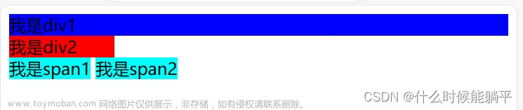
<h3>伸缩菜单项</h3>
<div class="box5">
<ul>
<li>首页</li>
<li>商品分类</li>
<li>我的订单</li>
<li>最新商品</li>
<li>联系我们</li>
</ul>
</div>
align-items:设置子元素(伸缩项)在侧轴方向上的对齐方式(center:侧轴方向居中对齐;flex-start:侧轴方向顶对齐;flex-end:侧轴方向底对齐;strench:让子元素在侧轴方向拉伸填充整个整个侧轴方向,这个是默认值,但是设置高度后会失效;baseline:侧轴方向文本基线对齐)。
align-self:设置单个元素在侧轴方向的对齐方式
        div.box6 {
            margin: auto;
            border: 1px solid darkgray;
            width: 900px;
            height: 600px;
            display: flex;
            justify-content: space-around;
            align-items: baseline;
        }
        div.box6 > div {
            width: 200px;
            height: 200px;
        }
        div.box6 > div.one {
            background-color: red;
        }
        div.box6 > div.two {
            background-color: green;
        }
        div.box6 > div.three {
            background-color: blue;
            align-self: flex-end;
        }

    <h3>align-items</h3>
    <div class="box6">
        <div class="one" style="font-size: 20px;">One</div>
        <div class="two" style="font-size: 100px;">Two</div>
        <div class="three" style="font-size: 50px;">Three</div>
    </div>
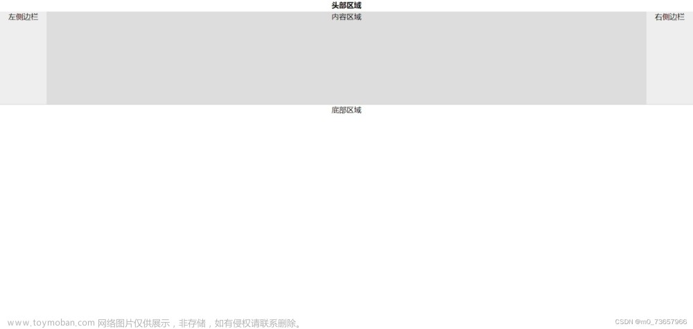
伸缩盒子案例:
        div.display {
            margin: auto;
            width: 500px;
            height: 600px;
            background-color: lightgray;
            /* 设置父容器为伸缩盒子 */
            display: flex;
            /* 默认主轴为row,这里需要以列的方式排列 */
            flex-direction: column;
        }
        header {
            width: 100%;
            height: 44px;
            background-color: red;
        }
        main {
            width: 100%;
            background-color: green;
            /* 占据父容器剩余空间 */
            flex: 1;
            display: flex;
        }
        article {
            height: 100%;
            background-color: cyan;
            flex: 1;
        }
        aside {
            height: 100%;
            background-color: pink;
            flex: 3;
        }
        footer {
            width: 100%;
            height: 49px;
            background-color: blue;
        }

    <h3>综合案例</h3>
    <div class="display">
        <header></header>
        <main>
            <article></article>
            <aside></aside>
        </main>
        <footer></footer>
    </div>
案例总结
案例一携程网,主要使用了语义化标签、伪类选择器和伸缩布局两个知识点,这里是代码链接。
案例二切割轮播图,主要使用了伪类选择器、三维变换、transition动画以及jquery,这里是代码链接。文章来源:https://www.toymoban.com/news/detail-422945.html
案例三360引导页,主要使用了伪类选择器、二维变换、transition动画,fullpage以及jquery,这里是代码链接。文章来源地址https://www.toymoban.com/news/detail-422945.html
到了这里,关于HTML5和CSS3七CSS3四的文章就介绍完了。如果您还想了解更多内容,请在右上角搜索TOY模板网以前的文章或继续浏览下面的相关文章,希望大家以后多多支持TOY模板网!