首先,从下面的仓库克隆代码:
git clone https://github.com/googlecodelabs/android-compose-codelabs.git
cd android-compose-codelabs/ThemingCodelab
一、颜色
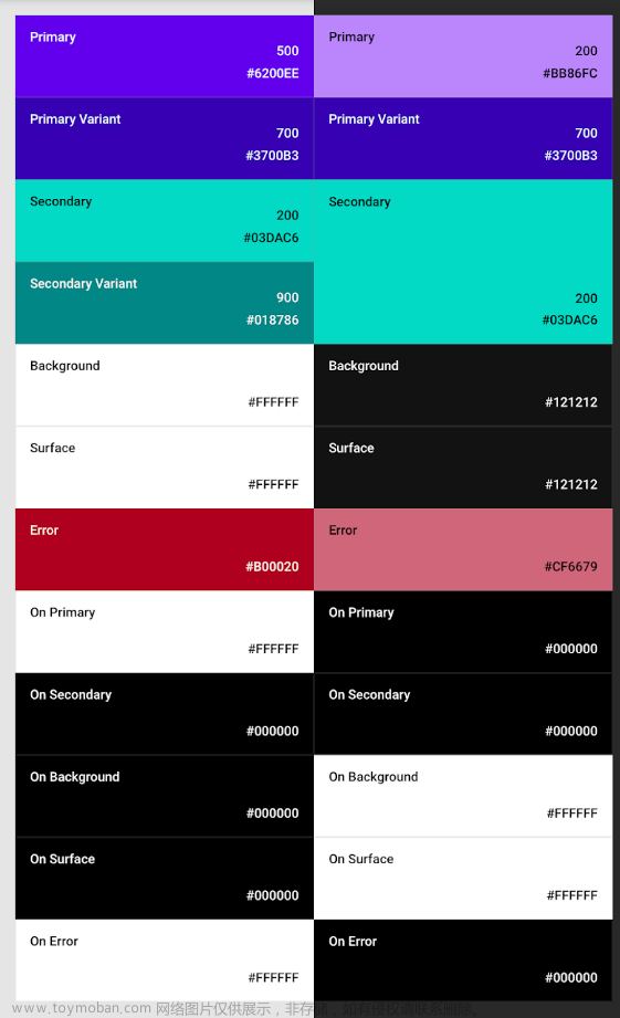
Material Design 定义了一些从语义上命名的颜色: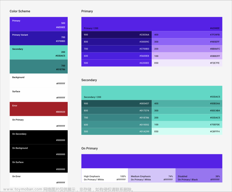
primary 是主要品牌颜色,secondary 用于提供强调色。您可以为形成对比的区域提供颜色更深/更浅的变体。background 和 surface 这两种颜色用于那些容纳在概念上驻留在应用“Surface”的组件的容器。此外,Material 还定义了“on”颜色,即针对具名颜色上层的内容使用的颜色;例如,“surface”色容器中的文本应采用“on surface”颜色。
通过定义具名颜色,可以提供备用调色板,例如浅色主题和深色主题:
二、定义 Theme
新建 Colors.kt 代码如下:
package com.codelab.theming.ui.start

import androidx.compose.ui.graphics.Color

val Red700 = Color(0xffdd0d3c)
val Red800 = Color(0xffd00036)
val Red900 = Color(0xffc20029)
val Red200 = Color(0xfff297a2)
val Red300 = Color(0xffea6d7e)
新建 Shape.kt 代码如下:
package com.codelab.theming.ui.start

import androidx.compose.foundation.shape.CutCornerShape
import androidx.compose.foundation.shape.RoundedCornerShape
import androidx.compose.material.Shapes
import androidx.compose.ui.unit.dp

val JetnewsShapes = Shapes(
    small = CutCornerShape(topStart = 8.dp),
    medium = CutCornerShape(topStart = 24.dp),
    large = RoundedCornerShape(8.dp)
)
新建 Typography.kt 代码如下:
package com.codelab.theming.ui.start

import androidx.compose.material.Typography
import androidx.compose.ui.text.TextStyle
import androidx.compose.ui.text.font.Font
import androidx.compose.ui.text.font.FontFamily
import androidx.compose.ui.text.font.FontWeight
import androidx.compose.ui.unit.sp
import com.codelab.theming.R

private val Montserrat = FontFamily(
    Font(R.font.montserrat_regular),
    Font(R.font.montserrat_medium, FontWeight.W500),
    Font(R.font.montserrat_semibold, FontWeight.W600)
)

private val Domine = FontFamily(
    Font(R.font.domine_regular),
    Font(R.font.domine_bold, FontWeight.Bold)
)

val JetnewsTypography = Typography(
    h4 = TextStyle(
        fontFamily = Montserrat,
        fontWeight = FontWeight.W600,
        fontSize = 30.sp
    ),
    h5 = TextStyle(
        fontFamily = Montserrat,
        fontWeight = FontWeight.W600,
        fontSize = 24.sp
    ),
    h6 = TextStyle(
        fontFamily = Montserrat,
        fontWeight = FontWeight.W600,
        fontSize = 20.sp
    ),
    subtitle1 = TextStyle(
        fontFamily = Montserrat,
        fontWeight = FontWeight.W600,
        fontSize = 16.sp
    ),
    subtitle2 = TextStyle(
        fontFamily = Montserrat,
        fontWeight = FontWeight.W500,
        fontSize = 14.sp
    ),
    body1 = TextStyle(
        fontFamily = Domine,
        fontWeight = FontWeight.Normal,
        fontSize = 16.sp
    ),
    body2 = TextStyle(
        fontFamily = Montserrat,
        fontSize = 14.sp
    ),
    button = TextStyle(
        fontFamily = Montserrat,
        fontWeight = FontWeight.W500,
        fontSize = 14.sp
    ),
    caption = TextStyle(
        fontFamily = Montserrat,
        fontWeight = FontWeight.Normal,
        fontSize = 12.sp
    ),
    overline = TextStyle(
        fontFamily = Montserrat,
        fontWeight = FontWeight.W500,
        fontSize = 12.sp
    )
)
新建 Theme.kt 代码如下:
package com.codelab.theming.ui.start

import androidx.compose.foundation.isSystemInDarkTheme
import androidx.compose.material.MaterialTheme
import androidx.compose.material.darkColors
import androidx.compose.material.lightColors
import androidx.compose.runtime.Composable
import androidx.compose.ui.graphics.Color

@Composable
fun JetnewsTheme(darkTheme: Boolean = isSystemInDarkTheme(), content: @Composable () -> Unit) {
    MaterialTheme(content = content, colors = if (darkTheme) DarkColors else LightColors, typography = JetnewsTypography, shapes = JetnewsShapes)
}

private val LightColors = lightColors(
    primary = Red700,
    primaryVariant = Red900,
    onPrimary = Color.White,
    secondary = Red700,
    secondaryVariant = Red900,
    onSecondary = Color.White,
    error = Red800
)

private val DarkColors = darkColors(
    primary = Red300,
    primaryVariant = Red700,
    onPrimary = Color.Black,
    secondary = Red300,
    onSecondary = Color.Black,
    error = Red200
)
最终,在 Home.kt 中引用 Theme,代码如下:
@Preview("Featured Post")
@Composable
private fun FeaturedPostPreview() {
    val post = remember { PostRepo.getFeaturedPost() }
    JetnewsTheme {
        FeaturedPost(post = post)
    }
}

@Preview("Featured Post • Dark")
@Composable
private fun FeaturedPostDarkPreview() {
    val post = remember { PostRepo.getFeaturedPost() }
    JetnewsTheme(darkTheme = true) {
        FeaturedPost(post = post)
    }
}
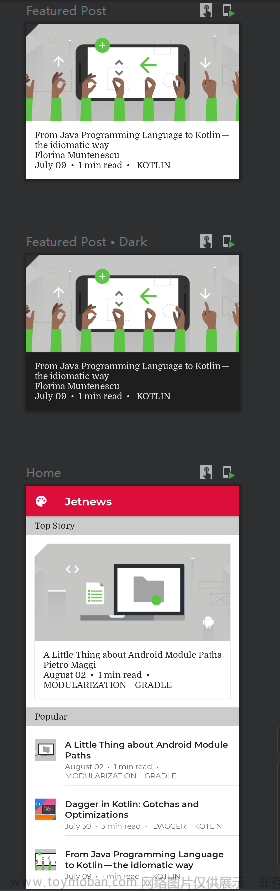
预览效果如下:
三、Color 的 Alpha 值
通常情况下,我们希望通过强调或弱化内容来突出重点并体现出视觉上的层次感。Material Design 建议采用不同的不透明度来传达这些不同的重要程度。
Jetpack Compose 通过 LocalContentAlpha 实现此功能。您可以通过为此 CompositionLocal 提供一个值来为层次结构指定内容 Alpha 值。子可组合项可以使用此值,例如 Text 和 Icon 默认使用 LocalContentColor 的组合,已调整为使用 LocalContentAlpha。Material 指定了一些标准 Alpha 值(high、medium、disabled),这些值由 ContentAlpha 对象建模。请注意,MaterialTheme 默认将 LocalContentAlpha 设置为 ContentAlpha.high。
// By default, both Icon & Text use the combination of LocalContentColor &
// LocalContentAlpha. De-emphasize content by setting a different content alpha
CompositionLocalProvider(LocalContentAlpha provides ContentAlpha.medium) {
    Text(...)
}
CompositionLocalProvider(LocalContentAlpha provides ContentAlpha.disabled) {
    Icon(...)
    Text(...)
}
我们将使用内容 Alpha 值来阐明精选博文的信息层次结构。在 Home.kt 的 PostMetadata 可组合项中,重点突出元数据 medium:
+ CompositionLocalProvider(LocalContentAlpha provides ContentAlpha.medium) {
  Text(
    text = text,
    modifier = modifier
  )
+ }
效果如下,主标题的透明度,和次标题的透明度不同,效果如下:

四、文本、自定义组件
如果您需要自定义 TextStyle,可以对其执行 copy 操作并替换相关属性(它只是一个 data class),或者让 Text 可组合项接受大量样式参数,这些参数会叠加到任何 TextStyle 的上层:
Text(
  text = "Hello World",
  style = MaterialTheme.typography.body1.copy(
    background = MaterialTheme.colors.secondary
  )
)
Compose 没有提供用于提取组件样式(例如,Android View 样式或 CSS 样式)的明确方法。由于所有 Compose 组件都是用 Kotlin 编写的,因此还可通过其他方法来实现相同的目的。您可以改为创建自己的自定义组件库,并在整个应用中使用这些组件。
下例中,Header 可组合项本质上是样式化的 Text,可供我们在整个应用中使用,代码如下:文章来源:https://www.toymoban.com/news/detail-449162.html
@Composable
fun Header(
  text: String,
  modifier: Modifier = Modifier
) {
  Surface(
    color = MaterialTheme.colors.onSurface.copy(alpha = 0.1f),
    contentColor = MaterialTheme.colors.primary,
    modifier = modifier.semantics { heading() }
  ) {
    Text(
      text = text,
      style = MaterialTheme.typography.subtitle2,
      modifier = Modifier
        .fillMaxWidth()
        .padding(horizontal = 16.dp, vertical = 8.dp)
    )
  }
}
可通过下文定制自定义的 Button,代码如下:文章来源地址https://www.toymoban.com/news/detail-449162.html
@Composable
fun AcmeButton(
  // expose Button params consumers should be able to change
) {
  val acmeButtonShape: Shape = ...
  Button(
    shape = acmeButtonShape,
    // other params
  )
}
@Composable
fun LoginButton(
    onClick: () -> Unit,
    modifier: Modifier = Modifier,
    content: @Composable RowScope.() -> Unit
) {
    Button(
        colors = ButtonConstants.defaultButtonColors(
            backgroundColor = MaterialTheme.colors.secondary
        ),
        onClick = onClick,
        modifier = modifier
    ) {
        ProvideTextStyle(...) { // set our own text style
            content()
        }
    }
}
到了这里,关于【Android-JetpackCompose】11、主题设置:Theme、Colors、Typography、Shapes的文章就介绍完了。如果您还想了解更多内容,请在右上角搜索TOY模板网以前的文章或继续浏览下面的相关文章,希望大家以后多多支持TOY模板网!


