前言
简介:本文将从头开始,带你快速上手 echarts最常用图例—柱状图
准备:请自行先将echarts图例引入你的项目,本文不多介绍。(自取——>:Vue3+Ts项目引入Echarts详细教程 )
心得:echarts 的基础使用还是较为简单的,看起来属性很多,但是自己上手多写几个图,慢慢的就会发现并没有那么的难,孰能生巧。
其他:其他的图例都和柱状图大差不差,学会柱状图,很快就能举一反三
一、初识柱状图
从echarts官网引入基础的柱状图后,可以看到他有如下的配置项。我们可以改变各个配置项的属性,将图例调整为我们期望的效果。

二、常用配置项
2.0 说明
因为引入echarts图例后,改变图例的东西都在option配置项中,所以我下面进贴出 option中的代码,html结构和echarts引入挂载等代码就不多赘述
2.1 柱子顶部展示数据
操作series 中 itemstyle 的 lable 属性,在lable中自定义顶部展示数据的css样式和数据格式

全量代码:
const yData = [15, 20, 12, 30, 45, 26];
option = {
  xAxis: {
    type: 'category',
    data: ['Mon', 'Tue', 'Wed', 'Thu', 'Fri', 'Sat', 'Sun']
  },
  yAxis: {
    type: 'value'
  },
  series: [
    {
      data: yData,
      type: 'bar',
      showBackground: true,
      label: {
        show: true, // 开启显示
        position: 'top', // 在上方显示
        distance: 15, // 距离图形元素的距离。当 position 为字符描述值(如 'top'、'insideRight')时候有效
        verticalAlign: 'middle',
        textStyle: {
          color: '#424656', // 顶部数据的颜色
          fontSize: 14     // 顶部数据的字体大小
        },
        formatter: function (params) {
          // dataIndex是当前柱状图的索引
          let num = yData[params.dataIndex] / 160;
          num = Math.round(num * 100) / 100; // 保留两位小数,不四舍五入
          return (
            yData[params.dataIndex] + '人' + '(' + num + '%' + ')' // 此处return的字符串可根据自身项目需求自定义
          );
        }
      }
    }
  ]
};
2.2 柱子的颜色(纯色与渐变)
操作series 中 itemstyle 的 color 属性,即可改变柱状图的颜色

纯绿色代码:
option = {
  xAxis: {
    type: 'category',
    data: ['Mon', 'Tue', 'Wed', 'Thu', 'Fri', 'Sat', 'Sun']
  },
  yAxis: {
    type: 'value'
  },
  series: [
    {
      data: [15, 20, 12, 30, 45, 26],
      type: 'bar',
      showBackground: true,
      itemStyle:{
        color:'green'  // 将柱子颜色改为绿色
      }
    }
  ]
};
渐变色图例:
渐变色代码:
option = {
  xAxis: {
    type: 'category',
    data: ['Mon', 'Tue', 'Wed', 'Thu', 'Fri', 'Sat', 'Sun']
  },
  yAxis: {
    type: 'value'
  },
  series: [
    {
      data: [15, 20, 12, 30, 45, 26],
      type: 'bar',
      showBackground: true,
      itemStyle: {
        color: {
          type: 'linear',
          x: 0, // 若将此值设为1,表示从右到左渐变
          y: 1, // 若将此值设为1,表示从上到下渐变
          x2: 0, // 左
          y2: 0, // 上
          colorStops: [
            {
              offset: 0,
              color: '#192060' // 0% 处的颜色
            },
            {
              offset: 0.9,
              color: '#00C0FF' // 90% 处的颜色
            }
          ]
        }
      }
    }
  ]
};
2.3 多根柱子
series[ ]中写一个对象,就是单柱柱状图,写两个对象就是双柱柱状图图,写三个就是三柱,以此类推

option = {
  xAxis: {
    type: 'category',
    data: ['Mon', 'Tue', 'Wed', 'Thu', 'Fri', 'Sat', 'Sun']
  },
  yAxis: {
    type: 'value'
  },
  series: [
    {
      data: [15, 20, 12, 30, 45, 26,36],
      type: 'bar',
      showBackground: true,
      itemStyle: {
        color: {
          type: 'linear',
          x: 0, // 若将此值设为1,表示从右到左渐变
          y: 1, // 若将此值设为1,表示从上到下渐变
          x2: 0, // 左
          y2: 0, // 上
          colorStops: [
            {
              offset: 0,
              color: '#192060' // 0% 处的颜色
            },
            {
              offset: 0.9,
              color: '#00C0FF' // 90% 处的颜色
            }
          ]
        }
      }
    },
    {
      data: [18, 28, 18, 38, 48, 28,32],
      type: 'bar',
      showBackground: true,
      itemStyle: {
        color: {
          type: 'linear',
          x: 0, // 若将此值设为1,表示从右到左渐变
          y: 1, // 若将此值设为1,表示从上到下渐变
          x2: 0, // 左
          y2: 0, // 上
          colorStops: [
            {
              offset: 0,
              color: '#322E28' // 0% 处的颜色
            },
            {
              offset: 0.9,
              color: '#FFD600' // 90% 处的颜色
            }
          ]
        }
      }
    }
  ]
};
2.4 柱子堆叠
操作series 中 itemstyle 的 stack 属性,两个柱状图的 stack属性值相等时,就会叠放

  series: [
    {
      stack: '演示柱状图',  // 两个柱子的 stack值相同时就会堆叠放置
      name: '蓝色柱子', // 这个name需要和 legend下面data里面的 name 对应起来
      data: [15, 20, 12, 30, 45, 26, 36], // 蓝色柱子数据
      type: 'bar', // 类型:柱状图
      barWidth: 40, // 柱子宽度
      showBackground: true, // 是否展示背后的阴影
      itemStyle: {
        color: '#2DC3FB' // 蓝色柱子颜色
      }
    },
    {
      stack: '演示柱状图',   // 两个柱子的 stack值相同时就会堆叠放置
      name: '黄色柱子', // 这个name需要和 legend下面data里面的 name 对应起来
      data: [18, 28, 18, 38, 48, 28, 32], // 黄色柱子数据
      type: 'bar', // 类型:柱状图
      barWidth: 40, // 柱子宽度
      showBackground: false, // 是否展示背后的阴影
      itemStyle: {
        color: '#FDD43C' // 黄色柱子颜色
      }
    }
  ]
2.5 展示legend
操作series 中 itemstyle 的 legedn 属性,即可调试 版块控制器的css样式以及位置等

代码:
option = {
  grid: {
    //调整图表位置
    show: false, //是否显示直角坐标系网格
    top: '15%', // 距离图例顶部的位置,可写百分比,可以写数字
    right: '8%',
    bottom: '10%',
    left: '8%'
  },
  legend: {
    top: '5%', // 控制 板块控制器的位置
    right: 'center',
    // icon: 'rect',//形状  类型包括 circle,rect,line,roundRect,triangle,diamond,pin,arrow,none
    // itemWidth: 10,  // 设置宽度
    // itemHeight: 4, // 设置高度
    itemGap: 40, // 设置两个legend之间的间距
    data: [
      {
        name: '蓝色柱子',  // 这个name需要和 series 里面的 name 对应起来
        textStyle: {
          color: '#2DC3FB' // 单独设置某一个图列的颜色
        }
      },
      {
        name: '黄色柱子',  // 这个name需要和 series 里面的 name 对应起来
        textStyle: {
          color: '#FDD43C' // 单独设置某一个图列的颜色
        }
      }
    ]
  },

  xAxis: {
    type: 'category',
    data: ['Mon', 'Tue', 'Wed', 'Thu', 'Fri', 'Sat', 'Sun'] // x轴数据
  },
  yAxis: {
    type: 'value'
  },
  series: [
    {
      name: '蓝色柱子',  // 这个name需要和 legend下面data里面的 name 对应起来
      data: [15, 20, 12, 30, 45, 26, 36], // 蓝色柱子数据
      type: 'bar', // 类型:柱状图
      barWidth: 40, // 柱子宽度
      showBackground: true,  // 是否展示背后的阴影
      itemStyle: {
        color: '#2DC3FB' // 蓝色柱子颜色
      }
    },
    {
      name: '黄色柱子',  // 这个name需要和 legend下面data里面的 name 对应起来
      data: [18, 28, 18, 38, 48, 28, 32], // 黄色柱子数据
      type: 'bar', // 类型:柱状图
      barWidth: 40, // 柱子宽度
      showBackground: false,  // 是否展示背后的阴影
      itemStyle: {
        color: '#FDD43C' // 黄色柱子颜色
      }
    }
  ]
};
三、常用图例及代码
3.1 渐变双柱柱状图

全量代码:
option = {
backgroundColor: '#1b2735',
tooltip: {//提示框组件
trigger: 'axis',//触发类型 柱状图
axisPointer:{type:'shadow'} //触发效果 移动上去 背景效果
},
xAxis: [//x轴
{
type: 'category',//坐标轴类型 离散
data: ['1月', '2月', '3月', '4月', '5月', '6月', '7月', '8月'],//数据
axisTick:false,//是否显示刻度
axisLine: {//坐标轴样式
show: true,//是否显示
lineStyle: {//线的样式
type:'dashed'//线的类型 虚线
},
},
axisLabel: {
color: "#DEDEDE"
}
},
],
yAxis: [//y轴
{
min: 0,//最小
max: 700,//最大
interval: 100,//相差
name: '单位:',//名称
type: 'value',//连续类型
axisLine: {//坐标轴样式
show: false, //不显示
},
splitLine: {//分隔辅助线
lineStyle: {
type:'dashed',//线的类型 虚线0
opacity:0.2//透明度
},
},
axisLabel: {
color: "#DEDEDE"
}
},
],
series: [//系统列表
{
name: '用水消耗',//名称
type: 'bar',//类型
barWidth :11,//宽度
data: [300, 450, 90, 300, 520, 450, 150, 300],//数值
z:2,
itemStyle: {
color: {//渐变色
x: 0,
y: 0,
x2: 0,
y2: 1,
type: 'linear',
global: false,
colorStops: [
{
offset: 0,
color: 'rgba(6, 244, 231)',
},
{
offset: 1,
color: 'rgba(6, 244, 231,0)',
},
],
},
},
},
{
name: '电力消耗',
type: 'bar',
barWidth : 11,
data: [400, 600, 90, 400, 400, 250, 90, 400],
z:1,
itemStyle: {
color: {
x: 0,
y: 0,
x2: 0,
y2: 1,
type: 'linear',
global: false,
colorStops: [
{
offset: 0,
color: 'rgba(3, 181, 243)',
},
{
offset: 1,
color: 'rgba(2, 190, 251,0)',
},
],
},
},
},
{
name: "",
barGap: '-220%',
type: 'bar',
z:0,
data: [420,620,110,420,540,470,170,420],
barWidth: '48px',
itemStyle: {
normal: {
color: '#fff', // 0% 处的颜色
opacity:0.1//透明度
}
},
},
],
legend: {
right: '70',
textStyle: {
// 图例文字的样式
color: '#fff',
fontSize: 14,
padding: [2, 0, 0, 2],
fontWeight: 100,
},
},
};
### 3.1 双柱柱状图
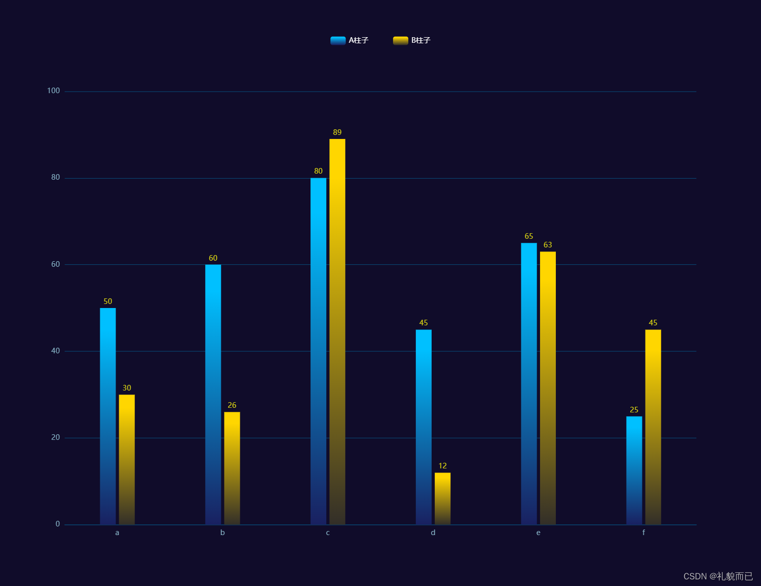
**全量代码:**
```javascript
option = {
backgroundColor: '#100C2A', // 背景色
tooltip: {
trigger: "axis",
axisPointer: {
type: "cross",
crossStyle: {
color: "#999",
},
},
},
grid: {
//调整图表位置
show: false, //是否显示直角坐标系网格
top: "15%", // 一下数值可为百分比也可为具体像素值
right: "8%",
bottom: "10%",
left: "8%",
},
xAxis: [
{
type: "category",
data: ["a", "b", "c", "d", "e", "f"],
axisPointer: {
type: "shadow",
},
axisLine: {
//横轴样式
lineStyle: {
color: "#08426D",
},
},
axisLabel: {
show: true,
textStyle: {
color: "#85B0C4",
},
},
axisTick: {
show: false, //隐藏刻度线
},
},
],
yAxis: [
{
type: "value",
// min: 0, 最小值
// interval: 20, 两根横轴之间的差值,不太建议手动设置
splitLine: {
show: true,
lineStyle: {
color: ["#08426D"],
width: 1,
type: "solid",
},
textStyle: {
color: "green",
},
},
axisLabel: {
show: true,
formatter: "{value}",
textStyle: {
color: "#85B0C4",
},
},
},
],
legend: {
top: "5%", // 控制 板块控制器的位置
right: "center",
// icon: 'rect',//形状 类型包括 circle,rect,line,roundRect,triangle,diamond,pin,arrow,none
// itemWidth: 10, // 设置宽度
// itemHeight: 4, // 设置高度
itemGap: 40, // 设置间距
data: [
{
name: "A柱子",
textStyle: {
color: "#fff", // 单独设置某一个图列的颜色
},
},
{
name: "B柱子",
textStyle: {
color: "#fff", // 单独设置某一个图列的颜色
},
},
],
},
series: [
{
name: "A柱子",
type: "bar",
barWidth: "15%", // 柱的宽度
data: [50, 60, 80, 45, 65, 25],
itemStyle: {
color: {
type: "linear",
x: 0, // 右
y: 1, // 下
x2: 0, // 左
y2: 0, // 上
colorStops: [
{
offset: 0,
color: "#192060", // 0% 处的颜色
},
{
offset: 0.9,
color: "#00C0FF", // 90% 处的颜色
},
],
},
},
label: {
show: true, // 开启显示
position: "top", // 在上方显示
distance: 10, // 距离图形元素的距离。当 position 为字符描述值(如 'top'、'insideRight')时候有效。
verticalAlign: "middle",
textStyle: {
// 数值样式
color: "#D2CC13",
fontSize: 12,
},
},
},
{
name: "B柱子",
type: "bar",
barWidth: "15%", // 柱的宽度
data: [30, 26, 89, 12, 63, 45],
itemStyle: {
color: {
type: "linear",
x: 0, // 右
y: 1, // 下
x2: 0, // 左
y2: 0, // 上
colorStops: [
{
offset: 0,
color: "#322E28", // 0% 处的颜色
},
{
offset: 0.9,
color: "#FFD600", // 90% 处的颜色
},
],
},
},
label: {
show: true, // 开启显示
position: "top", // 在上方显示
distance: 10, // 距离图形元素的距离。当 position 为字符描述值(如 'top'、'insideRight')时候有效。
verticalAlign: "middle",
textStyle: {
// 数值样式
color: "#D2CC13",
fontSize: 12,
},
},
},
],
};
3.2 折柱混合图

全量代码:
option = {
  backgroundColor: '#100C2A',
  tooltip: {
    trigger: "axis",
    axisPointer: {
      type: "cross",
      crossStyle: {
        color: "#fff",
      },
    },
  },
  tooltip: {
    // 图列提示框,默认不显示
    show: true,
    color: "red",
  },
  grid: {
    //调整图表位置
    show: false, //是否显示直角坐标系网格
    top: "15%", // 一下数值可为百分比也可为具体像素值
    right: "5%",
    bottom: "10%",
    left: "10%",
  },
  legend: {
    top: "5%",
    data: [
      {
        name: "柱子名称",
        textStyle: {
          color: "#A9DDEE", // 单独设置某一个图列的颜色
        },
      },
      {
        name: "折线名称",
        textStyle: {
          color: "#A9DDEE", // 单独设置某一个图列的颜色
        },
      },
    ],
  },
  xAxis: [
    {
      type: "category",
      data: ["A类", "B类", "C类", "D类", "E类", "F类", "G类", "H类"],
      axisPointer: {
        type: "shadow",
      },
      axisLine: {
        show: false, //横轴样式
      },
      axisLabel: {
        show: true,
        textStyle: {
          color: "#85B0C4",
        },
      },
      axisTick: {
        show: false, //隐藏刻度线
      },
    },
  ],
  yAxis: [
    {
      type: "value",
      // min: 0,
      // max: 250,
      // interval: 50, // y轴 两刻度之间的差值
      barWidth: "35%",
      axisLabel: {
        formatter: "{value} 个",
      },
      splitLine: {
        show: true,
        lineStyle: {
          color: ["#08426D"],
          width: 1,
          type: "solid",
        },
      },
      axisLabel: {
        // y轴 数据格式和颜色
        show: true,
        formatter: "{value} 个",
        textStyle: {
          color: "#85B0C4",
        },
      },
    },
  ],
  series: [
    {
      name: "柱子名称",
      type: "bar",
      barWidth: "20%",
      tooltip: {
        valueFormatter: function (value) {
          return value + " 个";
        },
      },
      data: [40, 50, 60, 65, 54, 65, 60, 50],
      itemStyle: {
        color: {
          type: "linear",
          x: 0, // 右
          y: 1, // 下
          x2: 0, // 左
          y2: 0, // 上
          colorStops: [
            {
              offset: 0,
              color: "#192F68", // 0% 处的颜色
            },
            {
              offset: 1,
              color: "#18E0FD", // 90% 处的颜色
            },
          ],
        },
      },
      label: {
        show: true, // 开启显示
        position: "top", // 在上方显示
        distance: 10, // 距离图形元素的距离。当 position 为字符描述值(如 'top'、'insideRight')时候有效。
        verticalAlign: "middle",
        textStyle: {
          // 数值样式
          color: "#F4EC03",
          fontSize: 12,
        },
      },
    },
    {
      name: "折线名称",
      type: "line",
      // yAxisIndex: 1,
      tooltip: {
        valueFormatter: function (value) {
          return value + " 个";
        },
      },
      data: [35, 62, 84, 52, 44, 96, 78, 66],
      itemStyle: {
        color: {
          type: "linear",
          x: 0, // 右
          y: 1, // 下
          x2: 0, // 左
          y2: 0, // 上
          colorStops: [
            {
              offset: 0,
              color: "#18E0FD", // 0% 处的颜色
            },
            {
              offset: 0.9,
              color: "#18E0FD", // 90% 处的颜色
            },
          ],
        },
      },
    },
  ],
};
3.3 堆叠柱状图

全量代码:
option = {
  backgroundColor: '#100C2A',
  tooltip: {
    trigger: "axis",
    axisPointer: {
      type: "cross",
      crossStyle: {
        color: "#999",
      },
    },
  },
  grid: {
    //调整图表位置
    show: false, //是否显示直角坐标系网格
    top: "15%", // 一下数值可为百分比也可为具体像素值
    right: "5%",
    bottom: "10%",
    left: "8%",
  },
  legend: {
    top: "5%", // 控制 板块控制器的位置
    // icon: 'rect',//形状  类型包括 circle,rect,line,roundRect,triangle,diamond,pin,arrow,none
    // itemWidth: 10,  // 设置宽度
    // itemHeight: 4, // 设置高度
    itemGap: 80, // 设置顶部图标间距
    right: "center",
    data: [
      {
        name: "A柱子的名字",
        textStyle: {
          color: "#fff", // 单独设置某一个图列的颜色
        },
      },
      {
        name: "B柱子的名字",
        textStyle: {
          color: "#fff", // 单独设置某一个图列的颜色
        },
      },
    ],
  },
  xAxis: [
    {
      type: "category",
      data: [
        "1月",
        "2月",
        "3月",
        "4月",
        "5月",
        "6月",
        "7月",
        "8月",
        "9月",
        "10月",
        "11月",
        "12月",
      ],
      axisPointer: {
        type: "shadow",
      },
      axisLine: {
        //横轴样式
        lineStyle: {
          color: "#08426D",
        },
      },
      axisLabel: {
        show: true,
        textStyle: {
          color: "#85B0C4",
        },
      },
    },
  ],
  yAxis: [
    {
      type: "value",
      splitLine: {
        show: true,
        lineStyle: {
          color: ["#08426D"],
          width: 1,
          type: "solid",
        },
        textStyle: {
          color: "green",
        },
      },
      axisLabel: {
        show: true,
        formatter: "{value}",
        textStyle: {
          color: "#85B0C4",
        },
      },
    },
  ],
  series: [
    {
      name: "A柱子的名字",
      type: "bar",
      barWidth: "25%", // 设置柱子的宽度
      stack: "柱子", //同个类目轴上系列配置相同的stack值可以堆叠放置
      data: [20, 30, 40, 60, 20, 50, 40, 30, 30, 50, 40, 30],
      itemStyle: {
        color: {
          type: "linear",
          x: 0, // 右
          y: 1, // 下
          x2: 0, // 左
          y2: 0, // 上
          colorStops: [
            {
              offset: 0,
              color: "#013560", // 0% 处的颜色
            },
            {
              offset: 0.9,
              color: "#00F5EE", // 90% 处的颜色
            },
          ],
        },
      },
    },
    {
      name: "B柱子的名字",
      type: "bar",
      barWidth: "25%", // 设置柱子的宽度
      stack: "柱子", //同个类目轴上系列配置相同的stack值可以堆叠放置
      data: [50, 40, 70, 15, 30, 45, 25, 60, 70, 30, 10, 65],
      itemStyle: {
        color: {
          type: "linear",
          x: 0, // 右
          y: 1, // 下
          x2: 0, // 左
          y2: 0, // 上
          colorStops: [
            {
              offset: 0,
              color: "#1B2E6E", // 0% 处的颜色
            },
            {
              offset: 0.9,
              color: "#00C0FF", // 90% 处的颜色
            },
          ],
        },
      },
      label: {
        show: true, // 开启显示
        position: "top", // 在上方显示
        distance: 10, // 距离图形元素的距离。当 position 为字符描述值(如 'top'、'insideRight')时候有效。
        verticalAlign: "middle",
        textStyle: {
          // 数值样式
          color: "#D2CC17",
          fontSize: 12,
        },
      },
    },
  ],
};
3.4 3D柱状图

3.5 横向柱状图

全量代码:
const offsetX = 24;  //bar宽
const offsetY = 6;   //倾斜角度
// 绘制左侧面
const CubeLeft = echarts.graphic.extendShape({
   shape: {
      x: 0,
      y: 0,
   },
   buildPath: function (ctx, shape) {
      // 会canvas的应该都能看得懂,shape是从custom传入的
      const xAxisPoint = shape.xAxisPoint;
      // console.log(shape);
      const c0 = [shape.x, shape.y];
      const c1 = [shape.x - offsetX, shape.y - offsetY];
      const c2 = [xAxisPoint[0] - offsetX, xAxisPoint[1] - offsetY];
      const c3 = [xAxisPoint[0], xAxisPoint[1]];
      ctx.moveTo(c0[0], c0[1]).lineTo(c1[0], c1[1]).lineTo(c2[0], c2[1]).lineTo(c3[0], c3[1]).closePath();
   },
});
// 绘制右侧面
const CubeRight = echarts.graphic.extendShape({
   shape: {
      x: 0,
      y: 0,
   },
   buildPath: function (ctx, shape) {
      const xAxisPoint = shape.xAxisPoint;
      const c1 = [shape.x, shape.y];
      const c2 = [xAxisPoint[0], xAxisPoint[1]];
      const c3 = [xAxisPoint[0] + offsetX, xAxisPoint[1] - offsetY];
      const c4 = [shape.x + offsetX, shape.y - offsetY];
      ctx.moveTo(c1[0], c1[1]).lineTo(c2[0], c2[1]).lineTo(c3[0], c3[1]).lineTo(c4[0], c4[1]).closePath();
   },
});
// 绘制顶面
const CubeTop = echarts.graphic.extendShape({
   shape: {
      x: 0,
      y: 0,
   },
   buildPath: function (ctx, shape) {
      const c1 = [shape.x, shape.y];
      const c2 = [shape.x + offsetX, shape.y - offsetY]; //右点
      // const c3 = [shape.x, shape.y - offsetX];
      const c3 = [shape.x, shape.y - offsetY * 2];
      const c4 = [shape.x - offsetX, shape.y - offsetY];
      ctx.moveTo(c1[0], c1[1]).lineTo(c2[0], c2[1]).lineTo(c3[0], c3[1]).lineTo(c4[0], c4[1]).closePath();
   },
});
// 注册三个面图形
echarts.graphic.registerShape('CubeLeft', CubeLeft);
echarts.graphic.registerShape('CubeRight', CubeRight);
echarts.graphic.registerShape('CubeTop', CubeTop);
let xAxisData = ["中国境内", "新加坡", "香港", "英国", "美国"]
let seriesData = [100, 200, 300, 400, 300]
let colorArr = [["#12D5AF"], ["#0BC19D", "rgba(13,8,16,0)"], ["#68EFD4", "rgba(14,185,151,0)"]]
option = {
    backgroundColor: '#0c2d55',
   tooltip: {
      trigger: 'axis',
      axisPointer: {
         type: 'shadow',
      },
      formatter: function (params, ticket, callback) {
         const item = params[1];
         return item.name + ' : ' + item.value;
      },
   },
   grid: {
      left: '10%',
      right: '10%',
      top: '15%',
      bottom: '20%',
      containLabel: true,
   },
   xAxis: {
      type: 'category',
      data: xAxisData,
      axisLine: {
         show: false,
         lineStyle: {
            width: 2,
            color: '#2B7BD6',
         },
      },
      axisTick: {
         show: false,
      },
      axisLabel: {
         fontSize: 24,
         color: "#fff",
         fontFamily: 'siyuan',
         margin: 15,
         fontWeight: 'bold'
      },
   },
   yAxis: {
      type: 'value',
      axisLine: {
         show: false,
         lineStyle: {
            width: 2,
            color: '#2B7BD6',
         },
      },
      splitLine: {
         show: false,
         lineStyle: {
            color: '#153D7D',
         },
      },
      axisTick: {
         show: false,
      },
      axisLabel: {
         show: false,
         fontSize: 14,
      },
      // boundaryGap: ['20%', '20%'],
   },
   series: [
      {
         type: 'custom',
         renderItem: (params, api) => {
            const location = api.coord([api.value(0), api.value(1)]);
            return {
               type: 'group',
               children: [
                  {
                     type: 'CubeLeft',
                     shape: {
                        api,
                        xValue: api.value(0),
                        yValue: api.value(1),
                        x: location[0],
                        y: location[1],
                        xAxisPoint: api.coord([api.value(0), 0]),
                     },
                     style: {
                        fill: new echarts.graphic.LinearGradient(0, 0, 0, 1, [
                           {
                              offset: 0,
                              color: colorArr[1][0],
                           },
                           {
                              offset: 1,
                              color: colorArr[1][1],
                           },
                        ]),
                     },
                  },
                  {
                     type: 'CubeRight',
                     shape: {
                        api,
                        xValue: api.value(0),
                        yValue: api.value(1),
                        x: location[0],
                        y: location[1],
                        xAxisPoint: api.coord([api.value(0), 0]),
                     },
                     style: {
                        fill: new echarts.graphic.LinearGradient(0, 0, 0, 1, [
                           {
                              offset: 0,
                              color: colorArr[2][0],
                           },
                           {
                              offset: 1,
                              color: colorArr[2][1],
                           },
                        ]),
                     },
                  },
                  {
                     type: 'CubeTop',
                     shape: {
                        api,
                        xValue: api.value(0),
                        yValue: api.value(1),
                        x: location[0],
                        y: location[1],
                        xAxisPoint: api.coord([api.value(0), 0]),
                     },
                     style: {
                        fill: new echarts.graphic.LinearGradient(0, 0, 0, 1, [
                           {
                              offset: 0,
                              color: colorArr[0][0],
                           },
                           {
                              offset: 1,
                              color: colorArr[0][0],
                           },
                        ]),
                     },
                  },
               ],
            };
         },
         data: seriesData,
      },
      {
         type: 'bar',
         label: {
            normal: {
               show: true,
               position: 'top',
               formatter: (e) => {
                  // return e.value + '次';
                  return e.value;
               },
               fontSize: 24,
               color: "#fff",
               fontFamily: 'siyuan',
               fontWeight: 'bold',
               offset: [0, -15],
            },
         },
         itemStyle: {
            color: 'transparent',
         },
         tooltip: {},
         data: seriesData,
      },
   ],
};
四、查阅文档
Echarts Demo集:https://www.isqqw.com/
里面有两万多个echarts图例,且附详细配置代码,总能找到你想要的,利用已有图例进行二次开发,会轻松许多


Echats文档地址:https://www.isqqw.com/echarts-doc/zh/option.html#title
截止目前,我也仅仅用过一下部分Echarts的配置项,经验也还在累积中,偶尔遇到问题也只能通过百度和参考文档解决,学会自己查文档吧!文章来源:https://www.toymoban.com/news/detail-450688.html
 文章来源地址https://www.toymoban.com/news/detail-450688.html
五、点赞收藏不迷路!!!
到了这里,关于【Echarts系列】—echarts柱状图配置代码详解的文章就介绍完了。如果您还想了解更多内容,请在右上角搜索TOY模板网以前的文章或继续浏览下面的相关文章,希望大家以后多多支持TOY模板网!