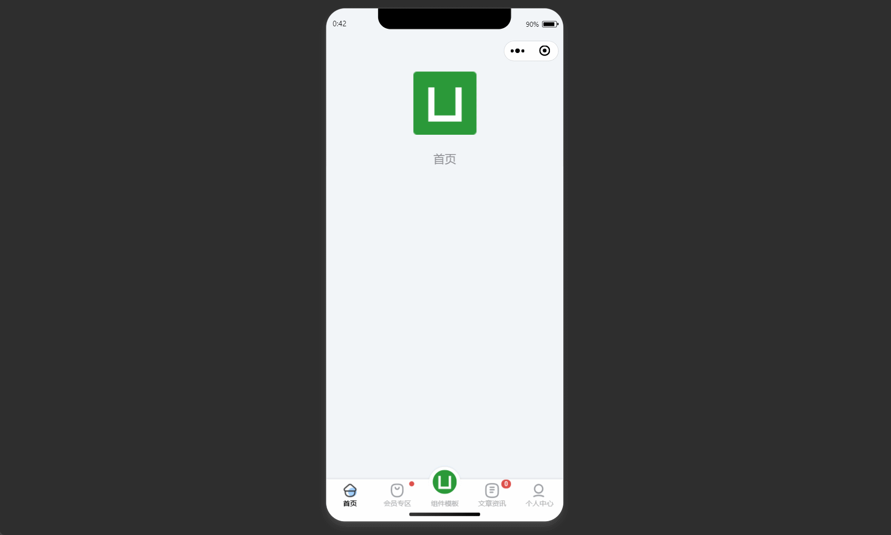
这种样式的底部导航栏

使用微信小程序的自定义tabBar:微信小程序官方说明
uni.app=>在 page.json 中的 tabBar 项指定 custom 字段为true:
	"tabBar": {
	   "custom": true,
		"color": "rgb(51, 51, 51)",
		"selectedColor": "rgb(249, 48, 43)",
		"backgroundColor": "rgb(196, 196, 196)",
		"list": [{
			"pagePath": "pages/index/index",
			"text": "首页",
			"iconPath": "/static/tabBar/taber_pictrue/home.png",
			"selectedIconPath": "/static/tabBar/taber_pictrue_selected/home.png"
		}, {
			"pagePath": "pages/course/index",
			"text": "课程",
			"iconPath": "/static/tabBar/taber_pictrue/course.png",
			"selectedIconPath": "/static/tabBar/taber_pictrue_selected/course.png"

		}, {
			"pagePath": "pages/bm/index",
			"text": "报名",
			"iconPath": "/static/tabBar/taber_pictrue/bm.png",
			"selectedIconPath": "/static/tabBar/taber_pictrue_selected/bm.png"
		}, {
			"pagePath": "pages/data/index",
			"text": "资料",
			"iconPath": "/static/tabBar/taber_pictrue/data.png",
			"selectedIconPath": "/static/tabBar/taber_pictrue_selected/data.png"

		}, {
			"pagePath": "pages/myCenter/index",
			"text": "我的",
			"iconPath": "/static/tabBar/taber_pictrue/mycenter.png",
			"selectedIconPath": "/static/tabBar/taber_pictrue_selected/mycenter.png"

		}]
},在根目录创建custom-tab-bar目录,注意一定要完全匹配,不要输错:
custom-tab-bar/index.js
custom-tab-bar/index.json
custom-tab-bar/index.wxml
custom-tab-bar/index.wxss
index.js代码:注意这里的中间需要凸出项设置一个class
Component({
	data: {
		selected: 0, //当前选中的tab下标
		color: "#1E1E1E",
		selectedColor: "#646464", //tabbar选中字体颜色
		"list": [{
			"pagePath": "pages/index/index",
			"text": "首页",
			"iconPath": "/static/tabBar/taber_pictrue/home.png",
			"selectedIconPath": "/static/tabBar/taber_pictrue_selected/home.png"
		}, {
			"pagePath": "pages/course/index",
			"text": "课程",
			"iconPath": "/static/tabBar/taber_pictrue/course.png",
			"selectedIconPath": "/static/tabBar/taber_pictrue_selected/course.png"

		}, {
			"pagePath": "pages/bm/index",
			"text": "报名",
			"iconPath": "/static/tabBar/taber_pictrue/bm-2.png",
			"selectedIconPath": "/static/tabBar/taber_pictrue_selected/bm.png",
			bmClass: "bm"
		}, {
			"pagePath": "pages/data/index",
			"text": "资料",
			"iconPath": "/static/tabBar/taber_pictrue/data.png",
			"selectedIconPath": "/static/tabBar/taber_pictrue_selected/data.png"

		}, {
			"pagePath": "pages/myCenter/index",
			"text": "我的",
			"iconPath": "/static/tabBar/taber_pictrue/mycenter.png",
			"selectedIconPath": "/static/tabBar/taber_pictrue_selected/mycenter.png"
		}]
	},
	attached() {},
	methods: {
		toggleTabbar(e) {
			const data = e.currentTarget.dataset;
			const url ='/' + data.path
			// this.setData({
			// 	selected: data.index
			// })
			wx.switchTab({url})
		}
	},
})
index.json代码:
{
  "component": true,
  "usingComponents": {}
}
index.wxml代码:动态设置中间凸出项的class,css样式可根据自己项目要求进行更改:
<view>
	<view  class="tab-bar" >
		<image class="tab-bar-bg" src="../static/tabBar/taber_pictrue/tabbar.png"></image>
		<view class="tab-bar-icon tab-bar">
			<view wx:for="{{list}}" wx:key="index" class="tab-bar-item {{item.diyClass}}" data-path="{{item.pagePath}}" data-index="{{index}}" bindtap="toggleTabbar">
			  <image src="{{selected === index ? item.selectedIconPath : item.iconPath}}" class="{{item.bmClass}}"  mode="aspectFit"/>
			  <view style="color: {{selected === index ? selectedColor : color}}" class="{{item.bmClass}}">{{item.text}}</view>
			</view>
		</view>
	</view>

</view>
index.wxss代码:文章来源:https://www.toymoban.com/news/detail-489150.html
/*重新样式*/
.tab-bar {
	position: fixed;
	bottom: 0;
	left: 0;
	right: 0;
	display: flex;
	box-sizing: content-box;
	background-color: transparent;
}

.tab-bar-bg {
	width: 100%;
	height: 140rpx;

}

.tab-bar-icon {
	display: flex;
	position: absolute;
	justify-content: space-between;
	width: 100%;
}

.tab-bar-border {
	background-color: rgba(0, 0, 0, 0.33);
	position: absolute;
	left: 0;
	top: 0;
	width: 100%;
	height: 1px;
	transform: scaleY(0.5);
}

.tab-bar-item {
	flex: auto;
	text-align: center;
	display: flex;
	justify-content: center;
	align-items: center;
	flex-direction: column;
	background-color: transparent;
	height: 120rpx;
}

.tab-bar-item.bm {
	margin-top: 0 !important;
	background: transparent;
	position: relative;
	flex: inherit;
	width: 134rpx;
}

.tab-bar-item image {
	width: 48rpx;
	height: 48rpx;
	overflow: initial;
}

.tab-bar-item view {
	font-size: 24rpx;
}

.tab-bar-item image.bm {
	position: absolute;
	width: 108rpx;
	height: 106rpx;
	bottom: 80%;
	z-index: 100;
}

.tab-bar-item view.bm {
	background: transparent;
	width: 100%;
	height: 100%;
	padding-top: 73rpx;
	z-index: 99;
}
有用可以点赞收藏,嘿嘿~文章来源地址https://www.toymoban.com/news/detail-489150.html
到了这里,关于微信小程序自定义tabbar导航栏,中间凸出样式的文章就介绍完了。如果您还想了解更多内容,请在右上角搜索TOY模板网以前的文章或继续浏览下面的相关文章,希望大家以后多多支持TOY模板网!