微信小程序自定义tabBar样式,选中后中间凸起
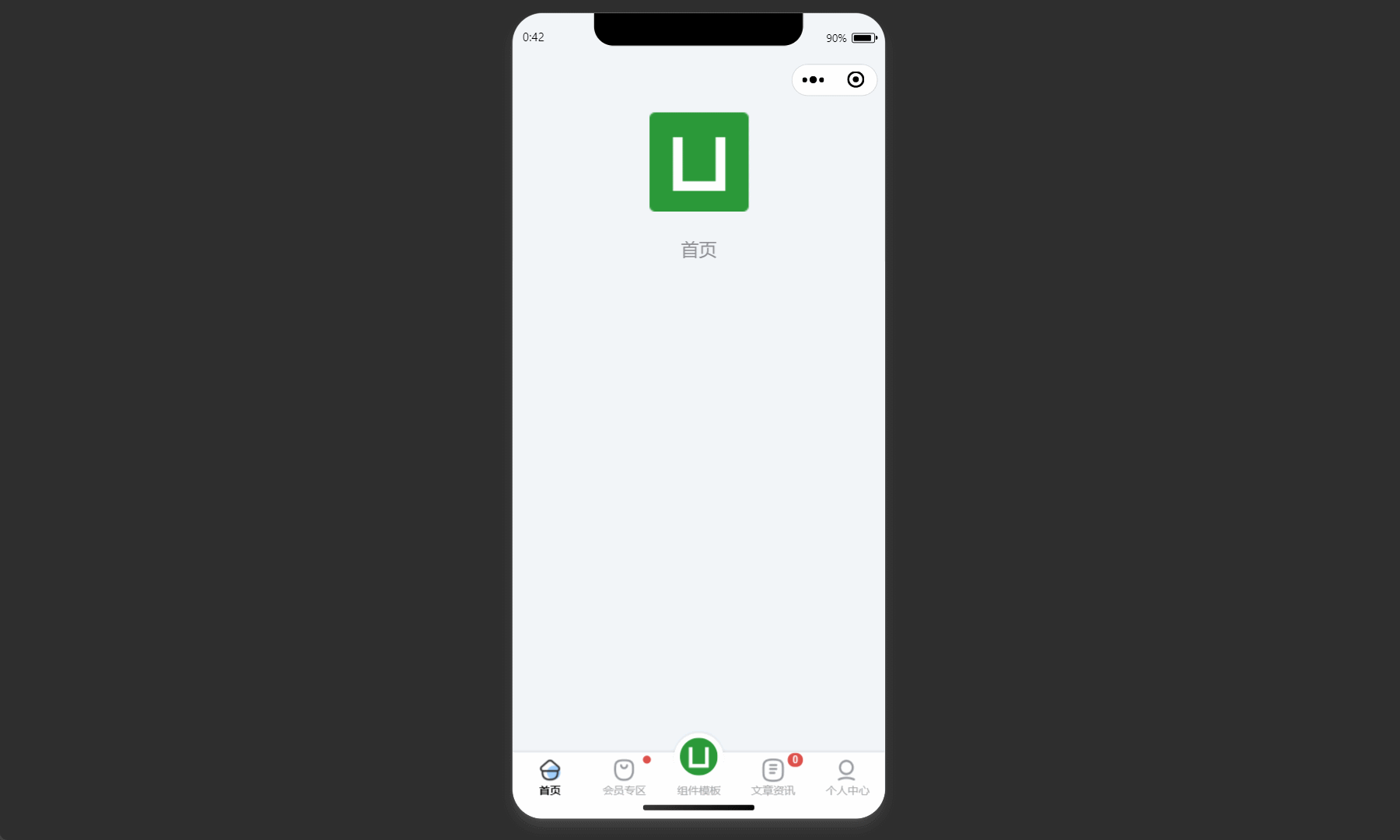
效果预览
 |
|---|
微信开发文档:自定义tabBar
一、配置信息
-
在 app.json 中的 tabBar 中指定 custom 字段为 true【允许使用自定义 tabBar】
-
在所有 tab 页 json 中申明usingComponents 项,或者在 app.json 中全局开启
-
在 list 中指定自己需要 tab
-
示例
"tabBar": {
    "custom": true,
    "color": "#515151",
    "selectedColor": "#DAA520",
    "backgroundColor": "#000000",
    "list": [
        {
            "pagePath": "pages/index/index",
            "text": "首页"
        },
        {
            "pagePath": "pages/hospital/hospital",
            "text": "医院"
        },
        {
            "pagePath": "pages/publish/publish",
            "text": "item3"
        },
        {
            "pagePath": "pages/popularization/popularization",
            "text": "科普"
        },
        {
            "pagePath": "pages/me/me",
            "text": "我的"
        }
    ]
},
"usingComponents": {},
二、添加 tabBar 代码文件
在代码根目录下添加custom-tab-bar文件夹,并在该文件夹下新建 page,文件结构如下
|-- cusotm-tab-bar
|-- index.js
|-- index.json
|-- index.wxml
|-- index.wxss
三、编写 tabBar 代码
-
wxml 代码
<!--custom-tab-bar/index.wxml--> <view class="tab-bar"> <view wx:for="{{list}}" wx:key="index" class="tab-bar-item {{item.bulge?'bulge':''}}" data-path="{{item.pagePath}}" data-index="{{index}}" bindtap="switchTab"> <view wx:if="item.bulge" class="tab-bar-bulge"></view> <image class="image" src="{{selected === index ? item.selectedIconPath : item.iconPath}}"></image> <!-- <view wx:if="{{item.text}}" style="color: {{selected === index ? selectedColor : color}}" class="tab-bar-view">{{item.text}}</view> --> <view class="tab-bar-view" style="color: {{selected === index ? selectedColor : color}}">{{item.text}}</view> </view> </view> -
js 代码
// custom-tab-bar/index.js Component({ data: { color: "#515151", selectedColor: "#DAA520", backgroundColor: "#ffffff", list: [ { pagePath: "/pages/index/index", text: "首页", iconPath: "/images/tabbar/index.png", selectedIconPath: "/images/tabbar/index-selected.png" }, { pagePath: "/pages/hospital/hospital", text: "医院", iconPath: "/images/tabbar/hospital.png", selectedIconPath: "/images/tabbar/hospital-selected.png" }, { pagePath: "/pages/publish/publish", bulge:true, text: "发布", iconPath: "/images/tabbar/dog.png", selectedIconPath: "/images/tabbar/dog-selected.png" }, { pagePath: "/pages/popularization/popularization", text: "科普", iconPath: "/images/tabbar/popularization.png", selectedIconPath: "/images/tabbar/popularization-selected.png" }, { pagePath: "/pages/me/me", text: "我的", iconPath: "/images/tabbar/me.png", selectedIconPath: "/images/tabbar/me-selected.png" }, ] }, attached() { }, methods: { switchTab(e) { const data = e.currentTarget.dataset const url = data.path wx.switchTab({url}) } } }) -
wxss 代码
.tab-bar { position: fixed; bottom: 0; left: 0; right: 0; height: 50px; background: #FFF; display: flex; line-height: 1.2; padding-bottom: env(safe-area-inset-bottom); border-top: 1px solid #e6e6e6; } .tab-bar-item { flex: 1; text-align: center; display: flex; justify-content: center; align-items: center; flex-direction: column; } .tab-bar-item .image { width: 26px; height: 26px; } .bulge { background-color: #FFF; } .bulge .tab-bar-bulge{ position: absolute; z-index: -1; width: 64px; height: 64px; top: -24px; border-radius: 50%; border-top: 1px solid #e6e6e6; background-color: #FFF; } .bulge .image{ position: absolute; width: 50px; height: 50px; top: -16px; } .bulge .tab-bar-view{ position: relative; bottom: -16px; margin-top: 4px; } .tab-bar-item .tab-bar-view { font-size: 12px; margin-top: 4px; } -
json 代码文章来源:https://www.toymoban.com/news/detail-496054.html
{
  "component": true
}
四、配置 tab 页
在每一个 tab 页的onShow函数中写入下面的代码,其中 selected 的值为每个 tab 的索引文章来源地址https://www.toymoban.com/news/detail-496054.html
onShow: function () {
    if (typeof this.getTabBar === 'function' && this.getTabBar()) {
        this.getTabBar().setData({
            // 首页为 0
            selected: 0
        })
    }
},
获取项目源代码
👇微信公众号【京茶吉鹿】内回复“微信小程序组件”👇到了这里,关于微信小程序自定义tabbar【中间凸起样式】的文章就介绍完了。如果您还想了解更多内容,请在右上角搜索TOY模板网以前的文章或继续浏览下面的相关文章,希望大家以后多多支持TOY模板网!


![uniapp - [ H5 网页 / App ] 高性能 tabbar 底部菜单凸起效果,原生系统自定义底部菜单不卡顿、切换页面不闪烁、自动缓存页面(底部菜单中间自定义一个图片并悬浮起来)](https://imgs.yssmx.com/Uploads/2024/02/831617-1.gif)


