🖥️ NodeJS专栏:Node.js从入门到精通
🖥️ 蓝桥杯真题解析:蓝桥杯Web国赛真题解析
🧧 加入社区领红包:海底烧烤店ai(从前端到全栈)
🧑💼个人简介:即将大三的学生,一个不甘平庸的平凡人🍬
👉 你的一键三连是我更新的最大动力❤️!
🏆分享博主自用牛客网🏆:一个非常全面的面试刷题求职网站,真的超级好用🍬
写在前边
最近博主一直在牛客网刷题巩固基础知识,快来和我一起冲关升级吧!点击进入牛客网
这篇博文是在黑马程序员uniapp-黑马优购项目文档的基础上进行书写的,原文在这里:uniapp-黑马优购,视频教程。
文章资料和接口文档:链接:https://pan.baidu.com/s/1dkJu8aaJEjnLEfERL7j1Nw
提取码:b3ub
如你所见,本人现在正在学习黑马的uniapp,为了让自己能够方便的复习所学知识,我将自己的理解以及一些在学习过程中遇到的问题和解决方法与黑马原有的文档进行结合,书写了这篇博文,如有侵权,联系必删!
因内容较多,本次博客分为上下两篇,下篇请见:uni-app黑马优购项目学习记录(下)
1. 起步
1.1 uni-app 简介
uni-app 是一个使用 Vue.js 开发所有前端应用的框架。开发者编写一套代码,可发布到 iOS、Android、H5、以及各种小程序(微信/支付宝/百度/头条/QQ/钉钉/淘宝)、快应用等多个平台。
详细的 uni-app 官方文档,请翻阅 https://uniapp.dcloud.net.cn/
1.2 开发工具
uni-app 官方推荐使用 HBuilderX 来开发 uni-app 类型的项目。主要好处:
-
模板丰富
-
完善的智能提示
-
一键运行
1.2.1 下载 HBuilderX
-
访问 HBuilderX 的官网首页 https://www.dcloud.io/hbuilderx.html
-
点击首页的
DOWNLOAD按钮 -
选择下载
正式版->App 开发版
1.2.2 安装 HBuilderX
-
将下载的
zip包进行解压缩 -
将解压之后的文件夹,存放到纯英文的目录中(且不能包含括号等特殊字符)
-
双击
HBuilderX.exe即可启动 HBuilderX
1.2.3 安装 scss/sass 编译
为了方便编写样式(例如:<style lang="scss"></style>),建议安装 scss/sass 编译 插件。插件下载地址:
https://ext.dcloud.net.cn/plugin?name=compile-node-sass
进入插件下载页面之后,点击右上角的 使用 HBuilderX 导入插件 按钮进行自动安装,截图如下:

如果没有右侧这两个按钮,可以看一下是不是自己的浏览器安装了屏蔽广告的插件,将插件关闭后就会显示按钮了
1.2.4 快捷键方案切换
操作步骤:工具 -> 预设快捷键方案切换 -> VS Code
1.2.5 修改编辑器的基本设置
操作步骤:工具 -> 设置 -> 打开 Settings.json 按需进行配置
源码视图下可用的参考配置:
{
  "editor.colorScheme": "Default",
  "editor.fontSize": 12,
  "editor.fontFamily": "Consolas",
  "editor.fontFmyCHS": "微软雅黑 Light",
  "editor.insertSpaces": true,
  "editor.lineHeight": "1.5",
  "editor.minimap.enabled": false,
  "editor.mouseWheelZoom": true,
  "editor.onlyHighlightWord": false,
  "editor.tabSize": 2,
  "editor.wordWrap": true,
  "explorer.iconTheme": "vs-seti",
  "editor.codeassist.px2rem.enabel": false,
  "editor.codeassist.px2upx.enabel": false
}
Tips:可以使用 Ctrl + 鼠标滚轮 缩放编辑器
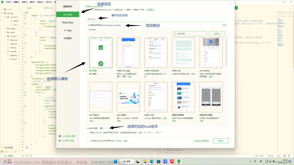
1.3 新建 uni-app 项目
-
文件 -> 新建 -> 项目

-
填写项目基本信息

项目模板按需进行选择
-
项目创建成功

1.4 目录结构
一个 uni-app 项目,默认包含如下目录及文件:
┌─components            uni-app组件目录
│  └─comp-a.vue         可复用的a组件
├─pages                 业务页面文件存放的目录
│  ├─index
│  │  └─index.vue       index页面
│  └─list
│     └─list.vue        list页面
├─static                存放应用引用静态资源(如图片、视频等)的目录,注意:静态资源只能存放于此
├─main.js               Vue初始化入口文件
├─App.vue               应用配置,用来配置小程序的全局样式、生命周期函数等
├─manifest.json         配置应用名称、appid、logo、版本等打包信息
└─pages.json            配置页面路径、页面窗口样式、tabBar、navigationBar 等页面类信息
1.5 把项目运行到微信开发者工具
-
填写自己的微信小程序的 AppID:

-
在 HBuilderX 中,配置“微信开发者工具”的安装路径:

-
在微信开发者工具中,通过
设置 -> 安全设置面板,开启“微信开发者工具”的服务端口:

-
在 HBuilderX 中,点击菜单栏中的
运行 -> 运行到小程序模拟器 -> 微信开发者工具,将当前 uni-app 项目编译之后,自动运行到微信开发者工具中,从而方便查看项目效果与调试:
-
初次运行成功之后的项目效果:

如果运行不成功可以尝试多运行几次
如果想要修改小程序
project.config.json里的配置项(如setting内容),不能直接在小程序开发者工具里修改,需要到HBuilderX的项目根目录下manifest.json里选择源码视图进行修改:
1.6 使用 Git 管理项目
1.6.1 本地管理
-
在项目根目录中新建
.gitignore忽略文件,并配置如下:# 忽略 node_modules 目录 /node_modules /unpackage/dist注意:由于我们忽略了
unpackage目录中仅有的dist目录,因此默认情况下,unpackage目录不会被 Git 追踪此时,为了让 Git 能够正常追踪 unpackage 目录,按照惯例,我们可以在
unpackage目录下创建一个叫做.gitkeep的文件进行占位 -
打开终端,切换到项目根目录中,运行如下的命令,初始化本地 Git 仓库:
git init -
将所有文件都加入到暂存区:
git add . -
本地提交更新:
git commit -m "init project"
1.6.2 把项目托管到码云
-
注册并激活码云账号( 注册页面地址:https://gitee.com/signup )
-
生成并配置 SSH 公钥
-
创建空白的码云仓库
-
把本地项目上传到码云对应的空白仓库中
2. tabBar
2.1 创建 tabBar 分支
运行如下的命令,基于 master 分支在本地创建 tabBar 子分支,用来开发和 tabBar 相关的功能:
git checkout -b tabbar
2.2 创建 tabBar 页面
在 pages 目录中,创建首页(home)、分类(cate)、购物车(cart)、我的(my) 这 4 个 tabBar 页面。在 HBuilderX 中,可以通过如下的两个步骤,快速新建页面:
-
在
pages目录上鼠标右键,选择新建页面 -
在弹出的窗口中,填写页面的名称、勾选
scss模板之后,点击创建按钮。截图如下:
2.3 配置 tabBar 效果
-
将
资料目录下的static 文件夹拷贝一份,替换掉项目根目录中的static文件夹 -
修改项目根目录中的
pages.json配置文件,新增tabBar的配置节点(与pages配置节点同级)如下:{ "tabBar": { "selectedColor": "#C00000", "list": [ { // 路径 "pagePath": "pages/home/home", // 导航文本 "text": "首页", // 默认图标 "iconPath": "static/tab_icons/home.png", // 选中的图标 "selectedIconPath": "static/tab_icons/home-active.png" }, { "pagePath": "pages/cate/cate", "text": "分类", "iconPath": "static/tab_icons/cate.png", "selectedIconPath": "static/tab_icons/cate-active.png" }, { "pagePath": "pages/cart/cart", "text": "购物车", "iconPath": "static/tab_icons/cart.png", "selectedIconPath": "static/tab_icons/cart-active.png" }, { "pagePath": "pages/my/my", "text": "我的", "iconPath": "static/tab_icons/my.png", "selectedIconPath": "static/tab_icons/my-active.png" } ] } }
2.4 删除默认的 index 首页
-
在 HBuilderX 中,把
pages目录下的index首页文件夹 删除掉 -
同时,把
page.json中记录的index首页 路径删除掉 -
为了防止小程序运行失败,在微信开发者工具中,手动删除
pages目录下的index首页文件夹 -
同时,把
components目录下的组件文件夹删除掉
2.5 修改导航条的样式效果
-
打开
pages.json这个全局的配置文件 -
修改
globalStyle节点如下:"globalStyle": { // 小程序导航栏标题颜色,仅支持 black / white "navigationBarTextStyle": "white", //小程序导航栏标题文字内容 "navigationBarTitleText": "小陈优购", //小程序导航栏背景颜色 "navigationBarBackgroundColor": "#C00000", // 窗口的背景色 "backgroundColor": "#ffffff", "app-plus": { "background": "#efeff4" } }
2.6 分支的提交与合并
-
将本地的
tabbar分支进行本地的commit提交:git add . git commit -m "完成了 tabBar 的开发" -
将本地的
tabbar分支推送到远程仓库进行保存:git push -u origin tabbar
此时码云仓库已经有了
tabbar分支 -
将本地的
tabbar分支合并到本地的master分支:git checkout master git merge tabbar -
更新码云仓库代码
因为新的代码我们推到了
tabbar分支里面,master分支里的代码我们还没有更新,可运行以下代码进行更新:git push -
删除本地的 tabbar 分支:
git branch -d tabbar
3. 首页
展示:
接口描述:
- 轮播图
请求URL:
https://api-ugo-web.itheima.net/api/public/v1/home/swiperdata
请求方式:
- GET
参数: 无
返回示例
{
    "message": [
        {
            "image_src": "https://api-ugo-web.itheima.net/pyg/banner1.png",
            "open_type": "navigate",
            "goods_id": 129,
            "navigator_url": "/pages/goods_detail/index?goods_id=129"
        }
    ],
    "meta": {
        "msg": "获取成功",
        "status": 200
    }
}
返回参数说明
| 参数名 | 类型 | 说明 |
|---|---|---|
| image_src | string | 图片路径 |
| open_type | string | 打开方式 |
| goods_id | number | 商品id |
| navigator_url | string | 导航链接 |
接口描述:
- 导航菜单
请求URL:
https://api-ugo-web.itheima.net/api/public/v1/home/catitems
请求方式:
- GET
参数: 无
返回示例
{
    "message": [
        {
            "name": "分类",
            "image_src": "https://api-ugo-web.itheima.net/pyg/icon_index_nav_4@2x.png",
            "open_type": "switchTab",
            "navigator_url": "/pages/category/index"
        },
        {
            "name": "秒杀拍",
            "image_src": "https://api-ugo-web.itheima.net/pyg/icon_index_nav_3@2x.png"
        },
        {
            "name": "超市购",
            "image_src": "https://api-ugo-web.itheima.net/pyg/icon_index_nav_2@2x.png"
        },
        {
            "name": "母婴品",
            "image_src": "https://api-ugo-web.itheima.net/pyg/icon_index_nav_1@2x.png"
        }
    ],
    "meta": {
        "msg": "获取成功",
        "status": 200
    }
}
返回参数说明
| 参数名 | 类型 | 说明 |
|---|---|---|
| name | string | 标题名称 |
| image_src | string | 图片路径 |
简要描述:
- 楼层
请求URL:
https://api-ugo-web.itheima.net/api/public/v1/home/floordata
请求方式:
- GET
参数: 无
返回示例
{
    "message": [
        {
            "floor_title": {
                "name": "时尚女装",
                "image_src": "https://api-ugo-web.itheima.net/pyg/pic_floor01_title.png"
            },
            "product_list": [
                {
                    "name": "优质服饰",
                    "image_src": "https://api-ugo-web.itheima.net/pyg/pic_floor01_1@2x.png",
                    "image_width": "232",
                    "open_type": "navigate",
                    "navigator_url": "/pages/goods_list/index?query=服饰"
                },
                {
                    "name": "春季热门",
                    "image_src": "https://api-ugo-web.itheima.net/pyg/pic_floor01_2@2x.png",
                    "image_width": "233",
                    "open_type": "navigate",
                    "navigator_url": "/pages/goods_list/index?query=热"
                },
                {
                    "name": "爆款清仓",
                    "image_src": "https://api-ugo-web.itheima.net/pyg/pic_floor01_3@2x.png",
                    "image_width": "233",
                    "open_type": "navigate",
                    "navigator_url": "/pages/goods_list/index?query=爆款"
                },
                {
                    "name": "倒春寒",
                    "image_src": "https://api-ugo-web.itheima.net/pyg/pic_floor01_4@2x.png",
                    "image_width": "233",
                    "open_type": "navigate",
                    "navigator_url": "/pages/goods_list/index?query=春季"
                },
                {
                    "name": "怦然心动",
                    "image_src": "https://api-ugo-web.itheima.net/pyg/pic_floor01_5@2x.png",
                    "image_width": "233",
                    "open_type": "navigate",
                    "navigator_url": "/pages/goods_list/index?query=心动"
                }
            ]
        },
        {
            "floor_title": {
                "name": "户外活动",
                "image_src": "https://api-ugo-web.itheima.net/pyg/pic_floor02_title.png"
            },
            "product_list": [
                {
                    "name": "勇往直前",
                    "image_src": "https://api-ugo-web.itheima.net/pyg/pic_floor02_1@2x.png",
                    "image_width": "232",
                    "open_type": "navigate",
                    "navigator_url": "/pages/goods_list/index?query=户外"
                },
                {
                    "name": "户外登山包",
                    "image_src": "https://api-ugo-web.itheima.net/pyg/pic_floor02_2@2x.png",
                    "image_width": "273",
                    "open_type": "navigate",
                    "navigator_url": "/pages/goods_list/index?query=登山包"
                },
                {
                    "name": "超强手套",
                    "image_src": "https://api-ugo-web.itheima.net/pyg/pic_floor02_3@2x.png",
                    "image_width": "193",
                    "open_type": "navigate",
                    "navigator_url": "/pages/goods_list/index?query=手套"
                },
                {
                    "name": "户外运动鞋",
                    "image_src": "https://api-ugo-web.itheima.net/pyg/pic_floor02_4@2x.png",
                    "image_width": "193",
                    "open_type": "navigate",
                    "navigator_url": "/pages/goods_list/index?query=运动鞋"
                },
                {
                    "name": "冲锋衣系列",
                    "image_src": "https://api-ugo-web.itheima.net/pyg/pic_floor02_5@2x.png",
                    "image_width": "273",
                    "open_type": "navigate",
                    "navigator_url": "/pages/goods_list/index?query=冲锋衣"
                }
            ]
        },
        {
            "floor_title": {
                "name": "箱包配饰",
                "image_src": "https://api-ugo-web.itheima.net/pyg/pic_floor03_title.png"
            },
            "product_list": [
                {
                    "name": "清新气质",
                    "image_src": "https://api-ugo-web.itheima.net/pyg/pic_floor03_1@2x.png",
                    "image_width": "232",
                    "open_type": "navigate",
                    "navigator_url": "/pages/goods_list?query=饰品"
                },
                {
                    "name": "复古胸针",
                    "image_src": "https://api-ugo-web.itheima.net/pyg/pic_floor03_2@2x.png",
                    "image_width": "263",
                    "open_type": "navigate",
                    "navigator_url": "/pages/goods_list?query=胸针"
                },
                {
                    "name": "韩版手链",
                    "image_src": "https://api-ugo-web.itheima.net/pyg/pic_floor03_3@2x.png",
                    "image_width": "203",
                    "open_type": "navigate",
                    "navigator_url": "/pages/goods_list?query=手链"
                },
                {
                    "name": "水晶项链",
                    "image_src": "https://api-ugo-web.itheima.net/pyg/pic_floor03_4@2x.png",
                    "image_width": "193",
                    "open_type": "navigate",
                    "navigator_url": "/pages/goods_list?query=水晶项链"
                },
                {
                    "name": "情侣表",
                    "image_src": "https://api-ugo-web.itheima.net/pyg/pic_floor03_5@2x.png",
                    "image_width": "273",
                    "open_type": "navigate",
                    "navigator_url": "/pages/goods_list?query=情侣表"
                }
            ]
        }
    ],
    "meta": {
        "msg": "获取成功",
        "status": 200
    }
}
返回参数说明
| 参数名 | 类型 | 说明 |
|---|---|---|
| floor_title | string | 一级分类标题 |
| product_list | array | 一级分类内容 |
| name | string | 名称 |
| image_src | string | 图片路径 |
| image_width | string | 图片宽度 |
| open_type | string | 打开方式 |
| navigator_url | string | 跳转连接 |
3.1 创建 home 分支
运行如下的命令,基于 master 分支在本地创建 home 子分支,用来开发和 home 首页相关的功能:
git checkout -b home
3.2 配置网络请求
由于平台的限制,小程序项目中不支持 axios,而且原生的 wx.request() API 功能较为简单,不支持拦截器等全局定制的功能。因此,建议在 uni-app 项目中使用 @escook/request-miniprogram 第三方包发起网络数据请求。
请参考 @escook/request-miniprogram 的官方文档进行安装、配置、使用
官方文档:https://www.npmjs.com/package/@escook/request-miniprogram
最终,在项目的 main.js 入口文件中,通过如下的方式进行配置:
import { $http } from '@escook/request-miniprogram'

uni.$http = $http
// 配置请求根路径
$http.baseUrl = 'https://api-ugo-web.itheima.net'

// 请求开始之前做一些事情
$http.beforeRequest = function (options) {
  uni.showLoading({
    title: '数据加载中...',
  })
}

// 请求完成之后做一些事情
$http.afterRequest = function () {
  uni.hideLoading()
}
3.3 轮播图区域
3.3.1 请求轮播图的数据
实现步骤:
-
在
data中定义轮播图的数组 -
在
onLoad生命周期函数中调用获取轮播图数据的方法 -
在
methods中定义获取轮播图数据的方法
示例代码:
//home.vue
export default {
    data() {
      return {
        //存放轮播图数据
        swiperList:[]
      };
    },
    onLoad(){
      //在小程序页面刚加载的时候,调用获取轮播图数据的方法
      this.getSwiperList()
    },
    methods:{
      //获取轮播图数据
      async getSwiperList(){
        //发起请求,从返回的数据中结构出data并起个res的别名
        const {data:res} = await uni.$http.get('/api/public/v1/home/swiperdata')
        //请求失败
        if(res.meta.status !==200){
          return uni.showToast({
            title:'数据请求失败!',
            duration:1500,
            icon:'none',
          })
        }
        //请求成功
        this.swiperList=res.message
      }
    }
  }
如果你在使用接口时报了如下错误:
net::ERR_PROXY_CONNECTION_FAILED(env: Windows,mp,1.05.2201240; lib: 2.24.0)
解决方法: 关掉重启微信开发者工具 。 如果还不行就关机重启,再不行就试试关掉你的Http代理。
出错问题估计是某些进程没有结束导致的。
3.3.2 渲染轮播图的 UI 结构
渲染 UI 结构:
<template>
  <!-- home.vue -->
  <view>
    <!-- 轮播图区域 -->
    <!-- indicator-dots:是否显示面板指示点
          autoplay:是否自动切换
          interval:自动切换时间间隔
          duration:滑动动画时长
          circular:是否采用衔接滑动
          更多配置查看微信小程序开发文档
     -->
    <swiper :indicator-dots="true" :autoplay="true" :interval="3000" :duration="1000" :circular="true">
      <!-- 循环渲染item项 -->
      <swiper-item v-for="(item,i) in swiperList" :key="i">
        <view class="swiper_item">
          <!-- 动态绑定图片的src属性-->
          <image :src="item.image_src" ></image>
        </view>
      </swiper-item>
    </swiper>
  </view>
</template>
美化 UI 结构:
<style lang="scss">
  // home.vue
  swiper{
    height: 330rpx;
    .swiper_item,image {
      height:100% ;
      width: 100%;
    }
  }
</style>
3.3.3 配置小程序分包
分包可以减少小程序首次启动时的加载时间
为此,我们在项目中,把 tabBar 相关的 4 个页面放到主包中,其它页面(例如:商品详情页、商品列表页)放到分包中。在 uni-app 项目中,配置分包的步骤如下:
-
在项目根目录中,创建分包的根目录,命名为
subpkg -
在
pages.json中,和pages节点平级的位置声明subPackages节点,用来定义分包相关的结构:{ "pages": [ { "path": "pages/home/home", "style": {} }, { "path": "pages/cate/cate", "style": {} }, { "path": "pages/cart/cart", "style": {} }, { "path": "pages/my/my", "style": {} } ], "subPackages": [ { "root": "subpkg", "pages": [] } ] } -
在
subpkg目录上鼠标右键,点击新建页面选项,并填写页面的相关信息:
3.3.4 点击轮播图跳转到商品详情页面
将 <swiper-item></swiper-item> 节点内的 view 组件,改造为 navigator 导航组件,并动态绑定 url 属性 的值。
-
改造之前的 UI 结构:
<swiper-item v-for="(item, i) in swiperList" :key="i"> <view class="swiper-item"> <!-- 动态绑定图片的 src 属性 --> <image :src="item.image_src"></image> </view> </swiper-item> -
改造之后的 UI 结构:
<swiper-item v-for="(item, i) in swiperList" :key="i">
    <navigator class="swiper-item" :url="'/subpkg/goods_detail/goods_detail?goods_id=' + item.goods_id">
      <!-- 动态绑定图片的 src 属性 -->
      <image :src="item.image_src"></image>
    </navigator>
</swiper-item>
3.3.5 封装 uni.$showMsg() 方法
当数据请求失败之后,经常需要调用 uni.showToast({ /* 配置对象 */ }) 方法来提示用户。此时,可以在全局封装一个 uni.$showMsg() 方法,来简化 uni.showToast() 方法的调用。具体的改造步骤如下:
-
在
main.js中,为uni对象挂载自定义的$showMsg()方法:// 封装的展示消息提示的方法 //接收两个参数,一个title(默认值为数据加载失败),一个duration(持续时间,默认为1500ms) uni.$showMsg = function (title = '数据加载失败!',duration=1500){ uni.showToast({ title, duration, icon:'none', }) } -
今后,在需要提示消息的时候,直接调用
uni.$showMsg()方法即可://请求失败 if(res.meta.status !==200) return uni.$showMsg()
3.4 分类导航区域
3.4.1 获取分类导航的数据
实现思路:
-
定义
data数据 -
在
onLoad中调用获取数据的方法 -
在
methods中定义获取数据的方法
示例代码如下:
  // home.vue
export default {
  data() {
    return {
      // 1. 分类导航的数据列表
      navList: [],
    }
  },
  onLoad() {
    // 2. 在 onLoad 中调用获取数据的方法
    this.getNavList()
  },
  methods: {
    // 3. 在 methods 中定义获取数据的方法
    async getNavList() {
      const { data: res } = await uni.$http.get('/api/public/v1/home/catitems')
      if (res.meta.status !== 200) return uni.$showMsg()
      this.navList = res.message
    },
  },
}
3.4.2 渲染分类导航的 UI 结构
定义如下的 UI 结构:
  <!-- home.vue -->
<!-- 分类导航区域 -->
<view class="nav-list">
   <view class="nav-item" v-for="(item, i) in navList" :key="i">
     <image :src="item.image_src" class="nav-img"></image>
   </view>
</view>
通过如下的样式美化页面结构:
  // home.vue
.nav-list {
  display: flex;
  justify-content: space-around;
  margin: 15px 0;

  .nav-img {
    width: 128rpx;
    height: 140rpx;
  }
}
3.4.3 点击第一项,切换到分类页面
-
为
nav-item绑定点击事件处理函数:<!-- 分类导航区域 --> <view class="nav-list"> <view class="nav-item" v-for="(item, i) in navList" :key="i" @click="navClickHandler(item)"> <image :src="item.image_src" class="nav-img"></image> </view> </view> -
定义
navClickHandler事件处理函数:// nav-item 项被点击时候的事件处理函数 navClickHandler(item) { // 判断点击的是哪个 nav if (item.name === '分类') { uni.switchTab({ url: '/pages/cate/cate' }) } }
3.5 楼层区域
3.5.1 获取楼层数据
实现思路:
-
定义
data数据 -
在
onLoad中调用获取数据的方法 -
在
methods中定义获取数据的方法
示例代码如下:
export default {
  data() {
    return {
      // 1. 楼层的数据列表
      floorList: [],
    }
  },
  onLoad() {
    // 2. 在 onLoad 中调用获取楼层数据的方法
    this.getFloorList()
  },
  methods: {
    // 3. 定义获取楼层列表数据的方法
    async getFloorList() {
      const { data: res } = await uni.$http.get('/api/public/v1/home/floordata')
      if (res.meta.status !== 200) return uni.$showMsg()
      this.floorList = res.message
    },
  },
}
3.5.2 渲染楼层的内容
定义如下的 UI 结构:
<view class="floor-list">
      <view class="floor-item" v-for="(item,i) in floorList" :key="i">
        <!-- 楼层标题 -->
        <image :src="item.floor_title.image_src" class="floor-title"></image>
        <!-- 楼层图片区域 -->
        <view class="floor-img-box">
          <!-- 左侧大图片盒子 -->
          <view class="left-img-box">
            <!-- widthFix	缩放模式,宽度不变,高度自动变化,保持原图宽高比不变 -->
            <image :src="item.product_list[0].image_src" :style="{width:item.product_list[0].image_width+'rpx'}" mode="widthFix"></image>
          </view>
          <!-- 右侧4个小图片盒子 -->
          <view class="right-img-box">
            <view class="right-img-item" v-for="(item2,i2) in item.product_list" :key="i2" v-if="i2 !==0">
              <image :src="item2.image_src" mode="widthFix" :style="{width:item2.image_width+'rpx'}"></image>
            </view>
          </view>
        </view>
      </view>
    </view>
美化楼层的样式:
.floor-title {
    height: 60rpx;
    width: 100%;
    display: flex;
  }
  .right-img-box {
    display: flex;
    flex-wrap: wrap;
    justify-content: space-around;
  }
  .floor-img-box {
    display: flex;
    padding-left: 10rpx;
  }
3.5.3 点击楼层图片跳转到商品列表页
-
在
subpkg分包中,新建goods_list页面 -
楼层数据请求成功之后,通过双层
forEach循环,处理 URL 地址:// 获取楼层列表数据 async getFloorList() { const { data: res } = await uni.$http.get('/api/public/v1/home/floordata') if (res.meta.status !== 200) return uni.$showMsg() // 通过双层 forEach 循环,处理 URL 地址 res.message.forEach(floor => { floor.product_list.forEach(prod => { prod.url = '/subpkg/goods_list/goods_list?' + prod.navigator_url.split('?')[1] }) }) this.floorList = res.message } -
把图片外层的
view组件,改造为navigator组件,并动态绑定url属性 的值:<!-- 楼层图片区域 --> <view class="floor-img-box"> <!-- 左侧大图片的盒子 --> <navigator class="left-img-box" :url="item.product_list[0].url"> <image :src="item.product_list[0].image_src" :style="{width: item.product_list[0].image_width + 'rpx'}" mode="widthFix"></image> </navigator> <!-- 右侧 4 个小图片的盒子 --> <view class="right-img-box"> <navigator class="right-img-item" v-for="(item2, i2) in item.product_list" :key="i2" v-if="i2 !== 0" :url="item2.url"> <image :src="item2.image_src" mode="widthFix" :style="{width: item2.image_width + 'rpx'}"></image> </navigator> </view> </view>
3.6 分支的合并与提交
-
将本地的
home分支进行本地的commit提交:切换到home分支
git checkout home查看当前分支
git branchgit add . git commit -m "完成了 home 首页的开发" -
将本地的
home分支推送到远程仓库进行保存:git push -u origin home -
将本地的
home分支合并到本地的master分支:git checkout master git merge home更新主仓库(master):
git push -
删除本地的
home分支:git branch -d home
4. 分类
简要描述:
请求URL:
https://api-ugo-web.itheima.net/api/public/v1/categories
请求方式:
- GET
参数: 无
返回示例
{
  "message": [
    {
      "cat_id": 1,
      "cat_name": "大家电",
      "cat_pid": 0,
      "cat_level": 0,
      "cat_deleted": false,
      "cat_icon": "",
      "children": [
        {
          "cat_id": 3,
          "cat_name": "电视",
          "cat_pid": 1,
          "cat_level": 1,
          "cat_deleted": false,
          "cat_icon": "",
          "children": [
            {
              "cat_id": 5,
              "cat_name": "曲面电视",
              "cat_pid": 3,
              "cat_level": 2,
              "cat_deleted": false,
              "cat_icon": "https://api-ugo-web.itheima.net/full/2fb113b32f7a2b161f5ee4096c319afedc3fd5a1.jpg"
            }
          ]
        }
      ]
    }
  ],
  "meta": {
    "msg": "获取成功",
    "status": 200
  }
}
返回参数说明
| 参数名 | 类型 | |
|---|---|---|
| cat_id | int | 分类id |
| cat_name | string | 分类名称 |
| children | array | 子节点 |
| cat_icon | string | 图标 |
4.0 创建 cate 分支
运行如下的命令,基于 master 分支在本地创建 cate 子分支,用来开发分类页面相关的功能:
git checkout -b cate
4.1 渲染分类页面的基本结构
-
定义页面结构如下:
<template> <view> <view class="scroll-view-container"> <!-- 左侧的滚动视图区域 --> <scroll-view class="left-scroll-view" scroll-y :style="{height: wh + 'px'}"> <view class="left-scroll-view-item active">xxx</view> <view class="left-scroll-view-item">xxx</view> <view class="left-scroll-view-item">xxx</view> <view class="left-scroll-view-item">xxx</view> <view class="left-scroll-view-item">xxx</view> <view class="left-scroll-view-item">多复制一些节点,演示纵向滚动效果...</view> </scroll-view> <!-- 右侧的滚动视图区域 --> <scroll-view class="right-scroll-view" scroll-y :style="{height: wh + 'px'}"> <view class="left-scroll-view-item">zzz</view> <view class="left-scroll-view-item">zzz</view> <view class="left-scroll-view-item">zzz</view> <view class="left-scroll-view-item">zzz</view> <view class="left-scroll-view-item">多复制一些节点,演示纵向滚动效果</view> </scroll-view> </view> </view> </template> -
动态计算窗口的剩余高度:
<script> export default { data() { return { // 窗口的可用高度 = 屏幕高度 - navigationBar高度 - tabBar 高度 wh: 0 }; }, onLoad() { // 获取当前系统的信息 const sysInfo = uni.getSystemInfoSync() // 为 wh 窗口可用高度动态赋值 this.wh = sysInfo.windowHeight } } </script> -
美化页面结构:
.scroll-view-container {
  display: flex;

  .left-scroll-view {
    width: 120px;

    .left-scroll-view-item {
      line-height: 60px;
      background-color: #f7f7f7;
      text-align: center;
      font-size: 12px;

      // 激活项的样式
      &.active {
        background-color: #ffffff;
        position: relative;

        // 渲染激活项左侧的红色指示边线
        &::before {
          content: ' ';
          display: block;
          width: 3px;
          height: 30px;
          background-color: #c00000;
          position: absolute;
          left: 0;
          top: 50%;
          transform: translateY(-50%);
        }
      }
    }
  }
}
4.2 获取分类数据
-
在
data中定义分类数据节点:data() { return { // 分类数据列表 cateList: [] } } -
调用获取分类列表数据的方法:
onLoad() { // 调用获取分类列表数据的方法 this.getCateList() } -
定义获取分类列表数据的方法:
methods: {
  async getCateList() {
    // 发起请求
    const { data: res } = await uni.$http.get('/api/public/v1/categories')
    // 判断是否获取失败
    if (res.meta.status !== 200) return uni.$showMsg()
    // 转存数据
    this.cateList = res.message
  }
}
4.3 动态渲染左侧的一级分类列表
-
循环渲染列表结构:
<!-- 左侧的滚动视图区域 --> <scroll-view class="left-scroll-view" scroll-y :style="{height: wh + 'px'}"> <block v-for="(item, i) in cateList" :key="i"> <view class="left-scroll-view-item">{{item.cat_name}}</view> </block> </scroll-view><block/>标签上,以渲染一个包含多节点的结构块。 -
在
data中定义默认选中项的索引:data() { return { // 当前选中项的索引,默认让第一项被选中 active: 0 } } -
循环渲染结构时,为选中项动态添加
.active类名:<block v-for="(item, i) in cateList" :key="i"> <view :class="['left-scroll-view-item', i === active ? 'active' : '']">{{item.cat_name}}</view> </block> -
为一级分类的
Item项绑定点击事件处理函数activeChanged:<block v-for="(item, i) in cateList" :key="i"> <view :class="['left-scroll-view-item', i === active ? 'active' : '']" @click="activeChanged(i)">{{item.cat_name}}</view> </block> -
定义
activeChanged事件处理函数,动态修改选中项的索引:methods: { // 选中项改变的事件处理函数 activeChanged(i) { this.active = i } }
4.4 动态渲染右侧的二级分类列表
-
在
data中定义二级分类列表的数据节点:data() { return { // 二级分类列表 cateLevel2: [] } } -
修改
getCateList方法,在请求到数据之后,为二级分类列表数据赋值:async getCateList() { const { data: res } = await uni.$http.get('/api/public/v1/categories') if (res.meta.status !== 200) return uni.$showMsg() this.cateList = res.message // 为二级分类赋值 this.cateLevel2 = res.message[0].children } -
修改
activeChanged方法,在一级分类选中项改变之后,为二级分类列表数据重新赋值:activeChanged(i) { this.active = i // 为二级分类列表重新赋值 this.cateLevel2 = this.cateList[i].children } -
循环渲染右侧二级分类列表的 UI 结构:
<!-- 右侧的滚动视图区域 --> <scroll-view class="right-scroll-view" scroll-y :style="{height: wh + 'px'}"> <view class="cate-lv2" v-for="(item2, i2) in cateLevel2" :key="i2"> <view class="cate-lv2-title">/ {{item2.cat_name}} /</view> </view> </scroll-view> -
美化二级分类的标题样式:
.cate-lv2-title {
  font-size: 12px;
  font-weight: bold;
  text-align: center;
  padding: 15px 0;
}
4.5 动态渲染右侧的三级分类列表
-
在二级分类的 组件中,循环渲染三级分类的列表结构:
<!-- 右侧的滚动视图区域 --> <scroll-view class="right-scroll-view" scroll-y :style="{height: wh + 'px'}"> <view class="cate-lv2" v-for="(item2, i2) in cateLevel2" :key="i2"> <view class="cate-lv2-title">/ {{item2.cat_name}} /</view> <!-- 动态渲染三级分类的列表数据 --> <view class="cate-lv3-list"> <!-- 三级分类 Item 项 --> <view class="cate-lv3-item" v-for="(item3, i3) in item2.children" :key="i3"> <!-- 图片 --> <image :src="item3.cat_icon"></image> <!-- 文本 --> <text>{{item3.cat_name}}</text> </view> </view> </view> </scroll-view> -
美化三级分类的样式:
.cate-lv3-list {
  display: flex;
  flex-wrap: wrap;

  .cate-lv3-item {
    width: 33.33%;
    margin-bottom: 10px;
    display: flex;
    flex-direction: column;
    align-items: center;

    image {
      width: 60px;
      height: 60px;
    }

    text {
      font-size: 12px;
    }
  }
}
4.6 切换一级分类后重置滚动条的位置
-
在
data中定义 滚动条距离顶部的距离:data() { return { // 滚动条距离顶部的距离 scrollTop: 0 } } -
动态为右侧的
<scroll-view>组件绑定scroll-top属性的值:<!-- 右侧的滚动视图区域 --> <scroll-view class="right-scroll-view" scroll-y :style="{height: wh + 'px'}" :scroll-top="scrollTop"></scroll-view> -
切换一级分类时,动态设置
scrollTop的值:// 选中项改变的事件处理函数 activeChanged(i) { this.active = i this.cateLevel2 = this.cateList[i].children // 让 scrollTop 的值在 0 与 1 之间切换 this.scrollTop = this.scrollTop === 0 ? 1 : 0 // 可以简化为如下的代码: // this.scrollTop = this.scrollTop ? 0 : 1 }
4.7 点击三级分类跳转到商品列表页面
-
为三级分类的
Item项绑定点击事件处理函数如下:<view class="cate-lv3-item" v-for="(item3, i3) in item2.children" :key="i3" @click="gotoGoodsList(item3)"> <image :src="item3.cat_icon"></image> <text>{{item3.cat_name}}</text> </view> -
定义事件处理函数如下:
// 点击三级分类项跳转到商品列表页面
gotoGoodsList(item3) {
  uni.navigateTo({
    url: '/subpkg/goods_list/goods_list?cid=' + item3.cat_id
  })
}
4.8 分支的合并与提交
-
将
cate分支进行本地提交:git add . git commit -m "完成了分类页面的开发" -
将本地的
cate分支推送到码云:git push -u origin cate -
将本地
cate分支中的代码合并到master分支:git checkout master git merge cate git push -
删除本地的
cate分支:git branch -d cate
5. 搜索

接口描述:
- 搜索建议查询
请求URL:
https://api-ugo-web.itheima.net/api/public/v1/goods/qsearch
请求方式:
- GET
参数:
| 参数名 | 必选 | 类型 | 说明 |
|---|---|---|---|
| query | 是 | string | 关键字 |
返回示例
{
    "message": [
        {
            "goods_id": 57444,
            "goods_name": "创维(Skyworth)42X6 42英寸10核智能酷开网络平板液晶电视(黑色)"
        }
    ],
    "meta": {
        "msg": "获取成功",
        "status": 200
    }
}
返回参数说明
| 参数名 | 类型 | 说明 |
|---|---|---|
| goods_id | number | 商品id |
| goods_name | string | 商品名称 |
5.0 创建 search 分支
运行如下的命令,基于 master 分支在本地创建 search 子分支,用来开发搜索相关的功能:
git checkout -b search
5.1 自定义搜索组件
5.1.1 自定义 my-search 组件
-
在项目根目录的
components目录上,鼠标右键,选择新建组件,填写组件信息后,最后点击创建按钮:
项目根目录如果没有
components文件夹,自己手动建一个就行 -
在分类页面的 UI 结构中,直接以标签的形式使用
my-search自定义组件:<!-- 使用自定义的搜索组件 --> <my-search></my-search> -
定义
my-search组件的 UI 结构如下:<template> <view class="my-search-container"> <!-- 使用 view 组件模拟 input 输入框的样式 --> <view class="my-search-box"> <!--uni图标组件--> <uni-icons type="search" size="17"></uni-icons> <text class="placeholder">搜索</text> </view> </view> </template>注意:在当前组件中,我们使用
view组件模拟input输入框的效果;并不会在页面上渲染真正的input输入框。uni-icons图标组件详情请见:链接 -
美化自定义
search组件的样式:.my-search-container { background-color: #c00000; height: 50px; padding: 0 10px; display: flex; align-items: center; } .my-search-box { height: 36px; background-color: #ffffff; border-radius: 15px; width: 100%; display: flex; align-items: center; justify-content: center; .placeholder { font-size: 15px; margin-left: 5px; } } -
由于自定义的
my-search组件高度为50px,因此,需要重新计算分类页面窗口的可用高度:onLoad() { const sysInfo = uni.getSystemInfoSync() // 可用高度 = 屏幕高度 - navigationBar高度 - tabBar高度 - 自定义的search组件高度 this.wh = sysInfo.windowHeight - 50 }
5.1.2 通过自定义属性增强组件的通用性
为了增强组件的通用性,我们允许使用者自定义搜索组件的 背景颜色 和 圆角尺寸。
-
通过
props定义bgcolor和radius两个属性,并指定值类型和属性默认值://my-search.vue //和data节点平级 props: { // 背景颜色 bgcolor: { type: String, default: '#C00000' }, // 圆角尺寸 radius: { type: Number, // 单位是 px default: 18 } } -
通过属性绑定的形式,为
.my-search-container盒子和.my-search-box盒子动态绑定style属性:<view class="my-search-container" :style="{'background-color': bgcolor}"> <view class="my-search-box" :style="{'border-radius': radius + 'px'}"> <uni-icons type="search" size="17"></uni-icons> <text class="placeholder">搜索</text> </view> </view> -
移除对应 scss 样式中的 背景颜色 和 圆角尺寸:
.my-search-container {
  // 移除背景颜色,改由 props 属性控制
  // background-color: #C00000;
  height: 50px;
  padding: 0 10px;
  display: flex;
  align-items: center;
}

.my-search-box {
  height: 36px;
  background-color: #ffffff;
  // 移除圆角尺寸,改由 props 属性控制
  // border-radius: 15px;
  width: 100%;
  display: flex;
  align-items: center;
  justify-content: center;

  .placeholder {
    font-size: 15px;
    margin-left: 5px;
  }
}
5.1.3 为自定义组件封装 click 事件
-
在
my-search自定义组件内部,给类名为.my-search-box的view绑定click事件处理函数:<view class="my-search-box" :style="{'border-radius': radius + 'px'}" @click="searchBoxHandler"> <uni-icons type="search" size="17"></uni-icons> <text class="placeholder">搜索</text> </view> -
在
my-search自定义组件的methods节点中,声明事件处理函数如下:methods: { // 点击了模拟的 input 输入框 searchBoxHandler() { // 触发外界通过 @click 绑定的 click 事件处理函数 this.$emit('click') } } -
在
subpkg分包目录下新建search分包页面 -
在分类页面中使用
my-search自定义组件时,即可通过@click为其绑定点击事件处理函数:<!-- 使用自定义的搜索组件 --> <my-search @click="gotoSearch"></my-search>同时在分类页面中,定义
gotoSearch事件处理函数如下:methods: { // 跳转到分包中的搜索页面 gotoSearch() { uni.navigateTo({ url: '/subpkg/search/search' }) } }
为自定义组件封装 click 事件目的是解决在自定义组件上直接绑定点击事件@click无效的问题
- 你可以试试在
my-search组件内部不做处理,直接在分类页面为该组件绑定点击事件,你就会发现绑定的这个gotoSearch事件无效
实际在my-search组件内部做的处理就是利用了父子组件通信:
-
@click="gotoSearch"相当于分类页面向my-search传了一个名为click的参数 -
my-search可以通过emit('click')调用这个参数(调用该参数就会执行分类页面的gotoSearch方法) - 这里的
click只是一个自定义的参数名,你可以写成其它的,比如(@myclick="gotoSearch",emit('myclick'))只要emit调用的参数与传来的一致就行
其实有一种非常简单的方法可以不利用父子组件通信解决这种问题:
在对组件添加点击事件时加上.native
@click.native="gotoSearch"
5.1.4 实现首页搜索组件的吸顶效果
-
在 home 首页定义如下的 UI 结构:
<!-- 使用自定义的搜索组件 --> <view class="search-box"> <my-search @click="gotoSearch"></my-search> </view> -
在 home 首页定义如下的事件处理函数:
gotoSearch() { uni.navigateTo({ url: '/subpkg/search/search' }) } -
通过如下的样式实现吸顶的效果:
.search-box {
  // 设置定位效果为“吸顶”
  position: sticky;
  // 吸顶的“位置”
  top: 0;
  // 提高层级,防止被轮播图覆盖
  z-index: 999;
}
5.2 搜索建议
5.2.1 渲染搜索页面的基本结构
-
定义如下的 UI 结构:
<!-- search.vue --> <view class="search-box"> <!-- 使用 uni-ui 提供的搜索组件 --> <uni-search-bar @input="input" :radius="100" cancelButton="none"></uni-search-bar> </view>uni-search-bar组件:点击查看 -
修改
uni_modules-> uni-search-bar -> components-> uni-search-bar.vue组件,将默认的白色搜索背景改为#C00000的红色背景:.uni-searchbar { /* #ifndef APP-NVUE */ display: flex; /* #endif */ flex-direction: row; position: relative; padding: 10px; //修改颜色 background-color: #C00000; } -
实现搜索框的吸顶效果:
// search.vue .search-box { position: sticky; top: 0; z-index: 999; } -
定义如下的
input事件处理函数:methods: { input(e) { // e是最新的搜索内容 console.log(e) } }
5.2.2 实现搜索框自动获取焦点
-
给
uni-search-bar组件添加:focus="true"即可<uni-search-bar @input="input" :radius="100" cancelButton="none" :focus="true"></uni-search-bar> -
使用手机扫码预览,即可在真机上查看效果。
5.2.3 实现搜索框的防抖处理
-
在
data中定义防抖的延时器timerId如下:// search.vue data() { return { // 延时器的 timerId timer: null, // 搜索关键词 kw: '' } } -
修改
input事件处理函数如下:input(e) { // 清除 timer 对应的延时器 clearTimeout(this.timer) // 重新启动一个延时器,并把 timerId 赋值给 this.timer this.timer = setTimeout(() => { // 如果 500 毫秒内,没有触发新的输入事件,则为搜索关键词赋值 this.kw = e console.log(this.kw) }, 500) }
5.2.4 根据关键词查询搜索建议列表
-
在
data中定义如下的数据节点,用来存放搜索建议的列表数据:data() { return { // 搜索结果列表 searchResults: [] } } -
在防抖的
setTimeout中,调用getSearchList方法获取搜索建议列表:this.timer = setTimeout(() => { //去除输入值的前后空格 this.kw = e.trim() // 根据关键词,查询搜索建议列表 this.getSearchList() }, 500) -
在
methods中定义getSearchList方法如下:// 根据搜索关键词,搜索商品建议列表 async getSearchList() { // 判断关键词是否为空 if (this.kw === '') { this.searchResults = [] return } // 发起请求,获取搜索建议列表 const { data: res } = await uni.$http.get('/api/public/v1/goods/qsearch', { query: this.kw }) if (res.meta.status !== 200) return uni.$showMsg() this.searchResults = res.message }
5.2.5 渲染搜索建议列表
-
定义如下的 UI 结构:
<!-- 搜索建议列表 --> <view class="sugg-list"> <view class="sugg-item" v-for="(item, i) in searchResults" :key="i" @click="gotoDetail(item.goods_id)"> <view class="goods-name">{{item.goods_name}}</view> <uni-icons type="arrowright" size="16"></uni-icons> </view> </view> -
美化搜索建议列表:
.sugg-list { padding: 0 5px; .sugg-item { font-size: 12px; padding: 13px 0; border-bottom: 1px solid #efefef; display: flex; align-items: center; justify-content: space-between; .goods-name { // 文字不允许换行(单行文本) white-space: nowrap; // 溢出部分隐藏 overflow: hidden; // 文本溢出后,使用 ... 代替 text-overflow: ellipsis; margin-right: 3px; } } } -
点击搜索建议的
Item项,跳转到商品详情页面:gotoDetail(goods_id) { uni.navigateTo({ // 指定详情页面的 URL 地址,并传递 goods_id 参数 url: '/subpkg/goods_detail/goods_detail?goods_id=' + goods_id }) }
5.3 搜索历史
5.3.1 渲染搜索历史记录的基本结构
-
在
data中定义搜索历史的假数据:data() { return { // 搜索关键词的历史记录 historyList: ['a', 'app', 'apple'] } } -
渲染搜索历史区域的 UI 结构:
<!-- 搜索历史 --> <view class="history-box"> <!-- 标题区域 --> <view class="history-title"> <text>搜索历史</text> <uni-icons type="trash" size="17"></uni-icons> </view> <!-- 列表区域 --> <view class="history-list"> <uni-tag :inverted="true" type="error" :text="item" v-for="(item, i) in historyList" :key="i"></uni-tag> </view> </view> -
美化搜索历史区域的样式:
.history-box {
  padding: 0 5px;

  .history-title {
    display: flex;
    justify-content: space-between;
    align-items: center;
    height: 40px;
    font-size: 13px;
    border-bottom: 1px solid #efefef;
  }

  .history-list {
    display: flex;
    flex-wrap: wrap;

    .uni-tag {
      margin-top: 5px;
      margin-right: 5px;
    }
  }
}
5.3.2 实现搜索建议和搜索历史的按需展示
-
当搜索结果列表的长度不为 0的时候(
searchResults.length !== 0),需要展示搜索建议区域,隐藏搜索历史区域 -
当搜索结果列表的长度等于 0的时候(
searchResults.length === 0),需要隐藏搜索建议区域,展示搜索历史区域 -
使用 v-if 和 v-else 控制这两个区域的显示和隐藏,示例代码如下:
<!-- 搜索建议列表 -->
<view class="sugg-list" v-if="searchResults.length !== 0">
  <!-- 省略其它代码... -->
</view>

<!-- 搜索历史 -->
<view class="history-box" v-else>
  <!-- 省略其它代码... -->
</view>
5.3.3 将搜索关键词存入 historyList
-
直接将搜索关键词
push到historyList数组中即可methods: { // 根据搜索关键词,搜索商品建议列表 async getSearchList() { // 省略其它不必要的代码... // 1. 查询到搜索建议之后,调用 saveSearchHistory() 方法保存搜索关键词 this.saveSearchHistory() }, // 2. 保存搜索关键词的方法 saveSearchHistory() { // 2.1 直接把搜索关键词 push 到 historyList 数组中 this.historyList.push(this.kw) } } -
上述实现思路存在的问题:
2.1 关键词前后顺序的问题(可以调用数组的
reverse() 方法对数组进行反转)2.2 关键词重复的问题(可以使用
Set 对象进行去重操作)
5.3.4 解决关键字前后顺序的问题
-
data中的historyList不做任何修改,依然使用push进行末尾追加 -
定义一个计算属性
historys,将historyList数组reverse反转之后,就是此计算属性的值:computed: { historys() { // 注意:由于数组是引用类型,所以不要直接基于原数组调用 reverse 方法,以免修改原数组中元素的顺序 // 而是应该新建一个内存无关的数组,再进行 reverse 反转 return [...this.historyList].reverse() } } -
页面中渲染搜索关键词的时候,不再使用
data中的historyList,而是使用计算属性historys:<view class="history-list"> <uni-tag :text="item" v-for="(item, i) in historys" :key="i"></uni-tag> </view>
5.3.5 解决关键词重复的问题
-
修改
saveSearchHistory方法如下:// 保存搜索关键词为历史记录 saveSearchHistory() { // this.historyList.push(this.kw) // 1. 将 Array 数组转化为 Set 对象 const set = new Set(this.historyList) // 2. 调用 Set 对象的 delete 方法,移除对应的元素 set.delete(this.kw) // 3. 调用 Set 对象的 add 方法,向 Set 中添加元素 set.add(this.kw) // 4. 将 Set 对象转化为 Array 数组 this.historyList = Array.from(set) }
5.3.6 一行代码解决上述保存关键字顺序和重复的问题
<!-- 搜索历史列表区域 -->
<view class="history-list">
  <uni-tag @click="gotoGoodsList(item)" :inverted="true" type="error" :text="item" v-for="(item,i) in historyList"
          :key="i"></uni-tag>
</view>
// 保存搜索关键词的方法
saveSearchHistory() {
   this.historyList=[...new Set([this.kw,...this.historyList])]
}
注意:这个种方法是我自己想的,并不是黑马教程里老师讲的,不知道为什么老师要用那么复杂的方法,知道的大佬还请解答一下🤓
5.3.6 将搜索历史记录持久化存储到本地
-
修改
saveSearchHistory方法如下:// 保存搜索关键词为历史记录 saveSearchHistory() { const set = new Set(this.historyList) set.delete(this.kw) set.add(this.kw) this.historyList = Array.from(set) // 调用 uni.setStorageSync(key, value) 将搜索历史记录持久化存储到本地 uni.setStorageSync('kw', JSON.stringify(this.historyList)) } -
在
onLoad生命周期函数中,加载本地存储的搜索历史记录:onLoad() { this.historyList = JSON.parse(uni.getStorageSync('kw') || '[]') }
5.3.7 清空搜索历史记录
-
为清空的图标按钮绑定
click事件:<uni-icons type="trash" size="17" @click="cleanHistory"></uni-icons> -
在
methods中定义cleanHistory处理函数:// 清空搜索历史记录 cleanHistory() { // 清空 data 中保存的搜索历史 this.historyList = [] // 清空本地存储中记录的搜索历史 uni.setStorageSync('kw', '[]') }
5.3.8 点击搜索历史跳转到商品列表页面
-
为搜索历史的
Item项绑定click事件处理函数:<uni-tag :text="item" v-for="(item, i) in historys" :key="i" @click="gotoGoodsList(item)"></uni-tag> -
在
methods中定义gotoGoodsList处理函数:// 点击跳转到商品列表页面 gotoGoodsList(kw) { uni.navigateTo({ url: '/subpkg/goods_list/goods_list?query=' + kw }) }
5.4 分支的合并与提交
-
将
search分支进行本地提交:git add . git commit -m "完成了搜索功能的开发" -
将本地的
search分支推送到码云:git push -u origin search -
将本地
search分支中的代码合并到master分支:git checkout master git merge search git push -
删除本地的
search分支:git branch -d search
6. 商品列表
接口描述:
- 商品列表搜索
请求URL:
https://api-ugo-web.itheima.net/api/public/v1/goods/search
请求方式:
- GET
参数:
| 参数名 | 必选 | 类型 | 说明 |
|---|---|---|---|
| query | 否 | string | 关键字 |
| cid | 否 | string | 分类id |
| pagenum | 否 | number | 页码 |
| pagesize | 否 | number | 页容量 |
返回示例
{
    "message": {
        "total": 10,
        "pagenum": 1,
        "goods": [
            {
                "goods_id": 57445,
                "cat_id": 9,
                "goods_name": "创维(Skyworth)65V9E 65英寸25核4K HDR高清智能电视",
                "goods_price": 6499,
                "goods_number": 100,
                "goods_weight": 100,
                "goods_big_logo": "",
                "goods_small_logo": "",
                "add_time": 1516663280,
                "upd_time": 1516663280,
                "hot_mumber": 0,
                "is_promote": false,
                "cat_one_id": 1,
                "cat_two_id": 3,
                "cat_three_id": 9
            }
        ]
    },
    "meta": {
        "msg": "获取成功",
        "status": 200
    }
}
返回参数说明
| 参数名 | 参数说明 | 备注 |
| total | 总条数 | |
| pagenum | 当前页数 | |
| goods_id | 商品ID | |
| cat_id | 分类ID | |
| goods_name | 商品名称 | |
| goods_price | 商品价格 | |
| goods_number | 商品数量 | |
| goods_weight | 商品重量 | |
| goods_big_logo | 商品大图标 | |
| goods_small_logo | 商品小图标 | |
| add_time | 商品添加时间 | |
| upd_time | 商品更新时间 | |
| hot_mumber | 热门商品数 | |
| cat_one_id | 所属一级分类 | |
| cat_two_id | 所属二级分类 | |
| cat_three_id | 所属三级分类 |
6.0 创建 goodslist 分支
运行如下的命令,基于 master 分支在本地创建 goodslist 子分支,用来开发商品列表相关的功能:
git checkout -b goodslist
6.1 定义请求参数对象
-
为了方便发起请求获取商品列表的数据,我们要根据接口的要求,事先定义一个请求参数对象:
// goods_list.vue data() { return { // 请求参数对象 queryObj: { // 查询关键词 query: '', // 商品分类Id cid: '', // 页码值 pagenum: 1, // 每页显示多少条数据 pagesize: 10 } } } -
将页面跳转时携带的参数,转存到
queryObj对象中:onLoad(options) { // 将页面参数转存到 this.queryObj 对象中 this.queryObj.query = options.query || '' this.queryObj.cid = options.cid || '' } -
为了方便开发商品分类页面,建议大家通过微信开发者工具,新建商品列表页面的编译模式:

这里我选的页面参数是
query=a,这里参数自己可以设置,只要让接口返回的数据多一点,能够测试后面要写的上拉加载更多就行
6.2 获取商品列表数据
-
在
data中新增如下的数据节点:data() { return { // 商品列表的数据 goodsList: [], // 总数量,用来实现分页 total: 0 } } -
在
onLoad生命周期函数中,调用getGoodsList方法获取商品列表数据:onLoad(options) { // 调用获取商品列表数据的方法 this.getGoodsList() } -
在
methods节点中,声明getGoodsList方法如下:methods: { // 获取商品列表数据的方法 async getGoodsList() { // 发起请求 const { data: res } = await uni.$http.get('/api/public/v1/goods/search', this.queryObj) if (res.meta.status !== 200) return uni.$showMsg() // 为数据赋值 this.goodsList = res.message.goods this.total = res.message.total } }
6.3 渲染商品列表结构
-
在页面中,通过
v-for指令,循环渲染出商品的 UI 结构:<template> <view> <view class="goods-list"> <block v-for="(goods, i) in goodsList" :key="i"> <view class="goods-item"> <!-- 商品左侧图片区域 --> <view class="goods-item-left"> <image :src="goods.goods_small_logo || defaultPic" class="goods-pic"></image> </view> <!-- 商品右侧信息区域 --> <view class="goods-item-right"> <!-- 商品标题 --> <view class="goods-name">{{goods.goods_name}}</view> <view class="goods-info-box"> <!-- 商品价格 --> <view class="goods-price">¥{{goods.goods_price}}</view> </view> </view> </view> </block> </view> </view> </template> -
为了防止某些商品的图片不存在,需要在
data中定义一个默认的图片:data() { return { // 默认的空图片 defaultPic: 'https://img3.doubanio.com/f/movie/8dd0c794499fe925ae2ae89ee30cd225750457b4/pics/movie/celebrity-default-medium.png' } }并在页面渲染时按需使用:
<image :src="goods.goods_small_logo || defaultPic" class="goods-pic"></image> -
美化商品列表的 UI 结构:
.goods-item {
  display: flex;
  padding: 10px 5px;
  border-bottom: 1px solid #f0f0f0;

  .goods-item-left {
    margin-right: 5px;

    .goods-pic {
      width: 100px;
      height: 100px;
      display: block;
    }
  }

  .goods-item-right {
    display: flex;
    flex-direction: column;
    justify-content: space-between;

    .goods-name {
      font-size: 13px;
    }

    .goods-price {
      font-size: 16px;
      color: #c00000;
    }
  }
}
6.4 把商品 item 项封装为自定义组件
-
在
components目录上鼠标右键,选择 新建组件:
-
将
goods_list页面中,关于商品item项相关的 UI 结构、样式、data数据,封装到my-goods组件中:<template> <view class="goods-item"> <!-- 商品左侧图片区域 --> <view class="goods-item-left"> <image :src="goods.goods_small_logo || defaultPic" class="goods-pic"></image> </view> <!-- 商品右侧信息区域 --> <view class="goods-item-right"> <!-- 商品标题 --> <view class="goods-name">{{goods.goods_name}}</view> <view class="goods-info-box"> <!-- 商品价格 --> <view class="goods-price">¥{{goods.goods_price}}</view> </view> </view> </view> </template> <script> export default { // 定义 props 属性,用来接收外界传递到当前组件的数据 props: { // 商品的信息对象 goods: { type: Object, defaul: {}, }, }, data() { return { // 默认的空图片 defaultPic: 'https://img3.doubanio.com/f/movie/8dd0c794499fe925ae2ae89ee30cd225750457b4/pics/movie/celebrity-default-medium.png', } }, } </script> <style lang="scss"> .goods-item { display: flex; padding: 10px 5px; border-bottom: 1px solid #f0f0f0; .goods-item-left { margin-right: 5px; .goods-pic { width: 100px; height: 100px; display: block; } } .goods-item-right { display: flex; flex-direction: column; justify-content: space-between; .goods-name { font-size: 13px; } .goods-price { font-size: 16px; color: #c00000; } } } </style> -
在
goods_list组件中,循环渲染my-goods组件即可:<view class="goods-list"> <block v-for="(item, i) in goodsList" :key="i"> <!-- 为 my-goods 组件动态绑定 goods 属性的值 --> <my-goods :goods="item"></my-goods> </block> </view>
6.5 使用过滤器处理价格
-
在
my-goods组件中,和data节点平级,声明filters过滤器节点如下:filters: { // 把数字处理为带两位小数点的数字 tofixed(num) { return Number(num).toFixed(2) } } -
在渲染商品价格的时候,通过管道符
|调用过滤器:<!-- 商品价格 --> <view class="goods-price">¥{{goods.goods_price | tofixed}}</view>管道符可以理解为:前一个命令的输出作为下一个命令的输入。
6.6 上拉加载更多
6.6.1 初步实现上拉加载更多
-
打开项目根目录中的
pages.json配置文件,为subPackages分包中的goods_list页面配置上拉触底的距离:"subPackages": [ { "root": "subpkg", "pages": [ { "path": "goods_detail/goods_detail", "style": {} }, { "path": "goods_list/goods_list", "style": { "onReachBottomDistance": 150 } }, { "path": "search/search", "style": {} } ] } ] -
在
goods_list页面中,和methods节点平级,声明onReachBottom事件处理函数,用来监听页面的上拉触底行为:// 触底的事件 onReachBottom() { // 让页码值自增 +1 this.queryObj.pagenum += 1 // 重新获取列表数据 this.getGoodsList() } -
改造
methods中的getGoodsList函数,当列表数据请求成功之后,进行新旧数据的拼接处理:// 获取商品列表数据的方法 async getGoodsList() { // 发起请求 const { data: res } = await uni.$http.get('/api/public/v1/goods/search', this.queryObj) if (res.meta.status !== 200) return uni.$showMsg() // 为数据赋值:通过展开运算符的形式,进行新旧数据的拼接 this.goodsList = [...this.goodsList, ...res.message.goods] this.total = res.message.total }
6.6.2 通过节流阀防止发起额外的请求
-
在
data中定义isloading节流阀如下:data() { return { // 是否正在请求数据 isloading: false } } -
修改
getGoodsList方法,在请求数据前后,分别打开和关闭节流阀:// 获取商品列表数据的方法 async getGoodsList() { // ** 打开节流阀 this.isloading = true // 发起请求 const { data: res } = await uni.$http.get('/api/public/v1/goods/search', this.queryObj) // ** 关闭节流阀 this.isloading = false // 省略其它代码... } -
在
onReachBottom触底事件处理函数中,根据节流阀的状态,来决定是否发起请求:// 触底的事件 onReachBottom() { // 判断是否正在请求其它数据,如果是,则不发起额外的请求 if (this.isloading) return this.queryObj.pagenum += 1 this.getGoodsList() }
6.6.3 判断数据是否加载完毕
-
如果下面的公式成立,则证明没有下一页数据了:
当前的页码值 * 每页显示多少条数据 >= 总数条数 pagenum * pagesize >= total -
修改
onReachBottom事件处理函数如下:// 触底的事件 onReachBottom() { // 判断是否还有下一页数据 if (this.queryObj.pagenum * this.queryObj.pagesize >= this.total) return uni.$showMsg('数据加载完毕!') // 判断是否正在请求其它数据,如果是,则不发起额外的请求 if (this.isloading) return this.queryObj.pagenum += 1 this.getGoodsList() }
6.7 下拉刷新
-
在
pages.json配置文件中,为当前的goods_list页面单独开启下拉刷新效果:"subPackages": [{ "root": "subpkg", "pages": [{ "path": "goods_detail/goods_detail", "style": {} }, { "path": "goods_list/goods_list", "style": { "onReachBottomDistance": 150, "enablePullDownRefresh": true, "backgroundColor": "#F8F8F8" } }, { "path": "search/search", "style": {} }] }] -
监听页面的
onPullDownRefresh事件处理函数:// 下拉刷新的事件 onPullDownRefresh() { // 1. 重置关键数据 this.queryObj.pagenum = 1 this.total = 0 this.isloading = false this.goodsList = [] // 2. 重新发起请求 this.getGoodsList(() => uni.stopPullDownRefresh()) } -
修改
getGoodsList函数,接收cb回调函数并按需进行调用:// 获取商品列表数据的方法 async getGoodsList(cb) { this.isloading = true const { data: res } = await uni.$http.get('/api/public/v1/goods/search', this.queryObj) this.isloading = false // 只要数据请求完毕,就立即按需调用 cb 回调函数 cb && cb() if (res.meta.status !== 200) return uni.$showMsg() this.goodsList = [...this.goodsList, ...res.message.goods] this.total = res.message.total }
6.8 点击商品 item 项跳转到详情页面
-
将循环时的
block组件修改为view组件,并绑定click点击事件处理函数:<view class="goods-list"> <view v-for="(item, i) in goodsList" :key="i" @click="gotoDetail(item)"> <!-- 为 my-goods 组件动态绑定 goods 属性的值 --> <my-goods :goods="item"></my-goods> </view> </view> -
在
methods节点中,定义gotoDetail事件处理函数:// 点击跳转到商品详情页面 gotoDetail(item) { uni.navigateTo({ url: '/subpkg/goods_detail/goods_detail?goods_id=' + item.goods_id }) }
6.9 分支的合并与提交
-
将
goodslist分支进行本地提交:git add . git commit -m "完成了商品列表页面的开发" -
将本地的
goodslist分支推送到码云:git push -u origin goodslist -
将本地
goodslist分支中的代码合并到master分支:git checkout master git merge goodslist git push -
删除本地的
goodslist分支:git branch -d goodslist
7. 商品详情

简要描述:
- 商品详情
请求URL:
https://api-ugo-web.itheima.net/api/public/v1/goods/detail
请求方式:
- GET
参数:
| 参数名 | 必选 | 类型 | 说明 |
|---|---|---|---|
| goods_id | 是 | number | 商品id |
返回示例
{
    "message": {
        "goods_id": 8888,
        "cat_id": 1085,
        "goods_name": "spike 经典武士大马士革直刀(微型) 户外野营直刀 收藏礼品刀 饰品刀具",
        "goods_price": 500,
        "goods_number": 100,
        "goods_weight": 100,
        "goods_introduce": "富文本内容",
        "goods_state": 2,
        "is_del": "0",
        "add_time": 1516361489,
        "upd_time": 1516361489,
        "delete_time": null,
        "hot_mumber": 0,
        "is_promote": false,
        "cat_one_id": 995,
        "cat_two_id": 1075,
        "cat_three_id": 1085,
        "goods_cat": "995,1075,1085",
        "pics": [
            {
                "pics_id": 38711,
                "goods_id": 8888,
                "pics_big": "http://image1.suning.cn/uimg/b2c/newcatentries/0070134290-000000000149003877_1_800x800.jpg",
                "pics_mid": "http://image1.suning.cn/uimg/b2c/newcatentries/0070134290-000000000149003877_1_400x400.jpg",
                "pics_sma": "http://image1.suning.cn/uimg/b2c/newcatentries/0070134290-000000000149003877_1_200x200.jpg",
                "pics_big_url": "http://image1.suning.cn/uimg/b2c/newcatentries/0070134290-000000000149003877_1_800x800.jpg",
                "pics_mid_url": "http://image1.suning.cn/uimg/b2c/newcatentries/0070134290-000000000149003877_1_400x400.jpg",
                "pics_sma_url": "http://image1.suning.cn/uimg/b2c/newcatentries/0070134290-000000000149003877_1_200x200.jpg"
            }
        ],
        "attrs": [
            {
                "goods_id": 8888,
                "attr_id": 9210,
                "attr_value": "户外直刀",
                "add_price": 0,
                "attr_name": "主体参数-类别",
                "attr_sel": "only",
                "attr_write": "manual",
                "attr_vals": "放大镜"
            }
        ]
    },
    "meta": {
        "msg": "获取成功",
        "status": 200
    }
}
返回参数说明
| 参数名 | 参数说明 | 备注 |
| goods_id | 商品ID | |
| cat_id | 分类ID | |
| goods_name | 商品名称 | |
| goods_price | 商品价格 | |
| goods_number | 商品数量 | |
| goods_weight | 商品重量 | |
| goods_big_logo | 商品大图标 | |
| goods_small_logo | 商品小图标 | |
| add_time | 商品添加时间 | |
| upd_time | 商品更新时间 | |
| hot_mumber | 热门商品数 | |
| cat_one_id | 所属一级分类 | |
| cat_two_id | 所属二级分类 | |
| cat_three_id | 所属三级分类 | |
| goods_introduce | 商品介绍 | |
| pics | 商品图片列表 | |
| attrs | 商品属性列表 |
7.0 创建 goodsdetail 分支
运行如下的命令,基于 master 分支在本地创建 goodsdetail 子分支,用来开发商品详情页相关的功能:
git checkout -b goodsdetail
7.1 添加商品详情页的编译模式
-
在微信开发者工具中,点击工具栏上的编译模式下拉菜单,选择
添加编译模式选项:
-
勾选
启动页面的路径,并填写了启动参数之后,点击确定按钮,添加详情页面的编译模式:
7.2 获取商品详情数据
-
在
data中定义商品详情的数据节点:data() { return { // 商品详情对象 goods_info: {} } } -
在
onLoad中获取商品的Id,并调用请求商品详情的方法:onLoad(options) { // 获取商品 Id const goods_id = options.goods_id // 调用请求商品详情数据的方法 this.getGoodsDetail(goods_id) } -
在
methods中声明getGoodsDetail方法:methods: { // 定义请求商品详情数据的方法 async getGoodsDetail(goods_id) { const { data: res } = await uni.$http.get('/api/public/v1/goods/detail', { goods_id }) if (res.meta.status !== 200) return uni.$showMsg() // 为 data 中的数据赋值 this.goods_info = res.message } }
7.3 渲染商品详情页的 UI 结构
7.3.1 渲染轮播图区域
-
使用
v-for指令,循环渲染如下的轮播图 UI 结构:<!-- 轮播图区域 --> <swiper :indicator-dots="true" :autoplay="true" :interval="3000" :duration="1000" :circular="true"> <swiper-item v-for="(item, i) in goods_info.pics" :key="i"> <image :src="item.pics_big"></image> </swiper-item> </swiper> -
美化轮播图的样式:
swiper {
  height: 750rpx;

  image {
    width: 100%;
    height: 100%;
  }
}
7.3.2 实现轮播图预览效果
-
为轮播图中的
image图片绑定click事件处理函数:<swiper-item v-for="(item, i) in goods_info.pics" :key="i"> <!-- 把当前点击的图片的索引,传递到 preview() 处理函数中 --> <image :src="item.pics_big" @click="preview(i)"></image> </swiper-item> -
在
methods中定义preview事件处理函数:// 实现轮播图的预览效果 preview(i) { // 调用 uni.previewImage() 方法预览图片 uni.previewImage({ // 预览时,默认显示图片的索引 current: i, // 所有图片 url 地址的数组 urls: this.goods_info.pics.map(x => x.pics_big) }) }
7.3.3 渲染商品信息区域
-
定义商品信息区域的 UI 结构如下:
<!-- 商品信息区域 --> <view class="goods-info-box"> <!-- 商品价格 --> <view class="price">¥{{goods_info.goods_price}}</view> <!-- 信息主体区域 --> <view class="goods-info-body"> <!-- 商品名称 --> <view class="goods-name">{{goods_info.goods_name}}</view> <!-- 收藏 --> <view class="favi"> <uni-icons type="star" size="18" color="gray"></uni-icons> <text>收藏</text> </view> </view> <!-- 运费 --> <view class="yf">快递:免运费</view> </view> -
美化商品信息区域的样式:
// 商品信息区域的样式
.goods-info-box {
  padding: 10px;
  padding-right: 0;

  .price {
    color: #c00000;
    font-size: 18px;
    margin: 10px 0;
  }

  .goods-info-body {
    display: flex;
    justify-content: space-between;

    .goods-name {
      font-size: 13px;
      padding-right: 10px;
    }
    // 收藏区域
    .favi {
      width: 120px;
      font-size: 12px;
      display: flex;
      flex-direction: column;
      justify-content: center;
      align-items: center;
      border-left: 1px solid #efefef;
      color: gray;
    }
  }

  // 运费
  .yf {
    margin: 10px 0;
    font-size: 12px;
    color: gray;
  }
}
7.3.4 渲染商品详情信息
-
在页面结构中,使用
rich-text组件,将带有HTML标签的内容,渲染为小程序的页面结构:<!-- 商品详情信息 --> <rich-text :nodes="goods_info.goods_introduce"></rich-text> -
修改
getGoodsDetail方法,从而解决图片底部空白间隙的问题:// 定义请求商品详情数据的方法 async getGoodsDetail(goods_id) { const { data: res } = await uni.$http.get('/api/public/v1/goods/detail', { goods_id }) if (res.meta.status !== 200) return uni.$showMsg() // 使用字符串的 replace() 方法,为 img 标签添加行内的 style 样式,从而解决图片底部空白间隙的问题 res.message.goods_introduce = res.message.goods_introduce.replace(/<img /g, '<img style="display:block;" ') this.goods_info = res.message } -
解决
.webp格式图片在ios设备上无法正常显示的问题:// 定义请求商品详情数据的方法 async getGoodsDetail(goods_id) { const { data: res } = await uni.$http.get('/api/public/v1/goods/detail', { goods_id }) if (res.meta.status !== 200) return uni.$showMsg() // 使用字符串的 replace() 方法,将 webp 的后缀名替换为 jpg 的后缀名 res.message.goods_introduce = res.message.goods_introduce.replace(/<img /g, '<img style="display:block;" ').replace(/webp/g, 'jpg') this.goods_info = res.message }
7.3.5 解决商品价格闪烁的问题
-
导致问题的原因:在商品详情数据请求回来之前,data 中
goods_info的值为{},因此初次渲染页面时,会导致商品价格、商品名称等闪烁的问题。 -
解决方案:判断
goods_info.goods_name属性的值是否存在,从而使用v-if指令控制页面的显示与隐藏:<template> <!-- 商品价格 --> <view class="price" v-if="goods_info.goods_price"> <!-- 省略其它代码 --> </view> <!-- 商品名称 --> <view class="goods-name" v-if="goods_info.goods_name"> <!-- 省略其它代码 --> </view> </template>
7.4 渲染详情页底部的商品导航区域
7.4.1 渲染商品导航区域的 UI 结构
基于
uni-ui提供的GoodsNav组件来实现商品导航区域的效果
-
在
data中,通过options和buttonGroup两个数组,来声明商品导航组件的按钮配置对象:data() { return { // 商品详情对象 goods_info: {}, // 左侧按钮组的配置对象 options: [{ icon: 'shop', text: '店铺' }, { icon: 'cart', text: '购物车', info: 2 }], // 右侧按钮组的配置对象 buttonGroup: [{ text: '加入购物车', backgroundColor: '#ff0000', color: '#fff' }, { text: '立即购买', backgroundColor: '#ffa200', color: '#fff' } ] } } -
在页面中使用
uni-goods-nav商品导航组件:<!-- 商品导航组件 --> <view class="goods_nav"> <!-- fill 控制右侧按钮的样式 --> <!-- options 左侧按钮的配置项 --> <!-- buttonGroup 右侧按钮的配置项 --> <!-- click 左侧按钮的点击事件处理函数 --> <!-- buttonClick 右侧按钮的点击事件处理函数 --> <uni-goods-nav :fill="true" :options="options" :buttonGroup="buttonGroup" @click="onClick" @buttonClick="buttonClick" /> </view> -
美化商品导航组件,使之固定在页面最底部:
.goods-detail-container {
  // 给页面外层的容器,添加 50px 的内padding,
  // 防止页面内容被底部的商品导航组件遮盖
  padding-bottom: 50px;
}

.goods_nav {
  // 为商品导航组件添加固定定位
  position: fixed;
  bottom: 0;
  left: 0;
  width: 100%;
}
7.4.2 点击跳转到购物车页面
-
点击商品导航组件左侧的按钮,会触发
uni-goods-nav的@click事件处理函数,事件对象e中会包含当前点击的按钮相关的信息:// 左侧按钮的点击事件处理函数 onClick(e) { console.log(e) }打印的按钮信息对象如下:

-
根据
e.content.text的值,来决定进一步的操作:// 左侧按钮的点击事件处理函数 onClick(e) { if (e.content.text === '购物车') { // 切换到购物车页面 uni.switchTab({ url: '/pages/cart/cart' }) } }
7.5 分支的合并与提交
-
将
goodsdetail分支进行本地提交:git add . git commit -m "完成了商品详情页面的开发" -
将本地的
goodsdetail分支推送到码云:git push -u origin goodsdetail -
将本地
goodsdetail分支中的代码合并到master分支:文章来源:https://www.toymoban.com/news/detail-497400.htmlgit checkout master git merge goodsdetail git push -
删除本地的
goodsdetail分支:文章来源地址https://www.toymoban.com/news/detail-497400.htmlgit branch -d goodsdetail
到了这里,关于uni-app黑马优购项目学习记录(上)的文章就介绍完了。如果您还想了解更多内容,请在右上角搜索TOY模板网以前的文章或继续浏览下面的相关文章,希望大家以后多多支持TOY模板网!


![[uni-app]微信小程序隐私保护指引设置的处理记录](https://imgs.yssmx.com/Uploads/2024/02/707163-1.png)