 文章来源地址https://www.toymoban.com/news/detail-499353.html
标题修改具体项
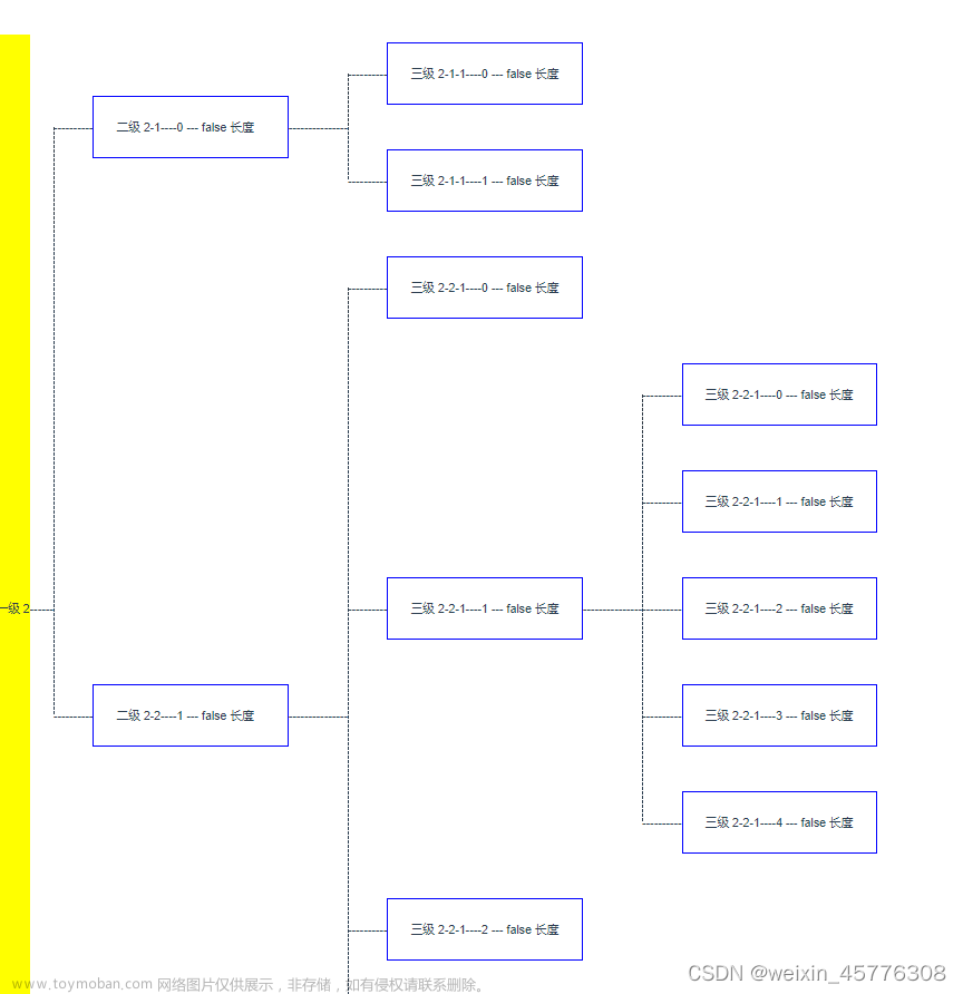
- 设置结点的样式
- 设置边的样式
- 添加修改结点名称功能
- 添加展示结点详细信息功能
参考链接
- 基本图形:https://g6.antv.vision/zh/examples/net/dagreFlow#lrDagreUL
- 展示结点详细信息功能:https://g6.antv.vision/zh/examples/tool/tooltip#tooltipClick
- 修改结点名称功能:https://g6.antv.vision/zh/examples/interaction/label#update
完整代码(直接建一个html文件拷进去就能用)
<!DOCTYPE html>
<html lang="en">
  <head>
    <meta charset="UTF-8" />
    <title>Tutorial Demo</title>
  </head>
  <body>
    <!-- 图的画布容器 -->
    <div id="container"></div>

    <!--  引入 G6  -->
    <script src="https://gw.alipayobjects.com/os/lib/antv/g6/4.3.11/dist/g6.min.js"></script>
    <script src="https://apps.bdimg.com/libs/jquery/2.1.4/jquery.min.js"></script>

    <script>
      // 定义数据源
      const data = {
        // 点集
        nodes: [
          {
            id: '0',
            label: '硅材料',
            style: {
              lineDash: [6],
            },
            description: ['text1','text2','text3','text4',],
          },
          {
            id: '1',
            label: '光伏级单晶硅片',
            description: ['text1','text2','text3','text4',],
          },
          {
            id: '2',
            label: '组件',
            description: ['text1','text2','text3','text4',],
          },
          {
            id: '3',
            label: '半导体硅片',
            style: {
              lineDash: [6],
            },
            description: ['text1','text2','text3','text4',],
          },
          {
            id: '4',
            label: 'IGBT芯片',
            style: {
              fill: '#00FF00', //填充颜色
            },
          },
          {
            id: '5',
            label: 'IGBT模块1700V及以上',
            style: {
              fill: '#00FF00', //填充颜色
            },
          },
          {
            id: '6',
            label: 'IGBT模块1700V及以下',
          },
          {
            id: '7',
            label: '变流器',
          },
          {
            id: '8',
            label: '换流阀',
          },
          {
            id: '9',
            label: '中车',
          },
          {
            id: '10',
            label: '轨道交通',
            type: 'rect',
          },
          {
            id: '11',
            label: '智能电网',
            type: 'rect',
          },
          {
            id: '12',
            label: '逆变器',
            style: {
              lineDash: [6],
            },
          },
          {
            id: '13',
            label: '电机控制器',
          },
          {
            id: '14',
            label: '新能源汽车',
            type: 'rect',
          },
        ],
        // 边集
        edges: [
          {
            source: '0',
            target: '1',
            description: ['text1','text2','text3','text4',],
          },
          {
            source: '1',
            target: '2',
            description: ['text1','text2','text3','text4',],
          },
          {
            source: '0',
            target: '3',
            style: {
              lineDash: [6],
            },
            description: ['text1','text2','text3','text4',],
          },
          {
            source: '3',
            target: '4',
            style: {
              lineDash: [6],
            },
          },
          {
            source: '4',
            target: '5',
            style: {
              lineDash: [3],
            },
          },
          {
            source: '4',
            target: '6',
          },
          {
            source: '5',
            target: '7',
            style: {
              lineDash: [6],
            },
          },
          {
            source: '5',
            target: '8',
            style: {
              lineDash: [6],
            },
          },
          {
            source: '7',
            target: '9',
          },
          {
            source: '9',
            target: '10',
          },
          {
            source: '8',
            target: '11',
          },
          {
            source: '6',
            target: '12',
            style: {
              lineDash: [6],
            },
          },
          {
            source: '12',
            target: '13',
            style: {
              lineDash: [6],
            },
          },
          {
            source: '13',
            target: '14',
          },
        ],
      };

      // 定义提示文本框--结点详细信息描述
      const tooltip = new G6.Tooltip({
        offsetX: 10,
        offsetY: 10,
        // v4.2.1 起支持配置 trigger,click 代表点击后出现 tooltip。默认为 mouseenter
        trigger: 'dbclick',
        // the types of items that allow the tooltip show up
        // 允许出现 tooltip 的 item 类型
        itemTypes: ['node', 'edge'],
        // custom the tooltip's content
        // 自定义 tooltip 内容
        getContent: (e) => {
          const outDiv = document.createElement('div');
          outDiv.style.width = 'fit-content';
          //outDiv.style.padding = '0px 0px 20px 0px';
          outDiv.innerHTML = `
            <h4>Custom Content</h4>
            <ul>
              <li>Label: ${e.item.getModel().description[0]}</li>
              <li>Label: ${e.item.getModel().description[1]}</li>
              <li>Label: ${e.item.getModel().description[2]}</li>
              <li>Label: ${e.item.getModel().description[3]}</li>
            </ul>`;
          return outDiv;
        },
      });

      // 定义修改文本框--结点名称修改
      const tooltip1 = new G6.Tooltip({
        offsetX: 10,
        offsetY: 10,
        // v4.2.1 起支持配置 trigger,click 代表点击后出现 tooltip。默认为 mouseenter
        trigger: 'click',
        // the types of items that allow the tooltip show up
        // 允许出现 tooltip 的 item 类型
        itemTypes: ['node', 'edge'],
        // custom the tooltip's content
        // 自定义 tooltip 内容
        getContent: (e) => {
          const outDiv = document.createElement('div');
          outDiv.style.width = 'fit-content';
          //outDiv.style.padding = '0px 0px 20px 0px';
          outDiv.innerHTML = `
            <input type="text" id="newLabel" value="${e.item.getModel().label}"/>
            <button type="submit" id="btn_submit" οnclick="btnAction()">确定</button>`;
          return outDiv;
        },
      });

      const container = document.getElementById('container');
      const width = container.scrollWidth;
      const height = container.scrollHeight || 500;
      // 创建 G6 图实例
      const graph = new G6.Graph({
        container: 'container', // 指定图画布的容器 id,与第 9 行的容器对应
        // 画布宽高
        // width: 800,
        // height: 500,
        width,
        height,
        fitView: true,  //自适应布局
        plugins: [tooltip,tooltip1],   //两个文本插件
        modes: {
          default: ['drag-canvas', 'drag-node'],
          edit: ['click-select'],
        },
        layout: {
          type: 'dagre',
          rankdir: 'LR',
          align: 'UL',
          controlPoints: true,
          nodesepFunc: () => 1,
          ranksepFunc: () => 1,
        },
        defaultNode: {
          size: [120, 60],
          type: 'ellipse',
          style: {
            lineWidth: 0.5,
            stroke: '#000000', //边框颜色
            fill: '#FFFFFF', //填充颜色
          },
        },
        defaultEdge: {
          type: 'polyline',
          size: 1,
          color: '#e2e2e2',
          style: {
            endArrow: {
              path: 'M 0,0 L 8,4 L 8,-4 Z',
              fill: '#e2e2e2',
            },
            radius: 20,
          },
        },
      });
      // 读取数据
      graph.data(data);
      // 渲染图
      graph.render();

      //针对结点和边的详细信息提示
      graph.on('node:mouseenter', (e) => {
        graph.setItemState(e.item, 'active', true);
      });
      graph.on('node:mouseleave', (e) => {
        graph.setItemState(e.item, 'active', false);
      });
      graph.on('edge:mouseenter', (e) => {
        graph.setItemState(e.item, 'active', true);
      });
      graph.on('edge:mouseleave', (e) => {
        graph.setItemState(e.item, 'active', false);
      });

      //针对结点的名称修改
      var cur_e;
      graph.on('node:click', (e) => {
        cur_e = e;
      });

      //针对结点的名称修改确定按钮调用函数
      function btnAction(){
        console.log($("#newLabel").val());
        console.log(cur_e);
        graph.updateItem(cur_e.item, {
          label: $("#newLabel").val(),
        });
      }

      if (typeof window !== 'undefined')
        window.onresize = () => {
          if (!graph || graph.get('destroyed')) return;
          if (!container || !container.scrollWidth || !container.scrollHeight) return;
          graph.changeSize(container.scrollWidth, container.scrollHeight);
      };
    </script>
  </body>
</html>
文章来源:https://www.toymoban.com/news/detail-499353.html
到了这里,关于G6框架Dagre流程图第三个自左向右的 Dagre 上对齐改造,对齐结点和边添加样式,并添加修改节点和展示结点详细信息交互的文章就介绍完了。如果您还想了解更多内容,请在右上角搜索TOY模板网以前的文章或继续浏览下面的相关文章,希望大家以后多多支持TOY模板网!