- 文章信息 - Author: Jack Lee (jcLee95)
Visit me at: https://jclee95.blog.csdn.net
Email: 291148484@163.com.
Shenzhen China
Address of this article:https://blog.csdn.net/qq_28550263/article/details/131419782
【介绍】:本文介绍Flutter 布局相关组件。
1. 概述
Flutter 中提供了丰富的原生布局组件。可以对这些组件分层以下几类:
1. 线性布局(Linear Layout):
- Row:水平方向的线性布局组件,可以包含多个子组件。
- Column:垂直方向的线性布局组件,可以包含多个子组件。
2. 层叠布局(Stacking Layout):
- Stack:层叠布局组件,可以叠加多个子组件。
- Positioned:用于定位子组件在Stack中的位置的组件。
- IndexedStack:将子组件堆叠在一起的布局组件,但只显示其中一个子组件,可以通过索引来控制显示哪个子组件。
3. 弹性布局(Flex Layout):
- Expanded:将子组件填充剩余空间的弹性布局组件。
- Flexible:弹性布局组件,可以根据比例分配可用空间。
4. 流式布局(Flow Layout):
- Wrap:自动换行的流式布局组件,可以容纳多个子组件。
- Flow:根据子组件的大小和约束条件来自动布局的自定义流式布局组件。
5. 表格布局(Table Layout):
- Table:以表格形式布局子组件的组件,可以指定行和列的数量,并对每个单元格进行定位。
6. 限制布局(Constraint Layout):
- LimitedBox:根据最大宽度和高度限制子组件的尺寸的布局组件。
- ConstrainedBox:对子组件施加额外约束条件的布局组件。
7. 宽高比布局(Aspect Ratio Layout):
- AspectRatio:根据给定的宽高比调整子组件的尺寸的布局组件。
这些分类可以用于根据布局需求选择适合的原生布局组件,以构建灵活且美观的用户界面。另外,还有一些其它的组件,实质上也起到了布局的作用,如 GridView 组件、ListView组件等等,不过我们将在其它文章中介绍。
2. 线性布局组件
2.1 什么是线性布局
在Flutter中,线性布局是一种常用的布局方式,可以使用Row组件和Column组件来创建水平和垂直方向的线性布局。
2.2 Row 组件
Row组件用于创建水平方向的线性布局,可以包含多个子组件。可以通过设置属性来调整子组件在水平方向上的对齐方式、间距和尺寸等。下面是一个使用Row组件创建水平线性布局的示例代码:
Row(
  mainAxisAlignment: MainAxisAlignment.spaceBetween,
  children: <Widget>[
    Text('子组件1'),
    Text('子组件2'),
    Text('子组件3'),
  ],
)

在上面的示例中,Row组件包含了三个Text组件作为子组件,并使用mainAxisAlignment属性设置了子组件在水平方向上的对齐方式为平均分布。子组件1、子组件2和子组件3将会平均分布在Row组件的水平空间上。
2.3 Column 组件
Column组件用于创建垂直方向的线性布局,可以包含多个子组件。可以通过设置属性来调整子组件在垂直方向上的对齐方式、间距和尺寸等。下面是一个使用Column组件创建垂直线性布局的示例代码:
Column(
  mainAxisAlignment: MainAxisAlignment.spaceBetween,
  children: <Widget>[
    Text('子组件1'),
    Text('子组件2'),
    Text('子组件3'),
  ],
)

在上面的示例中,Column组件包含了三个Text组件作为子组件,并使用mainAxisAlignment属性设置了子组件在垂直方向上的对齐方式为平均分布。子组件1、子组件2和子组件3将会平均分布在Column组件的垂直空间上。
通过使用Row组件和Column组件,您可以轻松创建水平和垂直方向的线性布局,并对子组件进行灵活的排列和对齐。这些布局组件是构建Flutter应用程序用户界面的重要工具。
3. 层叠布局(Stacking Layout)
3.1 什么是层叠布局
层叠布局(Stack)是一种特殊的布局方式,可以让子组件按照不同的位置和顺序堆叠在一起。通常,这种布局用于在同一区域显示多个相互重叠的元素,例如悬浮按钮、提示标签或视觉效果。
在Flutter中,层叠布局主要通过 Stack 和 Positioned 组件实现,其中Stack 组件负责将子组件堆叠在一起,而 Positioned 组件则用于指定相对于父 Stack 组件的位置。层叠布局可实现更丰富的视觉效果和高度定制的 UI设计。
3.2 Stack 组件
Stack组件用于创建层叠布局,它可以叠加多个子组件,并根据它们的位置进行叠放。下面是一个使用Stack组件创建层叠布局的示例代码:
Stack(
  alignment: Alignment.center,
  children: <Widget>[
    Container(
      width: 200,
      height: 200,
      color: Colors.blue,
    ),
    Container(
      width: 150,
      height: 150,
      color: Colors.red,
    ),
    Container(
      width: 100,
      height: 100,
      color: Colors.green,
    ),
  ],
)
在上面的示例中,Stack组件包含了三个Container组件作为子组件,它们分别具有不同的大小和颜色。Stack的alignment属性被设置为Alignment.center,这意味着子组件将会在层叠布局的中心对齐。
3.3 Positioned 组件
Positioned 组件用于定位子组件在 Stack 布局中的位置。通过设置top、bottom、left、right等属性,可以精确地控制子组件在Stack布局中的偏移和大小。下面是一个使用Positioned组件的示例代码:
Stack(
  children: <Widget>[
    Container(
      width: 200,
      height: 200,
      color: Colors.blue,
    ),
    Positioned(
      top: 50,
      left: 50,
      child: Container(
        width: 100,
        height: 100,
        color: Colors.red,
      ),
    ),
  ],
)
在上面的示例中,Stack组件包含了两个Container组件作为子组件。第二个Container组件使用Positioned组件进行定位,设置top为50,left为50,这样它将会相对于Stack布局的左上角向下和向右偏移,形成重叠的效果。
通过使用Stack组件和Positioned组件,您可以创建复杂的层叠布局,并精确控制子组件的位置和大小。这些布局组件为您构建Flutter应用程序的图层效果提供了强大的工具。
一个完整的例子如:文章来源:https://www.toymoban.com/news/detail-504702.html
import 'package:flutter/material.dart';
void main() {
runApp(const MyApp());
}
class MyApp extends StatelessWidget {
const MyApp({super.key});
Widget build(BuildContext context) {
return MaterialApp(
home: Scaffold(
appBar: AppBar(title: const Text('Stack Example')),
body: Center(
child: SizedBox(
width: 200,
height: 200,
child: Stack(
children: [
Container(
color: Colors.red,
),
Positioned(
left: 30,
top: 30,
child: Container(
width: 100,
height: 100,
color: Colors.green,
),
),
const Positioned(
right: 10,
bottom: 10,
child: Text(
'Stack',
style: TextStyle(fontSize: 24, color: Colors.white),
),
),
],
),
),
),
),
);
}
}

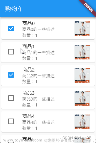
3.4 特殊的层叠布局:IndexedStack 组件
IndexedStack 是一个特殊类型的层叠布局,该布局允许显示子组件中的单个元素,基于一个索引值。
在Flutter中,IndexedStack是一个继承自 Stack 的特殊组件,它可以显示一个列表中指定索引(index)的子组件。与Stack不同,IndexedStack 只显示一个子组件,其他子组件在显示时不可见。
例如:
IndexedStack(
  index: 2,
  children: <Widget>[
    Container(
      width: 200,
      height: 200,
      color: Colors.blue,
    ),
    Container(
      width: 200,
      height: 200,
      color: Colors.red,
    ),
    Container(
      width: 200,
      height: 200,
      color: Colors.green,
    ),
  ],
)
在上面的示例中,IndexedStack组件包含了三个Container组件作为子组件。通过设置index属性为2,表示显示索引为2的子组件,即绿色的Container组件。蓝色和红色的Container组件则被隐藏。
通过使用IndexedStack组件,您可以轻松创建堆叠布局,并根据需要显示不同的子组件。这种布局方式特别适用于在同一个位置上切换显示不同内容的场景,如切换不同的页面或组件等。
官方一个完整的例子如:
该例子来源于此页面:https://api.flutter.dev/flutter/widgets/IndexedStack-class.html
import 'package:flutter/material.dart';
void main() => runApp(const IndexedStackApp());
class IndexedStackApp extends StatelessWidget {
const IndexedStackApp({super.key});
Widget build(BuildContext context) {
return MaterialApp(
home: Scaffold(
appBar: AppBar(title: const Text('IndexedStack Sample')),
body: const IndexedStackExample(),
),
);
}
}
class IndexedStackExample extends StatefulWidget {
const IndexedStackExample({super.key});
State<IndexedStackExample> createState() => _IndexedStackExampleState();
}
class _IndexedStackExampleState extends State<IndexedStackExample> {
List<String> names = <String>['Dash', 'John', 'Mary'];
int index = 0;
final TextEditingController fieldText = TextEditingController();
Widget build(BuildContext context) {
return Column(
mainAxisAlignment: MainAxisAlignment.center,
children: <Widget>[
SizedBox(
width: 300,
child: TextField(
decoration: const InputDecoration(
border: OutlineInputBorder(),
hintText: 'Enter the name for a person to track',
),
onSubmitted: (String value) {
setState(() {
names.add(value);
});
fieldText.clear();
},
controller: fieldText,
),
),
const SizedBox(height: 50),
Row(
mainAxisAlignment: MainAxisAlignment.center,
children: <Widget>[
GestureDetector(
onTap: () {
setState(() {
if (index == 0) {
index = names.length - 1;
} else {
index -= 1;
}
});
},
child: const Icon(Icons.chevron_left, key: Key('gesture1')),
),
Column(
mainAxisAlignment: MainAxisAlignment.center,
children: <Widget>[
IndexedStack(
index: index,
children: <Widget>[
for (String name in names) PersonTracker(name: name)
],
)
],
),
GestureDetector(
onTap: () {
setState(() {
if (index == names.length - 1) {
index = 0;
} else {
index += 1;
}
});
},
child: const Icon(Icons.chevron_right, key: Key('gesture2')),
),
],
)
],
);
}
}
class PersonTracker extends StatefulWidget {
const PersonTracker({super.key, required this.name});
final String name;
State<PersonTracker> createState() => _PersonTrackerState();
}
class _PersonTrackerState extends State<PersonTracker> {
int counter = 0;
Widget build(BuildContext context) {
return Container(
key: Key(widget.name),
decoration: BoxDecoration(
color: const Color.fromARGB(255, 239, 248, 255),
border: Border.all(color: const Color.fromARGB(255, 54, 60, 244)),
borderRadius: const BorderRadius.all(Radius.circular(10)),
),
padding: const EdgeInsets.all(16.0),
child: Column(
children: <Widget>[
Text('Name: ${widget.name}'),
Text('Score: $counter'),
TextButton.icon(
key: Key('increment${widget.name}'),
icon: const Icon(Icons.add),
onPressed: () {
setState(() {
counter += 1;
});
},
label: const Text('Increment'),
)
],
),
);
}
}

这个示例显示了一个 IndexedStack 组件,用于从一系列卡片中一次展示一张卡片,每张卡片都保持各自的状态。通过输入框输入可以增加卡片。
4. 弹性布局(Flex Layout)
在Flutter中,弹性布局是一种常用的布局方式,可以使用Expanded组件和Flexible组件来实现弹性布局。
4.1 Expanded 组件
Expanded 组件是弹性布局的关键组件之一,它用于将子组件 填充剩余的可用空间。
Expanded 组件通常作为父组件的子组件,并且会将剩余的空间按比例分配给其中的子组件。
例如:
Row(
  children: <Widget>[
    Expanded(
      child: Container(
        height: 100,
        color: Colors.blue,
      ),
    ),
    Expanded(
      child: Container(
        height: 100,
        color: Colors.red,
      ),
    ),
    Expanded(
      child: Container(
        height: 100,
        color: Colors.green,
      ),
    ),
  ],
)
在上面的示例中,Expanded 组件被用作 Row 布局的子组件,它包含了三个 Container 组件作为子组件。
每个 Expanded 组件都会自动填充剩余的水平空间,并按比例分配给子组件,从而使它们平均分布在 Row 布局中。
一个完整的例子如:
import 'package:flutter/material.dart';
void main() {
runApp(const MyApp());
}
class MyApp extends StatelessWidget {
const MyApp({super.key});
Widget build(BuildContext context) {
return MaterialApp(
home: Scaffold(
appBar: AppBar(title: const Text('Expanded组件示例')),
body: Column(
children: <Widget>[
Row(children: [
Expanded(
flex: 1,
child: Container(
color: Colors.red,
child: const Text('第一个组件'),
),
),
Expanded(
flex: 2,
child: Container(
color: Colors.green,
child: const Text('第二个组件'),
),
),
]),
Row(children: [
Expanded(
flex: 3,
child: Container(
color: Colors.blue,
child: const Text('第三个组件'),
),
),
Expanded(
flex: 4,
child: Container(
color: Colors.orange,
child: const Text('第四个组件'),
),
),
]),
],
),
),
);
}
}

在这个例子中,有两个 Row,每个 Row 中有两个 Expanded 组件,分别设置了不同的flex权重。每个 Expanded 组件包含一个颜色填充的容器以及文本
4.2 Flexible 组件
Flexible组件也是实现弹性布局的重要组件,它可以根据给定的比例来分配可用的空间。与Expanded组件不同的是,Flexible组件可以灵活地调整空间分配的比例,以满足布局的需求。下面是一个使用Flexible组件的示例代码:
Row(
  children: <Widget>[
    Flexible(
      flex: 2,
      child: Container(
        height: 100,
        color: Colors.blue,
      ),
    ),
    Flexible(
      flex: 1,
      child: Container(
        height: 100,
        color: Colors.red,
      ),
    ),
    Flexible(
      flex: 1,
      child: Container(
        height: 100,
        color: Colors.green,
      ),
    ),
  ],
)
在上面的示例中,Flexible组件被用作Row布局的子组件,它包含了三个Container组件作为子组件。每个Flexible组件通过设置flex属性来定义空间分配的比例,这样第一个子组件会占据2/4的空间,而后两个子组件会各自占据1/4的空间,从而实现了不同的比例分配。
一个完整的例子如:
import 'package:flutter/material.dart';
void main() {
runApp(const MyApp());
}
class MyApp extends StatelessWidget {
const MyApp({super.key});
Widget build(BuildContext context) {
return MaterialApp(
home: Scaffold(
appBar: AppBar(title: const Text('Flexible组件示例')),
body: Column(
children: <Widget>[
Row(children: [
Flexible(
flex: 1,
fit: FlexFit.tight,
child: Container(
color: Colors.red,
child: const Text('第一个组件'),
),
),
Flexible(
flex: 2,
fit: FlexFit.loose,
child: Container(
color: Colors.green,
child: const Text('第二个组件'),
),
),
]),
Row(children: [
Flexible(
flex: 3,
fit: FlexFit.tight,
child: Container(
color: Colors.blue,
child: const Text('第三个组件'),
),
),
Flexible(
flex: 4,
fit: FlexFit.loose,
child: Container(
color: Colors.orange,
child: const Text('第四个组件'),
),
),
]),
],
),
),
);
}
}

在此示例中,我们使用了两个Row 组件,其中每个 Row 包含两个 Flexible 组件。每个 Flexible 组件内部有一个带颜色的容器。
与 Expanded 类似,通过设置 flex 属性,可以控制子组件在行或列中占据的空间。此外,Flexible 组件还有一个 fit 属性,允许您设置子组件如何适应所分配的空间。在上面的示例中,我们所设置的 FlexFit.tight 指示子组件要占据所有可用空间,而 FlexFit.loose 则允许子组件在占用所需空间后仍然保持可用空间。
5. 流式布局(Flow Layout)
5.1 什么是流式布局
在 Flutter 中,流式布局指的是一种将子组件排列在多行或多列的布局方式,它可以自动根据屏幕尺寸调整子组件的排列。Flutter 框架提供了两种原生流式布局组件:
- Wrap 组件用于将一系列子组件按行排列,并在子组件长度超出容器宽度时自动换行。
-
Flow 组件是一个高度可定制的流式布局组件。
下面我们一一介绍之。
5.2 Wrap 组件
Wrap 组件用于创建 自动换行的流式布局,它可以容纳多个子组件,并在达到容器边界时自动换行。下面是一个使用 Wrap 组件创建流式布局的示例代码:
Wrap(
  spacing: 8.0,
  runSpacing: 8.0,
  children: <Widget>[
    Chip(
      label: Text('标签1'),
      backgroundColor: Colors.blue,
    ),
    Chip(
      label: Text('标签2'),
      backgroundColor: Colors.red,
    ),
    Chip(
      label: Text('标签3'),
      backgroundColor: Colors.green,
    ),
    Chip(
      label: Text('标签4'),
      backgroundColor: Colors.orange,
    ),
  ],
)
在上面的示例中,Wrap组件包含了四个Chip组件作为子组件。Wrap组件的spacing属性设置了子组件之间的水平间距为8.0,而runSpacing属性设置了子组件在新行上的垂直间距为8.0。当子组件的总宽度超过Wrap组件的宽度时,Wrap组件会自动将子组件放置在新行上。
5.3 Flow 组件
Flow组件是Flutter中一个强大且灵活的布局组件,它允许开发者自定义子组件在父组件中的位置。
使用Flow组件时,我们需要提供一个FlowDelegate对象,该对象负责控制子组件如何布局及排列。
5.3.1 使用 Flow 组件
要使用 Flow 组件,首先需要创建一个继承自FlowDelegate的子类,并实现其中的三个方法:
-
paintChildren:负责绘制子组件。 -
shouldRepaint:确定是否重绘子组件。通常在子组件位置或外观发生修改时返回true。 -
getSize:返回Flow组件的尺寸。
以下是一个简单的示例,展示了如何创建一个简单的自定义FlowDelegate子类:
class CustomFlowDelegate extends FlowDelegate {
void paintChildren(FlowPaintingContext context) {
// 实现子组件在父组件中的布局逻辑
}
bool shouldRepaint(FlowDelegate oldDelegate) {
// 确定是否需要重绘子组件
}
Size getSize(BoxConstraints constraints) {
// 返回Flow组件的尺寸
}
}
5.3.2 使用自定义FlowDelegate
创建好自定义的FlowDelegate子类后,我们可以在使用Flow组件时指定该子类的一个实例,如下所示:
Flow(
  delegate: CustomFlowDelegate(),
  children: <Widget>[
    // 添加子组件
  ],
)
5.3.3 一个 Flow 组件的完整例子
一个完整例子如:
import 'package:flutter/material.dart';
void main() {
runApp(const MyApp());
}
class MyApp extends StatelessWidget {
const MyApp({super.key});
Widget build(BuildContext context) {
return MaterialApp(
home: Scaffold(
appBar: AppBar(title: const Text('Flow组件示例')),
body: Flow(
delegate: MyFlowDelegate(),
children: List.generate(
6,
(index) => Container(
height: 50,
width: 50,
color: Colors.primaries[index],
child: Center(child: Text('${index + 1}')),
),
),
),
),
);
}
}
class MyFlowDelegate extends FlowDelegate {
void paintChildren(FlowPaintingContext context) {
double x = 10.0;
double y = 10.0;
for (int i = 0; i < context.childCount; i++) {
x += 60.0;
if (x > context.size.width - 50) {
x = 10.0;
y += 60.0;
}
context.paintChild(i, transform: Matrix4.translationValues(x, y, 0.0));
}
}
bool shouldRepaint(MyFlowDelegate oldDelegate) => true;
Size getSize(BoxConstraints constraints) {
return constraints.constrain(const Size(double.infinity, 300.0));
}
}

Flow 组件具有很高的自适应能力,能够对子组件的位置和布局进行精细控制。虽然Flow组件的使用场景相对少见,但在需要高度自定义布局的情况下,Flow组件将非常有用。
6. 表格布局(Table Layout)
在Flutter中,表格布局是一种常用的布局方式,可以使用Table组件来创建具有行和列的表格布局。
6.1 Table组件
Table组件用于创建表格布局,它以行和列的形式排列子组件。每个子组件被称为一个单元格,并根据给定的行和列进行定位。下面是一个使用Table组件创建表格布局的示例代码:
Table(
  border: TableBorder.all(),
  children: [
    TableRow(
      children: [
        TableCell(
          child: Text('单元格1'),
        ),
        TableCell(
          child: Text('单元格2'),
        ),
      ],
    ),
    TableRow(
      children: [
        TableCell(
          child: Text('单元格3'),
        ),
        TableCell(
          child: Text('单元格4'),
        ),
      ],
    ),
  ],
)
在上面的示例中,Table组件包含了两个TableRow组件作为子组件,每个TableRow组件代表一行。每行又包含了两个TableCell组件作为子组件,每个TableCell组件代表一个单元格。通过嵌套的方式,您可以创建具有多行多列的表格布局。
Table组件的border属性可以设置表格的边框样式,以增加可读性和美观性。
一个完整的例子如:
import 'package:flutter/material.dart';
void main() {
runApp(MyApp());
}
class MyApp extends StatelessWidget {
Widget build(BuildContext context) {
return MaterialApp(
home: Scaffold(
appBar: AppBar(title: const Text('Table Example')),
body: Center(
child: Container(
padding: const EdgeInsets.all(16),
child: Table(
border: TableBorder.all(color: Colors.black, width: 1),
defaultColumnWidth: const IntrinsicColumnWidth(),
columnWidths: const {
0: FlexColumnWidth(1),
1: FlexColumnWidth(3),
},
children: const [
TableRow(
children: [
TableCell(
child: Text('Header 1', textAlign: TextAlign.center)),
TableCell(
child: Text('Header 2', textAlign: TextAlign.center)),
],
),
TableRow(
children: [
TableCell(
child:
Text('Row 1 Col 1', textAlign: TextAlign.center)),
TableCell(
child:
Text('Row 1 Col 2', textAlign: TextAlign.center)),
],
),
TableRow(
children: [
TableCell(
child:
Text('Row 2 Col 1', textAlign: TextAlign.center)),
TableCell(
child:
Text('Row 2 Col 2', textAlign: TextAlign.center)),
],
),
],
),
),
),
),
);
}
}

7. 限制布局(Constraint Layout)
在Flutter中,限制布局是一种常用的布局方式,可以使用LimitedBox组件和ConstrainedBox组件来实现对子组件尺寸的限制和约束。
7.1 LimitedBox 组件
LimitedBox组件用于 限制子组件的最大尺寸,可以通过设置maxWidth和maxHeight属性来限制子组件的宽度和高度。LimitedBox组件会尽量将子组件的尺寸限制在指定的最大尺寸范围内。
注意:只有在父组件没有限制子组件大小时,LimitedBox才会发挥作用。
例如,当子组件嵌套在一个无限宽高的组件(如ListView)中时,可以使用 LimitedBox 来限制子组件的大小:
import 'package:flutter/material.dart';
void main() {
runApp(const MyApp());
}
class MyApp extends StatelessWidget {
const MyApp({super.key});
Widget build(BuildContext context) {
return MaterialApp(
home: Scaffold(
appBar: AppBar(title: const Text('LimitedBox Example')),
body: ListView(
children: const [
LimitedBoxWidget(),
LimitedBoxWidget(),
LimitedBoxWidget(),
],
),
),
);
}
}
class LimitedBoxWidget extends StatelessWidget {
const LimitedBoxWidget({super.key});
Widget build(BuildContext context) {
return LimitedBox(
maxWidth: 100,
maxHeight: 100,
child: Container(
width: double.infinity,
height: double.infinity,
color: Colors.blue,
child: const Center(
child: Text(
'LimitedBox',
style: TextStyle(fontSize: 24, color: Colors.white),
),
),
),
);
}
}

在这个示例中,我们在一个ListView中创建了3个LimitedBoxWidget。LimitedBoxWidget 是一个自定义的 StatelessWidget,其内部包含一个 LimitedBox 组件和一个宽高均为 double.infinity 的蓝色 Container。
由于ListView 本身没有限制子组件的大小,LimitedBox 会将子组件的宽高限制在最大 100 像素,从而创建一个等大小的蓝色矩形。在这种情况下,LimitedBox 的限制生效,以展示如何在特定场景下限制子组件的大小。
7.2 ConstrainedBox 组件
ConstrainedBox组件用于对子组件的尺寸进行约束和限制,可以通过设置constraints属性来指定约束条件。constraints属性接受BoxConstraints对象,该对象定义了子组件的最小和最大宽度和高度等约束。下面是一个使用ConstrainedBox组件对子组件尺寸进行约束的示例代码:
ConstrainedBox(
  constraints: BoxConstraints(
    minWidth: 100,
    maxWidth: 200,
    minHeight: 50,
    maxHeight: 100,
  ),
  child: Container(
    width: 150,
    height: 80,
    color: Colors.red,
  ),
)
在上面的示例中,ConstrainedBox组件的constraints属性设置了子组件的最小宽度为100,最大宽度为200,最小高度为50,最大高度为100。子组件Container的宽度为150,高度为80,但由于ConstrainedBox的约束条件,实际上显示的宽度为150(在最小和最大宽度范围内),高度为80(在最小和最大高度范围内)。
再一个完整例子如:
import 'package:flutter/material.dart';
void main() {
runApp(const MyApp());
}
class MyApp extends StatelessWidget {
const MyApp({super.key});
Widget build(BuildContext context) {
return MaterialApp(
home: Scaffold(
appBar: AppBar(title: const Text('ConstrainedBox Example')),
body: Center(
child: ConstrainedBox(
constraints: const BoxConstraints(
maxWidth: 100,
),
child: Container(
color: Colors.blue,
child: const Text(
'ConstrainedBox',
textAlign: TextAlign.center,
style: TextStyle(
fontSize: 24, color: Color.fromARGB(255, 168, 44, 44)),
),
),
),
),
),
);
}
}

8. 宽高比布局:AspectRatio组件
在Flutter中,宽高比布局是一种常用的布局方式,可以使用AspectRatio组件来实现根据指定宽高比例调整子组件的尺寸。AspectRatio,它通过设置aspectRatio属性来指定宽高比例。AspectRatio组件会根据指定的宽高比例调整子组件的尺寸,以保持宽高比例不变。下面是一个使用AspectRatio组件创建宽高比布局的示例代码:
AspectRatio(
  aspectRatio: 16 / 9,
  child: Container(
    color: Colors.blue,
  ),
)
在上面的示例中,AspectRatio组件的aspectRatio属性设置为16 / 9,表示宽高比为16:9。子组件Container的尺寸会根据这个宽高比例进行调整,以保持16:9的宽高比。
可以根据实际需求调整AspectRatio组件的aspectRatio属性,从而实现不同的宽高比例布局。这种布局方式特别适用于需要固定宽高比例的场景,如展示图片或视频的封面、轮播图等。
注意:AspectRatio组件不会对子组件的宽高进行强制调整,而是通过调整父组件的尺寸来保持宽高比例不变。如果子组件的宽高比例与AspectRatio组件的aspectRatio不一致,子组件可能会被裁剪或留有空白区域。
一个完整的例子如:
import 'package:flutter/material.dart';
void main() {
runApp(const MyApp());
}
class MyApp extends StatelessWidget {
const MyApp({super.key});
Widget build(BuildContext context) {
return MaterialApp(
home: Scaffold(
appBar: AppBar(title: const Text('AspectRatio Example')),
body: Center(
child: Container(
width: 200,
height: 200,
color: Colors.yellow,
child: AspectRatio(
aspectRatio: 16 / 9,
child: Container(
color: Colors.blue,
child: const Center(
child: Text(
'16:9',
style: TextStyle(
fontSize: 24,
color: Colors.white,
),
),
),
),
),
),
),
),
);
}
}
 文章来源地址https://www.toymoban.com/news/detail-504702.html
到了这里,关于Flutter开发笔记:Flutter 布局相关组件的文章就介绍完了。如果您还想了解更多内容,请在右上角搜索TOY模板网以前的文章或继续浏览下面的相关文章,希望大家以后多多支持TOY模板网!