uni-app下拉框 可输入下拉框 搜索+选择组合框功能
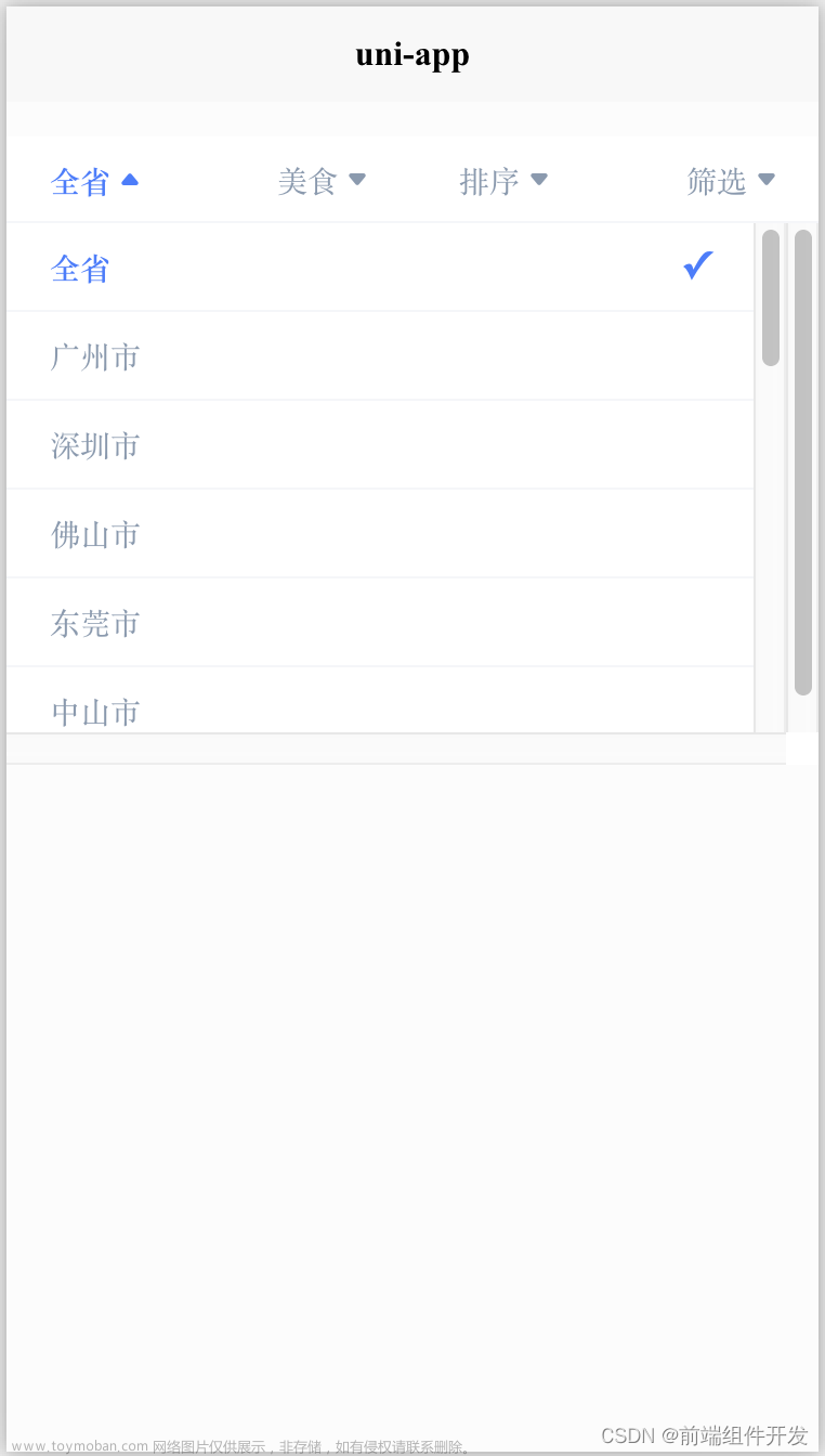
效果图


插件示例地址文章来源地址https://www.toymoban.com/news/detail-513380.html
https://ext.dcloud.net.cn/plugin?id=3756
<!-- 页面添加该标签 -->
<template>
    <view>
		<combox-search label="选择职位:" labelWidth="130px" emptyTips="无匹配选项" :isJSON="true" :keyName="keyName"
			placeholder="请选择职位" :candidates="zhiweiList" @getValue="getValue"></combox-search>
	</view>
</template>

<script>
<!-- 引入该vue文件 -->
	import combox_Searchfrom "@/pages/components/cuihai-combox/cuihai-combox.vue"
	export default {
		components: {
			combox_Search
		},
		data() {
			return {
				keyName: 'keyName',
				form: {

					zhiweiId: '', //职位id

				},
				zhiweiList: [], //职位

			}
		},
		onLoad() {
			this.getzhiweiList();

		},
		methods: {
			getValue(e) {
				console.log(e)
				this.form.zhiweiId= e.zhiweiId
			},
			onchange(e) {
				const value = e.detail.value
			},
			goBack() {
				uni.navigateTo({
					url: '/pages/menu/menu'
				})
			},
			changeLog(e) {},
			//查询职位
			getzhiweiList() {
				//查询方法接口
			},
		}

	}
</script>
//下载后并在项目中添加该文件
<template>
	<view class="uni-combox">
		<view v-if="label" class="uni-combox__label" :style="labelStyle">
			<text>{{label}}</text>
		</view>
		<view class="uni-combox__input-box">
			<input class="uni-combox__input" style="margin-left: -14px;" type="text" :placeholder="placeholder" :disabled="isDisabled" v-model="inputVal"
			 @input="onInput" @focus="onFocus" @blur="onBlur" />
			 <!--自测真机测试可以使用清除按钮 -->
			<icon type="clear" size="10" @tap="clearInputValue" v-if="!isDisabled" />
			<!-- <uni-icons class="uni-combox__input-arrow" type="arrowdown" size="14" @click="toggleSelector"></uni-icons> -->
			<view class="uni-combox__selector" v-if="showSelector">
				<scroll-view scroll-y="true" class="uni-combox__selector-scroll">
					<view class="uni-combox__selector-empty" v-if="filterCandidatesLength === 0">
						<text>{{emptyTips}}</text>
					</view>
					<view class="uni-combox__selector-item" v-for="(item,index) in filterCandidates" :key="index" @click="onSelectorClick(item)"
					 :style="isCheck(index)?'color:'+selectColor+';background-color:'+selectBgColor+';':'color:'+color+';'">
						<text>{{isJSON?item[keyName]:item}}</text>
					</view>
				</scroll-view>
			</view>
		</view>
	</view>
</template>

<script>
	/**
	 * Combox 组合输入框
	 * @description 组合输入框一般用于既可以输入也可以选择的场景
	 * @property {String} label 左侧文字
	 * @property {String} labelWidth 左侧内容宽度
	 * @property {String} placeholder 输入框占位符
	 * @property {Array} candidates 候选项列表
	 * @property {String} emptyTips 筛选结果为空时显示的文字
	 * @property {String} value 单选时组合框的初始值
	 * @property {Array} initValue 多选时组合框的初始值(下标集合)
	 * @property {String} keyName json数组显示的字段值
	 * @property {Boolean} isJSON 是否是json数组,默认不是
	 * @property {Boolean} isDisabled 是否是禁用输入,默认不禁用
	 * @property {Boolean} isCheckBox 是否是多选,默认不是,多选时不能输入查询
	 * @property {String} color 默认字体颜色,默认#000000
	 * @property {String} selectColor 选中字体颜色,默认#0081ff
	 * @property {String} selectBgColor 选中背景颜色,默认#e8e8e8
	 */
	export default {
		name: 'comboxSearch',
		props: {
			label: {
				type: String,
				default: ''
			},
			labelWidth: {
				type: String,
				default: 'auto'
			},
			placeholder: {
				type: String,
				default: ''
			},
			candidates: {
				type: Array,
				default () {
					return []
				}
			},
			emptyTips: {
				type: String,
				default: '无匹配项'
			},
			value: {
				type: String,
				default: ''
			},
			initValue: {
				type: Array,
				default: null
			},
			keyName: {
				type: String,
				default: ''
			},
			isJSON: {
				type: Boolean,
				default: false
			},
			isDisabled: {
				type: Boolean,
				default: false
			},
			isCheckBox: {
				type: Boolean,
				default: false
			},
			color: {
				default: "#000000",
				type: String
			},
			selectColor: {
				default: "#0081ff",
				type: String
			},
			selectBgColor: {
				default: "#e8e8e8",
				type: String
			}
		},
		data() {
			return {
				showSelector: false,
				inputVal: '',
				arrays: [],
				gid: `sm-org-dropDown-${(new Date()).getTime()}${Math.random()}`
			}
		},
		computed: {
			labelStyle() {
				if (this.labelWidth === 'auto') {
					return {}
				}
				return {
					width: this.labelWidth
					//width: 130
				}
			},
			filterCandidates() {
				if (!this.isDisabled) {
					if (this.isJSON) {
						let index = 0;
						return this.candidates.filter((item) => {
							item.index = index;
							index++;
							return item[this.keyName].indexOf(this.inputVal) > -1
						})
					} else {
						return this.candidates.filter((item) => {
							return item.indexOf(this.inputVal) > -1
						})
					}
				} else {
					if (this.isJSON) {
						let index = 0;
						return this.candidates.filter((item) => {
							item.index = index;
							index++;
							return item[this.keyName] != undefined;
						})
					} else {
						return this.candidates
					}
				}
			},
			filterCandidatesLength() {
				return this.filterCandidates.length
			}
		},
		created() {
			if (this.initValue != null) {
				this.arrays = this.initValue;
				this.inputVal = this.getInpuevals();
			}
			//在created的时候,给子组件放置一个监听,这个时候只是监听器被建立,此时这段代码不会生效
			//uni.$on接收一个sm-org-dropDown-show的广播
			uni.$on('sm-org-dropDown-show', (targetId) => {
				//接收广播,当该组件处于下拉框被打开的状态,并且跟下一个被点击的下拉框的gid不同时,将该组件的下拉框关闭,产生一个互斥效果。
				if (this.showSelector && this.gid != targetId) {
					this.showSelector = false
				}
			})
		},
		//当子组件销毁的时候,将建立的监听销毁,这里不会影响代码效果,但是在多次反复引用组件时,会在根节点定义越来越多的监听,长此以往影响性能,所以在不用的时候及时销毁,养成好习惯
		beforeDestroy() {
			uni.$off('sm-org-dropDown-show')
		},
		watch: {
			value: {
				handler(newVal) {
					this.inputVal = newVal
				},
				immediate: true
			}
		},
		methods: {
			toggleSelector() {
				this.showSelector = !this.showSelector
				if (this.showSelector) {
					uni.$emit('sm-org-dropDown-show', this.gid)
				}
			},
			onFocus() {
				this.showSelector = true;
				uni.$emit('sm-org-dropDown-show', this.gid)
			},
			onBlur() {
				/* setTimeout(() => {
					this.showSelector = false;
				}, 50) */
			},
			onSelectorClick(index) {
				var itemPlus = index
				var items = index.id
				index = index.index
				if (this.isCheckBox) {
					let flag = this.arrays.indexOf(index);
					if (flag != -1) {
						let x = (this.arrays || []).findIndex((item) => item === index)
						this.arrays.splice(x, 1);
					} else {
						this.arrays.push(index);
					}
					this.inputVal = this.getInpuevals();
					if (this.isJSON) {
						this.$emit('getValue', this.arrays);
					} else {
						this.$emit('getValue', this.trimSpace(this.inputVal.split(" ")));
					}
				} else {
					this.showSelector = false
					if (this.isJSON) {
						this.$emit('getValue', itemPlus);
						//循环根据页面数据传入的数据下标获取搜索时的名称跟id  并展示
						for (var i = 0; i < this.filterCandidates.length; i++){
							if(this.filterCandidates[i].index == index) {
								this.inputVal = this.filterCandidates[i].name;
							}

						}
					} else {
						this.$emit('getValue', this.filterCandidates[index]);
						this.inputVal = this.filterCandidates[index]
					}
				}
			},
			trimSpace(array) {
				for (var i = 0; i < array.length; i++) {
					if (array[i] == "") {
						array.splice(i, 1);
						i = i - 1;
					}
				}
				return array;
			},
			onInput() {
				setTimeout(() => {
					this.$emit('input', this.inputVal)
				})
			},
			clearInputValue() {
				this.inputVal = "";
				this.showSelector = false;
			},
			getInpuevals() {
				if (this.arrays.length == 0) {
					this.inputVal = "";
				} else {
					this.arrays.sort(function(a, b) {
						return a - b
					})
					this.inputVal = "";
					if (this.isJSON) {
						this.arrays.forEach(v => {
							this.inputVal += this.candidates[v][this.keyName] + " ";
						});
					} else {
						this.arrays.forEach(v => {
							this.inputVal += this.candidates[v] + " ";
						});
					}
				}
				return this.inputVal;
			},
			isCheck(index) {

				return this.arrays.indexOf(index) != -1;
			}
		}
	}
</script>
文章来源:https://www.toymoban.com/news/detail-513380.html
到了这里,关于uni-app下拉框 可实现输入下拉框 搜索+选择组合框功能的文章就介绍完了。如果您还想了解更多内容,请在右上角搜索TOY模板网以前的文章或继续浏览下面的相关文章,希望大家以后多多支持TOY模板网!