涉及技术点
遮罩层样式,自定义组件,子组件套用组件,子组件调用父组件方法,组件属性监听,输入框默认获得焦点,输入框数据双向绑定
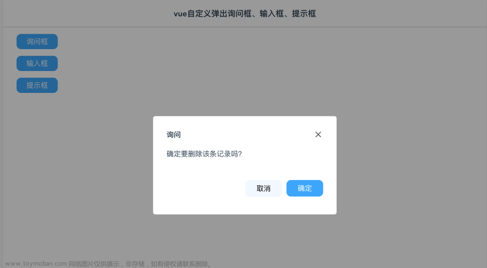
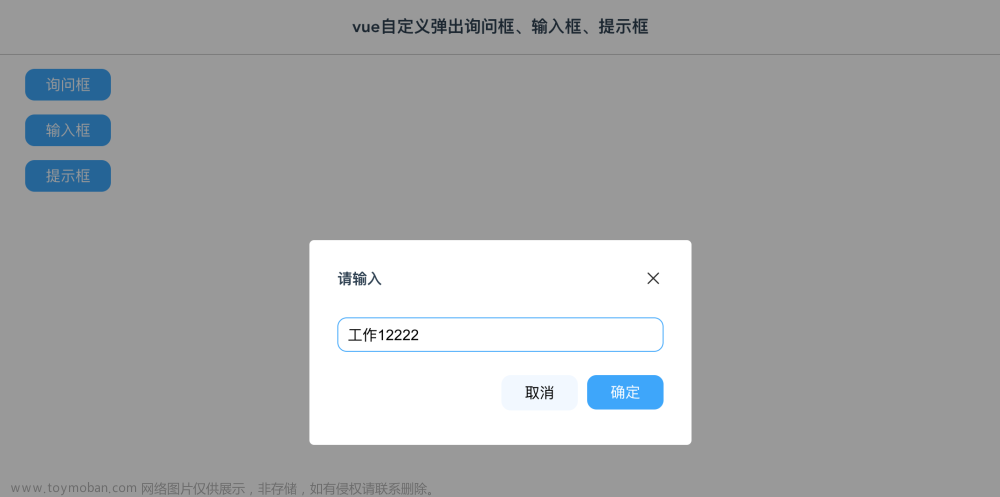
效果图
询问框:
输入框:
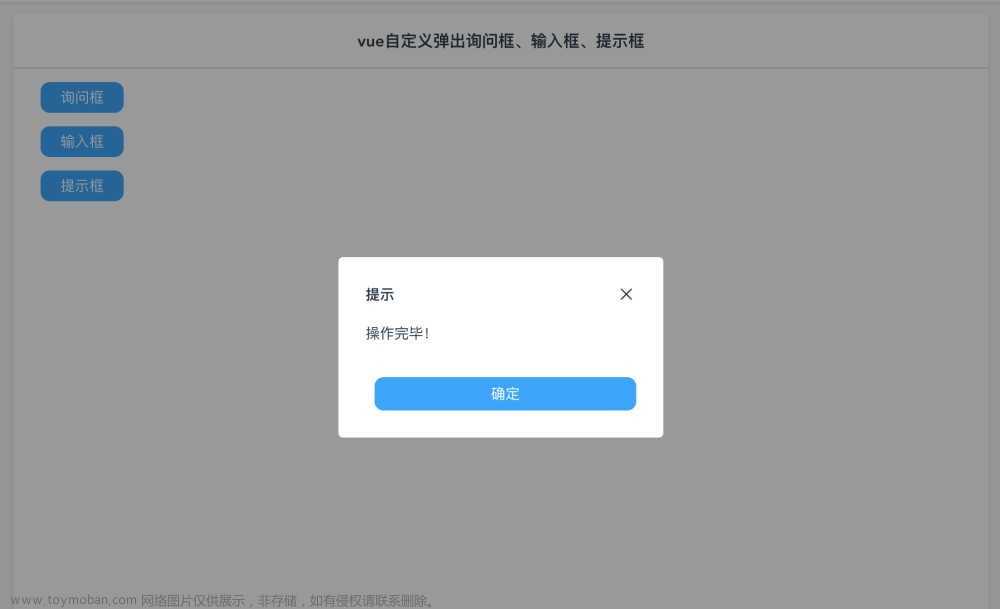
提示框
询问框组件代码
<template>
  <div v-if="show" class="mask">
    <div class="dlg-msg-box flex flex-col">
      <div class="flex flex-space-between full-width">
        <div class="font-bold">{{caption}}</div>
        <div class="pointer" @click="close"><img class="logo-22" src="@/assets/images/guanbi.png"/></div>
      </div>
      <div class="margin-top-l" style="height:45px;">{{msg}}</div>
      <div class="flex flex-end margin-top-xl">
        <div class="btn-huibai-auto pointer" style="width:80px" @click="cancelClick">取消</div>
        <div class="margin-left-m btn-blue-auto pointer" style="width:80px" @click="confirmClick">确定</div>
      </div>
    </div>
  </div>
</template>

<script>


export default {
    name: 'MsgBox',//组件递归必须有name属性 不然无法递归
    props: {
        caption:{},
        show: {},
        msg:{},
    },
    data() {
        return {
        }
    },

    methods: {
        close() {
            this.$emit('close');
        },
        confirmClick() {
            this.$emit('confirm');
        },
        cancelClick() {
            this.$emit('cancel');
        }

    }
}
</script>

<style>
    .dlg-msg-box {
        border-radius: 5px;
        width: 350px;
        height: 160px;
        background-color: #fff;
        padding: 30px;
        position: absolute;
        top: 0;
        bottom: 0;
        left: 0;
        right: 0;
        margin: auto;
    }
</style>
输入框组件代码
<template>
    <div v-if="show" class="mask">
      <div class="dlg-input-box flex flex-col">
        <div class="flex flex-space-between full-width">
          <div class="font-bold">{{caption}}</div>
          <div class="pointer" @click="close"><img class="logo-22" src="@/assets/images/guanbi.png"/></div>
        </div>
        <div class="margin-top-xl flex flex-col">
            <input class="input-box" placeholder="请输入" v-model="inputValue" ref="getfocus"/>
        </div>
        <div class="flex flex-end margin-top-xl">
          <div class="btn-huibai-auto pointer" style="width:80px" @click="cancelClick">取消</div>
          <div class="margin-left-m btn-blue-auto pointer" style="width:80px" @click="confirmClick">确定</div>
        </div>
      </div>
      <msg-show caption="提示" :msg="msgText" :show="showMessage" @close="showMessage=false"></msg-show>
    </div>
  </template>

  <script>

  import MsgShow from '@/components/MsgShow'

  export default {
      name: 'InputBox',//组件递归必须有name属性 不然无法递归
      props: {
          caption:{},
          value:{},
          show: {},
      },
      components: {
        MsgShow
      },
      watch: {
        show(val){
            if (val == true) {
                this.$nextTick(() => {
                    this.$refs.getfocus.focus();
                })
            }
        },
        value(val){
          this.inputValue = val;
        }

      },
      data() {
          return {
            showMessage:false,
            inputValue:'',
            msgText:''
          }
      },

      methods: {

          close() {
            this.$emit('close');
          },
          confirmClick() {
            if (this.inputValue == "") {
                this.msgText = "内容未填写";
                this.showMessage = true;
            } else {
                this.$emit('confirm', this.inputValue);
            }

          },
          cancelClick() {
            this.$emit('cancel');
          }

      }
  }
  </script>

  <style>
      .dlg-input-box {
          border-radius: 5px;
          width: 350px;
          height: 160px;
          background-color: #fff;
          padding: 30px;
          position: absolute;
          top: 0;
          bottom: 0;
          left: 0;
          right: 0;
          margin: auto;
      }
  </style>
提示框组件代码
<template>
    <div v-if="show" class="mask">
      <div class="dlg-show flex flex-col">
        <div class="flex flex-space-between full-width">
          <div class="font-bold">{{caption}}</div>
          <div class="pointer" @click="close"><img class="logo-22" src="@/assets/images/guanbi.png"/></div>
        </div>
        <div class="margin-top-l" style="height:45px;">{{msg}}</div>
        <div class="flex flex-end margin-top-xl">
          <div class="margin-left-m btn-blue-auto pointer full-width" @click="confirmClick">确定</div>
        </div>
      </div>
    </div>
  </template>

  <script>

  export default {
      name: 'MsgShow',//组件递归必须有name属性 不然无法递归
      props: {
          caption:{},
          show: {},
          msg:{},
      },
      data() {
          return {
          }
      },

      methods: {
          close() {
              this.$emit('close');
          },
          confirmClick() {
              this.$emit('close');
          }
      }
  }
  </script>

  <style>
      .dlg-show {
          border-radius: 5px;
          width: 300px;
          height: 140px;
          background-color: #fff;
          padding: 30px;
          position: absolute;
          top: 0;
          bottom: 0;
          left: 0;
          right: 0;
          margin: auto;
      }
  </style>
父组件代码
<template>
    <div class="body">
      <div class="table">
        <div class="filter font-bold">vue自定义弹出询问框、输入框、提示框</div>
        <div class="padding-left-l padding-right-l">

          <div class="pointer cannotselect margin-top-l margin-left-l btn-blue-full" @click="MsgBoxClick">询问框</div>
          <div class="pointer cannotselect margin-top-l margin-left-l btn-blue-full" @click="InputBoxClick">输入框</div>
          <div class="pointer cannotselect margin-top-l margin-left-l btn-blue-full" @click="MsgShowClick">提示框</div>

          <msg-box :caption="caption" :msg="msgText" :show="showMsgBox" @close="showMsgBox=false"  @confirm="MsgBoxYes" @cancel="showMsgBox=false">
          </msg-box>
          <msg-show :caption="caption" :msg="msgText" :show="showMsgShow" @close="showMsgShow=false">
          </msg-show>
          <input-box :caption="caption" :show="showInput" :value="inputValue" @close="showInput=false" @confirm="inputBoxYes" @cancel="showInput=false">
          </input-box>
        </div>

      </div>
    </div>
</template>

<script>
/*
       名称:vue自定义弹出询问框、输入框、提示框
       功能:自定义属于自己的弹出窗,涉及到技术点:遮罩层样式,自定义组件,子组件套用组件,子组件调用父组件方法,组件属性监听,输入框默认获得焦点,输入框数据双向绑定
       作者:唐赢
       时间:2023-1-17
*/
  import InputBox from '@/components/InputBox'
  import MsgBox from '@/components/MsgBox'
  import MsgShow from '@/components/MsgShow'

  export default {
    name: 'Main',
    components: {
      InputBox,MsgBox,MsgShow
    },
    data () {
      return {

        inputValue:'',
        caption: '',
        msgText: '',
        showMsgBox : false,
        showMsgShow: false,
        showInput: false,

      }
    },
    methods: {
      MsgBoxClick() {
        this.caption = "询问";
        this.msgText = "确定要删除该条记录吗?"
        this.showMsgBox = true;
      },
      InputBoxClick() {
        this.caption = "请输入";
        this.inputValue = "工作";
        this.showInput = true;
      },
      MsgShowClick() {
        this.caption = "提示";
        this.msgText = "操作完毕!";
        this.showMsgShow = true;
      },
      MsgBoxYes(){
        this.showMsgBox = false;
        this.caption = "提示";
        this.msgText = "您选择了确定操作";
        this.showMsgShow = true;
      },
      inputBoxYes(value){
        console.log(value);
        this.showInput = false;

        this.caption = "提示";
        this.msgText = "您输入的值是【" + value + "】";
        this.showMsgShow = true;


      }
    },


  }
</script>

  <!-- Add "scoped" attribute to limit CSS to this component only -->
  <style scoped>
  .body {
    display: flex;
    justify-content: center;
    margin-top: 73px;
    width: 100%;
  }
  .table {
    background-color: #fff;
    width: 1080px;
    min-height: 800px;
    box-shadow: 0px 3px 6px rgba(0, 0, 0, .1);
    margin-bottom: 10px;
  }
  .filter {
    display: flex;
    height: 60px;
    align-items:center;
    background-color: #fff;
    font-size: 18px;
    justify-content: center;
    border-bottom: 1px solid rgba(0, 0, 0, .2);;
  }


  </style>
下载及演示
操作演示地址:https://lusun.com/v/Szth3xngrsH文章来源:https://www.toymoban.com/news/detail-515879.html
源码地址:https://download.csdn.net/download/gdgztt/87389680文章来源地址https://www.toymoban.com/news/detail-515879.html
到了这里,关于vue自定义弹出询问框、输入框、提示框(附源码及演示视频)的文章就介绍完了。如果您还想了解更多内容,请在右上角搜索TOY模板网以前的文章或继续浏览下面的相关文章,希望大家以后多多支持TOY模板网!