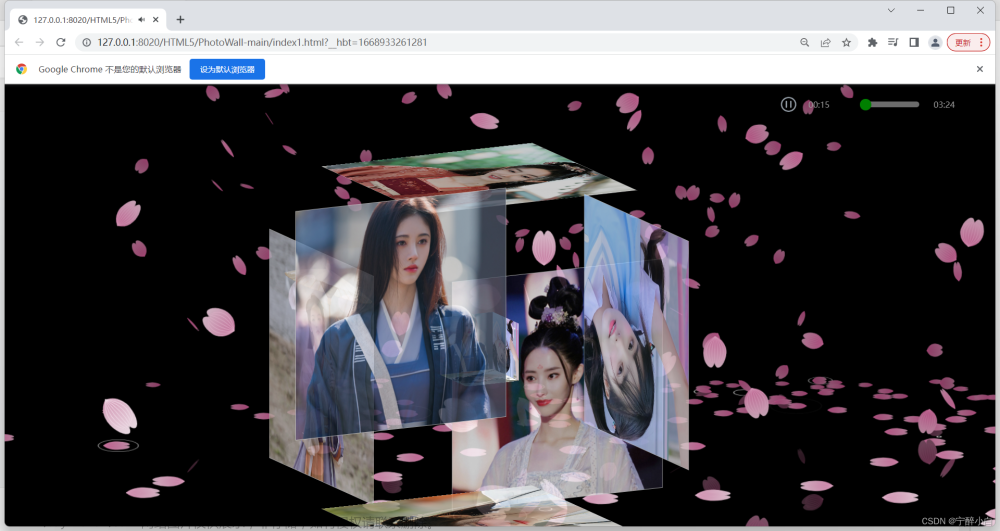
利用程序呈现图片,可以俘获一众女生的心,增加音乐可以实现图片变化的同时也带上了想要得到效果,如此一程序实乃众人之喜。
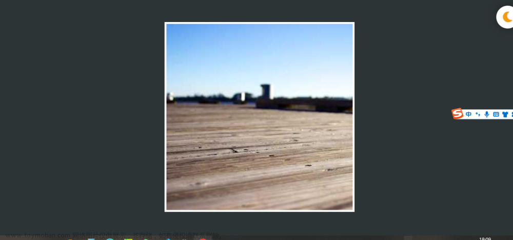
先看看程序呈现的效果,还是特别吸引人的。
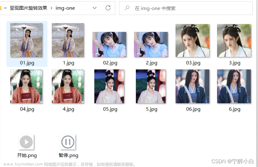
先在网上爬取想要呈现的美女照片,存放在文件夹img-one,与程序路径一致。
图片像素需进行调整,同一面图片可以使用同一个图片,保持图片像素一致的同时也增加了立体感。第二张02.jpg和2.jpg可以倒着放,这样在程序实现的时候,可以和其他方向的图片一致。
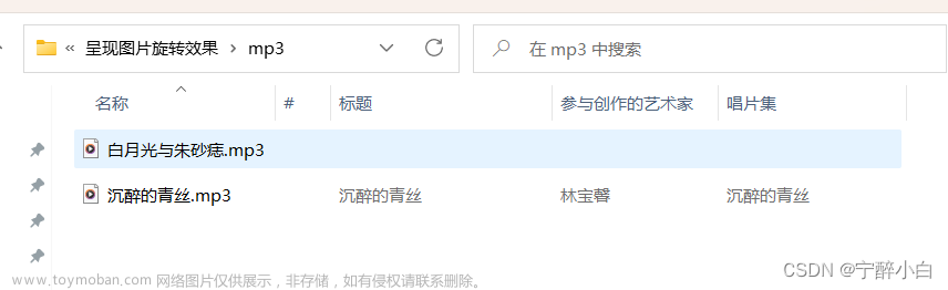
从网上下载自己想要播放的音乐,保存在文件mp3内。
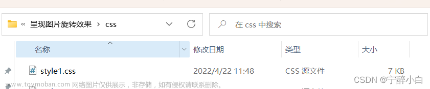
接下来就是前端呈现的代码了,利用HBuilder实现HTML5代码的编写。
<!DOCTYPE html>
<html>
<head>
<meta charset="utf-8" />
<title></title>
<script type="text/javascript" src="http://apps.bdimg.com/libs/jquery/2.1.4/jquery.min.js"></script>
<link type="text/css" href="./css/style1.css" rel="stylesheet" />
<!--
作者:ning@qq.com
时间:2022-11-20
描述:style1.css文件为调用图片的代码,img-one为存放图片的文件,mp3为需要播放的音乐
需注意调整图片像素值,否则呈现不完整
-->
<style>
html,
body {
width: 100%;
height: 100%;
margin: 0;
padding: 0;
overflow: hidden;
}
.container {
width: 100%;
height: 100%;
margin: 0;
padding: 0;
background-color: #000000;
}
</style>
</head>
<body>
<div class="m-main">
<div class="player">
<a href="javascript:void(0)" rel="external nofollow" rel="external nofollow" id="js-play">
<img src="./img-one/开始.png" alt="" id="img1"/>
</a>
<a href="javascript:void(0)" rel="external nofollow" rel="external nofollow" id="js-pause">
<img src="./img-one/暂停.png" alt="" id="img2"/>
</a>
<div class="play-box">
<div class="left">
<p class="timeline"><span style=""></span></p>
<div class="info">
<span class="size">00:00</span>
<span class="timeshow">00:00</span>
</div>
</div>
</div>
</div>
<div class="video">
<video controls autoplay name="media" id="js-video"><source src="./mp3/白月光与朱砂痣.mp3" type="video/mp4"></video>
</div>
</div>
</div>
<div id="jsi-cherry-container" class="container">
<div class="box">
<ul class="minbox">
<li></li>
<li></li>
<li></li>
<li></li>
<li></li>
<li></li>
</ul>
<ol class="maxbox">
<li></li>
<li></li>
<li></li>
<li></li>
<li></li>
<li></li>
</ol>
</div>
</div>
<script>
$(function () {
AudioControl('js-video');
function AudioControl(id) {
// 音频控制进度条
console.log(777);
var audio = document.getElementById(id);
$(audio).on('loadedmetadata', function () {
audio.pause();
// 进度条控制
$(document).on('touchend', '.timeline', function (e) {
var x = e.originalEvent.changedTouches[0].clientX - this.offsetLeft;
var X = x < 0 ? 0 : x;
var W = $(this).width();
var place = X > W ? W : X;
audio.currentTime = (place / W).toFixed(2) * audio.duration;
$(this).children().css({
width: (place / W).toFixed(2) * 100 + "%"
})
});
// 播放
$(document).on('click', '#js-play', function () {
audio.play()
$('#img1').css("display","none");
$('#img2').css("display","block");
});
// 暂停
$(document).on('click', '#js-pause', function () {
audio.pause()
$('#img1').css("display","block");
$('#img2').css("display","none");
});
});
setInterval(function () {
var currentTime = audio.currentTime;
setTimeShow(currentTime);
}, 1000);
// 设置播放时间
function setTimeShow(t) {
t = Math.floor(t);
var playTime = secondToMin(audio.currentTime);
$(".size").html(playTime);
$('.timeshow').text(secondToMin(audio.duration));
$('.timeline').children().css({
width: (t / audio.duration).toFixed(4) * 100 + "%"
})
}
// 计算时间
function secondToMin(s) {
var MM = Math.floor(s / 60);
var SS = s % 60;
if (MM < 10)
MM = "0" + MM;
if (SS < 10)
SS = "0" + SS;
var min = MM + ":" + SS;
return min.split('.')[0];
}
}
})
var RENDERER = {
INIT_CHERRY_BLOSSOM_COUNT: 30,
MAX_ADDING_INTERVAL: 10,
init: function () {
this.setParameters();
this.reconstructMethods();
this.createCherries();
this.render();
if (
navigator.userAgent.match(
/(phone|pod|iPhone|iPod|ios|Android|Mobile|BlackBerry|IEMobile|MQQBrowser|JUC|Fennec|wOSBrowser|BrowserNG|WebOS|Symbian|Windows Phone)/i
)
) {
var box = document.querySelectorAll('.box')[0];
console.log(box, '移动端');
box.style.marginTop = '65%';
}
},
setParameters: function () {
this.$container = $('#jsi-cherry-container');
this.width = this.$container.width();
this.height = this.$container.height();
this.context = $('<canvas />')
.attr({
width: this.width,
height: this.height
})
.appendTo(this.$container)
.get(0)
.getContext('2d');
this.cherries = [];
this.maxAddingInterval = Math.round(
(this.MAX_ADDING_INTERVAL * 1000) / this.width
);
this.addingInterval = this.maxAddingInterval;
},
reconstructMethods: function () {
this.render = this.render.bind(this);
},
createCherries: function () {
for (
var i = 0,
length = Math.round(
(this.INIT_CHERRY_BLOSSOM_COUNT * this.width) / 1000
); i < length; i++
) {
this.cherries.push(new CHERRY_BLOSSOM(this, true));
}
},
render: function () {
requestAnimationFrame(this.render);
this.context.clearRect(0, 0, this.width, this.height);
this.cherries.sort(function (cherry1, cherry2) {
return cherry1.z - cherry2.z;
});
for (var i = this.cherries.length - 1; i >= 0; i--) {
if (!this.cherries[i].render(this.context)) {
this.cherries.splice(i, 1);
}
}
if (--this.addingInterval == 0) {
this.addingInterval = this.maxAddingInterval;
this.cherries.push(new CHERRY_BLOSSOM(this, false));
}
}
};
var CHERRY_BLOSSOM = function (renderer, isRandom) {
this.renderer = renderer;
this.init(isRandom);
};
CHERRY_BLOSSOM.prototype = {
FOCUS_POSITION: 300,
FAR_LIMIT: 600,
MAX_RIPPLE_COUNT: 100,
RIPPLE_RADIUS: 100,
SURFACE_RATE: 0.5,
SINK_OFFSET: 20,
init: function (isRandom) {
this.x = this.getRandomValue(
-this.renderer.width,
this.renderer.width
);
this.y = isRandom ?
this.getRandomValue(0, this.renderer.height) :
this.renderer.height * 1.5;
this.z = this.getRandomValue(0, this.FAR_LIMIT);
this.vx = this.getRandomValue(-2, 2);
this.vy = -2;
this.theta = this.getRandomValue(0, Math.PI * 2);
this.phi = this.getRandomValue(0, Math.PI * 2);
this.psi = 0;
this.dpsi = this.getRandomValue(Math.PI / 600, Math.PI / 300);
this.opacity = 0;
this.endTheta = false;
this.endPhi = false;
this.rippleCount = 0;
var axis = this.getAxis(),
theta =
this.theta +
(Math.ceil(
-(this.y + this.renderer.height * this.SURFACE_RATE) / this.vy
) *
Math.PI) /
500;
theta %= Math.PI * 2;
this.offsetY =
40 * (theta <= Math.PI / 2 || theta >= (Math.PI * 3) / 2 ? -1 : 1);
this.thresholdY =
this.renderer.height / 2 +
this.renderer.height * this.SURFACE_RATE * axis.rate;
this.entityColor = this.renderer.context.createRadialGradient(
0,
40,
0,
0,
40,
80
);
this.entityColor.addColorStop(
0,
'hsl(330, 70%, ' + 50 * (0.3 + axis.rate) + '%)'
);
this.entityColor.addColorStop(
0.05,
'hsl(330, 40%,' + 55 * (0.3 + axis.rate) + '%)'
);
this.entityColor.addColorStop(
1,
'hsl(330, 20%, ' + 70 * (0.3 + axis.rate) + '%)'
);
this.shadowColor = this.renderer.context.createRadialGradient(
0,
40,
0,
0,
40,
80
);
this.shadowColor.addColorStop(
0,
'hsl(330, 40%, ' + 30 * (0.3 + axis.rate) + '%)'
);
this.shadowColor.addColorStop(
0.05,
'hsl(330, 40%,' + 30 * (0.3 + axis.rate) + '%)'
);
this.shadowColor.addColorStop(
1,
'hsl(330, 20%, ' + 40 * (0.3 + axis.rate) + '%)'
);
},
getRandomValue: function (min, max) {
return min + (max - min) * Math.random();
},
getAxis: function () {
var rate = this.FOCUS_POSITION / (this.z + this.FOCUS_POSITION),
x = this.renderer.width / 2 + this.x * rate,
y = this.renderer.height / 2 - this.y * rate;
return {
rate: rate,
x: x,
y: y
};
},
renderCherry: function (context, axis) {
context.beginPath();
context.moveTo(0, 40);
context.bezierCurveTo(-60, 20, -10, -60, 0, -20);
context.bezierCurveTo(10, -60, 60, 20, 0, 40);
context.fill();
for (var i = -4; i < 4; i++) {
context.beginPath();
context.moveTo(0, 40);
context.quadraticCurveTo(i * 12, 10, i * 4, -24 + Math.abs(i) * 2);
context.stroke();
}
},
render: function (context) {
var axis = this.getAxis();
if (
axis.y == this.thresholdY &&
this.rippleCount < this.MAX_RIPPLE_COUNT
) {
context.save();
context.lineWidth = 2;
context.strokeStyle =
'hsla(0, 0%, 100%, ' +
(this.MAX_RIPPLE_COUNT - this.rippleCount) /
this.MAX_RIPPLE_COUNT +
')';
context.translate(
axis.x +
this.offsetY * axis.rate * (this.theta <= Math.PI ? -1 : 1),
axis.y
);
context.scale(1, 0.3);
context.beginPath();
context.arc(
0,
0,
(this.rippleCount / this.MAX_RIPPLE_COUNT) *
this.RIPPLE_RADIUS *
axis.rate,
0,
Math.PI * 2,
false
);
context.stroke();
context.restore();
this.rippleCount++;
}
if (axis.y < this.thresholdY || !this.endTheta || !this.endPhi) {
if (this.y <= 0) {
this.opacity = Math.min(this.opacity + 0.01, 1);
}
context.save();
context.globalAlpha = this.opacity;
context.fillStyle = this.shadowColor;
context.strokeStyle =
'hsl(330, 30%,' + 40 * (0.3 + axis.rate) + '%)';
context.translate(
axis.x,
Math.max(axis.y, this.thresholdY + this.thresholdY - axis.y)
);
context.rotate(Math.PI - this.theta);
context.scale(axis.rate * -Math.sin(this.phi), axis.rate);
context.translate(0, this.offsetY);
this.renderCherry(context, axis);
context.restore();
}
context.save();
context.fillStyle = this.entityColor;
context.strokeStyle = 'hsl(330, 40%,' + 70 * (0.3 + axis.rate) + '%)';
context.translate(
axis.x,
axis.y + Math.abs(this.SINK_OFFSET * Math.sin(this.psi) * axis.rate)
);
context.rotate(this.theta);
context.scale(axis.rate * Math.sin(this.phi), axis.rate);
context.translate(0, this.offsetY);
this.renderCherry(context, axis);
context.restore();
if (this.y <= -this.renderer.height / 4) {
if (!this.endTheta) {
for (
var theta = Math.PI / 2, end = (Math.PI * 3) / 2; theta <= end; theta += Math.PI
) {
if (this.theta < theta && this.theta + Math.PI / 200 > theta) {
this.theta = theta;
this.endTheta = true;
break;
}
}
}
if (!this.endPhi) {
for (
var phi = Math.PI / 8, end = (Math.PI * 7) / 8; phi <= end; phi += (Math.PI * 3) / 4
) {
if (this.phi < phi && this.phi + Math.PI / 200 > phi) {
this.phi = Math.PI / 8;
this.endPhi = true;
break;
}
}
}
}
if (!this.endTheta) {
if (axis.y == this.thresholdY) {
this.theta +=
(Math.PI / 200) *
(this.theta < Math.PI / 2 ||
(this.theta >= Math.PI && this.theta < (Math.PI * 3) / 2) ?
1 :
-1);
} else {
this.theta += Math.PI / 500;
}
this.theta %= Math.PI * 2;
}
if (this.endPhi) {
if (this.rippleCount == this.MAX_RIPPLE_COUNT) {
this.psi += this.dpsi;
this.psi %= Math.PI * 2;
}
} else {
this.phi += Math.PI / (axis.y == this.thresholdY ? 200 : 500);
this.phi %= Math.PI;
}
if (this.y <= -this.renderer.height * this.SURFACE_RATE) {
this.x += 2;
this.y = -this.renderer.height * this.SURFACE_RATE;
} else {
this.x += this.vx;
this.y += this.vy;
}
return (
this.z > -this.FOCUS_POSITION &&
this.z < this.FAR_LIMIT &&
this.x < this.renderer.width * 1.5
);
}
};
$(function () {
console.log(6666);
RENDERER.init();
});
</script>
<style>
html,
body {
width: 100%;
height: 100%;
margin: 0;
padding: 0;
overflow: hidden;
}
.container {
width: 100%;
height: 100%;
margin: 0;
padding: 0;
background-color: #000000;
}
</style>
</body>
</html>css文件是设置图片路径的代码,先命名为css,可以修改,放置路径需和Html文件一致。
文章来源:https://www.toymoban.com/news/detail-546104.html
@charset "utf-8";

* {
    margin: 0;
    padding: 0;
}

body {
    max-width: 100%;
    min-width: 100%;
    height: 100%;
    background-size: cover;
    background-repeat: no-repeat;
    background-attachment: fixed;
    background-size: 100% 100%;
    position: absolute;
    margin-left: auto;
    margin-right: auto;
}

/*背景音乐*/
.m-main {
    width: 380px;
    height: 60px;
    margin: 0 auto;
    position: fixed;
    right: 30px;
}

.m-main video {
    display: none;
}

.m-main .player {
    width: 100%;
    height: 60px;
    position: relative;
    bottom: 0;
}

.m-main .player>a {
    display: inline-block;
    width: 20px;
    margin: 0 auto;
    padding: 10px;
    color: #FFF;
    text-align: center;
    float: left;
    font-size: 12px
}

.m-main .player>a img {
    width: 30px;
    height: 30px;
    position: absolute;
    top: 20px;
    left: 41px;
}

#img1 {
    display: block;
}

#img2 {
    display: none;
}

.m-main .play-box {
    width: 300px;
    height: 60px;
    margin: 0 auto;
    position: absolute;
    top: 0;
    right: 0;
}

.m-main .play-box .left {
    width: 100%;
    float: left;
}

.m-main .play-box .left p.timeline {
    width: 33%;
    height: 10px;
    background-color: rgba(216, 216, 216, 0.5);
    border-radius: 5px;
    margin: 30px auto 0;
    position: relative;
    z-index: 2;
}

.m-main .play-box .left p.timeline span {
    position: relative;
    width: 0;
    height: 10px;
    background-color: #D3EEDF;
    border-radius: 5px;
    display: block;
    -webkit-transition: width ease-out 0.3s;
    -o-transition: width ease-out 0.3s;
    transition: width ease-out 0.3s;
}

.m-main .play-box .left p.timeline span:after {
    content: "";
    position: absolute;
    top: -4px;
    right: -0.6rem;
    width: 1.2rem;
    height: 1.2rem;
    border-radius: 50%;
    background-color: green;
}

.m-main .play-box .left div.info {
    height: 26px;
    line-height: 26px;
    font-size: 14px;
    color: #9A9A9A;
    position: relative;
    top: -18px;
    margin: 0 10px;
    z-index: 1;
}

.m-main .play-box .left div.info .size {
    float: left;
    display: block;
}

.m-main .play-box .left div.info .timeshow {
    float: right;
    display: block;
    margin-right: 30px
}

/* ----------------------------------------------- */
li {
    list-style: none;
}

.box {
    width: 200px;
    height: 200px;
    background-size: cover;
    background-repeat: no-repeat;
    background-attachment: fixed;
    background-size: 100% 100%;
    position: absolute;
    margin-left: 42%;
    margin-top: 22%;
    -webkit-transform-style: preserve-3d;
    -webkit-transform: rotateX(13deg);
    -webkit-animation: move 5s linear infinite;
}

.minbox {
    width: 100px;
    height: 100px;
    position: absolute;
    left: 50px;
    top: 30px;
    -webkit-transform-style: preserve-3d;
}

.minbox li {
    width: 100px;
    height: 100px;
    position: absolute;
    left: 0;
    top: 0;
}

.minbox li:nth-child(1) {
    background: url(../img-one/01.jpg) no-repeat;
	background-size: cover;
    -webkit-transform: translateZ(50px);
}

.minbox li:nth-child(2) {
    background: url(../img-one/02.jpg) no-repeat;
	background-size: cover;
    -webkit-transform: rotateX(180deg) translateZ(50px);
    /* transform: rotate(180deg); */
}

.minbox li:nth-child(3) {
    background: url(../img-one/03.jpg) no-repeat;
	background-size: cover;
    -webkit-transform: rotateX(-90deg) translateZ(50px);
}

.minbox li:nth-child(4) {
    background: url(../img-one/04.jpg) no-repeat;
	background-size: cover;
    -webkit-transform: rotateX(90deg) translateZ(50px);
}

.minbox li:nth-child(5) {
    background: url(../img-one/05.jpg) no-repeat;
	background-size: cover;
    -webkit-transform: rotateY(-90deg) translateZ(50px);
}

.minbox li:nth-child(6) {
    background: url(../img-one/06.jpg) no-repeat;
	background-size: cover;
    -webkit-transform: rotateY(90deg) translateZ(50px);
}

.maxbox li:nth-child(1) {
    background: url(../img-one/1.jpg) no-repeat 0 0;
	background-size: cover;
    -webkit-transform: translateZ(50px);
}

.maxbox li:nth-child(2) {
    background: url(../img-one/2.jpg) no-repeat 0 0;
    -webkit-transform: translateZ(50px);
	background-size: cover;
    /* transform: rotate(180deg); */
}

.maxbox li:nth-child(3) {
    background: url(../img-one/3.jpg) no-repeat 0 0;
	background-size: cover;
    -webkit-transform: rotateX(-90deg) translateZ(50px);
}

.maxbox li:nth-child(4) {
    background: url(../img-one/4.jpg) no-repeat 0 0;
	background-size: cover;
    -webkit-transform: rotateX(90deg) translateZ(50px);
}

.maxbox li:nth-child(5) {
    background: url(../img-one/5.jpg) no-repeat 0 0;
	background-size: cover;
    -webkit-transform: rotateY(-90deg) translateZ(50px);
}

.maxbox li:nth-child(6) {
    background: url(../img-one/6.jpg) no-repeat 0 0;
	background-size: cover;
    -webkit-transform: rotateY(90deg) translateZ(50px);
}

.maxbox {
    width: 800px;
    height: 400px;
    position: absolute;
    left: 0;
    top: -20px;
    -webkit-transform-style: preserve-3d;
}

.maxbox li {
    width: 200px;
    height: 200px;
    background: #fff;
    border: 1px solid #ccc;
    position: absolute;
    left: 0;
    top: 0;
    opacity: 0.2;
    -webkit-transition: all 1s ease;
}

.maxbox li:nth-child(1) {
    -webkit-transform: translateZ(100px);
}

.maxbox li:nth-child(2) {
    -webkit-transform: rotateX(180deg) translateZ(100px);
}

.maxbox li:nth-child(3) {
    -webkit-transform: rotateX(-90deg) translateZ(100px);
}

.maxbox li:nth-child(4) {
    -webkit-transform: rotateX(90deg) translateZ(100px);
}

.maxbox li:nth-child(5) {
    -webkit-transform: rotateY(-90deg) translateZ(100px);
}

.maxbox li:nth-child(6) {
    -webkit-transform: rotateY(90deg) translateZ(100px);
}

.box:hover ol li:nth-child(1) {
    -webkit-transform: translateZ(300px);
    width: 400px;
    height: 400px;
    opacity: 0.8;
    left: -100px;
    top: -100px;
}

.box:hover ol li:nth-child(2) {
    -webkit-transform: rotateX(180deg) translateZ(300px);
    width: 400px;
    height: 400px;
    opacity: 0.8;
    left: -100px;
    top: -100px;
}

.box:hover ol li:nth-child(3) {
    -webkit-transform: rotateX(-90deg) translateZ(300px);
    width: 400px;
    height: 400px;
    opacity: 0.8;
    left: -100px;
    top: -100px;
}

.box:hover ol li:nth-child(4) {
    -webkit-transform: rotateX(90deg) translateZ(300px);
    width: 400px;
    height: 400px;
    opacity: 0.8;
    left: -100px;
    top: -100px;
}

.box:hover ol li:nth-child(5) {
    -webkit-transform: rotateY(-90deg) translateZ(300px);
    width: 400px;
    height: 400px;
    opacity: 0.8;
    left: -100px;
    top: -100px;
}

.box:hover ol li:nth-child(6) {
    -webkit-transform: rotateY(90deg) translateZ(300px);
    width: 400px;
    height: 400px;
    opacity: 0.8;
    left: -100px;
    top: -100px;
}

@keyframes move {
    0% {
        -webkit-transform: rotateX(13deg) rotateY(0deg);
    }

    100% {
        -webkit-transform: rotateX(13deg) rotateY(360deg);
    }
}
文章来源地址https://www.toymoban.com/news/detail-546104.html
到了这里,关于HTML5+CSS实现图片3D旋转效果,附音乐的文章就介绍完了。如果您还想了解更多内容,请在右上角搜索TOY模板网以前的文章或继续浏览下面的相关文章,希望大家以后多多支持TOY模板网!