根据颜色、形状、图标等等设计美观的按钮

使用type、plain、round和circle属性来定义 Button 的样式。

<el-row>
  <el-button>默认按钮</el-button>
  <el-button type="primary">主要按钮</el-button>
  <el-button type="success">成功按钮</el-button>
  <el-button type="info">信息按钮</el-button>
  <el-button type="warning">警告按钮</el-button>
  <el-button type="danger">危险按钮</el-button>
</el-row>
<el-row>
  <el-button plain>朴素按钮</el-button>
  <el-button type="primary" plain>主要按钮</el-button>
  <el-button type="success" plain>成功按钮</el-button>
  <el-button type="info" plain>信息按钮</el-button>
  <el-button type="warning" plain>警告按钮</el-button>
  <el-button type="danger" plain>危险按钮</el-button>
</el-row>
<el-row>
  <el-button round>圆角按钮</el-button>
  <el-button type="primary" round>主要按钮</el-button>
  <el-button type="success" round>成功按钮</el-button>
  <el-button type="info" round>信息按钮</el-button>
  <el-button type="warning" round>警告按钮</el-button>
  <el-button type="danger" round>危险按钮</el-button>
</el-row>
图标按钮
带图标的按钮可增强辨识度(有文字)或节省空间(无文字)
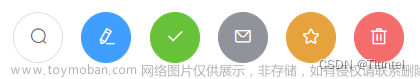
<el-row>
  <el-button icon="el-icon-search" circle></el-button>
  <el-button type="primary" icon="el-icon-edit" circle></el-button>
  <el-button type="success" icon="el-icon-check" circle></el-button>
  <el-button type="info" icon="el-icon-message" circle></el-button>
  <el-button type="warning" icon="el-icon-star-off" circle></el-button>
  <el-button type="danger" icon="el-icon-delete" circle></el-button>
</el-row>
其中,Icon 图标提供了一套常用的图标集合,直接通过设置类名为 el-icon-iconName 来使用即可。例如:
<i class="el-icon-edit"></i>
<i class="el-icon-share"></i>
<i class="el-icon-delete"></i>
<el-button type="primary" icon="el-icon-search">搜索</el-button>
文字按钮
没有边框和背景色的按钮,可以使用disabled属性来定义按钮是否可用。
<el-button type="text">文字按钮</el-button>
<el-button type="text" disabled>文字按钮</el-button>
按钮组
使用<el-button-group>标签来嵌套按钮
 文章来源:https://www.toymoban.com/news/detail-560511.html
<el-button-group>
  <el-button type="primary" icon="el-icon-arrow-left">上一页</el-button>
  <el-button type="primary">下一页<i class="el-icon-arrow-right el-icon--right"></i></el-button>
</el-button-group>
<el-button-group>
  <el-button type="primary" icon="el-icon-edit"></el-button>
  <el-button type="primary" icon="el-icon-share"></el-button>
  <el-button type="primary" icon="el-icon-delete"></el-button>
</el-button-group>
文章来源地址https://www.toymoban.com/news/detail-560511.html
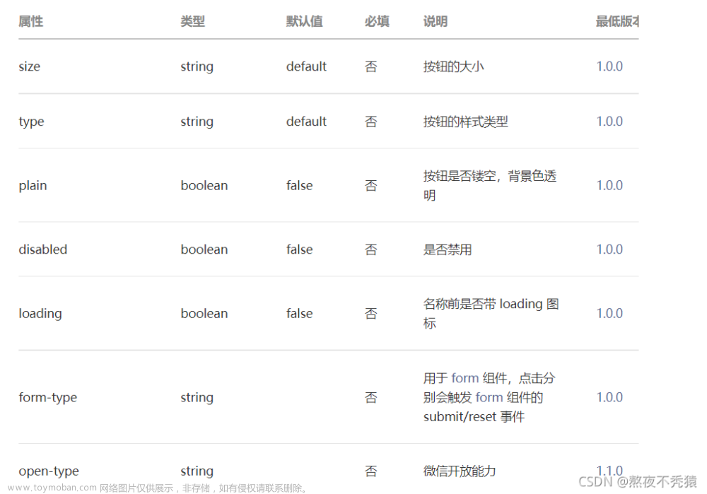
主要参数
| 参数 | 说明 | 类型 | 可选值 | 默认值 |
|---|---|---|---|---|
| size | 尺寸 | string | medium / small / mini | — |
| type | 类型 | string | primary / success / warning / danger / info / text | — |
| plain | 是否朴素按钮 | boolean | — | false |
| round | 是否圆角按钮 | boolean | — | false |
| circle | 是否圆形按钮 | boolean | — | false |
| loading | 是否加载中状态 | boolean | — | false |
| disabled | 是否禁用状态 | boolean | — | false |
| icon | 图标类名 | string | — | — |
| autofocus | 是否默认聚焦 | boolean | — | false |
| native-type | 原生 type 属性 | string | button / submit / reset | button |
到了这里,关于Vue中Button按钮基础用法及参数属性的文章就介绍完了。如果您还想了解更多内容,请在右上角搜索TOY模板网以前的文章或继续浏览下面的相关文章,希望大家以后多多支持TOY模板网!