【uni-app】自定义导航栏
新手刚玩uniapp进行微信小程序,甚至多端的开发。原生uniapp的导航栏,并不能满足ui的需求,所以各种查阅资料,导航栏自定义内容 整理如下:
需要修改的文件如下:

1、pages.json
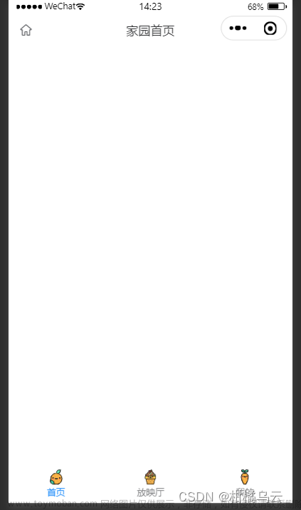
修改pages.json,启动导航栏自适应,设置"navigationStyle": "custom"
{
	"pages": [
		{
			"path": "pages/v2/AIChat/AIChat",
			"style": {
				"navigationBarTitleText": "AI",
				"navigationStyle": "custom"
			}
		}
	],
	"globalStyle": {
		"navigationBarTextStyle": "black",
		"navigationBarBackgroundColor": "#F8F8F8",
		"backgroundColor": "#F8F8F8",
		"app-plus": {
			"background": "#efeff4"
		}
	}
}
2、system_info.js
新建system_info.js,用于获取当前设备的机型系统信息。
/**
 * 此js文件管理关于当前设备的机型系统信息
 */
const systemInfo = function() {
	/****************** 所有平台共有的系统信息 ********************/
	// 设备系统信息
	let systemInfomations = uni.getSystemInfoSync()
	// 机型适配比例系数
	let scaleFactor = 750 / systemInfomations.windowWidth
	// 当前机型-屏幕高度
	let windowHeight = systemInfomations.windowHeight * scaleFactor //rpx
	// 当前机型-屏幕宽度
	let windowWidth = systemInfomations.windowWidth * scaleFactor //rpx
	// 状态栏高度
	let statusBarHeight = (systemInfomations.statusBarHeight) * scaleFactor //rpx

	// 导航栏高度  注意:此导航栏高度只针对微信小程序有效 其他平台如自定义导航栏请使用:状态栏高度+自定义文本高度
	let navHeight = 0 //rpx
	// console.log(windowHeight,'哈哈哈哈哈');

	/****************** 微信小程序头部胶囊信息 ********************/
	// #ifdef MP-WEIXIN
	const menuButtonInfo = wx.getMenuButtonBoundingClientRect()
	// 胶囊高度
	let menuButtonHeight = menuButtonInfo.height * scaleFactor //rpx
	// 胶囊宽度
	let menuButtonWidth = menuButtonInfo.width * scaleFactor //rpx
	// 胶囊上边界的坐标
	let menuButtonTop = menuButtonInfo.top * scaleFactor //rpx
	// 胶囊右边界的坐标
	let menuButtonRight = menuButtonInfo.right * scaleFactor //rpx
	// 胶囊下边界的坐标
	let menuButtonBottom = menuButtonInfo.bottom * scaleFactor //rpx
	// 胶囊左边界的坐标
	let menuButtonLeft = menuButtonInfo.left * scaleFactor //rpx

	// 微信小程序中导航栏高度 = 胶囊高度 + (顶部距离 - 状态栏高度) * 2
	navHeight = menuButtonHeight + (menuButtonTop - statusBarHeight) * 2
	// #endif


	// #ifdef MP-WEIXIN
	return {
		scaleFactor,
		windowHeight,
		windowWidth,
		statusBarHeight,
		menuButtonHeight,
		menuButtonWidth,
		menuButtonTop,
		menuButtonRight,
		menuButtonBottom,
		menuButtonLeft,
		navHeight
	}
	// #endif

	// #ifndef MP-WEIXIN
	return {
		scaleFactor,
		windowHeight,
		windowWidth,
		statusBarHeight
	}
	// #endif
}

export {
	systemInfo
}
3、HeadNav.vue
新建组件HeadNav.vue,这是自定义导航栏。文章来源:https://www.toymoban.com/news/detail-598072.html
/*
* 注意:
* 1、在传入宽度或者高度时,如果是Number数据,传入的值为px大小,无需带单位,组件自动计算
* 2、在使用此导航栏时,建议传入UI规定的导航栏高度,此高度只针对除微信小程序的其他平台有效,微信小程序的导航栏高度,组件自计算
*/
<template>
	<view :style="{height:navHeight+'rpx'}">
		<!-- 微信小程序头部导航栏 -->
		<!-- #ifdef MP-WEIXIN -->
		<view class="wx-head-mod" :style="{height:navHeight+'rpx',backgroundColor:navBackgroundColor}">
			<view class="wx-head-mod-nav" :style="{height:navigationBarHeight+'rpx',top:statusBarHeight+'rpx'}">
				<view class="wx-head-mod-nav-content"
					:style="{height:customHeight+'rpx',justifyContent:textAlign === 'center'?'center':'left'}">
					<!-- 文本区 -->
					<view class="wx-head-mod-nav-content-mian"
						:style="{width:navTextWidth,lineHeight:customHeight + 'rpx',paddingLeft:textPaddingLeft*scaleFactor+'rpx',fontSize:fontSize*scaleFactor+'rpx',fontWeight:fontWeight,color:titleColor}">
						{{textContent}}
					</view>
					<!-- 返回按钮 -->
					<view class="wx-head-mod-nav-content-back" :style="{display:isBackShow?'flex':'none'}"
						@click="backEvent">
						<view class="wx-head-mod-nav-content-back-img"
							:style="{width:backImageWidth*scaleFactor+'rpx',height:backImageHeight*scaleFactor+'rpx'}">
							<image :src="backImageUrl" mode="" style="width: 100%;height: 100%;"></image>
						</view>
					</view>
				</view>
			</view>
		</view>
		<!-- #endif -->

		<!-- 除微信小程序之外的其他设备 -->
		<!-- #ifndef MP-WEIXIN -->
		<view class="other-head-mod"
			:style="{height:navHeightValue*scaleFactor+statusBarHeight+'rpx',backgroundColor:navBackgroundColor}">
			<view class="other-head-mod-mian"
				:style="{height:navHeightValue*scaleFactor+'rpx',justifyContent:textAlign === 'center'?'center':'left'}">
				<!-- 返回按钮 -->
				<view class="other-head-mod-mian-back" v-show="isBackShow" @click="backEvent">
					<view class="other-head-mod-mian-back-img"
						:style="{width:backImageWidth*scaleFactor+'rpx',height:backImageHeight*scaleFactor+'rpx'}">
						<image :src="backImageUrl" mode="" style="width: 100%;height: 100%;"></image>
					</view>
				</view>
				<!-- 标题 -->
				<view class="other-head-mod-mian-title" :style="{width:windowWidth - 184+'rpx',lineHeight:navHeightValue*scaleFactor+'rpx',
					paddingLeft:textPaddingLeft*scaleFactor+'rpx',fontSize:fontSize*scaleFactor+'rpx',
					fontWeight:fontWeight,color:titleColor}">
					{{textContent}}
				</view>
			</view>
		</view>
		<!-- #endif -->
	</view>
</template>

<script>
	const app = getApp()
	import {systemInfo} from '@/pages/v2/acommon_js/system_info.js'
	export default {
		name: "HeadView",
		props: {
			// 文本区域位置 left:左  center:中
			textAlign: {
				type: String,
				default: 'center'
			},
			// 文本区内容
			textContent: {
				type: String,
				default: '哈哈哈哈哈哈哈哈哈哈哈哈哈哈哈哈就啊哈哈好借好还'
			},
			// 文本区离左边的距离
			textPaddingLeft: {
				type: Number,
				default: 16
			},
			// 是否需要返回按钮
			isBackShow: {
				type: Boolean,
				default: true
			},
			// 文本区字体大小
			fontSize: {
				type: Number,
				default: 20 //px
			},
			// 文本区字体粗细
			fontWeight: {
				type: Number,
				default: 700
			},
			// 文本区返回按钮图片宽
			backImageWidth: {
				type: Number,
				default: 12 //px
			},
			// 文本区返回按钮图片高
			backImageHeight: {
				type: Number,
				default: 24 //px
			},
			// 返回按钮图标路径
			backImageUrl: {
				type: String,
				default: '/static/v2/aichat/ai_robot.png'
			},
			// 导航栏整体背景颜色
			navBackgroundColor: {
				type: String,
				default: '#2476F9'
			},
			// 标题字体颜色
			titleColor: {
				type: String,
				default: '#ffffff',
			},

			/******** h5端,app端需要传入自定义导航栏高度 *******/
			navHeightValue: {
				type: Number,
				default: 44 //px
			}
		},
		computed: {
			// 文本区宽度
			navTextWidth() {
				if (this.textAlign === 'center') {
					return (this.windowWidth - (this.windowWidth - this.menubarLeft) * 2) + 'rpx'
				} else {
					return this.menubarLeft + 'rpx'
				}
			},
			// 文本区paddingLeft
			textPaddingleft() {
				if (this.textAlign === 'center') {
					return '0'
				} else {
					return this.textPaddingLeft + 'rpx'
				}
			}
		},
		data() {
			return {
				statusBarHeight: app.globalData.statusBarHeight, //状态栏高度
				navHeight: app.globalData.navHeight, //头部导航栏总体高度
				navigationBarHeight: app.globalData.navigationBarHeight, //导航栏高度
				customHeight: app.globalData.customHeight, //胶囊高度
				scaleFactor: app.globalData.scaleFactor, //比例系数
				menubarLeft: app.globalData.menubarLeft, //胶囊定位的左边left
				windowWidth: app.globalData.windowWidth * app.globalData.scaleFactor
			};
		},
		methods: {
			backEvent() {
				uni.navigateBack({
					delta: 1
				})
			}
		},
		created() {
			/* 获取设备信息 */
			const SystemInfomations = systemInfo()
			/* 通用平台 */
			this.statusBarHeight = SystemInfomations.statusBarHeight //状态栏高度
			this.scaleFactor = SystemInfomations.scaleFactor //比例系数
			this.windowWidth = SystemInfomations.windowWidth //当前设备的屏幕宽度
			/* 微信小程序平台 */
			// #ifdef MP-WEIXIN
			this.navHeight = SystemInfomations.navHeight + SystemInfomations.statusBarHeight //头部导航栏总高度
			this.navigationBarHeight = SystemInfomations.navHeight //头部导航栏高度
			this.customHeight = SystemInfomations.menuButtonHeight //胶囊高度
			this.menubarLeft = SystemInfomations.menuButtonLeft //胶囊左边界距离左上角的距离
			// #endif

			console.log("this.navHeight:", this.navHeight)
		}
	}
</script>

<style>
	/* #ifdef MP-WEIXIN */
	.wx-head-mod {
		box-sizing: border-box;
		width: 100%;
		position: fixed;
		top: 0;
		left: 0;
	}

	.wx-head-mod-nav {
		box-sizing: border-box;
		width: 100%;
		position: absolute;
		left: 0;
		display: flex;
		justify-content: center;
		align-items: center;

	}

	.wx-head-mod-nav-content {
		box-sizing: border-box;
		width: 100%;
		display: flex;
		justify-content: left;
		align-items: center;
		position: relative;
	}

	/* 文本区 */
	.wx-head-mod-nav-content-mian {
		box-sizing: border-box;
		height: 100%;
		white-space: nowrap;
		text-overflow: ellipsis;
		overflow: hidden;
	}

	/* 返回按钮 */
	.wx-head-mod-nav-content-back {
		box-sizing: border-box;
		width: 60rpx;
		height: 100%;
		/* background-color: aqua; */
		position: absolute;
		top: 0;
		left: 32rpx;
		display: flex;
		align-items: center;
		justify-content: left;
	}

	.wx-head-mod-nav-content-back-img {
		box-sizing: border-box;
	}

	/* #endif */

	/* #ifndef MP-WEIXIN */
	.other-head-mod {
		box-sizing: border-box;
		width: 100%;
		position: fixed;
		top: 0;
		left: 0;
	}

	.other-head-mod-mian {
		box-sizing: border-box;
		width: 100%;
		display: flex;
		align-items: center;
		justify-content: left;
		position: absolute;
		left: 0;
		bottom: 0;
	}

	/* 返回按钮 */
	.other-head-mod-mian-back {
		box-sizing: border-box;
		height: 100%;
		width: 60rpx;
		position: absolute;
		left: 32rpx;
		top: 0;
		display: flex;
		align-items: center;
	}

	/* 标题 */
	.other-head-mod-mian-title {
		box-sizing: border-box;
		height: 100%;
		white-space: nowrap;
		text-overflow: ellipsis;
		overflow: hidden;
	}

	/* #endif */
</style>
4、AIChat.vue
修改要自定义导航栏的组件文章来源地址https://www.toymoban.com/news/detail-598072.html
<template>
	<view style="height: 100%;">
		<head-nav :style="navStyle"></head-nav>
		<view class="container" :style="containerStyle">
			<scroll-view :scroll-top="scrollTop" class="chat-container" :scroll-into-view="scrollintoid" scroll-y="true"
				@scroll="handleScroll" @scrolltolower="handleScrollToLower">
			省略中间布局内容
			</scroll-view>
		</view>

	</view>
</template>

<script>
	import HeadNav from '@/pages/v2/components/HeadNav.vue'
	import {systemInfo} from '@/pages/v2/acommon_js/system_info.js'
	export default {
		components: {
			MarkdownViewer,
			HeadNav
		},
		data() {
			return {
				// 省略部分变量
				containerStyle: "",
				navStyle: ""
			};
		},
		onReady() {
			// -------------------------- 经典界面自定义,需要记录-------------------------------------------------------------
			// 设备系统信息
			let systemInfomations_ = uni.getSystemInfoSync()
			// 机型适配比例系数
			let scaleFactor_ = 750 / systemInfomations_.windowWidth
			// 当前机型-屏幕高度
			let windowHeight_ = systemInfomations_.windowHeight * scaleFactor_ //rpx

			/* 获取设备信息 */
			const SystemInfomations = systemInfo()
			/* 通用平台 */
			const statusBarHeight = SystemInfomations.statusBarHeight //状态栏高度
			const scaleFactor = SystemInfomations.scaleFactor //比例系数
			const windowWidth = SystemInfomations.windowWidth //当前设备的屏幕宽度
			/* 微信小程序平台 */
			// #ifdef MP-WEIXIN
			const navHeight = SystemInfomations.navHeight + SystemInfomations.statusBarHeight //头部导航栏总高度
			const navigationBarHeight = SystemInfomations.navHeight //头部导航栏高度
			const customHeight = SystemInfomations.menuButtonHeight //胶囊高度
			const menubarLeft = SystemInfomations.menuButtonLeft //胶囊左边界距离左上角的距离
			this.containerStyle = ' height:' + (systemInfomations_.windowHeight - statusBarHeight - 10) + 'px;';
			// #endif

			console.log("this.viewHight:", this.viewHeight)

			/* 通用平台 */
			// #ifndef MP-WEIXIN
			this.containerStyle = 'height:' + (systemInfomations_.windowHeight - 54) + 'px;';
			this.navStyle = 'height:' + 44 + 'px';
			// #endif
			// ---------------------------------------------------------------------------------------
	}
}
</script>
到了这里,关于【uni-app】自定义导航栏的文章就介绍完了。如果您还想了解更多内容,请在右上角搜索TOY模板网以前的文章或继续浏览下面的相关文章,希望大家以后多多支持TOY模板网!