欢迎点击领取 -《前端开发面试题进阶秘籍》:前端登顶之巅-最全面的前端知识点梳理总结
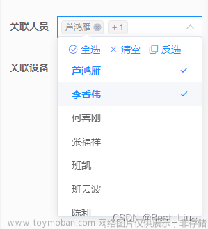
需求分析:
1、实现一个区域下拉选项与现有ui组件库不同,支持多选、单选需求
2、支持选中区域后-全选中当前区域下的所有城市信息
3、只能选中当前一个区域的内的城市其余城市禁用
扩展思路:
1、封装公共组件或者封装在组件库内
2、出入参相关api透明好理解
3、支持单选或者多选,支持只选择当前区域下的城市或者全面区域下的城市
4、在原有的element plus下进行扩展延伸满足需求
5、缺陷:未做maxLength-标签最大展示的api;这个按需自己修改一下就行
1、第一种模式:显示区域信息
2、第二种模式:只展示城市内容 文章来源:https://www.toymoban.com/news/detail-646050.html
1、相关开发代码篇
创建文件:custom-select.vue文件;复制copy当下代码;
使用方式:
1、外部入参例如城市:dataSource=[{ label: 华北,value: '华东', children: [{ label: '山东',value: 'shandong'}]],树形结构
2、标签引用:<custom-select :disabled="true" :multilevel="true" height="32" v-model="checkGroup" :dataSource="cityList"></custom-select>
3、相关api说明文档在文章底部文章来源地址https://www.toymoban.com/news/detail-646050.html
<template>
  <div
    tabindex="1"
    ref="customSelectRef"
    @click="handleClickDiv"
    @mouseenter="handelMouseEnter"
    @mouseleave="handleMouseLeave"
    :style="{ width: modelLabel && modelValue?.length ? '166px' : '100px', height: (height + 'px') || '25px' }"
    :class="['custom-select_contaniner-i', isShowDropdown && 'custom-select_background']"
  >
    <div>
      <span v-if="modelLabel" class="custom-tag">
        <span>{{ modelLabel }}</span>
        <i
          class="custom_tag_delete"
          @mouseenter="handelIconMouseEnter"
          @mouseleave="handleIconMouseLeave"
          @click.stop="handleDeleteIcon"
        >
          <svg
            v-if="!ishShowIconDeleteText"
            t="1678090923023"
            class="icon"
            viewBox="0 0 1024 1024"
            version="1.1"
            xmlns="http://www.w3.org/2000/svg"
            p-id="6709"
            width="11"
            height="11"
          >
            <path
              d="M263.802377 224.219482a7.964444 7.964444 0 0 1 11.263425 0l236.934198 236.934198 236.934198-236.934198a7.964444 7.964444 0 0 1 11.263425 0l39.582895 39.582895a7.964444 7.964444 0 0 1 0 11.263425l-236.934198 236.934198 236.934198 236.934198a7.964444 7.964444 0 0 1 0 11.263425l-39.582895 39.582895a7.964444 7.964444 0 0 1-11.263425 0l-236.934198-236.934198-236.934198 236.934198a7.964444 7.964444 0 0 1-11.263425 0l-39.582895-39.582895a7.964444 7.964444 0 0 1 0-11.263425l236.934198-236.934198-236.934198-236.934198a7.964444 7.964444 0 0 1 0-11.263425l39.582895-39.582895z"
              fill="#8a8a8a"
              p-id="6710"
            />
          </svg>
          <svg
            v-else
            t="1678091410677"
            class="icon"
            viewBox="0 0 1024 1024"
            version="1.1"
            xmlns="http://www.w3.org/2000/svg"
            p-id="6936"
            width="22"
            height="22"
          >
            <path
              d="M479.072 512l-98.72-98.72c-9.152-9.152-9.088-23.84 0-32.928 9.152-9.152 23.84-9.088 32.928 0l98.72 98.72 98.72-98.72c9.152-9.152 23.84-9.088 32.928 0 9.152 9.152 9.088 23.84 0 32.928l-98.72 98.72 98.72 98.72c9.152 9.152 9.088 23.84 0 32.928-9.152 9.152-23.84 9.088-32.928 0l-98.72-98.72-98.72 98.72c-9.152 9.152-23.84 9.088-32.928 0-9.152-9.152-9.088-23.84 0-32.928l98.72-98.72zM512 837.824c179.936 0 325.824-145.888 325.824-325.824s-145.888-325.824-325.824-325.824c-179.936 0-325.824 145.888-325.824 325.824s145.888 325.824 325.824 325.824z"
              fill="#B7B8B9"
              p-id="6937"
            />
          </svg>
        </i>
      </span>
      <span v-if="modelLabel && modelValue?.length > 1" class="custom-tag">+ {{ modelValue.length - 1 }}</span>
      <span v-if="!modelLabel" class="cus_placeholder">{{ placeholder }}</span>
    </div>
    <i class="arrow-top-icon" v-if="!isShowIconRemove || !modelLabel" :class="[!isShowDropdown && 'arrow-top-icon-active']">
      <svg viewBox="0 0 1024 1024" xmlns="http://www.w3.org/2000/svg">
        <path
          fill="currentColor"
          d="M831.872 340.864 512 652.672 192.128 340.864a30.592 30.592 0 0 0-42.752 0 29.12 29.12 0 0 0 0 41.6L489.664 714.24a32 32 0 0 0 44.672 0l340.288-331.712a29.12 29.12 0 0 0 0-41.728 30.592 30.592 0 0 0-42.752 0z"
        />
      </svg>
    </i>
    <i class="remove-icon" v-if="isShowIconRemove && modelLabel" @click.stop="handleRemove">
      <svg
        t="1678084213981"
        class="icon"
        viewBox="0 0 1024 1024"
        version="1.1"
        xmlns="http://www.w3.org/2000/svg"
        p-id="4480"
        width="11"
        height="11"
      >
        <path
          d="M512 32c265.097 0 480 214.903 480 480S777.097 992 512 992 32 777.097 32 512 246.903 32 512 32z m0 64C282.25 96 96 282.25 96 512s186.25 416 416 416 416-186.25 416-416S741.75 96 512 96z m169.706 246.294c12.496 12.497 12.496 32.758 0 45.255L557.256 512l124.45 124.452c12.496 12.497 12.496 32.758 0 45.255-12.497 12.496-32.758 12.496-45.255 0L512 557.254 387.549 681.706c-12.497 12.496-32.758 12.496-45.255 0-12.496-12.497-12.496-32.758 0-45.255l124.452-124.452-124.452-124.45c-12.496-12.497-12.496-32.758 0-45.255 12.497-12.496 32.758-12.496 45.255 0l124.452 124.45 124.45-124.45c12.497-12.496 32.758-12.496 45.255 0z"
          fill="#8a8a8a"
          p-id="4481"
        />
      </svg>
    </i>
  </div>
  <transition>
    <div
      v-if="isShowDropdown"
      ref="cusSelectDropdown"
      class="cus_select_background"
      :style="{ minWidth: popperOffestWidth + 'px', zIndex: 99999 }"
    >
      <div v-if="multilevel" style="padding: 5px 20px;">
        <div :key="key" v-for="(opt, key) in cusDataListChecked" class="multilevel_box">
          <el-checkbox
            style="width: 60px;"
            v-model="opt.checkAll"
            @change="handleCheckAllChange($event, opt)"
            :indeterminate="opt.isIndeterminate"
            :disabled="disabled && checkList.length ? !opt.checkList.length : false"
            >
            {{ opt.label }}
          </el-checkbox>
          <el-checkbox-group
            v-model="opt.checkList"
            v-if="opt.children"
            @change="handleCheckedCitiesChange($event, opt)"
            style="display: inline-block; padding-left: 20px"
          >
              <el-checkbox
                :label="item.value"
                style="width: 60px"
                :key="index + Math.random()"
                v-for="(item, index) in opt.children"
                :disabled="disabled && checkList.length ? !opt.checkList.length : false"
                >
                {{ item.label }}
              </el-checkbox>
          </el-checkbox-group>
        </div>
      </div>
      <div class="cus_select_contaniner" v-else>
        <div class="cus_select_left">中国</div>
        <div class="cus_select_right">
          <el-checkbox-group
            v-model="checkList"
            @change="handelCheckGroup"
            style="display: inline-block; padding-left: 20px"
          >
            <el-checkbox
              :key="index"
              :label="item.value"
              style="width: 60px"
              v-for="(item, index) in dataSource"
            >
              {{ item.label }}
            </el-checkbox>
          </el-checkbox-group>
        </div>
      </div>
      <span class="el-popper__arrow" data-popper-arrow="" style="position: absolute; left: 140px;"></span>
    </div>
  </transition>
</template>
<script setup lang="ts">
import { createPopper } from '@popperjs/core'
import { ref, onMounted, nextTick, watch, onUnmounted, toRaw, onBeforeMount, computed } from 'vue'

const props = withDefaults(
  defineProps<{
    height?: string | number
    dataSource: any
    modelValue?: any
    placeholder?: string
    multilevel?: boolean
    disabled?: boolean
  }>(),
  {
    height: 25,
    disabled: false,
    multilevel: false,
    dataSource: [],
    modelValue: [],
    placeholder: '请选择'
  }
)

const emit = defineEmits(['update:modelValue'])

const customSelectRef = ref()

const cusSelectDropdown = ref()

const cusDataListChecked = ref<any[]>([])

const checkList = ref<string[]>([])

const popperOffestWidth = ref<number>(0)

const isShowDropdown = ref<boolean>(false)

const modelLabel = ref<string>('')

const isShowIconRemove = ref<boolean>(false)

const ishShowIconDeleteText = ref<boolean>(false)

const handleClickDiv = () => {
  isShowDropdown.value = !isShowDropdown.value
}

const handelCheckGroup = (value) => {
  const obj = props.dataSource.filter((item) => item.value === value[0])[0]
  modelLabel.value = obj?.label
  emit('update:modelValue', value)
}

const handelMouseEnter = () => {
  isShowIconRemove.value = true
}

const handleMouseLeave = () => {
  isShowIconRemove.value = false
}

const handleRemove = () => {
  modelLabel.value = ''
  checkList.value = []
  if (isShowDropdown.value) {
    isShowDropdown.value = false
  }
  if (props.multilevel) {
    cusDataListChecked.value = addCheckProperties(props.dataSource)
  }
  emit('update:modelValue', [])
}

const handleDeleteIcon = () => {
  isShowDropdown.value = false
  checkList.value.splice(0, 1)
  if (props.multilevel) return cusDataListChecked.value = findTreeChecked(cusDataListChecked.value)
  const info = toRaw(checkList.value)[0]
  const obj = props.dataSource.filter((item) => item.value === info)[0]
  modelLabel.value = obj?.label || ''
}

const handelIconMouseEnter = () => {
  ishShowIconDeleteText.value = true
}

const handleIconMouseLeave = () => {
  ishShowIconDeleteText.value = false
}

// 点击某个DOM元素之外的方法
const handlerDocClick = (event) => {
  const isSelf = customSelectRef.value?.contains(event.target)
  || cusSelectDropdown.value?.contains(event.target)
  if (!isSelf) {
    isShowDropdown.value = false
  }
}

/**
 * 展示区域省份的逻辑
 * */
const handleCheckAllChange = (bool: any, option) => {
  const allCity = option.children ? option.children.map(item => item.value) : [option.value]
  bool ? option.checkList = allCity : option.checkList = []
  option.isIndeterminate = false
  checkList.value = option.checkList
  const newLabelArr = option.children
  ? option.children.filter(item => checkList.value.includes(item.value))
  : checkList.value?.length ? [{ label: '默认' }] : []
  modelLabel.value = newLabelArr?.[0]?.label || ''
  emit('update:modelValue', checkList.value)
}

const handleCheckedCitiesChange = (value: any[], option) => {
  const checkedCount = value.length
  const allCity = option.children ? option.children.map(item => item.value) : [option.value]
  option.checkAll = checkedCount === allCity.length
  option.isIndeterminate = checkedCount > 0 && checkedCount < allCity.length
  checkList.value = option.checkList
  const newLabelArr = option.children
  ? option.children.filter(item => checkList.value.includes(item.value))
  : checkList.value?.length ? [{ label: '默认' }] : []
  modelLabel.value = newLabelArr?.[0]?.label || ''
  emit('update:modelValue', checkList.value)
}

const addCheckProperties = (treeData) => {
  let result = []
  result = JSON.parse(JSON.stringify(treeData))
  result.forEach(node => {
    const child = node.children;
    node.checkAll = false;
    node.isIndeterminate = false;
    node.checkList = [];
    if (child && child.length > 0) {
      addCheckProperties(child);
    }
  });
  return result
}

const findTreeChecked = (treeData) => {
  let newLabel
  const val = toRaw(checkList.value)
  const defaultBool = val.some(item => item.includes('default'))
  treeData.forEach(node => {
    if (node.children?.length) {
      const child = node.children;
      const bool = child.some(opt => val.includes(opt.value))
      !newLabel ? newLabel = child.filter(item => val.includes(item.value))[0] : void null
      if (bool) {
        node.checkAll = val.length === child?.length;
        node.isIndeterminate = val.length > 0 && val.length < child?.length;
        node.checkList = val;
      } else {
        node.isIndeterminate = false
      }
    }
  })
  treeData[0].isIndeterminate = false;
  treeData[0].checkAll = defaultBool ? true : false;
  treeData[0].checkList = defaultBool ? ['default'] : [];
  modelLabel.value = defaultBool ? '默认' : newLabel?.label || ''
  return treeData
}

watch(
  [customSelectRef, cusSelectDropdown],
  () => {
    if (customSelectRef.value && cusSelectDropdown.value) {
      createPopper(customSelectRef.value, cusSelectDropdown.value, {
        placement: 'bottom',
        modifiers: [
          {
            name: 'offset',
            options: {
              offset: [80, 8]
            }
          }
        ]
      })
    }
  },
  {
    deep: true,
    immediate: true
  }
)

watch(
  props.modelValue,
  (newval) => {
    if (!newval || !newval.length) return
    checkList.value = props.modelValue
    if (props.multilevel) return
    const obj = props.dataSource.filter((item) => item.value === newval[0])[0]
    modelLabel.value = obj?.label
  },
  {
    deep: true,
    immediate: true
  }
)

onBeforeMount(() => {
  if (props.multilevel) {
    cusDataListChecked.value = addCheckProperties(props.dataSource)
  }
})

onMounted(async () => {
  await nextTick()
  popperOffestWidth.value = customSelectRef.value.offsetWidth
  document.addEventListener('click', handlerDocClick, true)
  if (props.multilevel && props.modelValue.length) {
    cusDataListChecked.value = findTreeChecked(cusDataListChecked.value)
  }
})

onUnmounted(() => {
  document.removeEventListener('click', handlerDocClick, true)
})
</script>

<script lang="ts">
export default { name: 'CustomSelect' }
</script>

<style lang="scss" scoped>
.v-enter-active,
.v-leave-active {
  transition: opacity 0.5s ease;
}

.v-enter-from,
.v-leave-to {
  opacity: 0;
}

.custom-select_contaniner-i {
  width: 100%;
  height: 25px;
  padding: 7px 9px;
  padding-left: 5px;
  border-radius: 4px;
  line-height: 1;
  cursor: pointer;
  position: relative;
  user-select: none;
  word-wrap: break-word;
  word-break: break-all;
  font-size: 13px;
  flex-grow: 1;
  display: inline-flex;
  align-items: center;
  box-sizing: border-box;
  justify-content: space-between;
  color: var(--el-input-text-color, var(--el-text-color-regular));
  background-color: var(--el-input-bg-color, var(--el-fill-color-blank));
  box-shadow: 0 0 0 1px var(--el-input-border-color, var(--el-border-color)) inset;
}

.custom-tag {
  color: var(--el-color-info);
  display: inline-flex;
  justify-content: center;
  align-items: center;
  height: 18px;
  padding: 0 9px;
  line-height: 1;
  border-radius: 4px;
  white-space: nowrap;
  font-size: 12px;
  background-color: var(--el-fill-color);
}

.custom_tag_delete {
  width: 18px;
  margin-left: 5px;
  font-size: 0px;
  border-radius: 50%;
  display: flex;
  justify-content: center;
  align-items: center;
  cursor: pointer;
  color: var(--el-color-info);
}

.custom-tag:first-child {
  margin-right: 6px;
  padding-right: 4px;
}

.arrow-top-icon {
  width: 14px;
  transform: rotateX(-180deg);
  color: var(--el-text-color-placeholder);
}

.remove-icon {
  margin-top: 2px;
  color: var(--el-text-color-placeholder);
}

.arrow-top-icon-active {
  transform: rotateX(0deg);
}

.custom-select:hover {
  box-shadow: 0 0 0 1px var(--el-border-color-hover) inset;
}

.custom-select:focus {
  outline: none;
  box-shadow: 0 0 0 1px var(--el-color-primary) inset;
}

.custom-select_background {
  box-shadow: 0 0 0 1px var(--el-color-primary) inset;
}

::-webkit-scrollbar {
  width: 4px;
  height: 4px;
  background-color: transparent;
}

/*滚动条的轨道*/
::-webkit-scrollbar-track {
  background-color: transparent;
}

/*滚动条的滑块按钮*/
::-webkit-scrollbar-thumb {
  border-radius: 8px;
  background-color: rgba(0, 0, 0, 0.1);
  box-shadow: inset 0 0 2px rgba(#000000, 0.04);
}

/*滚动条的上下两端的按钮*/
::-webkit-scrollbar-button {
  height: 0;
  background-color: transparent;
}

.cus_select_contaniner {
  padding: 5px 10px;
  display: flex;
}

.cus_select_left {
  width: 60px;
  margin-top: 5px;
}

.cus_select_right {
  flex: 1;
  width: 480px;
}

.cus_select_background {
  min-height: 200px;
  box-sizing: border-box;
  border-radius: 4px;
  font-size: var(--el-font-size-base);
  color: var(--el-text-color-regular);
  background: var(--el-bg-color-overlay);
  border: 1px solid var(--el-border-color-light);
  .multilevel_box {
    display: flex;
    padding: 5px;
    border-bottom: 1px solid #e4e7ed;
  }
  .multilevel_box:last-child {
    border-bottom: none;
  }
}

.cus_placeholder {
  color: var(--el-text-color-placeholder);
}

.el-popper__arrow {
  top: -5px;
}

.el-popper__arrow {
  position: absolute;
  width: 10px;
  height: 10px;
  z-index: -1;
}

.el-popper__arrow::before {
  border: 1px solid var(--el-border-color-light);
  background: var(--el-bg-color-overlay);
  right: 0;
  border-bottom-color: transparent!important;
  border-right-color: transparent!important;
}
</style>
2、组件-相关api说明
| 参数 | 说明 | 类型 | 默认值 | 必填项 |
|---|---|---|---|---|
| height | 输入框的高度 | String/Number | 25 | 否 |
| dataSource | [{}]-label,value;树形结构 | Array[] | [] | 是 |
| modelValue | 当前选中项内容 | Array | [] | 否 |
| placeholder | 输入框内容 | String | 请输入 | 否 |
| multilevel | 是否开启跨层级模式 | Boolean | false | 否 |
| disabled | 是否开启跨层级禁用 | Boolean | false | 否 |
到了这里,关于vue3实现自定义select下拉框内容之城市区域篇的文章就介绍完了。如果您还想了解更多内容,请在右上角搜索TOY模板网以前的文章或继续浏览下面的相关文章,希望大家以后多多支持TOY模板网!