概述
动画栏是使用 HTML 和 CSS 创建的图形动画栏。动画栏的布局是使用 HTML 创建的,栏的样式是使用 CSS 制作的。普通的条形图可以正常创建,但我们必须创建带有动画的条形图,因此我们将使用 CSS 过渡动画属性来使其具有动画效果。我们将构建一个与音乐动画条同步器相同的动画条。
算法
第 1 步 - 在文本编辑器中创建一个 HTML 文件并在其中添加 HTML 样板。
第 2 步 − 现在创建一个包含动画线条的父 div 容器。
<div class="animatedLines"></div>第 3 步 − 在父 div 内创建一个 div 子容器。创建至少七个“div”来制作一个好的动画栏,并将类名作为线条添加到其中。
<div class="lines"></div>
<div class="lines"></div>
<div class="lines"></div>
<div class="lines"></div>
<div class="lines"></div>
<div class="lines"></div>
<div class="lines"></div>
<div class="lines"></div>
第 4 步 − 现在创建一个 style.css 文件并将该文件链接到 HTML 文档。
<link rel="stylesheet" href="style.css">第 5 步− 在 style.css 文件中设置 HTML 元素的样式。
.animatedLines {
   display: flex;
   justify-content: center;
   padding-top: 2rem;
}
.animatedLines .lines:nth-child(1) {
   animation-delay: .1s;
   background-color: rgb(141, 255, 88);
}

.animatedLines .lines:nth-child(2) {
   animation-delay: .2s;
   background-color: rgb(127, 253, 69);
}

.animatedLines .lines:nth-child(3) {
   animation-delay: .3s;

   background-color: rgb(18, 49, 6);
}

.animatedLines .lines:nth-child(4) {
   animation-delay: .4s;
   background-color: rgb(18, 49, 6);
}

.animatedLines .lines:nth-child(5) {
   animation-delay: .3s;
   background-color: rgb(18, 49, 6);
}

.animatedLines .lines:nth-child(6) {
   animation-delay: .2s;
   background-color: rgb(127, 253, 69);
}

.animatedLines .lines:nth-child(7) {
   animation-delay: .1s;
   background-color: rgb(102, 228, 43);
}
第 6 步 − 通过定位子“div”容器的类名来制作这些线条的动画。
.animatedLines .lines {
   list-style: none;
   width: 5px;
   height: 10px;
   margin: 0 4px;
   animation: animatedBars .5s infinite alternate;
}

@keyframes animatedBars {
   0% {
      transform: scaleY(1);
   }

   25% {
       transform: scaleY(1);
   }

   50% {
       transform: scaleY(1);
   }

   100% {
       transform: scaleY(6);
   }

}
第 7 步− 动画条已成功创建。
示例
在此示例中,我们创建了一个动画栏。为此,我们创建了两个文件:index.html 和 style.css。索引文件包含页面的布局,style.css 文件包含页面的样式部分。
<html>
<head>
   <title>animated bars</title>
   <link rel="stylesheet" href="style.css">
   <style>
      .animatedLines {
         display: flex;
         justify-content: center;
         padding-top: 2rem;
      }
      .animatedLines .lines:nth-child(1) {
         animation-delay: .1s;
         background-color: rgb(141, 255, 88);
      }

      .animatedLines .lines:nth-child(2) {
         animation-delay: .2s;
         background-color: rgb(127, 253, 69);
      }

      .animatedLines .lines:nth-child(3) {
         animation-delay: .3s;

         background-color: rgb(18, 49, 6);
      }

      .animatedLines .lines:nth-child(4) {
         animation-delay: .4s;
         background-color: rgb(18, 49, 6);
      }

      .animatedLines .lines:nth-child(5) {
         animation-delay: .3s;
         background-color: rgb(18, 49, 6);
      }

      .animatedLines .lines:nth-child(6) {
         animation-delay: .2s;
         background-color: rgb(127, 253, 69);
      }

      .animatedLines .lines:nth-child(7) {
         animation-delay: .1s;
         background-color: rgb(102, 228, 43);
      }
      .animatedLines .lines {
         list-style: none;
         width: 5px;
         height: 10px;
         margin: 0 4px;
         animation: animatedBars .5s infinite alternate;
      }

      @keyframes animatedBars {
         0% {
            transform: scaleY(1);
         }

         25% {
            transform: scaleY(1);
         }

         50% {
            transform: scaleY(1);
         }

         100% {
            transform: scaleY(6);
         }

      }
   </style>
</head>
<body>
   <h1 style="text-align: center;text-decoration: underline;color: green;">tutorialspoint.com</h1>
   <div class="animatedLines">
      <div class="lines"></div>
      <div class="lines"></div>
      <div class="lines"></div>
      <div class="lines"></div>
      <div class="lines"></div>
      <div class="lines"></div>
      <div class="lines"></div>
      <div class="lines"></div>
   </div>
</body>
</html>
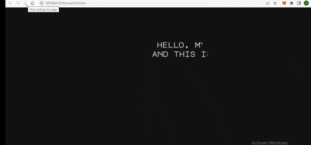
下面给定的图像显示了上面示例的输出,它显示了一些您可以在浏览器上实时看到的动画线。当用户将此功能加载到浏览器中时,它会显示一条看起来更有吸引力的动画线条。文章来源:https://www.toymoban.com/news/detail-694030.html
结论
动画栏的这一功能可以作为图形界面在语音合成器中使用。您还可以在许多应用程序中看到此组件,例如录音机和 dj 节拍同步器。上面例子中的主要部分是计时,我们设置了随着条形尺寸的增加而动画的计时。文章来源地址https://www.toymoban.com/news/detail-694030.html
到了这里,关于如何使用HTML和CSS创建动画条形图?的文章就介绍完了。如果您还想了解更多内容,请在右上角搜索TOY模板网以前的文章或继续浏览下面的相关文章,希望大家以后多多支持TOY模板网!
![[HTML]Web前端开发技术7(HTML5、CSS3、JavaScript )CSS的定位机制——喵喵画网页](https://imgs.yssmx.com/Uploads/2024/02/755631-1.png)
![[HTML]Web前端开发技术9(HTML5、CSS3、JavaScript )——喵喵画网页](https://imgs.yssmx.com/Uploads/2024/02/777294-1.png)
![[HTML]Web前端开发技术12(HTML5、CSS3、JavaScript )——喵喵画网页](https://imgs.yssmx.com/Uploads/2024/02/793019-1.png)
![[HTML]Web前端开发技术16(HTML5、CSS3、JavaScript )表格课后练习网页标题:域标签的使用网页标题:美家装饰联系我们网页标题:登录界面网页标题问卷调查——喵喵画网页](https://imgs.yssmx.com/Uploads/2024/01/820808-1.png)
![[HTML]Web前端开发技术26(HTML5、CSS3、JavaScript )JavaScript基础——喵喵画网页](https://imgs.yssmx.com/Uploads/2024/02/828994-1.png)
![[HTML]Web前端开发技术5.2(HTML5、CSS3、JavaScript )CSS基础,decoration,selector,properties,Cascading——喵喵画网页](https://imgs.yssmx.com/Uploads/2024/02/751717-1.png)

![[HTML]Web前端开发技术8(HTML5、CSS3、JavaScript )CSS样式属性,withborder,italic | oblique,indent,padding,——喵喵画网页](https://imgs.yssmx.com/Uploads/2024/02/755873-1.png)


