✅作者简介:人工智能专业本科在读,喜欢计算机与编程,写博客记录自己的学习历程。
🍎个人主页:小嗷犬的个人主页
🍊个人网站:小嗷犬的技术小站
🥭个人信条:为天地立心,为生民立命,为往圣继绝学,为万世开太平。
Seaborn 简介
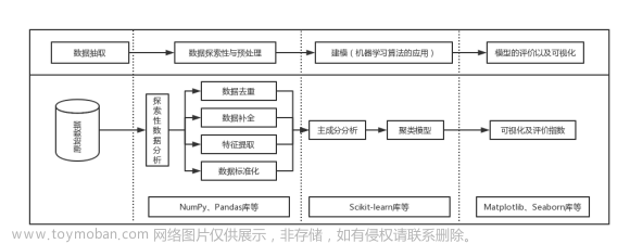
Seaborn 是一个基于 Python 的数据可视化库,它建立在 matplotlib 之上,并与 pandas 数据结构密切集成。Seaborn 的主要目的是通过使用更高级的界面来制作有吸引力的统计图形,从而使可视化变得更简单。
Seaborn 的主要特点包括:
- 高级界面: Seaborn 提供了更高级的界面来绘制有吸引力的统计图形,例如散点图、条形图、箱线图等。这些图形可以通过几行代码快速生成,而不需要手动调整每个细节。
- 内置主题: Seaborn 包括几个预定义的主题,可以用于改变图形的外观。这使得它更容易创建美观且专业的图形。
- 与 pandas 集成: Seaborn 与 pandas 数据结构紧密集成,这意味着你可以直接在 pandas 的 DataFrame 上调用 Seaborn 的函数,从而方便地进行数据可视化。
- 统计绘图: Seaborn 不仅提供了用于绘制基本图形的函数,还提供了用于绘制更复杂的统计图形的函数,例如 Pairplot(用于显示数据集中的成对关系)、Violinplot(用于显示分组的分布)等。
- 颜色控制: Seaborn 允许用户通过参数控制图形的颜色,使其更易于创建颜色协调的图形。
- 面板绘图: Seaborn 支持面板绘图,可以方便地在一个图形中显示多个不同的视图。
Seaborn 安装
Seaborn 可以通过 pip 安装:
pip install seaborn
Seaborn 使用
要使用 Seaborn,必须先导入 Seaborn 库。通常,Seaborn 会与 numpy、pandas 和 matplotlib 一起导入:
import numpy as np
import pandas as pd
import matplotlib.pyplot as plt
import seaborn as sns
Seaborn 样例数据集
Seaborn 中提供了多种样例数据集,可以用于练习和测试。可以通过以下命令查看所有可用的数据集:
print(sns.get_dataset_names())
得到以下输出:
['anagrams', 'anscombe', 'attention', 'brain_networks', 'car_crashes', 'diamonds', 'dots', 'exercise', 'flights', 'fmri', 'gammas', 'geyser', 'iris', 'mpg', 'penguins', 'planets', 'taxis', 'tips', 'titanic']
Seaborn 中的数据集可以通过 load_dataset() 函数加载,该函数返回一个 pandas 的 DataFrame 对象。例如,要加载 Seaborn 中的 anscombe 数据集,可以使用以下命令:
df = sns.load_dataset("anscombe")
print(df.head())
得到以下输出:
  dataset     x     y
0       I  10.0  8.04
1       I   8.0  6.95
2       I  13.0  7.58
3       I   9.0  8.81
4       I  11.0  8.33
Seaborn 样式设置
Seaborn 中的样式可以通过 set_style() 函数设置。Seaborn 中有五种不同的样式,可以通过 set_style() 函数的 style 参数设置:
-
darkgrid:默认样式,带有灰色网格。 -
whitegrid:带有白色网格的样式。 -
dark:不带网格的黑色背景样式。 -
white:不带网格的白色背景样式。 -
ticks:不带网格的样式,但带有刻度。
例如,要将样式设置为 whitegrid,可以使用以下命令:
sns.set_style("whitegrid")
Seaborn 颜色设置
Seaborn 中的颜色可以通过 set_palette() 函数设置。Seaborn 中有六种不同的调色板,可以通过 set_palette() 函数的 palette 参数设置:
-
deep:默认调色板 -
muted:较柔和的颜色 -
pastel:柔和的颜色 -
bright:明亮的颜色 -
dark:暗色调 -
colorblind:适合色盲的颜色
除此之外,还可以使用任何 matplotlib 调色板或者自定义调色盘。
要将颜色设置为 pastel,可以使用以下命令:
sns.set_palette("pastel")
Seaborn 绘图函数
Seaborn 支持绘制超多种不同的图表。下面列出了 Seaborn 支持的所有图表:
- 关系图表
relplot()- 散点图
scatterplot() - 折线图
lineplot()
- 散点图
- 分布图表
displot()- 直方图
histplot() - 核密度估计图
kdeplot() - 累积分布图
ecdfplot() - 地毯图
rugplot()
- 直方图
- 分类图表
catplot()- 分类散点图
stripplot()、swarmplot() - 分类分布图
boxplot()、violinplot()、boxenplot() - 分类估计图
pointplot()、barplot()、countplot()
- 分类散点图
- 回归图表
- 回归模型图
lmplot()- 简单回归图
regplot() - 多图网格
FacetGrid
- 简单回归图
- 回归残差图
residplot()
- 回归模型图
- 其他图表
- 热力图
heatmap() - 聚类图
clustermap() - 成对关系图
pairplot()- 成对网格
PairGrid
- 成对网格
- 联合分布图
jointplot()- 联合网格
JointGrid
- 联合网格
- 热力图

绘图示例
示例 1
sns.set_theme(style="ticks")

# Load the example dataset for Anscombe's quartet
df = sns.load_dataset("anscombe")

# Show the results of a linear regression within each dataset
sns.lmplot(
    data=df,
    x="x",
    y="y",
    col="dataset",
    hue="dataset",
    col_wrap=2,
    palette="muted",
    ci=None,
    height=4,
    scatter_kws={"s": 50, "alpha": 1},
)
plt.show()

示例 2
sns.set_theme(style="whitegrid")

# Load the example diamonds dataset
diamonds = sns.load_dataset("diamonds")

# Draw a scatter plot while assigning point colors and sizes to different
# variables in the dataset
f, ax = plt.subplots(figsize=(6.5, 6.5))
sns.despine(f, left=True, bottom=True)
clarity_ranking = ["I1", "SI2", "SI1", "VS2", "VS1", "VVS2", "VVS1", "IF"]
sns.scatterplot(
    x="carat",
    y="price",
    hue="clarity",
    size="depth",
    palette="ch:r=-.2,d=.3_r",
    hue_order=clarity_ranking,
    sizes=(1, 8),
    linewidth=0,
    data=diamonds,
    ax=ax,
)
plt.show()

示例 3
sns.set_theme(style="darkgrid")

# Load an example dataset with long-form data
fmri = sns.load_dataset("fmri")

# Plot the responses for different events and regions
sns.lineplot(x="timepoint", y="signal", hue="region", style="event", data=fmri)
plt.show()

示例 4
sns.set_theme(style="darkgrid")
df = sns.load_dataset("penguins")
sns.displot(
    df,
    x="flipper_length_mm",
    col="species",
    row="sex",
    binwidth=3,
    height=3,
    facet_kws=dict(margin_titles=True),
)
plt.show()

示例 5
sns.set_theme(style="ticks")

dots = sns.load_dataset("dots")

# Define the palette as a list to specify exact values
palette = sns.color_palette("rocket_r")

# Plot the lines on two facets
sns.relplot(
    data=dots,
    x="time",
    y="firing_rate",
    hue="coherence",
    size="choice",
    col="align",
    kind="line",
    size_order=["T1", "T2"],
    palette=palette,
    height=5,
    aspect=0.75,
    facet_kws=dict(sharex=False),
)
plt.show()

示例 6
sns.set_theme(style="whitegrid")

penguins = sns.load_dataset("penguins")

# Draw a nested barplot by species and sex
g = sns.catplot(
    data=penguins,
    kind="bar",
    x="species",
    y="body_mass_g",
    hue="sex",
    palette="dark",
    alpha=0.6,
    height=6,
)
g.despine(left=True)
g.set_axis_labels("", "Body mass (g)")
g.legend.set_title("")
plt.show()

示例 7
sns.set_theme(style="ticks", palette="pastel")

# Load the example tips dataset
tips = sns.load_dataset("tips")

# Draw a nested boxplot to show bills by day and time
sns.boxplot(x="day", y="total_bill", hue="smoker", palette=["m", "g"], data=tips)
sns.despine(offset=10, trim=True)
plt.show()

示例 8
sns.set_theme(style="whitegrid")

# Load the example tips dataset
tips = sns.load_dataset("tips")

# Draw a nested violinplot and split the violins for easier comparison
sns.violinplot(
    data=tips,
    x="day",
    y="total_bill",
    hue="smoker",
    split=True,
    inner="quart",
    linewidth=1,
    palette={"Yes": "b", "No": ".85"},
)
sns.despine(left=True)
plt.show()

示例 9
sns.set_theme(style="whitegrid")

# Load the brain networks dataset, select subset, and collapse the multi-index
df = sns.load_dataset("brain_networks", header=[0, 1, 2], index_col=0)

used_networks = [1, 5, 6, 7, 8, 12, 13, 17]
used_columns = df.columns.get_level_values("network").astype(int).isin(used_networks)
df = df.loc[:, used_columns]

df.columns = df.columns.map("-".join)

# Compute a correlation matrix and convert to long-form
corr_mat = df.corr().stack().reset_index(name="correlation")

# Draw each cell as a scatter point with varying size and color
g = sns.relplot(
    data=corr_mat,
    x="level_0",
    y="level_1",
    hue="correlation",
    size="correlation",
    palette="vlag",
    hue_norm=(-1, 1),
    edgecolor=".7",
    height=10,
    sizes=(50, 250),
    size_norm=(-0.2, 0.8),
)

# Tweak the figure to finalize
g.set(xlabel="", ylabel="", aspect="equal")
g.despine(left=True, bottom=True)
g.ax.margins(0.02)
for label in g.ax.get_xticklabels():
    label.set_rotation(90)
for artist in g.legend.legendHandles:
    artist.set_edgecolor(".7")
plt.show()

示例 10
sns.set_theme(style="ticks")

rs = np.random.RandomState(11)
x = rs.gamma(2, size=1000)
y = -0.5 * x + rs.normal(size=1000)

sns.jointplot(x=x, y=y, kind="hex", color="#4CB391")
plt.show()

示例 11
sns.set_theme(style="ticks")

diamonds = sns.load_dataset("diamonds")

f, ax = plt.subplots(figsize=(7, 5))
sns.despine(f)

sns.histplot(
    diamonds,
    x="price",
    hue="cut",
    multiple="stack",
    palette="light:m_r",
    edgecolor=".3",
    linewidth=0.5,
    log_scale=True,
)
ax.set_xticks([500, 1000, 2000, 5000, 10000])
plt.show()

示例 12
sns.set_theme(style="ticks")

# Initialize the figure with a logarithmic x axis
f, ax = plt.subplots(figsize=(7, 6))
ax.set_xscale("log")

# Load the example planets dataset
planets = sns.load_dataset("planets")

# Plot the orbital period with horizontal boxes
sns.boxplot(
    x="distance", y="method", data=planets, whis=[0, 100], width=0.6, palette="vlag"
)

# Add in points to show each observation
sns.stripplot(x="distance", y="method", data=planets, size=4, color=".3", linewidth=0)

# Tweak the visual presentation
ax.xaxis.grid(True)
ax.set(ylabel="")
sns.despine(trim=True, left=True)
plt.show()

示例 13
sns.set_theme(style="whitegrid")
iris = sns.load_dataset("iris")

# "Melt" the dataset to "long-form" or "tidy" representation
iris = pd.melt(iris, "species", var_name="measurement")

# Initialize the figure
f, ax = plt.subplots()
sns.despine(bottom=True, left=True)

# Show each observation with a scatterplot
sns.stripplot(
    data=iris,
    x="value",
    y="measurement",
    hue="species",
    dodge=True,
    alpha=0.25,
    zorder=1,
)

# Show the conditional means, aligning each pointplot in the
# center of the strips by adjusting the width allotted to each
# category (.8 by default) by the number of hue levels
sns.pointplot(
    data=iris,
    x="value",
    y="measurement",
    hue="species",
    join=False,
    dodge=0.8 - 0.8 / 3,
    palette="dark",
    markers="d",
    scale=0.75,
    errorbar=None,
)

# Improve the legend
sns.move_legend(
    ax, loc="lower right", ncol=3, frameon=True, columnspacing=1, handletextpad=0
)
plt.show()

示例 14
sns.set_theme(style="ticks")

# Load the planets dataset and initialize the figure
planets = sns.load_dataset("planets")
g = sns.JointGrid(data=planets, x="year", y="distance", marginal_ticks=True)

# Set a log scaling on the y axis
g.ax_joint.set(yscale="log")

# Create an inset legend for the histogram colorbar
cax = g.figure.add_axes([0.15, 0.55, 0.02, 0.2])

# Add the joint and marginal histogram plots
g.plot_joint(
    sns.histplot,
    discrete=(True, False),
    cmap="light:#03012d",
    pmax=0.8,
    cbar=True,
    cbar_ax=cax,
)
g.plot_marginals(sns.histplot, element="step", color="#03012d")
plt.show()

示例 15
sns.set_theme(style="ticks")

# Load the penguins dataset
penguins = sns.load_dataset("penguins")

# Show the joint distribution using kernel density estimation
g = sns.jointplot(
    data=penguins,
    x="bill_length_mm",
    y="bill_depth_mm",
    hue="species",
    kind="kde",
)
plt.show()

示例 16
sns.set_theme(style="white", rc={"axes.facecolor": (0, 0, 0, 0)})

# Create the data
rs = np.random.RandomState(1979)
x = rs.randn(500)
g = np.tile(list("ABCDEFGHIJ"), 50)
df = pd.DataFrame(dict(x=x, g=g))
m = df.g.map(ord)
df["x"] += m

# Initialize the FacetGrid object
pal = sns.cubehelix_palette(10, rot=-0.25, light=0.7)
g = sns.FacetGrid(df, row="g", hue="g", aspect=15, height=0.5, palette=pal)

# Draw the densities in a few steps
g.map(sns.kdeplot, "x", bw_adjust=0.5, clip_on=False, fill=True, alpha=1, linewidth=1.5)
g.map(sns.kdeplot, "x", clip_on=False, color="w", lw=2, bw_adjust=0.5)

# passing color=None to refline() uses the hue mapping
g.refline(y=0, linewidth=2, linestyle="-", color=None, clip_on=False)


# Define and use a simple function to label the plot in axes coordinates
def label(x, color, label):
    ax = plt.gca()
    ax.text(
        0,
        0.2,
        label,
        fontweight="bold",
        color=color,
        ha="left",
        va="center",
        transform=ax.transAxes,
    )


g.map(label, "x")

# Set the subplots to overlap
g.figure.subplots_adjust(hspace=-0.25)

# Remove axes details that don't play well with overlap
g.set_titles("")
g.set(yticks=[], ylabel="")
g.despine(bottom=True, left=True)
plt.show()

示例 17
sns.set_theme(style="whitegrid")

diamonds = sns.load_dataset("diamonds")
clarity_ranking = ["I1", "SI2", "SI1", "VS2", "VS1", "VVS2", "VVS1", "IF"]

sns.boxenplot(
    x="clarity",
    y="carat",
    color="b",
    order=clarity_ranking,
    scale="linear",
    data=diamonds,
)
plt.show()

示例 18
sns.set_theme(style="dark")

# Simulate data from a bivariate Gaussian
n = 10000
mean = [0, 0]
cov = [(2, 0.4), (0.4, 0.2)]
rng = np.random.RandomState(0)
x, y = rng.multivariate_normal(mean, cov, n).T

# Draw a combo histogram and scatterplot with density contours
f, ax = plt.subplots(figsize=(6, 6))
sns.scatterplot(x=x, y=y, s=5, color=".15")
sns.histplot(x=x, y=y, bins=50, pthresh=0.1, cmap="mako")
sns.kdeplot(x=x, y=y, levels=5, color="w", linewidths=1)
plt.show()

示例 19
sns.set_theme(style="darkgrid")

# Load the example Titanic dataset
df = sns.load_dataset("titanic")

# Make a custom palette with gendered colors
pal = dict(male="#6495ED", female="#F08080")

# Show the survival probability as a function of age and sex
g = sns.lmplot(
    x="age",
    y="survived",
    col="sex",
    hue="sex",
    data=df,
    palette=pal,
    y_jitter=0.02,
    logistic=True,
    truncate=False,
)
g.set(xlim=(0, 80), ylim=(-0.05, 1.05))
plt.show()

示例 20
sns.set_theme(style="ticks")

# Create a dataset with many short random walks
rs = np.random.RandomState(4)
pos = rs.randint(-1, 2, (20, 5)).cumsum(axis=1)
pos -= pos[:, 0, np.newaxis]
step = np.tile(range(5), 20)
walk = np.repeat(range(20), 5)
df = pd.DataFrame(np.c_[pos.flat, step, walk], columns=["position", "step", "walk"])

# Initialize a grid of plots with an Axes for each walk
grid = sns.FacetGrid(
    df, col="walk", hue="walk", palette="tab20c", col_wrap=4, height=1.5
)

# Draw a horizontal line to show the starting point
grid.refline(y=0, linestyle=":")

# Draw a line plot to show the trajectory of each random walk
grid.map(plt.plot, "step", "position", marker="o")

# Adjust the tick positions and labels
grid.set(xticks=np.arange(5), yticks=[-3, 3], xlim=(-0.5, 4.5), ylim=(-3.5, 3.5))

# Adjust the arrangement of the plots
grid.fig.tight_layout(w_pad=1)
plt.show()

示例 21
from string import ascii_letters

sns.set_theme(style="white")

# Generate a large random dataset
rs = np.random.RandomState(33)
d = pd.DataFrame(data=rs.normal(size=(100, 26)), columns=list(ascii_letters[26:]))

# Compute the correlation matrix
corr = d.corr()

# Generate a mask for the upper triangle
mask = np.triu(np.ones_like(corr, dtype=bool))

# Set up the matplotlib figure
f, ax = plt.subplots(figsize=(11, 9))

# Generate a custom diverging colormap
cmap = sns.diverging_palette(230, 20, as_cmap=True)

# Draw the heatmap with the mask and correct aspect ratio
sns.heatmap(
    corr,
    mask=mask,
    cmap=cmap,
    vmax=0.3,
    center=0,
    square=True,
    linewidths=0.5,
    cbar_kws={"shrink": 0.5},
)
plt.show()

示例 22
sns.set_theme(style="white", color_codes=True)
mpg = sns.load_dataset("mpg")

# Use JointGrid directly to draw a custom plot
g = sns.JointGrid(data=mpg, x="mpg", y="acceleration", space=0, ratio=17)
g.plot_joint(
    sns.scatterplot,
    size=mpg["horsepower"],
    sizes=(30, 120),
    color="g",
    alpha=0.6,
    legend=False,
)
g.plot_marginals(sns.rugplot, height=1, color="g", alpha=0.6)
plt.show()

示例 23
sns.set_theme(style="darkgrid")
iris = sns.load_dataset("iris")

# Set up the figure
f, ax = plt.subplots(figsize=(8, 8))
ax.set_aspect("equal")

# Draw a contour plot to represent each bivariate density
sns.kdeplot(
    data=iris.query("species != 'versicolor'"),
    x="sepal_width",
    y="sepal_length",
    hue="species",
    thresh=0.1,
)
plt.show()

示例 24
sns.set_theme(style="whitegrid")

# Load the diamonds dataset
diamonds = sns.load_dataset("diamonds")

# Plot the distribution of clarity ratings, conditional on carat
sns.displot(
    data=diamonds,
    x="carat",
    hue="cut",
    kind="kde",
    height=6,
    multiple="fill",
    clip=(0, None),
    palette="ch:rot=-.25,hue=1,light=.75",
)
plt.show()

示例 25
sns.set_theme(style="ticks")
mpg = sns.load_dataset("mpg")

colors = (250, 70, 50), (350, 70, 50)
cmap = sns.blend_palette(colors, input="husl", as_cmap=True)
sns.displot(
    mpg,
    x="displacement",
    col="origin",
    hue="model_year",
    kind="ecdf",
    aspect=0.75,
    linewidth=2,
    palette=cmap,
)
plt.show()

示例 26
sns.set_theme()

# Load the penguins dataset
penguins = sns.load_dataset("penguins")

# Plot sepal width as a function of sepal_length across days
g = sns.lmplot(
    data=penguins, x="bill_length_mm", y="bill_depth_mm", hue="species", height=5
)

# Use more informative axis labels than are provided by default
g.set_axis_labels("Snoot length (mm)", "Snoot depth (mm)")
plt.show()

示例 27
sns.set_theme(style="white")

df = sns.load_dataset("penguins")

g = sns.PairGrid(df, diag_sharey=False)
g.map_upper(sns.scatterplot, s=15)
g.map_lower(sns.kdeplot)
g.map_diag(sns.kdeplot, lw=2)
plt.show()

示例 28
sns.set_theme(style="whitegrid")

# Load the example Titanic dataset
titanic = sns.load_dataset("titanic")

# Set up a grid to plot survival probability against several variables
g = sns.PairGrid(
    titanic,
    y_vars="survived",
    x_vars=["class", "sex", "who", "alone"],
    height=5,
    aspect=0.5,
)

# Draw a seaborn pointplot onto each Axes
g.map(sns.pointplot, scale=1.3, errwidth=4, color="xkcd:plum")
g.set(ylim=(0, 1))
sns.despine(fig=g.fig, left=True)
plt.show()

示例 29
sns.set_theme(style="whitegrid")

# Load the dataset
crashes = sns.load_dataset("car_crashes")

# Make the PairGrid
g = sns.PairGrid(
    crashes.sort_values("total", ascending=False),
    x_vars=crashes.columns[:-3],
    y_vars=["abbrev"],
    height=10,
    aspect=0.25,
)

# Draw a dot plot using the stripplot function
g.map(
    sns.stripplot,
    size=10,
    orient="h",
    jitter=False,
    palette="flare_r",
    linewidth=1,
    edgecolor="w",
)

# Use the same x axis limits on all columns and add better labels
g.set(xlim=(0, 25), xlabel="Crashes", ylabel="")

# Use semantically meaningful titles for the columns
titles = [
    "Total crashes",
    "Speeding crashes",
    "Alcohol crashes",
    "Not distracted crashes",
    "No previous crashes",
]

for ax, title in zip(g.axes.flat, titles):
    # Set a different title for each axes
    ax.set(title=title)

    # Make the grid horizontal instead of vertical
    ax.xaxis.grid(False)
    ax.yaxis.grid(True)

sns.despine(left=True, bottom=True)
plt.show()

示例 30
sns.set_theme(style="white", context="talk")
rs = np.random.RandomState(8)

# Set up the matplotlib figure
f, (ax1, ax2, ax3) = plt.subplots(3, 1, figsize=(7, 5), sharex=True)

# Generate some sequential data
x = np.array(list("ABCDEFGHIJ"))
y1 = np.arange(1, 11)
sns.barplot(x=x, y=y1, palette="rocket", ax=ax1)
ax1.axhline(0, color="k", clip_on=False)
ax1.set_ylabel("Sequential")

# Center the data to make it diverging
y2 = y1 - 5.5
sns.barplot(x=x, y=y2, palette="vlag", ax=ax2)
ax2.axhline(0, color="k", clip_on=False)
ax2.set_ylabel("Diverging")

# Randomly reorder the data to make it qualitative
y3 = rs.choice(y1, len(y1), replace=False)
sns.barplot(x=x, y=y3, palette="deep", ax=ax3)
ax3.axhline(0, color="k", clip_on=False)
ax3.set_ylabel("Qualitative")

# Finalize the plot
sns.despine(bottom=True)
plt.setp(f.axes, yticks=[])
plt.tight_layout(h_pad=2)
plt.show()

示例 31
sns.set_theme(style="white")
rs = np.random.RandomState(50)

# Set up the matplotlib figure
f, axes = plt.subplots(3, 3, figsize=(9, 9), sharex=True, sharey=True)

# Rotate the starting point around the cubehelix hue circle
for ax, s in zip(axes.flat, np.linspace(0, 3, 10)):
    # Create a cubehelix colormap to use with kdeplot
    cmap = sns.cubehelix_palette(start=s, light=1, as_cmap=True)

    # Generate and plot a random bivariate dataset
    x, y = rs.normal(size=(2, 50))
    sns.kdeplot(
        x=x,
        y=y,
        cmap=cmap,
        fill=True,
        clip=(-5, 5),
        cut=10,
        thresh=0,
        levels=15,
        ax=ax,
    )
    ax.set_axis_off()

ax.set(xlim=(-3.5, 3.5), ylim=(-3.5, 3.5))
f.subplots_adjust(0, 0, 1, 1, 0.08, 0.08)
plt.show()

示例 32
sns.set_theme(style="whitegrid")

# Initialize the matplotlib figure
f, ax = plt.subplots(figsize=(6, 15))

# Load the example car crash dataset
crashes = sns.load_dataset("car_crashes").sort_values("total", ascending=False)

# Plot the total crashes
sns.set_color_codes("pastel")
sns.barplot(x="total", y="abbrev", data=crashes, label="Total", color="b")

# Plot the crashes where alcohol was involved
sns.set_color_codes("muted")
sns.barplot(x="alcohol", y="abbrev", data=crashes, label="Alcohol-involved", color="b")

# Add a legend and informative axis label
ax.legend(ncol=2, loc="lower right", frameon=True)
ax.set(xlim=(0, 24), ylabel="", xlabel="Automobile collisions per billion miles")
sns.despine(left=True, bottom=True)
plt.show()

示例 33
sns.set_theme(style="whitegrid")

# Load the example exercise dataset
exercise = sns.load_dataset("exercise")

# Draw a pointplot to show pulse as a function of three categorical factors
g = sns.catplot(
    data=exercise,
    x="time",
    y="pulse",
    hue="kind",
    col="diet",
    capsize=0.2,
    palette="YlGnBu_d",
    errorbar="se",
    kind="point",
    height=6,
    aspect=0.75,
)
g.despine(left=True)
plt.show()

示例 34
sns.set_theme()

# Generate an example radial datast
r = np.linspace(0, 10, num=100)
df = pd.DataFrame({"r": r, "slow": r, "medium": 2 * r, "fast": 4 * r})

# Convert the dataframe to long-form or "tidy" format
df = pd.melt(df, id_vars=["r"], var_name="speed", value_name="theta")

# Set up a grid of axes with a polar projection
g = sns.FacetGrid(
    df,
    col="speed",
    hue="speed",
    subplot_kws=dict(projection="polar"),
    height=4.5,
    sharex=False,
    sharey=False,
    despine=False,
)

# Draw a scatterplot onto each axes in the grid
g.map(sns.scatterplot, "theta", "r")
plt.show()

示例 35
sns.set_theme(style="darkgrid")

tips = sns.load_dataset("tips")
g = sns.jointplot(
    x="total_bill",
    y="tip",
    data=tips,
    kind="reg",
    truncate=False,
    xlim=(0, 60),
    ylim=(0, 12),
    color="m",
    height=7,
)
plt.show()

示例 36
sns.set_theme(style="whitegrid")

# Make an example dataset with y ~ x
rs = np.random.RandomState(7)
x = rs.normal(2, 1, 75)
y = 2 + 1.5 * x + rs.normal(0, 2, 75)

# Plot the residuals after fitting a linear model
sns.residplot(x=x, y=y, lowess=True, color="g")
plt.show()

示例 37
sns.set_theme(style="white")

# Load the example mpg dataset
mpg = sns.load_dataset("mpg")

# Plot miles per gallon against horsepower with other semantics
sns.relplot(
    x="horsepower",
    y="mpg",
    hue="origin",
    size="weight",
    sizes=(40, 400),
    alpha=0.5,
    palette="muted",
    height=6,
    data=mpg,
)
plt.show()

示例 38
sns.set_theme(style="whitegrid", palette="muted")

# Load the penguins dataset
df = sns.load_dataset("penguins")

# Draw a categorical scatterplot to show each observation
ax = sns.swarmplot(data=df, x="body_mass_g", y="sex", hue="species")
ax.set(ylabel="")
plt.show()

示例 39
sns.set_theme(style="ticks")

df = sns.load_dataset("penguins")
sns.pairplot(df, hue="species")
plt.show()

示例 40
sns.set_theme(style="whitegrid")

# Load the example planets dataset
planets = sns.load_dataset("planets")

cmap = sns.cubehelix_palette(rot=-0.2, as_cmap=True)
g = sns.relplot(
    data=planets,
    x="distance",
    y="orbital_period",
    hue="year",
    size="mass",
    palette=cmap,
    sizes=(10, 200),
)
g.set(xscale="log", yscale="log")
g.ax.xaxis.grid(True, "minor", linewidth=0.25)
g.ax.yaxis.grid(True, "minor", linewidth=0.25)
g.despine(left=True, bottom=True)
plt.show()

示例 41
sns.set_theme()

# Create a random dataset across several variables
rs = np.random.default_rng(0)
n, p = 40, 8
d = rs.normal(0, 2, (n, p))
d += np.log(np.arange(1, p + 1)) * -5 + 10

# Show each distribution with both violins and points
sns.violinplot(data=d, palette="light:g", inner="points", orient="h")
plt.show()

示例 42
sns.set_theme(style="white")

df = sns.load_dataset("penguins")

g = sns.JointGrid(data=df, x="body_mass_g", y="bill_depth_mm", space=0)
g.plot_joint(
    sns.kdeplot,
    fill=True,
    clip=((2200, 6800), (10, 25)),
    thresh=0,
    levels=100,
    cmap="rocket",
)
g.plot_marginals(sns.histplot, color="#03051A", alpha=1, bins=25)
plt.show()

示例 43
sns.set_theme()

# Load the example flights dataset and convert to long-form
flights_long = sns.load_dataset("flights")
flights = flights_long.pivot("month", "year", "passengers")

# Draw a heatmap with the numeric values in each cell
f, ax = plt.subplots(figsize=(9, 6))
sns.heatmap(flights, annot=True, fmt="d", linewidths=0.5, ax=ax)
plt.show()

示例 44
sns.set_theme()

mpg = sns.load_dataset("mpg")
sns.catplot(
    data=mpg, x="cylinders", y="acceleration", hue="weight", zorder=1, legend=False
)
sns.regplot(
    data=mpg,
    x="cylinders",
    y="acceleration",
    scatter=False,
    truncate=False,
    order=2,
    color=".2",
)
plt.show()

示例 45
sns.set_theme()

# Load the brain networks example dataset
df = sns.load_dataset("brain_networks", header=[0, 1, 2], index_col=0)

# Select a subset of the networks
used_networks = [1, 5, 6, 7, 8, 12, 13, 17]
used_columns = df.columns.get_level_values("network").astype(int).isin(used_networks)
df = df.loc[:, used_columns]

# Create a categorical palette to identify the networks
network_pal = sns.husl_palette(8, s=0.45)
network_lut = dict(zip(map(str, used_networks), network_pal))

# Convert the palette to vectors that will be drawn on the side of the matrix
networks = df.columns.get_level_values("network")
network_colors = pd.Series(networks, index=df.columns).map(network_lut)

# Draw the full plot
g = sns.clustermap(
    df.corr(),
    center=0,
    cmap="vlag",
    row_colors=network_colors,
    col_colors=network_colors,
    dendrogram_ratio=(0.1, 0.2),
    cbar_pos=(0.02, 0.32, 0.03, 0.2),
    linewidths=0.75,
    figsize=(12, 13),
)

g.ax_row_dendrogram.remove()
plt.show()

示例 46
sns.set_theme(style="dark")

diamonds = sns.load_dataset("diamonds")
sns.displot(
    data=diamonds,
    x="price",
    y="color",
    col="clarity",
    log_scale=(True, False),
    col_wrap=4,
    height=4,
    aspect=0.7,
)
plt.show()

示例 47
sns.set_theme(style="dark")
flights = sns.load_dataset("flights")

# Plot each year's time series in its own facet
g = sns.relplot(
    data=flights,
    x="month",
    y="passengers",
    col="year",
    hue="year",
    kind="line",
    palette="crest",
    linewidth=4,
    zorder=5,
    col_wrap=3,
    height=2,
    aspect=1.5,
    legend=False,
)

# Iterate over each subplot to customize further
for year, ax in g.axes_dict.items():
    # Add the title as an annotation within the plot
    ax.text(0.8, 0.85, year, transform=ax.transAxes, fontweight="bold")

    # Plot every year's time series in the background
    sns.lineplot(
        data=flights,
        x="month",
        y="passengers",
        units="year",
        estimator=None,
        color=".7",
        linewidth=1,
        ax=ax,
    )

# Reduce the frequency of the x axis ticks
ax.set_xticks(ax.get_xticks()[::2])

# Tweak the supporting aspects of the plot
g.set_titles("")
g.set_axis_labels("", "Passengers")
g.tight_layout()
plt.show()

示例 48
sns.set_theme(style="whitegrid")

rs = np.random.RandomState(365)
values = rs.randn(365, 4).cumsum(axis=0)
dates = pd.date_range("1 1 2016", periods=365, freq="D")
data = pd.DataFrame(values, dates, columns=["A", "B", "C", "D"])
data = data.rolling(7).mean()

sns.lineplot(data=data, palette="tab10", linewidth=2.5)
plt.show()
 文章来源:https://www.toymoban.com/news/detail-733060.html
示例 49
sns.set_theme(style="whitegrid")

# Load the example dataset of brain network correlations
df = sns.load_dataset("brain_networks", header=[0, 1, 2], index_col=0)

# Pull out a specific subset of networks
used_networks = [1, 3, 4, 5, 6, 7, 8, 11, 12, 13, 16, 17]
used_columns = df.columns.get_level_values("network").astype(int).isin(used_networks)
df = df.loc[:, used_columns]

# Compute the correlation matrix and average over networks
corr_df = df.corr().groupby(level="network").mean()
corr_df.index = corr_df.index.astype(int)
corr_df = corr_df.sort_index().T

# Set up the matplotlib figure
f, ax = plt.subplots(figsize=(11, 6))

# Draw a violinplot with a narrower bandwidth than the default
sns.violinplot(data=corr_df, palette="Set3", bw=0.2, cut=1, linewidth=1)

# Finalize the figure
ax.set(ylim=(-0.7, 1.05))
sns.despine(left=True, bottom=True)
plt.show()
 文章来源地址https://www.toymoban.com/news/detail-733060.html
到了这里,关于Python 数据可视化:Seaborn 库的使用的文章就介绍完了。如果您还想了解更多内容,请在右上角搜索TOY模板网以前的文章或继续浏览下面的相关文章,希望大家以后多多支持TOY模板网!