一、初始化
假设已经安装了matplotlib工具包。
利用matplotlib.figure.Figure创建一个图框:
| 1 2 3 4 |
|

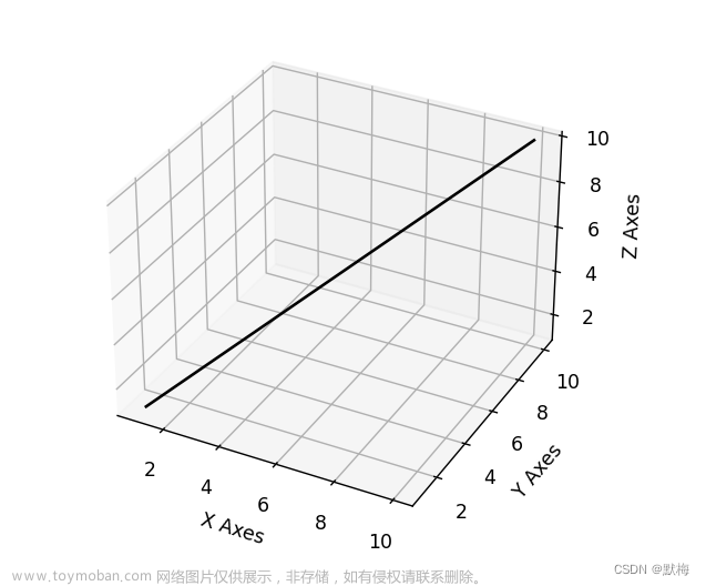
二、直线绘制(Line plots)
基本用法:
| 1 |
|
code:
| 1 2 3 4 5 6 7 8 9 10 11 12 13 14 15 16 17 18 |
|

三、散点绘制(Scatter plots)
基本用法:
| 1 |
|
- xs,ys,zs:输入数据;
- s:scatter点的尺寸
- c:颜色,如c = 'r'就是红色;
- depthshase:透明化,True为透明,默认为True,False为不透明
- *args等为扩展变量,如maker = 'o',则scatter结果为’o‘的形状
code:
| 1 2 3 4 5 6 7 8 9 10 11 12 13 14 15 16 17 18 19 20 21 22 23 24 25 26 27 28 29 30 |
|

四、线框图(Wireframe plots)
基本用法:
| 1 |
|
- X,Y,Z:输入数据
- rstride:行步长
- cstride:列步长
- rcount:行数上限
- ccount:列数上限
code:
| 1 2 3 4 5 6 7 8 9 10 11 12 13 14 |
|

五、表面图(Surface plots)
基本用法:
| 1 |
|
- X,Y,Z:数据
- rstride、cstride、rcount、ccount:同Wireframe plots定义
- color:表面颜色
- cmap:图层
code:
| 1 2 3 4 5 6 7 8 9 10 11 12 13 14 15 16 17 18 19 20 21 22 23 24 25 26 27 28 29 30 |
|

六、三角表面图(Tri-Surface plots)
基本用法:
| 1 |
|
- X,Y,Z:数据
- 其他参数类似surface-plot
code:
| 1 2 3 4 5 6 7 8 9 10 11 12 13 14 15 16 17 18 19 20 21 22 23 24 25 26 27 28 29 30 |
|

七、等高线(Contour plots)
基本用法:
| 1 |
|
code:
| 1 2 3 4 5 6 7 8 9 10 11 |
|

二维的等高线,同样可以配合三维表面图一起绘制:
code:
| 1 2 3 4 5 6 7 8 9 10 11 12 13 14 15 16 17 18 19 20 21 |
|

也可以是三维等高线在二维平面的投影:
code:
| 1 2 3 4 5 6 7 8 9 10 11 12 13 14 15 16 17 18 19 20 |
|

八、Bar plots(条形图)
基本用法:
| 1 |
|
- x,y,zs = z,数据
- zdir:条形图平面化的方向,具体可以对应代码理解。
code:
| 1 2 3 4 5 6 7 8 9 10 11 12 13 14 15 16 17 18 19 20 21 |
|

九、子图绘制(subplot)
A-不同的2-D图形,分布在3-D空间,其实就是投影空间不空,对应code:
| 1 2 3 4 5 6 7 8 9 10 11 12 13 14 15 16 17 18 19 20 21 22 23 24 25 26 27 28 29 30 31 |
|

B-子图Subplot用法
与MATLAB不同的是,如果一个四子图效果,如:

MATLAB:
1
2
3
subplot(2,2,1)
subplot(2,2,2)
subplot(2,2,[3,4])Python:
1
2
3
subplot(2,2,1)
subplot(2,2,2)
subplot(2,1,2)
code:
| 1 2 3 4 5 6 7 8 9 10 11 12 13 14 15 16 17 18 19 20 21 22 23 24 25 26 27 28 29 30 31 32 33 34 35 36 37 |
|

补充:
文本注释的基本用法:
code:
| 1 2 3 4 5 6 7 8 9 10 11 12 13 14 15 16 17 18 19 20 21 22 23 24 25 26 27 28 29 30 31 32 33 |
|
 文章来源地址https://www.toymoban.com/news/detail-735715.html
到了这里,关于python绘制三维图的文章就介绍完了。如果您还想了解更多内容,请在右上角搜索TOY模板网以前的文章或继续浏览下面的相关文章,希望大家以后多多支持TOY模板网!