一、起因
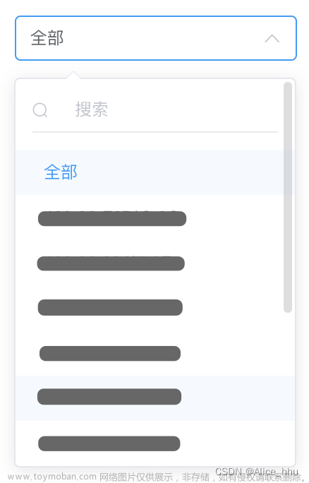
接到的项目需求,查看ui设计图后,由于微信小程序官方设计的下拉选择框不符合需求,而且常用的第三方库也没有封装类似的,所以选择自己自定义组件。在此记录一下,方便日后复用。
ui设计图如下:


微信官方提供的选择框

对比发现并不能实现我们想要的功能。
二、自定义组件
2.1 封装品牌组件
注:我这里的箭头是使用Vant-Weapp生成的,可自由替换组件或图片实现,把相应的wxss改掉即可
代码如下
- wxml
<view class="select_all_view">
 <!-- 内容说明,可以没有 -->
 <view class="select_title" wx:if="{{title}}">{{title}}</view>
 <view class="select_view">
  <!-- 输入框 -->
  <view class="inputPlaceholder" bindtap="startChange">
   <text class="text" wx:if='{{select}}' >{{select}}</text>
   <text class="text" wx:else="{{select}}" >{{placeholder}}</text>
   <view class="icon" wx:if='{{changable}}'>
    <van-icon name="arrow-down" />
   </view>
   <view class="icon" wx:else='{{changable}}'>
    <van-icon name="arrow" />
   </view>
  </view>
  <!-- 下拉展开后的可选择内容 -->
  <view class="content" wx:if='{{changable}}'>
   <view class="{{item.id==selectId ? 'active':''}}" wx:for="{{selectcontent}}" wx:key="idnex" bindtap="changecontent" data-datavalue="{{item}}">
    {{item.name}}
   </view>
  </view>
 </view>
</view>
- wxss
/* components/select-postSale.wxss */
.select_all_view {
  display: flex;
  z-index: 999;
}

.select_view {
  display: inline;
  width: 200rpx;
  height: 64rpx;
}

/* .select_title {
  margin-right: 10rpx;
} */

.inputPlaceholder {
  min-width: 230rpx;
  height: 64rpx;
  background: #FFFFFF;
  border: 2rpx solid #D9D9D9;
  border-radius: 12rpx 12rpx 12rpx 12rpx;
  padding: 4rpx 0rpx 10rpx 10rpx;
  border-radius: 10rpx;
  position: relative;
  overflow: hidden;
  text-overflow: ellipsis;
  white-space: nowrap;
  font-size: 28rpx;
  font-family: PingFang SC-Regular, PingFang SC;
  font-weight: 400;
  color: #000000;
  line-height: 33rpx;
}

.select_view .inputPlaceholder .text {
  height: 40rpx;
  position: relative;
  top: 16rpx;
  left: 12rpx;
}

.icon {
  position: absolute;
  right: 12rpx;
  top: 20rpx;
}

.content {
  position: absolute;
  z-index: 999;
  width: 200rpx;
  max-height: 208rpx;
  background: #FFFFFF;
  box-shadow: 0rpx 12rpx 32rpx 0rpx rgba(0, 0, 0, 0.08), 0rpx 6rpx 12rpx -8rpx rgba(0, 0, 0, 0.12), 0rpx 18rpx 56rpx 16rpx rgba(0, 0, 0, 0.05);
  border-radius: 16rpx 16rpx 16rpx 16rpx;
  opacity: 1;
  margin-top: 8rpx;
  padding: 20rpx;
  overflow-x: hidden;
  overflow-y: scroll;
  display: flex;
  flex-direction: column;
  justify-content: center;
  align-items: center;
}

.select_view .content .active {
  width: 184rpx;
  height: 64rpx;
  background: #F9F9F9;
  border-radius: 0rpx 0rpx 0rpx 0rpx;
  opacity: 1;
  font-size: 28rpx;
  font-family: PingFang SC-Regular, PingFang SC;
  font-weight: 400;
  color: #000000;
  line-height: 33rpx;
  display: flex;
  justify-content: center;
  align-items: center;
}

.select_view .content .normal {
  width: 184rpx;
  height: 64rpx;
  background: #FFFFFF;
  border-radius: 0rpx 0rpx 0rpx 0rpx;
  opacity: 1;
  font-size: 28rpx;
  font-family: PingFang SC-Regular, PingFang SC;
  font-weight: 400;
  color: #000000;
  line-height: 33rpx;
  display: flex;
  justify-content: center;
  align-items: center;
}- json
{
  "component": true,
  "usingComponents": {
    "van-icon": "@vant/weapp/icon/index"
  }
}- js
// components/select-postSale.js
Component({
  properties: {
   title:{
    type: String,
    value: ""
   },
   nameList: {
    type: Array,
    value: [],
    observer: function(){
    //有的时候选项组是后端获取数据来的,初始化时可能为[],所以这里使用obersver,当父组件中值改变时触发
     this.processData();
    }
   },
   nowId: {
    type: Number,
    value: -1
   },
   nowName: {
    type: String,
    value: "",
    observer: function(){
     this.setData({select: this. properties.nowName,
      selectId: this.properties.nowId,});
    }
   },
   placeholder: {
    type: String,
    value: ""
   }
  },

  /**
   * 页面的初始数据
   */
  data: {
   selectcontent: [],
   changable: false, //箭头切换
   select: undefined, //选中的值
   selectId: undefined, //选中的id
  },
  methods: {
  // 下拉框收起和展开
   startChange(e) {
    this.setData({
     changable: !this.data.changable
    })
   },
   // 选择数据后回显
   changecontent(e) {
    this.setData({
     select: e.currentTarget.dataset.datavalue.name,
     selectId: e.currentTarget.dataset.datavalue.id,
     changable: false
    })
    this.triggerEvent("handleChange", {selectId: this.data.selectId, select: this.data.select});//向父组件传参
   },
   //处理数据,复制一遍,因为子组件不能直接改变父组件的传进来的值。
   processData(){
    let options = [];
    let that = this;
    this.properties.nameList.forEach((item) => {
     options.push({
      id: item.id,
      name: item.name,
     });
    }); //forEach
    this.setData({
     selectcontent: options,
     select: that.properties.nowName,
     selectId: that.properties.nowId,
    });
   }
  }
 })
2.2 组件调用与ui原型图对比
在要使用组件的页面js中添加自己想要的数据
- js
 data: {
    curfId: 1,
    brandList: [{name: "万达影视" ,id: 1},
    {name: "金逸影视" ,id: 2},
    {name: "CGV" ,id: 3}
   ],
   curBrandName:"万达影视" ,
}- wxml
<select-postSale nowId="{{curfId}}" nameList="{{brandList}}" nowName="{{curBrandName}}" placeholder="请选择品牌" bind:handleChange="changeBrand"></select-postSale>- json
"usingComponents": {
    "van-icon": "@vant/weapp/icon/index",
    "select-postSale":"/components/select-postSale/select-postSale"
  },
  "navigationStyle": "custom"
ui设计图与效果对比

可以看到效果已经基本实现.具体细节需要优化一下
2.3 封装下方灰色区域组件
这个组件有两个地方使用,样式基本相同,拿上方的品牌组件修改一下样式即可
代码如下
- wxml
<!--pages/components/my_select/my_select.wxml-->
<view class="select_all_view">
 <view class="select_view">
  <!-- 输入框 -->
  <view class="inputPlaceholder" bindtap="startChange">
   <text class="text" wx:if='{{select}}' >{{select}}</text>
   <text class="text" wx:else="{{select}}" >{{placeholder}}</text>
   <view class="icon" wx:if='{{changable}}'>
    <van-icon name="arrow-down" />
   </view>
   <view class="icon" wx:else='{{changable}}'>
    <van-icon name="arrow" />
   </view>
  </view>
  <!-- 下拉展开后的可选择内容 -->
  <view class="content" wx:if='{{changable}}'>
   <view class="{{item.id==selectId ? 'active':'normal'}}" wx:for="{{selectcontent}}" wx:key="idnex" bindtap="changecontent" data-datavalue="{{item}}">
    {{item.name}}
   </view>
  </view>
 </view>
</view>
- wxss
/* components/select-postSale.wxss */
.select_all_view {
  display: flex;
  z-index: 999;
  width: 654rpx;
  height: 104rpx;
  background: #F9F9F9;
  border-radius: 12rpx 12rpx 12rpx 12rpx;
  opacity: 1;
}

.select_view {
  display: inline;
  /* width: 200rpx;
  height: 64rpx; */
}

.inputPlaceholder {
  min-width: 654rpx;
  height: 82rpx;
  background: #F9F9F9;
  border: 2rpx solid #D9D9D9;
  border-radius: 12rpx 12rpx 12rpx 12rpx;
  padding: 4rpx 0rpx 10rpx 10rpx;
  /* color: #252525;
  font-weight: 400; */
  border-radius: 10rpx;
  position: relative;
  overflow: hidden;
  text-overflow: ellipsis;
  white-space: nowrap;
  font-size: 32rpx;
  font-family: PingFang SC-Regular, PingFang SC;
  font-weight: 600;
  color: #000000;
  line-height: 38rpx;
}

.select_view .inputPlaceholder .text {
  height: 40rpx;
  position: relative;
  top: 30rpx;
  left: 24rpx;
}

.icon {
  position: absolute;
  right: 24rpx;
  top: 30rpx;
}

.content {
  position: absolute;
  z-index: 999;
  min-width: 626rpx;
  max-height: 516rpx;
  background: #FFFFFF;
  box-shadow: 0rpx 12rpx 32rpx 0rpx rgba(0, 0, 0, 0.08), 0rpx 6rpx 12rpx -8rpx rgba(0, 0, 0, 0.12), 0rpx 18rpx 56rpx 16rpx rgba(0, 0, 0, 0.05);
  border-radius: 16rpx 16rpx 16rpx 16rpx;
  opacity: 1;
  margin-top: 8rpx;
  padding: 20rpx;
  overflow-x: hidden;
  overflow-y: scroll;
  display: flex;
  flex-direction: column;
  justify-content: center;
  align-items: center;
}

.content>.inputPlaceholder {
  padding: 10rpx 0;
}

.select_view .active {
  width: 638rpx;
  height: 100rpx;
  background: #F9F9F9;
  font-size: 32rpx;
  font-family: PingFang SC-Regular, PingFang SC;
  font-weight: 600;
  color: #000000;
  line-height: 38rpx;
  display: flex;
  justify-content: center;
  align-items: center;
}

.select_view .normal {
  width: 638rpx;
  height: 100rpx;
  border-radius: 16rpx 16rpx 16rpx 16rpx;
  opacity: 1;
  font-size: 32rpx;
  font-family: PingFang SC-Regular, PingFang SC;
  font-weight: 600;
  color: #000000;
  line-height: 38rpx;
  display: flex;
  justify-content: center;
  align-items: center;
}- json
{
  "component": true,
  "usingComponents": {
    "van-icon": "@vant/weapp/icon/index"
  }
}- js
-
// components/select-postSale.js
Component({
  properties: {
   title:{
    type: String,
    value: ""
   },
   nameList: {
    type: Array,
    value: [],
    observer: function(){
    //有的时候选项组是后端获取数据来的,初始化时可能为[],所以这里使用obersver,当父组件中值改变时触发
     this.processData();
    }
   },
   nowId: {
    type: Number,
    value: -1
   },
   nowName: {
    type: String,
    value: "",
    observer: function(){
     this.setData({select: this. properties.nowName,
      selectId: this.properties.nowId,});
    }
   },
   placeholder: {
    type: String,
    value: ""
   }
  },

  /**
   * 页面的初始数据
   */
  data: {
   selectcontent: [],
   changable: false, //箭头切换
   select: undefined, //选中的值
   selectId: undefined, //选中的id
  },
  methods: {
  // 下拉框收起和展开
   startChange(e) {
    this.setData({
     changable: !this.data.changable
    })
   },
   // 选择数据后回显
   changecontent(e) {
    this.setData({
     select: e.currentTarget.dataset.datavalue.name,
     selectId: e.currentTarget.dataset.datavalue.id,
     changable: false
    })
    this.triggerEvent("handleChange", {selectId: this.data.selectId, select: this.data.select});//向父组件传参
   },
   //处理数据,复制一遍,因为子组件不能直接改变父组件的传进来的值。
   processData(){
    let options = [];
    let that = this;
    this.properties.nameList.forEach((item) => {
     options.push({
      id: item.id,
      name: item.name,
     });
    }); //forEach
    this.setData({
     selectcontent: options,
     select: that.properties.nowName,
     selectId: that.properties.nowId,
    });
   }
  }
 })
2.4 第二个组件调用与ui原型图对比
跟上方调用组件一样.在使用组件页面js中添加数据,这里调用两次组件即可,只是展示数据不一样
- js
 /**
   * 页面的初始数据
   */
  data: {
    curfId: 1,
   filmList: [{name: "坚如磐石" ,id: 1},
    {name: "变形金刚3" ,id: 2},
    {name: "复仇者联盟5" ,id: 3}
   ],
   curFilmName: "复仇者联盟5",
   dateList: [{name: "2023/10/16" ,id: 1},
    {name: "2023/10/23" ,id: 2},
    {name: "2023/10/30" ,id: 3}
   ],
   curDateName: "2023/10/16",
},- wxml
<select-postSale_2 nowId="{{curfId}}" nameList="{{filmList}}" nowName="{{curFilmName}}" placeholder="请选择要更换的电影"></select-postSale_2>

<select-postSale_2 nowId="{{curfId}}" nameList="{{dateList}}" nowName="{{curDateName}}" placeholder="请选择要修改的日期"></select-postSale_2>- json
"usingComponents": {
    "van-icon": "@vant/weapp/icon/index",
    "select-postSale_2":"/components/select-postSale_2/select-postSale_2"
  },
  "navigationStyle": "custom"
ui原型图与实现效果对比
电影部分

日期部分


三、自定义修改说明
- 选择框的大小修改inputPlaceholder样式即可
举个栗子: 此处我修改了宽度与背景色
.inputPlaceholder {
min-width: 400rpx;//修改后的宽度
height: 82rpx;
background: #FF00FF; // 修改后的背景色
border: 2rpx solid #D9D9D9;
border-radius: 12rpx 12rpx 12rpx 12rpx;
padding: 4rpx 0rpx 10rpx 10rpx;
position: relative;
overflow: hidden;
text-overflow: ellipsis;
white-space: nowrap;
font-size: 32rpx;
font-family: PingFang SC-Regular, PingFang SC;
font-weight: 400;
color: #000000;
line-height: 38rpx;
}

- 选择后的弹窗修改content样式即可
- 选中样式修改active,没选中样式修改normal,弹窗大小修改content
举个栗子:此处修改选中的背景色与没选中的背景色(懒人,修改背景色容易区分)
- active
.select_view .active {
width: 638rpx;
height: 100rpx;
background: #32CD32; // 修改后背景色
font-size: 32rpx;
font-family: PingFang SC-Regular, PingFang SC;
font-weight: 400;
color: #000000;
line-height: 38rpx;
display: flex;
justify-content: center;
align-items: center;
}
- normal
.select_view .normal {
width: 638rpx;
height: 100rpx;
background: #FF6347; // 修改后背景色
opacity: 1;
font-size: 32rpx;
font-family: PingFang SC-Regular, PingFang SC;
font-weight: 400;
color: #000000;
line-height: 38rpx;
display: flex;
justify-content: center;
align-items: center;
}

其他的需要自定义的依照自己ui样式修改即可。 文章来源:https://www.toymoban.com/news/detail-752245.html
文章来源地址https://www.toymoban.com/news/detail-752245.html
到了这里,关于微信小程序--下拉选择框组件封装,可CV直接使用的文章就介绍完了。如果您还想了解更多内容,请在右上角搜索TOY模板网以前的文章或继续浏览下面的相关文章,希望大家以后多多支持TOY模板网!


![[微信小程序] scroll-view组件下拉刷新,怎样结束刷新(已解决)](https://imgs.yssmx.com/Uploads/2024/01/807886-1.png)