源码:
链接:https://pan.baidu.com/s/120uNFjkiVcgXi5iycOdVAA?pwd=9zii
提取码:9zii
前言:
网页是由HTML和CSS写的,背景音乐和新闻列表有一点JS,对静态网页几乎没有影响,可删除。没有用到BootStrap之类的框架,对着官方网页F12,一点一点手写出来的,中间改动很多,类名都是照着官方网页源码起的,所以又臭又长。本人对前端了解不是很深入,对源码有问题的地方,尽量帮忙解决。
视频展示:点击跳转

01-项目目录

原神
- audio 文件夹:存放网页需要的视频,例如:首页背景播放的视频等
- css 文件夹:存放 CSS 文件(link 标签引入)
- images 文件夹:存放固定使用的图片素材,例如:logo、样式修饰图等
- js 文件夹:存放了一些简单的JS文件(可有可无),不影响主要的静态网页
- iconfont:原神图标
- index.html :首页 HTML 文件
引入样式表
<link rel="shortcut icon" href="favicon.ico" type="image/x-icon">
<link rel="stylesheet" href="./css/base.css">
<link rel="stylesheet" href="./css/index.css">
02-头部导航栏

- HTML文件
<div class="header">
<!-- 音乐播放器 -->
<div class="audio-controller" id="audio_on">
<img src="image/home/turn_on.png" style="width: 100%;" id="audio_headerimg">
</div>
<!-- 头部Logo -->
<div class="header__logo--cut">
<img src="image/home/header_logo.png" alt="">
</div>
<!-- 导航选项 -->
<div class="header__navbar">
<div class="header_Cloud"></div>
<div class="header_navitem">
<a class="header_hover">首 页</a>
<a href="#">新 闻</a>
<a href="#">角 色</a>
<a href="#">世 界</a>
<a href="#">漫 画</a>
<a href="#">社 区</a>
<a href="#">赛 事</a>
</div>
</div>
<!-- 导航右部分 -->
<div class="header__right">
<div class="header__login">
<a class="login_cs">
<span>成长关爱系统</span>
<img src="image/home/care.png" alt="">
</a>
</div>
<div class="header__login">
<button class="login_btn">
<span>登 录</span>
<img src="image/home/user.png" alt="">
</button>
</div>
</div>
</div>- CSS文件
/* 头部导航栏 */
.header {
    display: flex;
    width: 100%;
    height: 66px;
    position: fixed;
    z-index: 999;
    background-color: rgba(17, 17, 17, 0.75);
    box-shadow: 0px 3px 7px 0px rgba(0, 0, 0, 0.35);
    transition: opacity 0.5s ease-out;
}

.audio-controller {
    width: 29.5px;
    height: 29.5px;
    position: absolute;
    top: 18.5px;
    left: 70.5px;
    cursor: pointer;
}

.header__logo--cut {
    width: 317px;
    margin-left: 8px;
    overflow: hidden;
}

.header__logo--cut img {
    width: 100%;
    height: 100%;
    margin-left: 22.5px;
    object-fit: cover;
}

.header__navbar {
    width: 800px;
    margin-left: -45px;
    padding-right: 10px;
    display: inline-block;
}

.header_navitem a {
    position: relative;
    float: left;
    line-height: 66px;
    margin: 0 30px;
    font-size: 17px;
    color: #ccc;
    letter-spacing: 0.5px;
}

.header_hover {
    text-shadow: 0 0 10px #69e0ff, 0 0 20px #69e0ff, 0 0 40px #69e0ff;
    color: white;
}

.header_navitem a:hover {
    text-shadow: 0 0 10px #69e0ff, 0 0 40px #69e0ff, 0 0 40px #69e0ff;
    color: #fff;
}

.header_Cloud {
    position: absolute;
    transition: all 0.2s ease-out 0s;
    background-color: rgb(105, 224, 255);
    height: 5px;
    left: 310px;
    width: 40px;
    top: 0px;
}

.header__right {
    position: absolute;
    right: 30px;
    height: 100%;
    display: flex;
    align-items: center;
}

.header__login {
    cursor: pointer;
}

.login_cs {
    display: flex;
    align-items: center;
    margin-right: 20px;
}

.login_cs span {
    font-size: 17px;
    color: #ccc;
}

.header__login .login_btn {
    display: flex;
    align-items: center;
    padding: 0 10px;
    font-size: 17px;
    color: #ccc;
    cursor: pointer;
}

.header__login img {
    margin-left: 18px;
    width: 27px;
    height: 27px;
    opacity: 0.6;
}
03-首页背景

- HTML文件
<div class="bgWrap">
    <video loop="loop" muted="muted" autoplay>
        <source src="audio/video.mp4" type="audio/mp4">
    </video>
    <div class="poster__sign">
        <div class="qisheng">
            <img src="image/home/qisheng.png">
        </div>
        <div class="poster__video--entry">
            <img src="image/home/播放边框.png">
            <button class="poster_video"></button>
        </div>
        <!-- 下载区域 -->
        <div class="ys-download-pc__box">
            <div class="ys-download-pc__qr">
                <img class="ys-download-pc__qr-icon" src="image/download/二维码图标.jpg"/>
                <img class="ys-download-pc__qr-code" src="image/download/二维码.png"/>
            </div>
            <div class="ys-download-pc__ps4app">
                <img id="img" src="image/download/Ps4.png" />
                <img id="img" src="image/download/Apple.png" />
            </div>
            <div class="ys-download-pc__tapard">
                <img id="img" src="image/download/Tap.png" />
                <img id="img" src="image/download/Android.png" />
            </div>
            <img class="ys-download-pc" id="img" src="image/download/PC下载.png" />
        </div>
        <div class="poster__prohibit">
            <img src="image/home/12限制.png" alt="">
        </div>
        <div class="glide">
            <div class="arrow arrow_1"></div>
            <div class="arrow arrow_2"></div>
            <div class="arrow arrow_3"></div>
        </div>
    </div>
</div>- CSS文件
.bgWrap {
width: 100%;
height: 745px;
overflow: hidden;
}
.bgWrap video {
width: 100%;
height: 100%;
object-fit: cover;
}
.poster__sign {
display: flex;
flex-direction: column;
align-items: center;
justify-content: flex-end;
}
.qisheng {
position: absolute;
width: 161px;
height: 152px;
top: 71px;
right: 28px;
z-index: 6;
}
.poster__video--entry {
position: absolute;
top: 448px;
}
.poster_video {
position: relative;
display: block;
margin: -66px auto 0;
width: 48px;
height: 48px;
border-radius: 50%;
background: #fff;
}
.poster_video:hover {
transition: 0.2s;
background: transparent;
}
.poster_video::before {
content: '';
display: block;
position: absolute;
left: 50%;
top: 50%;
z-index: 1;
width: 28px;
height: 28px;
transform: translate(-50%, -50%);
background: url(../image/home/播放.png) no-repeat;
background-position: center top;
}
.poster_video:hover::before {
background-position: center bottom;
}
/* 下载区域 */
.ys-download-pc__box {
display: flex;
position: absolute;
top: 536px;
flex-direction: row;
align-items: center;
align-content: center;
justify-content: space-between;
width: 540px;
}
.ys-download-pc__box #img:hover {
filter: brightness(150%);
cursor: pointer;
transition: 0.3s linear;
}
.ys-download-pc__qr {
position: relative;
top: -14px;
}
.ys-download-pc__qr-code {
width: 102px;
height: 102px;
}
.ys-download-pc__qr-icon {
position: relative;
width: 29px;
height: 29px;
top: 66px;
left: 37px;
border: 2px solid #475e7d;
border-radius: 4px;
}
.ys-download-pc__ps4app {
display: flex;
flex-direction: column;
justify-content: space-between;
align-items: center;
}
.ys-download-pc__ps4app img {
width: 160px;
height: 55px;
}
.ys-download-pc__tapard {
display: flex;
flex-direction: column;
justify-content: space-between;
align-items: center;
}
.ys-download-pc__tapard img {
width: 160px;
height: 55px;
}
.ys-download-pc {
width: 112px;
height: 112px;
}
.poster__prohibit {
position: absolute;
top: 590px;
left: 20px;
width: 100px;
cursor: pointer;
}
.poster__prohibit img {
width: 100%;
}
.glide {
display: flex;
flex-direction: column;
position: absolute;
top: 690px;
}
.arrow {
width: 0;
height: 0;
border-top: 10px solid #fff;
border-left: 15px solid transparent;
border-right: 15px solid transparent;
margin-bottom: 8px;
animation-name: arrow;
animation-iteration-count: infinite;
animation-duration: 1.5s;
animation-timing-function: linear;
}
.arrow_1 {
animation-delay: 0s;
}
.arrow_2 {
animation-delay: 0.5s;
}
.arrow_3 {
animation-delay: 1s;
}
@keyframes arrow {
50% {
opacity: 0;
}
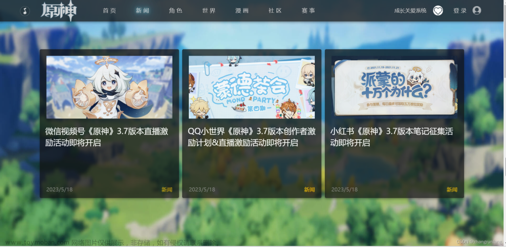
}04-新闻资讯

- HTML文件
<div class="new">
    <h3>新闻资讯</h3>
    <div class="news_banner">
        <!-- 轮播图 -->
        <div class="news_carousel">
            <div class="swiper-img">
                <img src="image/new/carousel/轮播1.jpg" />
                <img src="image/new/carousel/轮播2.jpg" />
                <img src="image/new/carousel/轮播3.jpg" />
                <img src="image/new/carousel/轮播4.jpg" />
            </div>
            <div class="imgdot">
                <ol>
                    <li><i class="current"></i></li>
                    <li><i></i></li>
                    <li><i></i></li>
                    <li><i></i></li>
                </ol>
            </div>
        </div>
        <!-- 新闻列表 -->
        <div class="news__contents">
            <ul class="news__tab__list__ul">
                <li class="currenters">最新</li>
                <li>新闻</li>
                <li>公告</li>
                <li>活动</li>
            </ul>
            <div class="tab_con">
                <!-- 最新 -->
                <ul class="item" style="display: block;">
                    <li>
                        <a>
                            <p class="item_p">《原神》「神铸赋形」活动祈愿即将开启,「法器·不灭月华」「...</p>
                            <p class="item_p2">2023/07/25</p>
                        </a>
                    </li>
                    <li>
                        <a>
                            <p class="item_p">《原神》「余火变相」活动祈愿现已开启</p>
                            <p class="item_p2">2023/07/25</p>
                        </a>
                    </li>
                    <li>
                        <a>
                            <p class="item_p">《原神》「浮岳虹珠」活动祈愿现已开启</p>
                            <p class="item_p2">2023/07/25</p>
                        </a>
                    </li>
                    <li>
                        <a>
                            <p class="item_p">《原神》「壁纸放送」</p>
                            <p class="item_p2">2023/07/29</p>
                        </a>
                    </li>
                    <li>
                        <a>
                            <p class="item_p">烟绯生日快乐 | 嗯!味道很不错,我很喜欢!</p>
                            <p class="item_p2">2023/07/28</p>
                        </a>
                    </li>
                </ul>
                <!-- 新闻 -->
                <ul class="item" style="display: none;">
                    <li>
                        <a>
                            <p class="item_p">《原神》「神铸赋形」活动祈愿即将开启,「法器·不灭月华」「...</p>
                            <p class="item_p2">2023/07/25</p>
                        </a>
                    </li>
                    <li>
                        <a>
                            <p class="item_p">《原神》「余火变相」活动祈愿现已开启</p>
                            <p class="item_p2">2023/07/25</p>
                        </a>
                    </li>
                    <li>
                        <a>
                            <p class="item_p">《原神》「浮岳虹珠」活动祈愿现已开启</p>
                            <p class="item_p2">2023/07/25</p>
                        </a>
                    </li>
                    <li>
                        <a>
                            <p class="item_p">《原神》「壁纸放送」</p>
                            <p class="item_p2">2023/07/29</p>
                        </a>
                    </li>
                    <li>
                        <a>
                            <p class="item_p">烟绯生日快乐 | 嗯!味道很不错,我很喜欢!</p>
                            <p class="item_p2">2023/07/28</p>
                        </a>
                    </li>
                </ul>
                <!-- 公告 -->
                <ul class="item" style="display: none;">
                    <li>
                        <a>
                            <p class="item_p">《原神》祈愿概率公示</p>
                        </a>
                    </li>
                    <li>
                        <a>
                            <p class="item_p">《原神》3.5版本「风花的呼吸」更新说明</p>
                            <p class="item_p2">2023/03/01</p>
                        </a>
                    </li>
                    <li>
                        <a>
                            <p class="item_p">《原神》「风花的呼吸」3.5版本更新维护预告</p>
                            <p class="item_p2">2023/02/27</p>
                        </a>
                    </li>
                    <li>
                        <a>
                            <p class="item_p">《原神》预下载已开启</p>
                            <p class="item_p2">2023/01/16</p>
                        </a>
                    </li>
                    <li>
                        <a>
                            <p class="item_p">《原神》3.4版本「馨弦奏华」更新维护预告</p>
                            <p class="item_p2">2023/01/16</p>
                        </a>
                    </li>
                </ul>
                <!-- 活动 -->
                <ul class="item" style="display: none;">
                    <li>
                        <a>
                            <p class="item_p">《原神》「神工天巧」活动即将开启</p>
                            <p class="item_p2">2022/02/28</p>
                        </a>
                    </li>
                    <li>
                        <a>
                            <p class="item_p">「岩港奇珍行记」网页活动说明</p>
                            <p class="item_p2">2020/11/02</p>
                        </a>
                    </li>
                    <li>
                        <a>
                            <p class="item_p">《原神》月夕祝颂-万份空月祝福相赠</p>
                            <p class="item_p2">2020/10/01</p>
                        </a>
                    </li>
                    <li>
                        <a>
                            <p class="item_p"> “在尘世的相逢”抖音《原神》公测主播招募</p>
                            <p class="item_p2">2020/09/28</p>
                        </a>
                    </li>
                    <li>
                        <a>
                            <p class="item_p"> “在尘世的相逢”快手直播《原神》主播招募活动</p>
                            <p class="item_p2">2020/09/16</p>
                        </a>
                    </li>
                </ul>
            </div>
            <a href="#" class="news__more">查看全部资讯</a>
        </div>
    </div>
</div>- CSS文件
.new {
position: relative;
display: flex;
flex-direction: column;
width: 100%;
height: 910px;
color: #fff;
background: url(../image/new/新闻资讯.jpg)no-repeat center/cover;
}
.new h3 {
position: relative;
margin: 183px auto 60px;
font-size: 50px;
font-weight: 400;
text-align: center;
}
.new h3::before,
.new h3::after {
content: '';
position: absolute;
top: 50%;
width: 385px;
height: 14px;
background: url(../image/new/border.png) no-repeat right center/cover;
}
.new h3::before {
left: 0;
transform: translate(calc(-100% - 32px), -50%);
}
.new h3::after {
right: 0;
transform: translate(calc(100% + 32px), -50%) rotateY(180deg);
}
/* 新闻banner区域 */
.news_banner {
display: flex;
justify-content: center;
height: 400px;
margin: 0 auto;
}
.news_carousel {
width: 640px;
height: 400px;
overflow: hidden;
}
.swiper-img img {
width: 2560px;
height: 400px;
float: left;
margin: 0;
padding: 0;
}
.swiper-img {
margin: 0 auto;
position: relative;
display: flex;
flex-direction: row;
animation: carousel 10s linear infinite;
}
@keyframes carousel {
0% {
transform: translateX(0);
}
20% {
transform: translateX(0);
}
27% {
transform: translateX(-638.8px);
}
47% {
transform: translateX(-638.8px);
}
54% {
transform: translateX(-1279.8px);
}
74% {
transform: translateX(-1279.8px);
}
80% {
transform: translateX(-1920px);
}
100% {
transform: translateX(-1920px);
}
}
.news_carousel .imgdot ol {
position: relative;
display: flex;
bottom: 37px;
left: 263px;
}
.news_carousel .imgdot ol i {
display: inline-block;
width: 18px;
height: 18px;
border-radius: 50%;
margin: 10px 5px;
box-shadow: 0 0 10px rgba(0, 0, 0, 0.5);
cursor: pointer;
}
.imgdot .current {
background-color: #fff;
}
/* 新闻列表 */
.news__contents {
position: relative;
width: 640px;
height: 400px;
background: rgba(38, 18, 12, 0.62);
}
.news__tab__list__ul {
display: flex;
align-items: flex-start;
width: 592px;
margin: 35px auto 0;
border-bottom: 3px solid rgba(255, 255, 255, 0.1);
}
.news__tab__list__ul li {
position: relative;
padding: 0 19px 12px;
font-size: 18px;
text-align: center;
cursor: pointer;
float: left;
}
.currenters {
color: #ffd49f;
border-bottom: 3px solid #ffd49f;
}
.tab_con {
width: 592px;
margin: 0 auto;
height: 260px;
cursor: pointer;
overflow: hidden;
}
.tab_con a {
position: relative;
display: flex;
align-items: center;
width: 100%;
height: 50px;
border-bottom: 2px solid rgba(255, 255, 255, 0.08);
box-sizing: content-box;
font-size: 16px;
color: #fff;
}
.tab_con a:hover {
cursor: pointer;
background: rgba(255, 212, 159, 0.06);
}
.item_p {
width: 480px;
height: 20px;
line-height: 20px;
padding-left: 11px;
}
.item_p2 {
color: rgba(255, 255, 255, 0.35);
}
.news__more {
position: absolute;
right: 33px;
bottom: 30px;
height: 22px;
line-height: 22px;
font-size: 18px;
color: rgba(255, 255, 255, 0.75);
cursor: pointer;
padding-left: 38px;
background: url(../image/new/加号.png) no-repeat left center/22px;
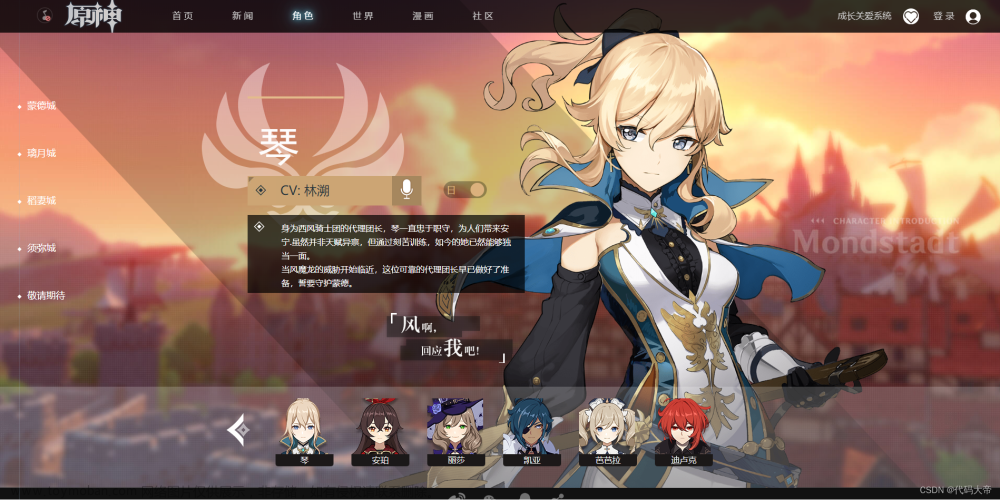
}05-城邦
 文章来源:https://www.toymoban.com/news/detail-754287.html
- HTML文件
<div class="city">
    <ul class="city__list">
        <!-- 蒙德城 -->
        <li class="city__list-item">
            <div class="city__list-bg" style="background-image: url(image/city/蒙德城.jpg);"></div>
            <a href="#">
                <p>蒙德城</p>
            </a>
            <div class="city__list-char" style="background-image: url(image/city/琴.png);"></div>
        </li>
        <!-- 璃月港 -->
        <li class="city__list-item">
            <div class="city__list-bg" style="background-image: url(image/city/璃月港.jpg);"></div>
            <a href="#">
                <p>璃月城</p>
            </a>
            <div class="city__list-char" style="background-image: url(image/city/神里凌华.png);"></div>
        </li>
        <!-- 稻妻城 -->
        <li class="city__list-item">
            <div class="city__list-bg" style="background-image: url(image/city/稻妻城.jpg);"></div>
            <a href="#">
                <p>稻妻城</p>
            </a>
            <div class="city__list-char" style="background-image: url(image/city/魈.png);"></div>
        </li>
        <!-- 须弥城 -->
        <li class="city__list-item">
            <div class="city__list-bg" style="background-image: url(image/city/须弥城.jpg);"></div>
            <a href="#">
                <p>须弥城</p>
            </a>
            <div class="city__list-char" style="background-image: url(image/city/提纳里.png);"></div>
        </li>
        <li class="city__list-item city__list-item--disable city__list-item3">
            <p>敬请期待</p>
        </li>
    </ul>
</div>- CSS文件
.city {
    width: 100%;
}

.city__list {
    overflow: hidden;
}

.city__list-item {
    position: relative;
    width: 100%;
    height: 260px;
    background: center no-repeat;
    background-size: 100% auto;
    cursor: pointer;
    overflow: hidden;
}

/* 没选中时的阴影 */
.city__list-item::before {
    position: absolute;
    z-index: 2;
    top: 0;
    left: 0;
    display: block;
    content: '';
    width: 100%;
    height: 100%;
    background: rgba(0, 0, 0, 0.4);
}

.city__list-item:hover:not(.city__list-char)::before {
    background: none;
}

.city__list-bg {
    position: absolute;
    top: 0;
    left: 0;
    display: block;
    width: 100%;
    height: 100%;
    block-size: 100% auto;
    transition: transform 0.4s 0s ease-out;
    background-size: cover;
}

.city__list-item a,
.city__list-item p {
    display: inline-block;
    position: relative;
    z-index: 3;
    font-size: 36px;
    color: #fff;
    line-height: 260px;
    width: 100%;
    height: 260px;
    background: url(../image/city/宝石.png) center no-repeat;
    background-size: 132px;
    text-align: center;
    text-shadow: 0 2px 6px rgba(0, 0, 0, 0.2);
    margin: 0 !important;
    overflow: hidden;
}

.city__list p::after {
    position: absolute;
    bottom: 91px;
    left: 50%;
    transform: translateX(-50%);
    display: block;
    content: '';
    width: 210px;
    height: 10px;
    background: url(../image/city/边框.png) center no-repeat;
    background-size: 210px 10px;
    opacity: 0;
}

.city__list-item:hover .city__list-bg {
    transform: scale(1.1);
}

.city__list-item:hover p::after,
.city__list-item:hover a::after {
    opacity: 1;
}

.city__list-item .city__list-char {
    position: absolute;
    z-index: 2;
    top: 0;
    left: 0;
    display: block;
    content: '';
    width: 100%;
    height: 100%;
    background-repeat: no-repeat;
    background-position: calc(50% + 360px) 50%;
    background-size: 960px 260px;
    opacity: 0;
    transition: all 0.2s 0s ease-in;
    border: #fff solid 6px;
    box-sizing: border-box;
}

.city ul li:hover .city__list-char {
    opacity: 1;
}

.city__list-item3 {
    background-image: url(../image/city/lastcontinue.jpg);
    background-size: cover;
}

.city__list-item--disable {
    pointer-events: none;
}
06-底部
 文章来源地址https://www.toymoban.com/news/detail-754287.html
- HTML文件
<div class="footer">
    <ul class="footer__socialbar">
        <li class="footer__socialitem"><img src="image/footer/新浪微博.png"></li>
        <li class="footer__socialitem"><img src="image/footer/微信.png"></li>
        <li class="footer__socialitem"><img src="image/footer/qq.png"></li>
        <li class="footer__socialitem"><img src="image/footer/分享方式.png"></li>
    </ul>
    <div class="footer_end">
        <img src="image/footer/footer.png" alt="">
    </div>
</div>- CSS文件
.footer {
  width: 100%;
  padding-bottom: 35px;
  margin: 0 auto;
  background-color: #111;
}

.footer__socialbar {
  display: flex;
  z-index: 2;
  list-style-type: none;
  width: 100%;
  height: 52px;
  line-height: 52px;
  background-color: #111;
  justify-content: center;
  align-items: center;
  margin: 0 auto;
  border-bottom: #1a1a1a solid 2px;
}

.footer__socialitem {
  position: relative;
  float: left;
  width: 32px;
  height: 32px;
  line-height: 32px;
  margin-right: 34px;
  opacity: 0.4;
  cursor: pointer;
  background-size: cover;
}

.footer_end img {
  width: 100%;
  height: 400px;
}
到了这里,关于HTML.CSS静态 原神 官方网页(开源)的文章就介绍完了。如果您还想了解更多内容,请在右上角搜索TOY模板网以前的文章或继续浏览下面的相关文章,希望大家以后多多支持TOY模板网!