Android应用开发学习笔记——目录索引
本章介绍视图(View)的基本概念及其用法,包括:如何设置视图的宽度和高度,如何设置视图的外部间距和内部间距,如何设置视图的外部对齐方式和内部对齐方式等。
在Android中,什么是视图(View)?View是Android中所有控件的基类,不管是简单的TextView,Button还是复杂的LinearLayout和ListView,它们的共同基类都是View;
View是一种界面层的控件的一种抽象,它代表了一个控件,除了View还有ViewGroup,从名字来看ViewGroup可以翻译为控件组,即一组View;
在Android中,ViewGroup也继承了View,这就意味着View可以是单个控件,也可以是由多个控件组成的一组控件;
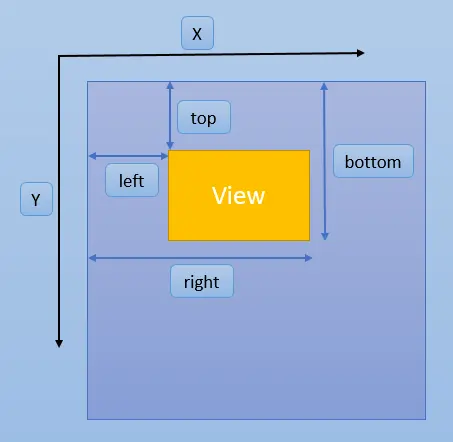
View坐标对应图
一、设置视图的宽和高
Layout XML中的控件属性:android:layout_width 和 android:layout_height
| 控件属性 |
取值 |
说明 |
| android:layout_width |
match_parent |
与上级视图保持一致 |
| wrap_content |
与内容自适应 |
|
| dp具体尺寸 |
以dp为单位的具体具体尺寸,如200dp |
|
| android:layout_height |
match_parent |
与上级视图保持一致 |
| wrap_content |
与内容自适应 |
|
| dp具体尺寸 |
已dp为单位的具体具体尺寸,如200dp |
在Java代码中设置视图宽、高:
-
XML中宽、高属性需要取值wrap_content
-
调用控件对象的getLayoutParams()获取布局参数,如TextView:
TextView textView = (TextView)findViewById(R.id.textView);
ViewGroup.LayoutParams layoutParams = textView.getLayoutParams();-
修改布局参数width、height(单位为pixel)
layoutParams.width = dp2px(this, 200);
layoutParams.height = dp2px(this, 50);
int dp2px(Context context, float dp) {
    float density = context.getResources().getDisplayMetrics().density;
    return (int) (density * dp + 0.5f);
}-
调用控件对象setLayoutParams(LayoutParams params)方法设置
textView.setLayoutParams(layoutParams);二、设置视图的间距
-
layout_margin:当前视图与外部视图(包括上级视图和平级视图)之间的距离属性。
-
padding:当前视图与内部视图(包括下级视图和内部文本)之间的距离属性。
layout_margin
| 控件属性 |
说明 |
| android:layout_margin |
一次性指定此视图与外部视图四周边距,适用于所有视图 |
| android:layout_marginLeft |
指定此视图与外部视图左边距 |
| android:layout_marginTop |
指定此视图与外部视图上边距 |
| android:layout_marginRight |
指定此视图与外部视图右边距 |
| android:layout_marginBottom |
指定此视图与外部视图下边距 |
| android:layout_marginHorizontal |
指定此视图与外部视图左侧和右侧的边距 |
| android:layout_marginVertical |
指定此视图与外部视图上侧和下侧的边距 |
| android:layout_marginStart |
效果同android:layout_marginLeft |
| android:layout_marginEnd |
效果同android:layout_marginRight |
padding:
| 控件属性 |
说明 |
| android:padding |
一次性指定此视图四周边距,适用于所有视图 |
| android:paddingLeft |
指定此视图左边距 |
| android:paddingTop |
指定此视图上边距 |
| android:paddingRight |
指定此视图右边距 |
| android:paddingBottom |
指定此视图下边距 |
| android:paddingHorizontal |
指定此视图左侧和右侧的边距 |
| android:paddingVertical |
指定此视图上侧和下侧的边距 |
| android:paddingStart |
指定此视图左边距,效果同android:paddingLeft |
| android:paddingEnd |
指定此视图右边距,效果同android:paddingRight |
不管是布局还是控件,都是有视图基类View派生而来,layout_margin和padding是View的一个通用属性。
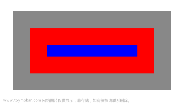
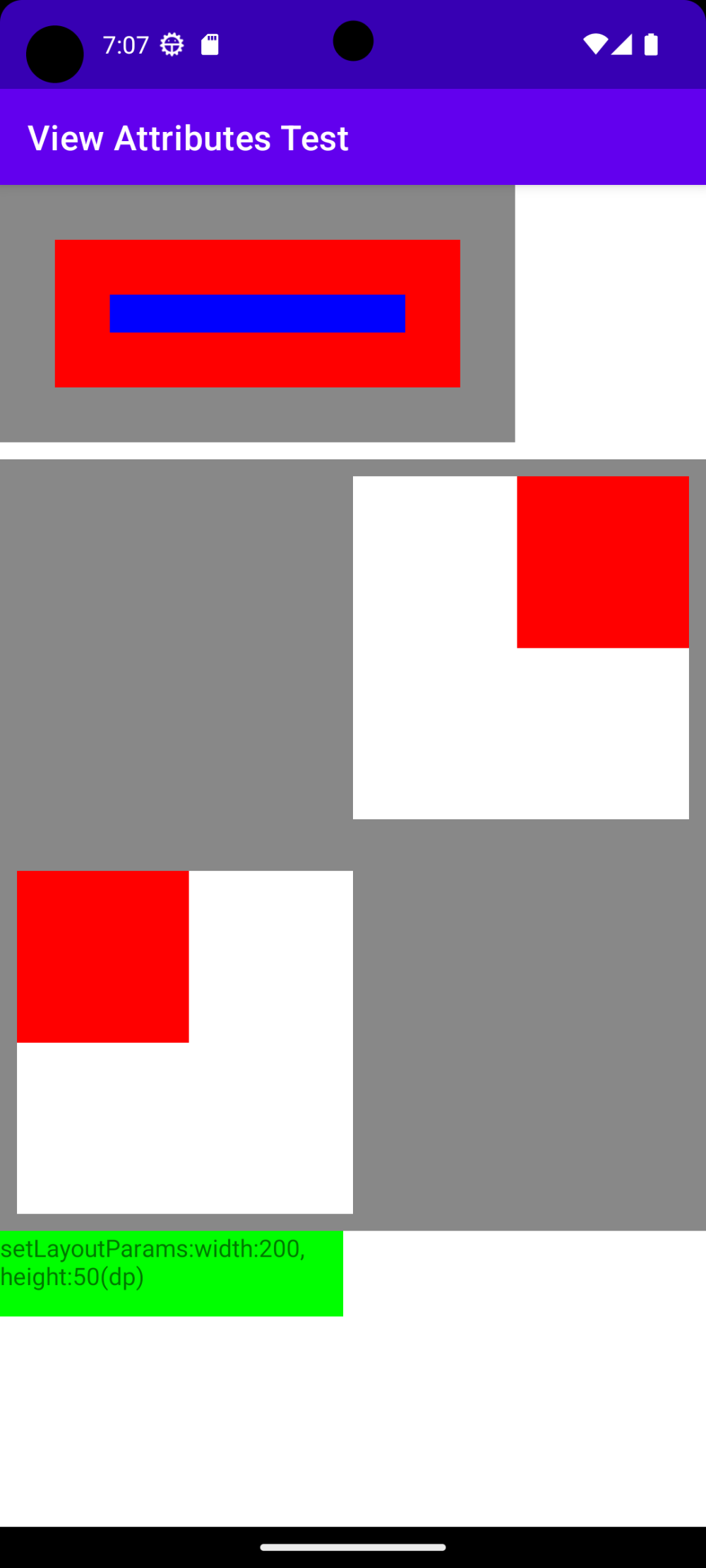
<LinearLayout
    android:layout_width="300dp"
    android:layout_height="150dp"
    android:layout_marginTop="32dp"
    android:orientation="vertical"
    android:background="@color/gray">

    <LinearLayout
        android:layout_width="match_parent"
        android:layout_height="match_parent"
        android:layout_margin="32dp"
        android:padding="32dp"
        android:background="@color/red"
        android:orientation="horizontal">

        <View
            android:layout_width="match_parent"
            android:layout_height="match_parent"
            android:background="@color/blue" />
    </LinearLayout>
</LinearLayout>
显示如下图:
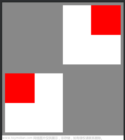
三、设置视图的对齐方式
参考:Android界面布局属性layout_gravity和gravity的区别_Hard Coder的博客-CSDN博客
-
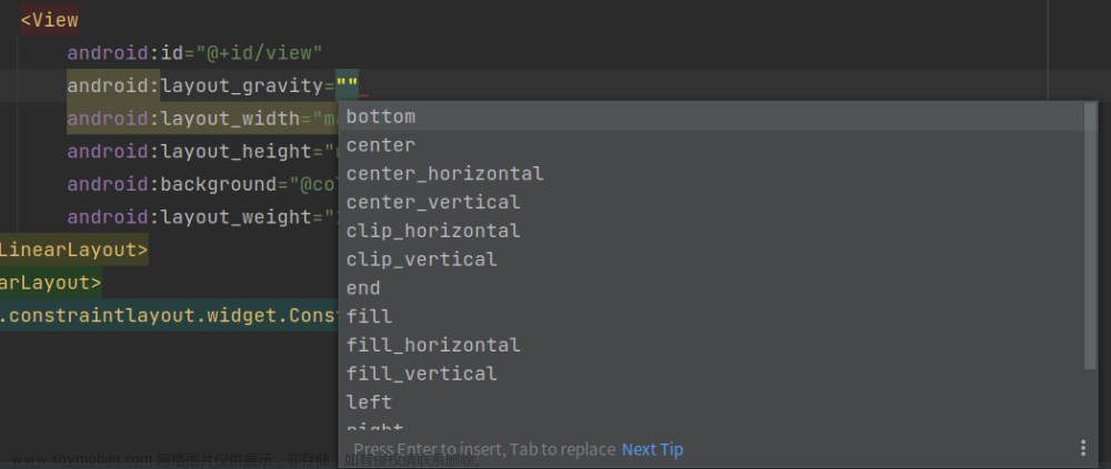
android:layout_gravity:当前视图与上级视图(父容器)的对齐方式。
-
android:gravity:设置子元素在该容器内的对齐方式。
android默认是左上对齐。
layout_gravity和gravity可以设置的值:top、bottom、left、right、center_vertical、fill_vertical、center_horizontal、fill_horizontal、center、fill、clip_vertical。(一个属性可以包含多个值,需用 “|” 分开),其具体作用如下:
| 控件属性 |
取值 |
说明 |
| android:layout_gravity |
top |
朝上对齐,将对象放在其容器的顶部,不改变其大小 |
| bottom |
朝下对齐,将对象放在其容器的底部,不改变其大小 |
|
| left |
靠左对齐,将对象放在其容器的左侧,不改变其大小 |
|
| right |
靠右对齐,将对象放在其容器的右侧,不改变其大小 |
|
| center |
将对象居中,不改变其大小 |
|
| center_horizontal |
将对象横向居中,不改变其大小 水平对齐方式,水平方向居中对齐 |
|
| center_vertical |
将对象纵向居中,不改变其大小 垂直对齐方式,垂直方向居中对齐 |
|
| fill |
必要的时候增加对象的横纵向大小,以完全充满容器 |
|
| fill_horizontal |
必要的时候增加对象的横向大小,以完全充满容器 水平方向填充 |
|
| fill_vertical |
必要的时候增加对象的纵向大小,以完全充满容器 垂直方向填充 |
|
| clip_horizontal |
附加选项 用于按照容器的边来剪切对象的左侧和/或右侧的内容,剪切基于其横向对齐设置; 左侧对齐时,剪切右侧;右侧对齐时,剪切左侧,除此之外剪切左侧和右侧; 水平方向裁剪 |
|
| clip_vertical |
附加选项 用于按照容器的边来剪切对象的顶部和/或底部的内容,剪切基于其纵向对齐设置; 顶部对齐时,剪切底部;底部对齐时,剪切顶部,除此之外剪切顶部和底部; 垂直方向裁剪 |
<?xml version="1.0" encoding="utf-8"?>
<LinearLayout xmlns:android="http://schemas.android.com/apk/res/android"
    android:layout_width="match_parent"
    android:layout_height="450dp"
    android:background="@color/gray"
    android:padding="10dp">

    <LinearLayout
        android:layout_width="0dp"
        android:layout_height="200dp"
        android:layout_weight="1"
        android:background="@color/white"
        android:layout_gravity="bottom"
        android:gravity="left"
        android:orientation="horizontal">
        <View
            android:layout_width="100dp"
            android:layout_height="100dp"
            android:background="@color/red"/>
    </LinearLayout>

    <LinearLayout
        android:layout_width="0dp"
        android:layout_height="200dp"
        android:layout_weight="1"
        android:layout_gravity="top"
        android:gravity="right"
        android:background="@color/white"
        android:orientation="horizontal">
        <View
            android:layout_width="100dp"
            android:layout_height="100dp"
            android:background="@color/red"/>
    </LinearLayout>
</LinearLayout>
显示如下图:
四、常见控件的基本属性总结
TextView:
向用户显示文本的用户界面元素
public class TextView extends View implements ViewTreeObserver.OnPreDrawListener
| XML中属性 | 描述 |
| android:id | 组件id |
| android:layout_width | 组件宽度 |
| android:lauout_height | 组件高度 |
| android:text | 文本内容 |
| android:textSize | 文本大小 |
| android:textColor | 文本颜色 |
| android:background | 组件背景 |
| android:ellipsize | 当文字长度超过textview宽度时的省略显示方式 "start"省略号显示在开头 "end"省略号显示在结尾 "middle"省略号显示在中间 "marquee"以横向滚动方向显示(需要获取当前焦点) |
| android:layout_weight | 权重占比 |
| 设置间距 | |
| android:layout_margin |
一次性指定此视图与外部视图四周边距,适用于所有视图 |
| android:layout_marginLeft |
指定此视图与外部视图左边距 |
| android:layout_marginTop |
指定此视图与外部视图上边距 |
| android:layout_marginRight |
指定此视图与外部视图右边距 |
| android:layout_marginBottom |
指定此视图与外部视图下边距 |
| android:layout_marginHorizontal |
指定此视图与外部视图左侧和右侧的边距 |
| android:layout_marginVertical |
指定此视图与外部视图上侧和下侧的边距 |
| android:layout_marginStart |
效果同android:layout_marginLeft |
| android:layout_marginEnd |
效果同android:layout_marginRight |
| android:padding |
一次性指定此视图四周边距,适用于所有视图 |
| android:paddingLeft |
指定此视图左边距 |
| android:paddingTop |
指定此视图上边距 |
| android:paddingRight |
指定此视图右边距 |
| android:paddingBottom |
指定此视图下边距 |
| android:paddingHorizontal |
指定此视图左侧和右侧的边距 |
| android:paddingVertical |
指定此视图上侧和下侧的边距 |
| android:paddingStart |
指定此视图左边距,效果同android:paddingLeft |
| android:paddingEnd |
指定此视图右边距,效果同android:paddingRight |
| 对齐方式 | |
| android:layout_gravity | 当前视图与上级视图(父容器)的对齐方式 |
| android:gravity | 设置子元素在该容器内的对齐方式 |
| android:textStyle | 文本的样式(正常、粗体、斜体、粗体|斜体) |
| android:layout_gravity | 当前视图与上级视图(父容器)的对齐方式 |
| android:gravity | 设置子元素在该容器内的对齐方式 |
| android:textStyle | 文本的样式(正常、粗体、斜体、粗体|斜体) |
| android:typeface | 文本行之间的显式高度 |
| ... | ... |
ImageView:
public class ImageView extends View
| XML中属性 | 描述 |
| android:adjustViewBounds |
如果您希望 ImageView 调整其边界以保持其可绘制对象的纵横比,请将此设置为 true。 |
| android:baseline |
此视图中基线的偏移量。 |
| android:baselineAlignBottom |
如果为真,则图像视图将基于其底部边缘进行基线对齐。 |
| android:cropToPadding |
如果为真,图像将被裁剪以适合其填充。 |
| android:maxHeight |
一个可选参数,用于为此视图提供最大高度。 |
| android:maxWidth |
一个可选参数,用于为此视图提供最大宽度。 |
| android:scaleType |
控制应如何调整图像大小或移动图像以匹配此 ImageView 的大小。 |
| android:src |
将可绘制对象设置为此 ImageView 的内容。 |
| android:tint |
图像的着色颜色。 |
| android:tintMode |
用于应用图像色调的混合模式。 |
EditText:
public class EditText extends TextView
| XML中属性 | 描述 |
| android:textCursorDrawable | 设置光标颜色 |
| android:textColorHint | 输入框提示字体颜色 |
| android:inputType | 输入内容类型 |
| android:text | 文本内容 |
| android:enableTextStylingShortcuts | 启用样式快捷方式 |
五、测试程序
java:
MainActivity.java
package com.example.viewattributestest;

import androidx.appcompat.app.AppCompatActivity;

import android.content.Context;
import android.graphics.Color;
import android.os.Bundle;
import android.os.TestLooperManager;
import android.util.Log;
import android.view.ViewGroup;
import android.widget.TextView;

public class MainActivity extends AppCompatActivity {
    private final static String TAG = "lzl-test-ViewAttributes";

    @Override
    protected void onCreate(Bundle savedInstanceState) {
        super.onCreate(savedInstanceState);
        setContentView(R.layout.activity_main);

        TextView textView = (TextView) findViewById(R.id.textView);
        ViewGroup.LayoutParams layoutParams = textView.getLayoutParams();
        Log.i(TAG, "onCreate: layoutParams.width:" + layoutParams.width + ", layoutParams.height:" + layoutParams.height);
        textView.setBackgroundColor(Color.GREEN);
        textView.setText("setLayoutParams测试");
        layoutParams.width = dp2px(this, 200);
        layoutParams.height = dp2px(this, 50);
        textView.setLayoutParams(layoutParams);
        textView.setText("setLayoutParams:width:" + 200 + ", height:" + 50 + "(dp)");
    }

    private int dp2px(Context context, float dp) {
        float density = context.getResources().getDisplayMetrics().density;
        return (int) (density * dp + 0.5f);
    }
}
xml:
res/layout/activity_main.xml
<?xml version="1.0" encoding="utf-8"?>
<LinearLayout xmlns:android="http://schemas.android.com/apk/res/android"
    xmlns:app="http://schemas.android.com/apk/res-auto"
    xmlns:tools="http://schemas.android.com/tools"
    android:layout_width="match_parent"
    android:layout_height="match_parent"
    android:orientation="vertical"
    tools:context=".MainActivity">

    <LinearLayout
        android:id="@+id/linearLayout"
        android:layout_width="300dp"
        android:layout_height="150dp"
        android:background="@color/gray"
        android:orientation="vertical">

        <LinearLayout
            android:layout_width="match_parent"
            android:layout_height="match_parent"
            android:layout_margin="32dp"
            android:background="@color/red"
            android:orientation="horizontal"
            android:padding="32dp">

            <View
                android:layout_width="match_parent"
                android:layout_height="match_parent"
                android:background="@color/blue" />
        </LinearLayout>
    </LinearLayout>

    <LinearLayout
        android:id="@+id/linearLayout2"
        android:layout_width="match_parent"
        android:layout_height="450dp"
        android:layout_marginTop="10dp"
        android:background="@color/gray"
        android:padding="10dp"
        app:layout_constraintTop_toBottomOf="@+id/linearLayout"
        tools:layout_editor_absoluteX="-16dp">

        <LinearLayout
            android:layout_width="0dp"
            android:layout_height="200dp"
            android:layout_gravity="bottom"
            android:layout_weight="1"
            android:background="@color/white"
            android:gravity="left"
            android:orientation="horizontal">

            <View
                android:layout_width="100dp"
                android:layout_height="100dp"
                android:background="@color/red" />
        </LinearLayout>

        <LinearLayout
            android:layout_width="0dp"
            android:layout_height="200dp"
            android:layout_gravity="top"
            android:layout_weight="1"
            android:background="@color/white"
            android:gravity="right"
            android:orientation="horizontal">

            <View
                android:layout_width="100dp"
                android:layout_height="100dp"
                android:background="@color/red" />
        </LinearLayout>
    </LinearLayout>
    <LinearLayout
        android:layout_width="match_parent"
        android:layout_height="match_parent"
        android:orientation="vertical">
        <TextView
            android:id="@+id/textView"
            android:layout_width="wrap_content"
            android:layout_height="wrap_content"
            android:text="TextView" />
    </LinearLayout>
</LinearLayout>
res/values/colors.xml中添加
    <color name="white">#FFFFFFFF</color>
    <color name="red">#FFFF0000</color>
    <color name="green">#FF00FF00</color>
    <color name="blue">#FF0000FF</color>
    <color name="gray">#FF888888</color>
模拟器上运行
源码及测试apk
百度网盘链接:百度网盘 请输入提取码 提取码:test
github下载地址:
GitHub - liuzhengliang1102/AndroidStudio-LearnAppDevelopment文章来源:https://www.toymoban.com/news/detail-768333.html
android:enableTextStylingShortcuts文章来源地址https://www.toymoban.com/news/detail-768333.html
到了这里,关于Android应用开发(4)视图布局基本属性的文章就介绍完了。如果您还想了解更多内容,请在右上角搜索TOY模板网以前的文章或继续浏览下面的相关文章,希望大家以后多多支持TOY模板网!