1、flex布局
1.1 flex认识

1.2 flex组成

1.3 flex布局

1.3.1 主轴对齐方式
<!DOCTYPE html>
<html lang="CN">
<head>
    <meta charset="UTF-8">
    <meta name="viewport" content="width=device-width, initial-scale=1.0">
    <title>flex--主轴对齐方式</title>
    <style>
        .box{
            width: 900px;
            height: 400px;
            border: 1px solid;
            display: flex;
            /* justify-content  项目在主轴(水平)方向的排布
                    flex-start:默认 从起点开始排 顺着主轴方向
                    flex-end:   从终点开始排  逆着主轴方向
                    center      居中
                    space-between:左 右 紧贴两边,中间平均分
                    space-around:均匀分布在盒子两侧,二倍宽
                    space-evenly:全部平均分

                       */
            justify-content: space-evenly;
        }
        .box div{
            width: 200px;
            height: 100px;
            background-color: aqua;
            border: 1px dashed rebeccapurple;
        }
    </style>
</head>
<body>
   <div class="box">
    <div></div>
    <div></div>
    <div></div>
    <div></div>
   </div>
</body>
</html>
1.3.2 侧轴对齐方式
<!DOCTYPE html>
<html lang="CN">
<head>
    <meta charset="UTF-8">
    <meta name="viewport" content="width=device-width, initial-scale=1.0">
    <title>侧轴对齐方式</title>
    <style>
        .box{
            width: 900px;
            height: 400px;
            border: 1px solid;
            display: flex;
            /* align-items  项目在侧轴方向的排布
                    flex-start:默认 上 侧轴的起点
                    flex-end:  侧轴终点
                    center      侧轴居中
                stretch:如果子元素没有高,默认拉伸高,沿着侧轴方向拉伸
                       */
            /* align-items: stretch; */
            /* justify-content: center; */
        }
        .box div{
            width: 200px;
            /* height: 100px; */
            background-color: aqua;
            border: 1px dashed rebeccapurple;
        }
    </style>
</head>
<body>
    <div class="box">
        <div></div>
        <div></div>
        <div></div>
        <div></div>
    </div>
</body>
</html>
1.3.3 修改主轴方向
<!DOCTYPE html>
<html lang="CN">
<head>
    <meta charset="UTF-8">
    <meta name="viewport" content="width=device-width, initial-scale=1.0">
    <title>改变主轴方向</title>
    <style>
        .box{
            width: 900px;
            height: 600px;
            border: 1px solid;
            display: flex;
            /* flex-direction:调整主轴的方向
                    row 默认 水平方向 行 从左到右
                    column 垂直方向 列  从上到下
                    row-reverse 水平方向 从右到左
                    column-reverse 垂直方向 从下到上
                       */
            flex-direction: column-reverse;
        }
        .box div{
            width: 200px;
            height: 100px;
            background-color: aqua;
            border: 1px dashed rebeccapurple;
        }
    </style>
</head>
<body>
    <div class="box">
        <div></div>
        <div></div>
        <div></div>
        <div></div>
    </div>
</body>
</html>
1.3.4 align-self
<!DOCTYPE html>
<html lang="CN">
<head>
    <meta charset="UTF-8">
    <meta name="viewport" content="width=device-width, initial-scale=1.0">
    <title>align-self</title>
    <style>
        * {
            box-sizing: border-box;
        }
        .box {
            display: flex;
            width: 780px;
            height: 500px;
            border: 1px solid red;
            align-items: center;
        }
        .box .son {
            width: 234px;
            height: 100px;
            background-color: pink;
            border: 1px dashed deeppink;
        }
        .box .son:nth-child(1){
			/* align-slef:单独控制某个弹性盒子的侧轴对齐方式 */
            align-self: flex-start;
        }
        .box .son:nth-child(3){
            align-self: flex-end;
        }
     </style>
</head>
<body>
     <div class="box">
        <div class="son">1</div>
        <div class="son">2</div>
        <div class="son">3</div>
     </div>
</body>
</html>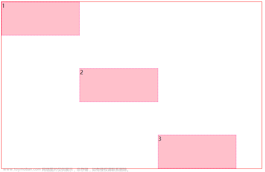
1.3.5 弹性伸缩比
<!DOCTYPE html>
<html lang="CN">
<head>
    <meta charset="UTF-8">
    <meta name="viewport" content="width=device-width, initial-scale=1.0">
    <title>弹性伸缩比</title>
    <style>
        .box{
            width: 1000px;
            height: 600px;
            border: 1px solid;
            display: flex;
        }
        .box div{
            flex: 1;
            width: 200px;
            height: 100px;
            background-color: aqua;
            border: 1px dashed rebeccapurple;
        }
        .box div:nth-child(1){
            flex: 2;
        }
        .box div:last-child{
            flex: 2;
        }
    </style>
</head>
<body>
    <div class="box">
        <div></div>
        <div></div>
        <div></div>
        <div></div>
    </div>
</body>
</html>
1.3.6 弹性盒子换行
弹性盒子可以自动挤压或拉伸,默认情况下,所有盒子都在一行显示。
属性名:flex-wrap
属性值:
wrap:换行
nowrap:不换行(默认)
<!DOCTYPE html>
<html lang="CN">
<head>
    <meta charset="UTF-8">
    <meta name="viewport" content="width=device-width, initial-scale=1.0">
    <title>弹性盒子换行</title>
    <style>
        *{
            margin: 0;
            padding: 0;
            box-sizing: border-box;
        }
        .box{
            width: 700px;
            height: 500px;
            background-color: pink;
            display: flex;
            /* flex-wrap wrap 换行,nowrap 不换行 */
            flex-wrap: wrap;
            justify-content: space-between;
            align-items: center;
        }
        .son{
            width: 200px;
            height: 200px;
            background-color: aqua;
        }
    </style>
</head>
<body>
    <div class="box">
        <div class="son">1</div>
        <div class="son">2</div>
        <div class="son">3</div>
        <div class="son">4</div>
        <div class="son">5</div>
        <div class="son">6</div>
     </div>
</body>
</html>
1.3.7 行对齐方式
 文章来源:https://www.toymoban.com/news/detail-818100.html
<!DOCTYPE html>
<html lang="CN">
<head>
    <meta charset="UTF-8">
    <meta name="viewport" content="width=device-width, initial-scale=1.0">
    <title>行对齐方式</title>
    <style>
        *{
            margin: 0;
            padding: 0;
            box-sizing: border-box;
        }
        .box{
            width: 700px;
            height: 500px;
            border: 1px solid;
            display: flex;
            /* 添加了换行,浏览器就会认为你是多行 */
            flex-wrap: wrap;
            justify-content: space-evenly;
            /* 1.多行 2.控制行在侧轴上的对齐方式  */
            align-content: space-evenly;

        }
        .son{
            width: 200px;
            height: 200px;
            background-color: aqua;
        }
    </style>
</head>
<body>
    <div class="box">
        <div class="son">1</div>
        <div class="son">2</div>
        <div class="son">3</div>
        <div class="son">4</div>
        <div class="son">5</div>
        <div class="son">6</div>
     </div>
</body>
</html>
文章来源地址https://www.toymoban.com/news/detail-818100.html
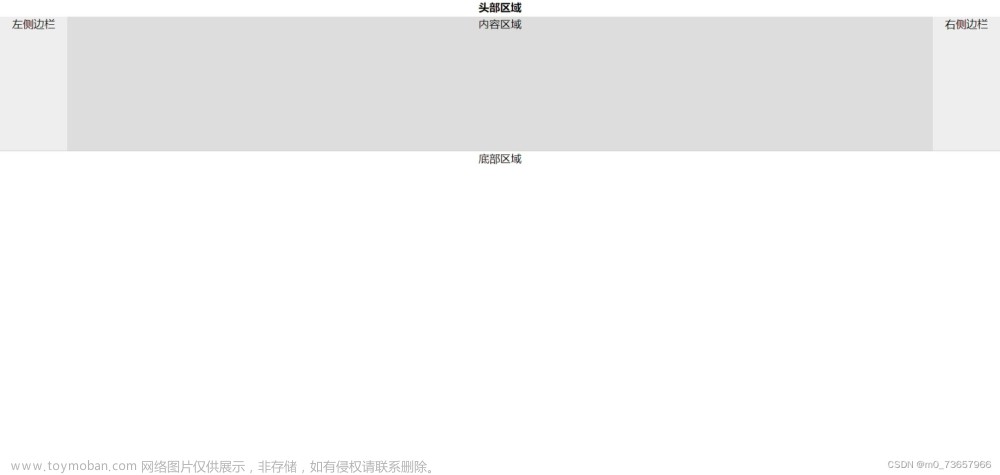
到了这里,关于Web04--Flex布局的文章就介绍完了。如果您还想了解更多内容,请在右上角搜索TOY模板网以前的文章或继续浏览下面的相关文章,希望大家以后多多支持TOY模板网!


![[HTML]Web前端开发技术10(HTML5、CSS3、JavaScript )CSS+DIV页面布局,固定定位,相对定位relative,绝对定位absolute,层定位的应用——喵喵画网页](https://imgs.yssmx.com/Uploads/2024/02/783047-1.png)


![[HTML]Web前端开发技术11(HTML5、CSS3、JavaScript )页面布局设计 “三行模式”或“三列模式”“三行二列”“三行三列”模式 多行多列复杂模式水平导航菜单——喵喵画网页](https://imgs.yssmx.com/Uploads/2024/02/787720-1.png)