前言
Vue 是前端开发中非常常见的一种框架,它的易用性和灵活性使得它成为了很多开发者的首选。而在 Vue2 版本中,组件的开发也变得非常简单,但随着 Vue3 版本的发布,组件开发有了更多的特性和优化,为我们的业务开发带来了更多便利。本文将介绍如何使用 Vue3 开发业务组件,并通过代码实例进行演示。
一、自己封装组件
1、button 代码
在
src目录下创建components文件夹,并在该文件夹下创建Button文件。
在Button文件中创建index.vue文件和index.ts文件,并编写以下代码
在index.vue文件中编写以下代码
<script lang="ts" setup name="ZButton">
defineProps({
  text: {
    type: String,
    default: ''
  },
  btnSize: {
    type: String,
    default: 'default'
  },
  size: {
    type: Number,
    default: 14
  },
  type: {
    type: String,
    default: 'default'
  },
  left: {
    type: Number,
    default: 0
  },
  right: {
    type: Number,
    default: 0
  },
  disabled: {
    type: Boolean,
    default: false
  },
  loading: {
    type: Boolean,
    default: false
  }
})
</script>

<template>
  <div :type="type" :size="btnSize" :class="`z-button-${type}`" :disabled="disabled" :loading="loading" :style="{
    marginLeft: `${left}px`,
    marginRight: `${right}px`
  }">
    {{ text }}
  </div>
</template>

<style lang="scss" scoped>
.z-button-blue {
  background: #80d4fb;
  color: #fff;
  border: none;

  &:hover,
  &:focus,
  &:active {
    background: #80d4fb80;
    color: #fff;
  }

  .anticon {
    color: #fff;
  }
}

.z-button-warn {
  background: #ec622b;
  color: #fff;
  border: none;
  outline: none;

  &:hover,
  &:focus,
  &:active {
    background-color: #ec622b80;
    color: #fff;
  }

  .anticon {
    color: #fff;
  }
}
</style>
在
index.ts文件中编写以下代码
import ZButton from "./index.vue";

export default ZButton
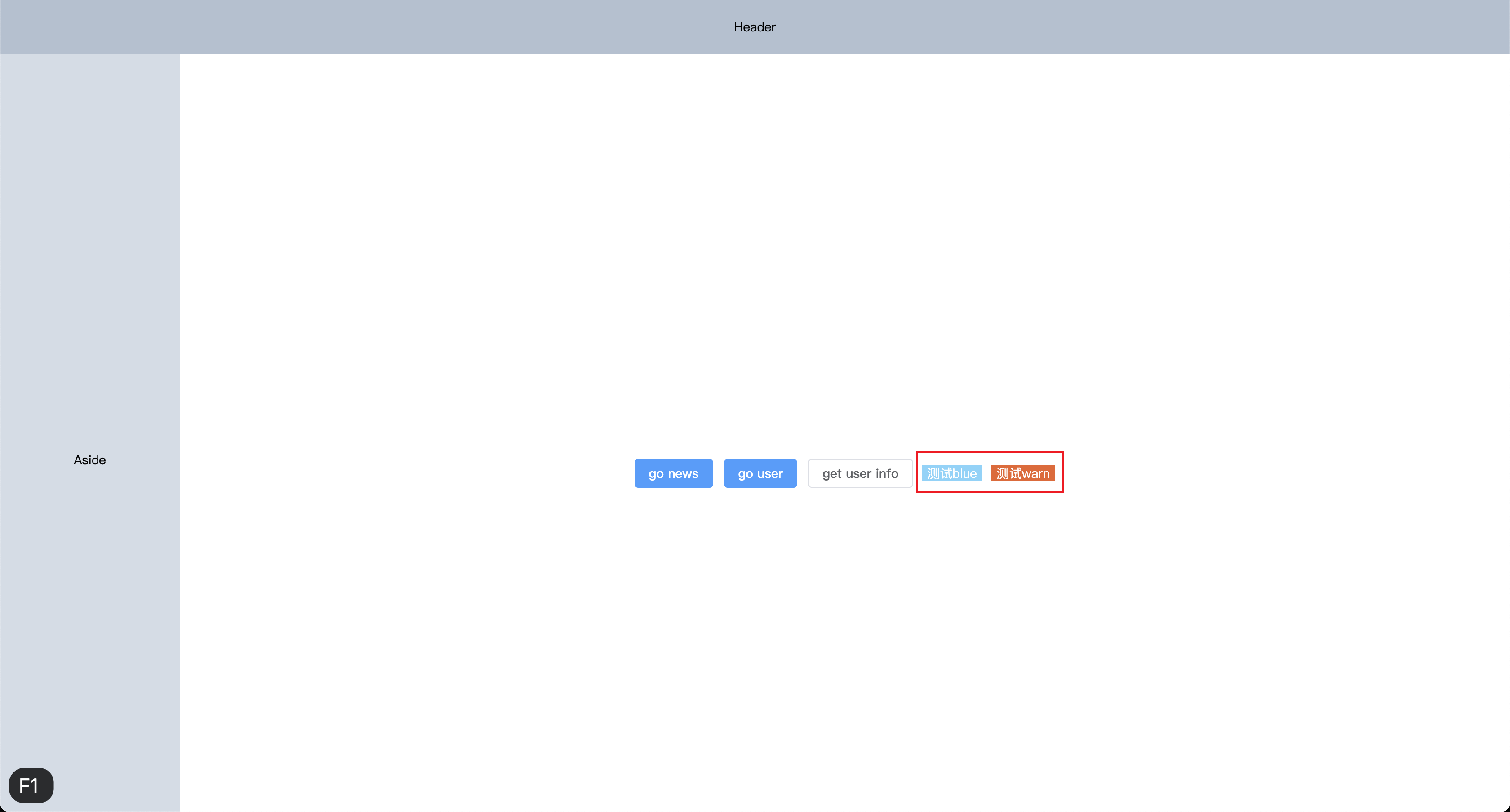
2、button 使用组件
我们在 home 页面导入组件来进行测试
<script setup lang="ts">
import { useRouter } from 'vue-router'
import useUserStore from '@/store/modules/user'
import ZButton from '@/components/Button/index' // 新增

const router = useRouter()
const userStore = useUserStore()

function goRouter(path: string): void {
  router.push(path)
}

function getUserInfo(): void {
  console.log(userStore.userInfo, 'userStore.userInfo')
}
</script>

<template>
  <div class="flex-c flex-align h-100">
    <el-button type="primary" @click="goRouter('/news')">
      go news
    </el-button>
    <el-button type="primary" @click="goRouter('/user')">
      go user
    </el-button>
    <el-button @click="getUserInfo">
      get user info
    </el-button>
    <el-button type="primary" @click="goRouter('/table')">
      go table
    </el-button>
    <!-- 新增 -->
    <z-button type="blue" text="测试blue" :left="10"></z-button>
    <!-- 新增 -->
    <z-button type="warn" text="测试warn" :left="10"></z-button>
  </div>
</template>
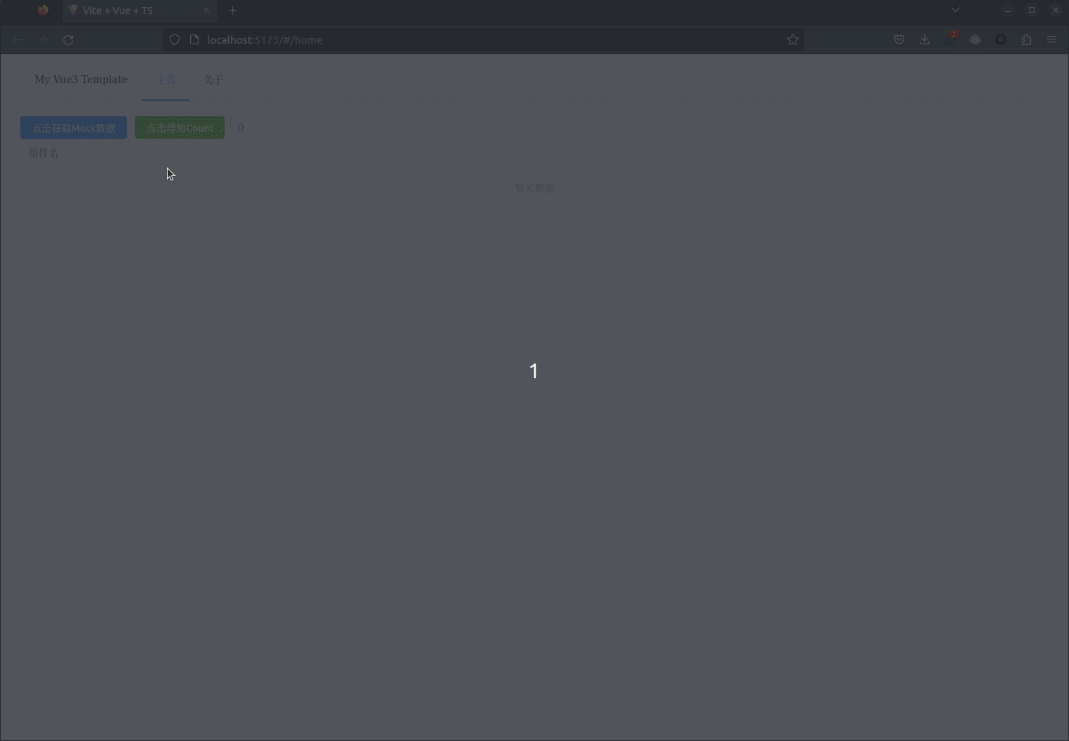
3、button 效果图
二、基于 Element-Plus 封装组件
1、table 代码
在
components文件夹下创建Table文件。在
Table文件中创建index.vue、index.ts和types.ts文件,并编写以下代码
在index.vue文件中编写以下代码
<script setup lang="ts" name="ZTable">
import { ref, computed, watch, nextTick, defineExpose } from 'vue'
import { ElTable } from 'element-plus'
import { ZTableOptions } from './types'

const props = withDefaults(
  defineProps<{
    // 表格配置选项
    propList: ZTableOptions[]
    // 表格数据
    data: any[]
    // 表格高度
    height?: string | number
    maxHeight?: string | number
    // 显示复选框
    showSelectColumn?: boolean
    // 显示复选框
    showExpand?: boolean
    // 显示序号
    showIndexColumn?: boolean
    // 显示操作column
    operation?: boolean
    // 操作column 宽度
    operationWidth?: string
    moreOperationsPopoverWidth?: string
    // 加载状态
    loading?: boolean
    // 加载文案
    loadingText?: string
    // 加载图标名
    elementLoadingSpinner?: string
    // 是否显示分页
    pagination?: boolean
    // 显示分页的对齐方式
    paginationAlign?: 'left' | 'center' | 'right'
    pageInfo?: any
    // 显示分页数据多少条的选项
    pageSizes?: number[]
    // 数据总条数
    total?: number
    emptyImg?: boolean
  }>(),
  {
    propList: () => [],
    height: '100%',
    operation: true,
    operationWidth: '240px',
    moreOperationsPopoverWidth: '160px',
    paginationAlign: 'right',
    pageInfo: () => ({ page: 1, size: 10 }),
    pageSizes: () => [10, 15, 20, 30],
    total: 0,
    emptyImg: true
  }
)

const ZTableRef = ref<InstanceType<typeof ElTable>>()
const tablePropList: any = ref([])

watch(
  () => props.propList,
  (list) => {
    tablePropList.value = []
    nextTick(() => {
      tablePropList.value = JSON.parse(JSON.stringify(list))
    })
  },
  {
    immediate: true
  }
)

// 表格分页的排列方式
const justifyContent = computed(() => {
  if (props.paginationAlign === 'left') return 'flex-start'
  else if (props.paginationAlign === 'right') return 'flex-end'
  else return 'center'
})

const emits = defineEmits([
  'row-click',
  'select-rows',
  'page-change',
  'sort-change',
  'operation-click'
])

const handleOperationClick = (row: any, code: string, index: number) => {
  emits('operation-click', code, row, index)
}
const selectable = (row: any, index: any) => {
  return !row.noSelectable
}
const handleRowClick = (row: any, column: any) => {
  if (column?.label == '操作') return
  emits('row-click', row, column)
}
const handleSelectionChange = (list: any) => {
  emits('select-rows', list)
}
const handleSizeChange = (size: number) => {
  emits('page-change', { page: 1, size })
}
const handleCurrentChange = (page: number) => {
  emits('page-change', { ...props.pageInfo, page })
}
const changeTableSort = (value: any) => {
  emits('sort-change', value)
}
const toggleSelection = (rows?: any) => {
  if (rows) {
    rows.forEach((row: any) => {
      ZTableRef.value!.toggleRowSelection(row, true)
    })
  } else {
    ZTableRef.value!.clearSelection()
  }
}

defineExpose({
  toggleSelection
})
</script>

<template>
  <div class="z-table">
    <el-table :data="data" :height="height" :max-height="maxHeight" ref="ZTableRef" v-loading="loading"
      :element-loading-text="loadingText" :element-loading-spinner="elementLoadingSpinner" stripe
      @sort-change="changeTableSort" @row-click="handleRowClick" @selection-change="handleSelectionChange"
      v-bind="$attrs">
      <template #empty v-if="emptyImg">
        <div class="empty-box">
          <el-empty></el-empty>
        </div>
      </template>
      <el-table-column type="expand" v-if="showExpand">
        <template #default="scope">
          <slot name="baseExpandSlot" :row="scope.row"></slot>
        </template>
      </el-table-column>
      <el-table-column v-if="showSelectColumn" type="selection" :selectable="selectable" fixed="left" align="center"
        width="55"></el-table-column>
      <el-table-column v-if="showIndexColumn" fixed="left" type="index" label="序号" align="center"
        width="55"></el-table-column>
      <template v-for="propItem in tablePropList" :key="propItem.prop">
        <template v-if="propItem.visible !== false">
          <template v-if="!propItem.slotName">
            <el-table-column v-bind="propItem"></el-table-column>
          </template>
          <template v-else>
            <el-table-column v-bind="propItem">
              <template #default="scope">
                <slot :name="propItem.slotName" :format="propItem.dateFormat" :row="scope.row" :prop="propItem.prop"
                  :index="scope.$index">
                </slot>
              </template>
            </el-table-column>
          </template>
        </template>
      </template>
      <el-table-column v-if="operation" label="操作" :width="operationWidth" fixed="right">
        <template #default="scope">
          <template v-if="scope.row.operations">
            <div class="operations-wrap">
              <template v-for="(o, i) in scope.row.operations" :key="o.code">
                <el-button v-if="i < 3" text type="primary" size="small" :disabled="o.disabled"
                  @click="handleOperationClick(scope.row, o.code, scope.$index)">
                  {{ o.name }}
                </el-button>
              </template>
              <el-popover placement="bottom-end" :width="moreOperationsPopoverWidth"
                v-if="scope.row.operations.length > 3">
                <template #reference>
                  <el-icon color="#26A5FF" class="more-dot">
                    <MoreFilled />
                  </el-icon>
                </template>
                <div class="more-operations">
                  <template v-for="(o, i) in scope.row.operations" :key="o.code">
                    <el-button v-if="i > 2" text type="primary" size="small" :disabled="o.disabled" @click="
                      handleOperationClick(scope.row, o.code, scope.$index)
                      ">
                      {{ o.name }}
                    </el-button>
                  </template>
                </div>
              </el-popover>
            </div>
          </template>
        </template>
      </el-table-column>
    </el-table>
    <div v-if="pagination" class="pagination" :style="{ justifyContent }">
      <el-pagination small :current-page="pageInfo.page" :page-sizes="pageSizes" :page-size="pageInfo.size"
        layout="total, sizes, prev, pager, next, jumper" :total="total" @size-change="handleSizeChange"
        @current-change="handleCurrentChange"></el-pagination>
    </div>
  </div>
</template>

<style lang="scss" scoped>
.operations-wrap {
  .el-button+.el-button {
    margin-left: 25px;
  }

  .more-dot {
    position: relative;
    top: 0.3em;
    margin-left: 25px;
    font-size: 20px;
    cursor: pointer;
  }
}

.more-operations {
  display: flex;
  flex-wrap: wrap;

  .el-button {
    overflow: hidden;
    margin-left: 10px;
    height: 32px;
    border-radius: 8px;
    line-height: 32px;
  }
}

.el-loading-mask {
  z-index: 1;
}

.pagination {
  display: flex;
  margin-top: 16px;
}

.el-table__expand-column .cell {
  width: 55px;
}

.is-dark {
  max-width: 40%;
}
</style>
在
index.ts文件中编写以下代码
import ZTable from './index.vue'

export default ZTable
在
types.ts文件中编写以下代码
export interface ZTableOptions {
  // 是否可见
  visible?: boolean
  // 自定义列模板的插槽名
  slotName?: string
  // 日期格式化
  dateFormat?: string
  // 表头
  label: string
  // 字段名称
  prop?: string
  // 对应列的宽度
  width?: string | number
  minWidth?: string | number
  // 对齐方式
  align?: 'left' | 'center' | 'right'
  fixed?: true | 'left' | 'right'
  showOverflowTooltip?: boolean
  sortable?: boolean | 'custom'
}
2、table 组件使用
在
table文件中下添加index.vue并添加对应路由文件,编写以下代码
<script lang="ts" setup>
import ZTable from '@/components/Table/index'
import { ref } from 'vue'
import { ZTableOptions } from '@/components/Table/types'

const tableData: any = ref([
  {
    fileName: '测试文件01',
    fileType: 'pdf',
    submitterName: '张三',
    submitTime: '2024-01-04 09:34:18'
  },
  {
    fileName: '测试文件02',
    fileType: 'png',
    submitterName: '李四',
    submitTime: '2024-01-04 11:26:57'
  }
])

const propList: ZTableOptions[] = [
  {
    showOverflowTooltip: true,
    label: '文件名称',
    prop: 'fileName',
    minWidth: 130,
    align: 'left'
  },
  {
    showOverflowTooltip: true,
    label: '文件类型',
    prop: 'fileType',
    minWidth: 130,
    align: 'left'
  },
  {
    label: '上传人',
    prop: 'submitterName',
    minWidth: 150,
    showOverflowTooltip: true
  },
  {
    label: '上传时间',
    prop: 'submitTime',
    minWidth: 160
  }
]
</script>

<template>
  <div>
    <z-table :propList="propList" :data="tableData" :operation="false"></z-table>
  </div>
</template>

<style scoped lang="scss">
</style>
3、table 效果图
 文章来源:https://www.toymoban.com/news/detail-826293.html
总结
通过以上的介绍和代码实例,我们可以看到 Vue3 提供了更多的特性和优化,让我们更加方便地开发业务组件。在实际开发中,我们可以根据实际需求选择合适的组件开发方式,并通过 Vue3 的特性来提升开发效率。希望本文能够帮助到你在 Vue3 开发中的业务组件开发。上文中的配置代码可在 github 仓库中直接 copy,仓库路径:https://github.com/SmallTeddy/ProjectConstructionHub。文章来源地址https://www.toymoban.com/news/detail-826293.html
到了这里,关于前端新手Vue3+Vite+Ts+Pinia+Sass项目指北系列文章 —— 第十一章 基础界面开发 (组件封装和使用)的文章就介绍完了。如果您还想了解更多内容,请在右上角搜索TOY模板网以前的文章或继续浏览下面的相关文章,希望大家以后多多支持TOY模板网!