We have gone through the basic part of how to clean and process before analyzing your data.
How to communicate with your data?
R语言具有生成各种图形的多种可能性。
并非所有图形功能对初学者来说都是必要的。 复杂的图形需要长代码。
我们将从简单的图形元素开始,然后逐步定制复杂图形。
Which package do we need: ggplot 2
>library (ggplot2)
What can we do?
For continuous variables:
Creating, editing coloring histogram
For categorical variables
Creating, editing coloring bar plot
我们需要哪个包:
ggplot2 >库(ggplot2)
我们能做什么
对于连续变量: 创建,编辑着色直方图
对于分类变量: 创建,编辑着色条形图
# 导入 ggplot2 包
library(ggplot2)

# 创建一个数据框
data <- data.frame(
  x = c(1, 2, 3, 4, 5),
  y = c(2, 3, 4, 5, 6)
)

# 使用 ggplot 函数创建一个散点图
ggplot(data, aes(x = x, y = y)) +
  geom_point()
Separate parts or layers
In ggplot2, a plot can be subdivided into separate parts or layers, each of which contributes to the final appearance of the plot. This layering system allows you to add different elements to the plot, such as data points, lines, text, and annotations, in a flexible and customizable way.
Here's a brief explanation of the key components of a ggplot2 plot:
-
Data: The data you want to visualize, typically in the form of a data frame.
-
Aesthetic Mapping (aes) adj. 审美的,美学的;美的,艺术的: Aesthetic mappings define how variables in the data are mapped to visual properties of the plot, such as x and y positions, colors, shapes, and sizes.
-
Geoms (Geometric Objects): Geoms are the visual elements that represent the data in the plot, such as points, lines, bars, and polygons. Each geom function adds a new layer to the plot.
-
Facets: Facets allow you to create multiple plots, each showing a different subset of the data. You can facet by one or more variables to create small multiples.
-
Stats (Statistical Transformations): Stats are used to calculate summary statistics or perform transformations on the data before plotting. Each stat function can be thought of as a new dataset that is plotted using a geom.
-
Scales: Scales control how the data values are mapped to the visual properties of the plot, such as axes, colors, and sizes. You can customize scales to change the appearance of the plot.
-
Coordinate Systems: Coordinate systems determine how the plot is spatially arranged. The default is Cartesian coordinates, but ggplot2 also supports polar coordinates and other specialized coordinate systems.
By combining these components and adding them in layers, you can create complex and informative visualizations that effectively communicate insights from your data.
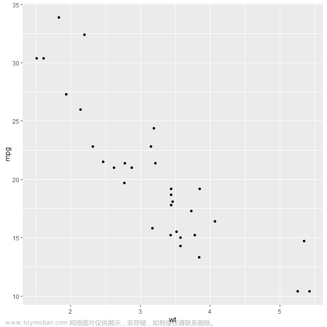
Using mtcars dataset to explore:
The mtcars dataset in R contains information about various features of 32 different automobiles from the early 1970s. Here are the meanings of the variables in the mtcars dataset:
- mpg: Miles per gallon (fuel efficiency).
- cyl: Number of cylinders.
- disp: Displacement (engine size) in cubic inches.
- hp: Gross horsepower.
- drat: Rear axle ratio.
- wt: Weight (in 1000 lbs).
- qsec: 1/4 mile time (in seconds).
- vs: Engine type, where 0 = V-shaped and 1 = straight.
- am: Transmission type, where 0 = automatic and 1 = manual.
- gear: Number of forward gears.
- carb: Number of carburetors.
#Load mtcars and ggplot2
data("mtcars")
str(mtcars)

library(ggplot2)
'data.frame': 32 obs. of 11 variables:
$ mpg : num 21 21 22.8 21.4 18.7 18.1 14.3 24.4 22.8 19.2 ...
$ cyl : num 6 6 4 6 8 6 8 4 4 6 ...
$ disp: num 160 160 108 258 360 ...
$ hp : num 110 110 93 110 175 105 245 62 95 123 ...
$ drat: num 3.9 3.9 3.85 3.08 3.15 2.76 3.21 3.69 3.92 3.92 ...
$ wt : num 2.62 2.88 2.32 3.21 3.44 ...
$ qsec: num 16.5 17 18.6 19.4 17 ...
$ vs : num 0 0 1 1 0 1 0 1 1 1 ...
$ am : num 1 1 1 0 0 0 0 0 0 0 ...
$ gear: num 4 4 4 3 3 3 3 4 4 4 ...
$ carb: num 4 4 1 1 2 1 4 2 2 4 ...It tell the performances of cars in the US.
ggplot(mtcars,aes(x=mpg))+geom_histogram()![[R] How to communicate with your data? - ggplot2,r语言,python,开发语言](https://imgs.yssmx.com/Uploads/2024/03/838362-2.png)
ggplot(mtcars,aes(x=cyl))+geom_histogram()![[R] How to communicate with your data? - ggplot2,r语言,python,开发语言](https://imgs.yssmx.com/Uploads/2024/03/838362-3.png)
It look poor.
ggplot(mtcars,aes(x=mpg))+geom_dotplot()![[R] How to communicate with your data? - ggplot2,r语言,python,开发语言](https://imgs.yssmx.com/Uploads/2024/03/838362-4.png)
The resulting image is a dot plot where each dot represents a car from the mtcars dataset, and the position of the dot on the x-axis represents its miles per gallon value. The dot plot can give you an idea of the distribution of miles per gallon values in the dataset and can help identify any patterns or outliers.
ggplot(mtcars,aes(x=qsec))+geom_area(stat="bin")![[R] How to communicate with your data? - ggplot2,r语言,python,开发语言](https://imgs.yssmx.com/Uploads/2024/03/838362-5.png)
The code attempts to create an area plot using the qsec variable from the mtcars dataset.
ggplot(mtcars,aes(x=disp))+geom_density()

#or

ggplot(mtcars,aes(x=disp))+geom_density(kernel ="gaussian")![[R] How to communicate with your data? - ggplot2,r语言,python,开发语言](https://imgs.yssmx.com/Uploads/2024/03/838362-6.png)
The code creates a density plot using the disp (displacement) variable from the mtcars dataset. Here's a breakdown of the code:
-
ggplot(mtcars, aes(x = disp)): This sets up the basic plot using themtcarsdataset and specifies that the x-axis of the plot should represent thedispvariable. -
geom_density(): This adds a layer to the plot, specifying that the data should be displayed as a density plot.
Density plots are useful for visualizing the distribution of a continuous variable and can help identify patterns such as peaks, valleys, and skewness偏度 in the data.
In a density plot created using geom_density(), the y-axis represents the density of the data at each point along the x-axis. Density is a way of representing the distribution of data values. It is calculated using kernel density estimation, which estimates the probability density function of the underlying variable.
Graphing
poor for publication
1.binwidth
2. color
3. title and labels
4. Gaussian curve: from a normal distribution or not
Change four parameters in my bar design= change to be made on Geom
Binwidth=nbr Change the bar width
Fill ="name of the colour" Change the colour with which the bar is filled
Colour="name of the colour” Change the outline of the bar
Alpha=nbr Change the transparency of the colour
ggplot(mtcars,aes(x=mpg))+geom_histogram(binwidth = 5)
ggplot(mtcars,aes(x=mpg))++geom_histogram(fill="blue",binwidth=5)
ggplot(mtcars,aes(x=mpg))+geom_histogram(fill="skyblue",alpha=0.7,binwidth=5,colour="grey")![[R] How to communicate with your data? - ggplot2,r语言,python,开发语言](https://imgs.yssmx.com/Uploads/2024/03/838362-8.png)
![[R] How to communicate with your data? - ggplot2,r语言,python,开发语言](https://imgs.yssmx.com/Uploads/2024/03/838362-9.png)
![[R] How to communicate with your data? - ggplot2,r语言,python,开发语言](https://imgs.yssmx.com/Uploads/2024/03/838362-10.png)
#Let's practice, hisogram of BMI in purple
#after importing the excel file with File->Import dataset->From excel
ggplot(SEE_students_data_2,aes(x=BMI))+geom_histogram(binwidth = 1, fill="purple",colour="black",alpha=0.5)![[R] How to communicate with your data? - ggplot2,r语言,python,开发语言](https://imgs.yssmx.com/Uploads/2024/03/838362-11.png)
-
ggplot(SEE_students_data_2, aes(x = BMI)):使用SEE_students_data_2数据集,将BMI变量映射到x轴。 -
geom_histogram(binwidth = 1, fill = "purple", colour = "black", alpha = 0.5):添加直方图层,其中binwidth = 1指定每个直方柱的宽度为1(即每个单位)。fill = "purple"设置直方图的填充颜色为紫色,colour = "black"设置边框颜色为黑色,alpha = 0.5设置透明度为0.5,使得直方图具有一定的透明度。 -
ggplot(SEE_students_data_2, aes(x = BMI)): This sets up the basic plot using theSEE_students_data_2dataset and maps the BMI variable to the x-axis. -
geom_histogram(binwidth = 1, fill = "purple", colour = "black", alpha = 0.5): This adds a histogram layer to the plot.binwidth = 1specifies the width of each histogram bin as 1 (i.e., each unit).fill = "purple"sets the fill color of the histogram bars to purple,colour = "black"sets the border color to black, andalpha = 0.5sets the transparency to 0.5, giving the histogram bars some transparency.
Tips:
1. Since male and female depends on the variable Gender, the fill option should be specified in the aesthetics part
2. Geom_area require the option stat=bin when there is no variable plot on the Y axis
ggplot(SEE_students_data_2,aes(x=BMI, fill=Gender))+geom_density(colour="black",alpha=0.5)![[R] How to communicate with your data? - ggplot2,r语言,python,开发语言](https://imgs.yssmx.com/Uploads/2024/03/838362-12.png)
-
ggplot(SEE_students_data_2, aes(x = BMI, fill = Gender)): Sets up the basic plot using theSEE_students_data_2dataset. Theaes()function maps the BMI variable to the x-axis and uses theGendervariable to fill the density curves by gender. -
geom_density(colour = "black", alpha = 0.5): Adds a density plot layer to the plot. Thecolour = "black"argument sets the color of the density curve outlines to black, and thealpha = 0.5argument sets the transparency of the density curves to 0.5, making them partially transparent.
ggplot(SEE_students_data_2,aes(x=BMI, fill=Gender)) + geom_area(stat="bin", colour="black",alpha=0.5,binwidth=1)Geom_area require the option stat=bin when there is no variable to plot on the Y axis![[R] How to communicate with your data? - ggplot2,r语言,python,开发语言](https://imgs.yssmx.com/Uploads/2024/03/838362-13.png)
ggplot(SEE_students_data_2,aes(x=BMI, fill=Gender))+geom_density(colour="black",alpha=0.5)+labs(title="Body Mass index per Gender\nSEE Students", y="Frequency",x="Body Mass Index")
#add a title and axis title to the BMI geom_density graph![[R] How to communicate with your data? - ggplot2,r语言,python,开发语言](https://imgs.yssmx.com/Uploads/2024/03/838362-14.png)
Unvariate categorical data
#Graphing a factor variable using geom_bar()
ggplot(SEE_students_data_2,aes(x=Gender))+geom_bar()
![[R] How to communicate with your data? - ggplot2,r语言,python,开发语言](https://imgs.yssmx.com/Uploads/2024/03/838362-15.png)
#adding color to the bar using a set, a given color, manually defined colors
ggplot(SEE_students_data_2,aes(x=Gender, fill=Gender))+geom_bar(alpha=0.5)+scale_fill_brewer(palette="Set1")
ggplot(SEE_students_data_2,aes(x=Gender, fill=Gender))+geom_bar()+scale_fill_brewer(palette = "Blues")
ggplot(SEE_students_data_2,aes(x=Gender,fill=Gender))+geom_bar(alpha=0.75)+scale_fill_manual(values=c("pink","blue"))
-
ggplot(SEE_students_data_2, aes(x = Gender, fill = Gender)) + geom_bar(alpha = 0.5) + scale_fill_brewer(palette = "Set1"): This code creates a bar plot where each bar is filled with a color from the "Set1" color palette调色板, which is part of the RColorBrewer酿造师 package. Thealpha = 0.5argument sets the transparency of the bars to 0.5, making them partially transparent. -
ggplot(SEE_students_data_2, aes(x = Gender, fill = Gender)) + geom_bar() + scale_fill_brewer(palette = "Blues"): This code creates a bar plot with bars filled with shades of blue from the "Blues" color palette. The bars are fully opaque by default. -
Manually defined color: ggplot(SEE_students_data_2, aes(x = Gender, fill = Gender)) + geom_bar(alpha = 0.75) + scale_fill_manual(values = c("pink", "blue")): This code creates a bar plot with bars filled with the colors "pink" and "blue", using thescale_fill_manual()function to manually specify the colors. Thealpha = 0.75argument sets the transparency of the bars to 0.75, making them partially transparent.
![[R] How to communicate with your data? - ggplot2,r语言,python,开发语言](https://imgs.yssmx.com/Uploads/2024/03/838362-16.png)
![[R] How to communicate with your data? - ggplot2,r语言,python,开发语言](https://imgs.yssmx.com/Uploads/2024/03/838362-17.png)
![[R] How to communicate with your data? - ggplot2,r语言,python,开发语言](https://imgs.yssmx.com/Uploads/2024/03/838362-18.png)
Order the bar in the right order:
# Install and load the forcats package
install.packages("forcats")
library(forcats)

# Create the plot with the reordered factor levels
ggplot(CUHKSZ_employment_survey_1, aes(fct_infreq(Occupation, palette="Blues")) +
  geom_bar(fill = Occupation, alpha = 0.75) +
  scale_fill_brewer(palette = "Blues")
-
ggplot(CUHKSZ_employment_survey_1, aes(x = fct_infreq(Occupation), fill = Occupation)): This sets up the basic plot using theCUHKSZ_employment_survey_1dataset. Thexaesthetic uses thefct_infreq()function from theforcatspackage to reorder theOccupationvariable based on frequency. Thefillaesthetic fills the bars based on theOccupationvariable. -
geom_bar(alpha = 0.75): This adds a bar plot layer to the plot. Thealphaparameter sets the transparency of the bars to 0.75, making them partially transparent. -
scale_fill_brewer(palette = "Blues"): This sets the fill color of the bars using the "Blues" color palette from theRColorBrewerpackage. -
the
fill = Occupationaesthetic is used to fill the bars of the bar plot based on the levels of theOccupationvariable. Each unique level of theOccupationvariable will be represented by a different color in the plot, which can be helpful for distinguishing between different categories or groups in the data.文章来源:https://www.toymoban.com/news/detail-838362.html -
additional resources: STHDA - Homehttp://www.sthda.com/english/文章来源地址https://www.toymoban.com/news/detail-838362.html
到了这里,关于[R] How to communicate with your data? - ggplot2的文章就介绍完了。如果您还想了解更多内容,请在右上角搜索TOY模板网以前的文章或继续浏览下面的相关文章,希望大家以后多多支持TOY模板网!