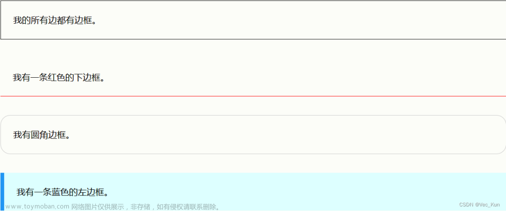
Android使用shape属性绘制边框内渐变色

这篇具有很好参考价值的文章主要介绍了Android使用shape属性绘制边框内渐变色。希望对大家有所帮助。如果存在错误或未考虑完全的地方,请大家不吝赐教,您也可以点击"举报违法"按钮提交疑问。

先上效果图

这是使用AndroidStudio绘制的带有渐变色的边框背景色

Android使用shape属性绘制边框内渐变色,Android,学习教程,android,笔记

实现方法

项目中由于UI设计需求,需要给按钮、控件设置带有背景色效果的。以下是UI效果图。
Android使用shape属性绘制边框内渐变色,Android,学习教程,android,笔记

这里我们使用shape属性来绘制背景效果。

shape属性介绍

<?xml version="1.0" encoding="utf-8"?>
<shape
    xmlns:android="http://schemas.android.com/apk/res/android"
    android:shape=["rectangle" | "oval" | "line" | "ring"] > // 定义形状
    <corners //圆角属性
        android:radius="integer"
        android:topLeftRadius="integer"
        android:topRightRadius="integer"
        android:bottomLeftRadius="integer"
        android:bottomRightRadius="integer" />
    <gradient //渐变属性
        android:angle="integer"
        android:centerX="integer"
        android:centerY="integer"
        android:centerColor="integer"
        android:endColor="color"
        android:gradientRadius="integer"
        android:startColor="color"
        android:type=["linear" | "radial" | "sweep"]
        android:useLevel=["true" | "false"] />
    <padding //边距属性
        android:left="integer"
        android:top="integer"
        android:right="integer"
        android:bottom="integer" />
    <size //大小属性
        android:width="integer"
        android:height="integer" />
    <solid //填充属性
        android:color="color" />
    <stroke //描边属性
        android:width="integer"
        android:color="color"
        android:dashWidth="integer"
        android:dashGap="integer" />
</shape>

Shape可以定义控件的一些展示效果,例如圆角,渐变,填充,描边,大小,边距;shape子标签就可以实现这些效果,shape子标签有下面几个属性:
corners,
gradient,
padding,
size,
solid,
stroke:
corners
(圆角)

代码

layer-list 是用来创建 图层列表的,通过它能创建出一些特殊的 drawable

<?xml version="1.0" encoding="utf-8"?>
<layer-list xmlns:android="http://schemas.android.com/apk/res/android">
    <!--顶部的渐变色-->
    <item
        android:gravity="top">
        <shape
            xmlns:android="http://schemas.android.com/apk/res/android"
            android:shape="rectangle">
            <gradient
                android:type="linear"
                android:angle="90"
                android:startColor="#0077b3c7"
                android:endColor="#9077b3c7"
                android:useLevel="false"/>

            <size
                android:width="100dp"
                android:height="10dp" />
        </shape>
    </item>

    <!--左侧的渐变色-->
    <item
        android:gravity="left">
        <shape
            xmlns:android="http://schemas.android.com/apk/res/android"
            android:shape="rectangle">
            <gradient
                android:type="linear"
                android:angle="0"
                android:startColor="#9077b3c7"
                android:endColor="#0077b3c7"
                android:useLevel="false"/>
            <size
                android:width="10dp"
                android:height="100dp" />
        </shape>
    </item>

    <!--右侧的渐变色-->
    <item
        android:gravity="right">
        <shape
            xmlns:android="http://schemas.android.com/apk/res/android">
            <gradient
                android:type="linear"
                android:angle="180"
                android:startColor="#9077b3c7"
                android:endColor="#0077b3c7"
                android:useLevel="false"/>

            <size
                android:width="10dp"
                android:height="100dp"/>
        </shape>
    </item>

    <!--底部的渐变色-->
    <item
        android:gravity="bottom">
        <shape
            xmlns:android="http://schemas.android.com/apk/res/android">
            <gradient
                android:type="linear"
                android:angle="90"
                android:centerX="0"
                android:centerY="0"
                android:startColor="#9077b3c7"
                android:endColor="#0077b3c7"
                android:useLevel="false"/>

            <size
                android:width="100dp"
                android:height="10dp" />
        </shape>
    </item>

    <!--边框线-->
    <item>
        <shape
            xmlns:android="http://schemas.android.com/apk/res/android"
            android:shape="rectangle">
            <stroke
                android:width="1dp"
                android:color="@color/button_text_color"/>
        </shape>
    </item>
</layer-list>

绘制完毕后,直接到代码中引用即可

结果

Android使用shape属性绘制边框内渐变色,Android,学习教程,android,笔记文章来源地址https://www.toymoban.com/news/detail-849708.html

到了这里,关于Android使用shape属性绘制边框内渐变色的文章就介绍完了。如果您还想了解更多内容,请在右上角搜索TOY模板网以前的文章或继续浏览下面的相关文章,希望大家以后多多支持TOY模板网!

本文来自互联网用户投稿,该文观点仅代表作者本人,不代表本站立场。本站仅提供信息存储空间服务,不拥有所有权,不承担相关法律责任。如若转载,请注明出处: 如若内容造成侵权/违法违规/事实不符,请点击违法举报进行投诉反馈,一经查实,立即删除!

领支付宝红包 赞助服务器费用

相关文章

  • Android Shape 的使用

    目录 什么是Shape? shape属性 子标签属性 corners (圆角) solid (填充色) gradient (渐变) stroke (描边) padding (内边距) size (大小) 特殊属性 rectangle(矩形) oval(椭圆) line(线) ring(圆环) shape 用法 在Android开发中,我们可以使用shape定义各种各样的形状,也可以定义

    2024年02月12日
    浏览(40)
  • 【YOLOv8改进】Shape-IoU:考虑边框形状与尺度的指标(论文笔记+引入代码)

    ​ 作为检测器定位分支的重要组成,边框回归损失在目标检测任务中发挥巨大作用。现有的边框回归方法,通常考虑了GT框与预测框之间的几何关系,通过使用边框间的相对位置与相对形状等计算损失,而忽略了边框其自身的形状与尺度等固有属性对边框回归的影响。为了弥

    2024年02月20日
    浏览(36)
  • IMGUI 图片绘制和边框绘制

    using System.Collections; using System.Collections.Generic; using UnityEngine;   public class lesson5 : MonoBehaviour {     public Rect texPos;       public Texture tex;       public ScaleMode mode = ScaleMode.StretchToFill;     public bool alpha = true;     public float wh = 0;       private void OnGUI()     {         #region 图片绘制

    2024年02月06日
    浏览(40)
  • Android开发—布局LinearLayout,布局RelativeLayout常见属性根据父容器定位,兄弟组件定位,FrameLayout帧布局的绘制原理是,TableLayout

    1. orientation  布局中组件的排列方式 2. gravity  控制组件所包含的子元素的对齐方式,可多个组合 3. layout _ gravity  控制该组件在父容器里的对其方式 4. background  为该组件设置一个背景图片,或者是直接用颜色覆盖 5. divider  分割线 6. showDividers 设置分割线所在的位置,

    2024年02月03日
    浏览(34)
  • CSS边框、边距、轮廓(边框宽度/颜色/各边/简写属性/圆角边框/内外边距/高度宽度/框模型/轮廓宽度/颜色/属性/偏移)——万字长文|一文搞懂

    目录 CSS边框 CSS 边框属性 CSS 边框样式 实例 CSS 边框宽度 实例 特定边的宽度 实例 CSS 边框颜色 实例 特定边框的颜色 实例 HEX 值 实例 RGB 值 实例 HSL 值 实例 CSS 边框 - 单独的边 实例 不同的边框样式 实例 它的工作原理是这样的: border-style: dotted solid double dashed; border-style: do

    2024年01月18日
    浏览(53)
  • 【python】【pandas】获得DataFrame的列数的两种方法:shape属性或columns属性。

    要获得DataFrame的列数,可以使用 shape 属性或 columns 属性。 下面是两种方法的示例: 1. 使用 shape 属性:  输出结果: 2. 使用 columns 属性: 输出结果: 在上述代码中,我们创建了一个示例DataFrame,并使用不同的方法获得列数。使用 shape 属性,我们可以获取DataFrame的形状信息,其

    2024年02月16日
    浏览(31)
  • 10 CSS边框属性

    10 CSS边框属性 border-style(边框风格) 定义边框的风格,值可以有: border-style的值可以缩写的: border-style还可以单独指定不同方向: border-width(边框宽度) 使用border-width可以定义边框的厚度,值可以是medium,thin,thick和指定数值的宽度。 同时,border-width也可以进行缩写:

    2024年02月12日
    浏览(40)
  • 积跬步至千里 || PyTorch 中 shape 和 size 属性的区别

    在深度学习中,张量 Tensor 和 向量 array 有相似之处,不同的在于 Tensor 兼具了求导的属性。张量和向量一样,可以表示多维矩阵,也同样都有 shape 和 size 属性。 PyTorch 中 shape 可以计算出各个维数的个数,即表示多维矩阵的形状; PyTorch 中 size() 可通过参数计算出特定维度上的

    2024年02月12日
    浏览(36)
  • Qt绘制边框有阴影兼容性问题

    在Qt开发过程中,有时候我们要显示一个有阴影的对话框,这时一般采用自定义实现,然而最近在开发时软件时,Win11上显示正常,Win10或其他Win11电脑显示不正常,存在兼容性问题吗? 下面是具体的源码 运行点击Button按钮 这是在Win11上显示的效果 这是在Win10上显示的效果,很

    2024年04月23日
    浏览(31)
  • mars3d绘制区域范围(面+边框)

    1、图例(绿色面区域+白色边框)  2、代码 1)、绘制区域ts文件 解释: 1、new mars3d.layer.GeoJsonLayer      生成矢量图层 2、styleField       \\\"levels\\\" 是在json文件中区分不同级别景区的标志,值为1、2、3等 3、styleFieldOptions       根据styleField获取到的值进行区分,划分不同颜色的

    2024年02月15日
    浏览(33)

觉得文章有用就打赏一下文章作者

支付宝扫一扫打赏

博客赞助

微信扫一扫打赏

请作者喝杯咖啡吧~博客赞助

支付宝扫一扫领取红包,优惠每天领

二维码1

领取红包

二维码2

领红包